Redesigning Hawaii missile alert user interface
A couple of weeks ago Hawaii residents got a shocking alert on their phones:
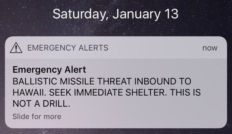
It turned out to be false.
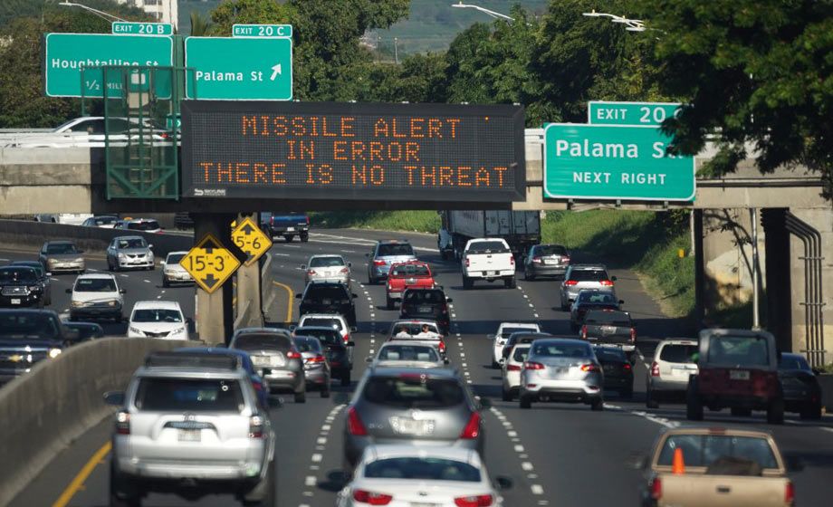
A state employee accidentally sent the message while testing the alert system.
It’s natural to blame the employee for impermissible negligence. But here is the user interface that they were using:
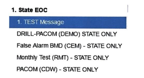
Instead of selecting “DRILL-PACOM BLAH BLAH”, they chose “PACOM BLAH BLAH”.
Firing the employee will not help avoid this mistake in the future, another employee is as likely to err.
The user interface is the problem.
Some commenters suggested adding a confirmation dialog. But confirmation dialogs are only good at one thing: forming the habit of pressing “Yes”. Testing the alert system is a daily routine, so after a couple of days the effectiveness of a dialog will be zero. Even if we require confirmation only for the real alert, but not for the test and drill alerts, the error is still quite likely: people see confirmation dialogs too often and are trained to ignore them. Also, sending even a drill message by mistake is probably not desirable.
Here is how to really fix the interface.
Selecting the right option
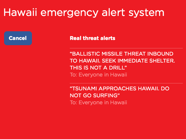
In the current interface, the two options that the employee has mixed up, look almost the same: just a line of meaningless all-caps text. Instead, the drill options should be clearly separated from those that send real alerts. The text should be edited for absolute clarity. All abbreviations, parentheses and repeated words (“state only”) should be removed.
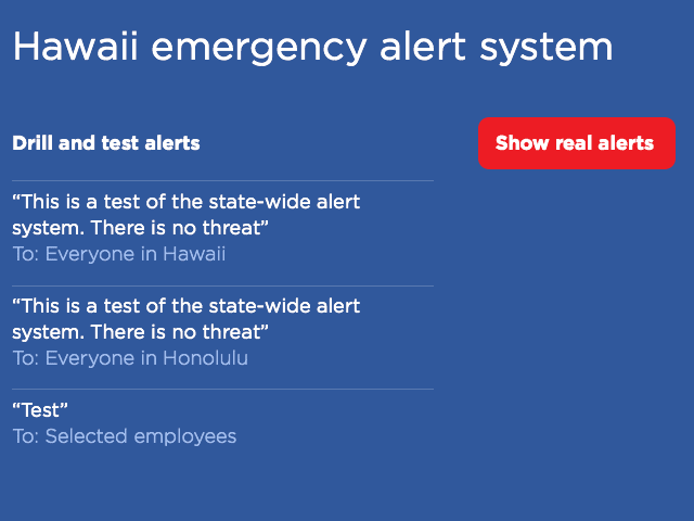
Ideally, what should remain is the actual text that will be sent, and to whom it will be sent:
If the employee wants to send a real alert, they have to explicitly choose that. Then everything should look really serious:
Undoing the wrong action
But most importantly, undo should be implemented.
How can you undo sending of a state-wide alert? Easy, the same way you undo sending an email in GMail:
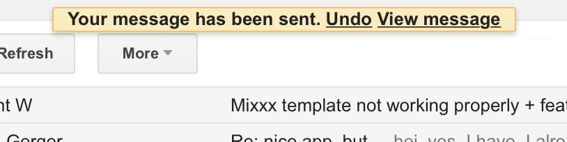
For a short period of time, the mail is not really sent, giving the user the chance to correct the accidental mistake.
After the employee selects to send an alert, the next screen should say what has happened in a way that makes the employee’s job look completed, but still leaves the option to prevent the actual alert:
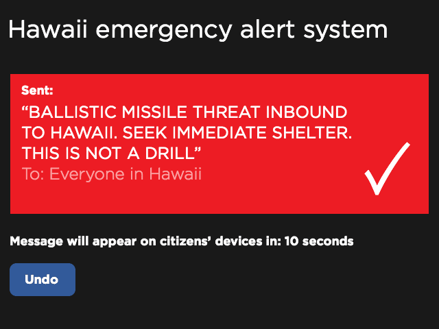
Notice how there is no confirmation button: there is nothing to confirm, the command has been accepted without confirmation. And since there is no way to close this screen before the timeout is over, the habit is not being formed to do it.
***
The problem with the modern world is that there is this stupid separation of “UI” and “UX” design, in which the important stuff gets lost. Good user interface design used to be about understanding how humans operate and helping them do their job better. And now, it’s undefined.
“UI” designers are now supposed to be thinking about beautiful buttons, fonts, and animations. This is too narrow. It’s hard to justify this work if you are designing software for use by a few government employees. “UX” designers are now supposed to be thinking about the user experience, whatever that is. This is too abstract. Caring about how “satisfied” or “engaged” the user is, again, not something a government could afford to think about. The “UI/UX” separation is bullshit. Between “UI” and “UX”, someone has to do the actual work.
See also:
Sources of images:
- Hawaii residents received false emergency alert about an incoming missile. The Verge.
- Pandemonium and Rage in Hawaii. The Atlantic.
- Hawaii Distributed Phony Image Of Missile Warning Screen. Honolulu Civil Beat.
- Bad design in action: the false Hawaiian ballistic missile alert. Jason Kottke.