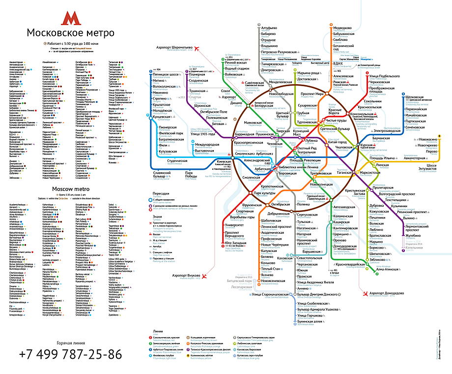
Assignment: Design the best map for Moscow metro.
The new map is informative, simple and useful:
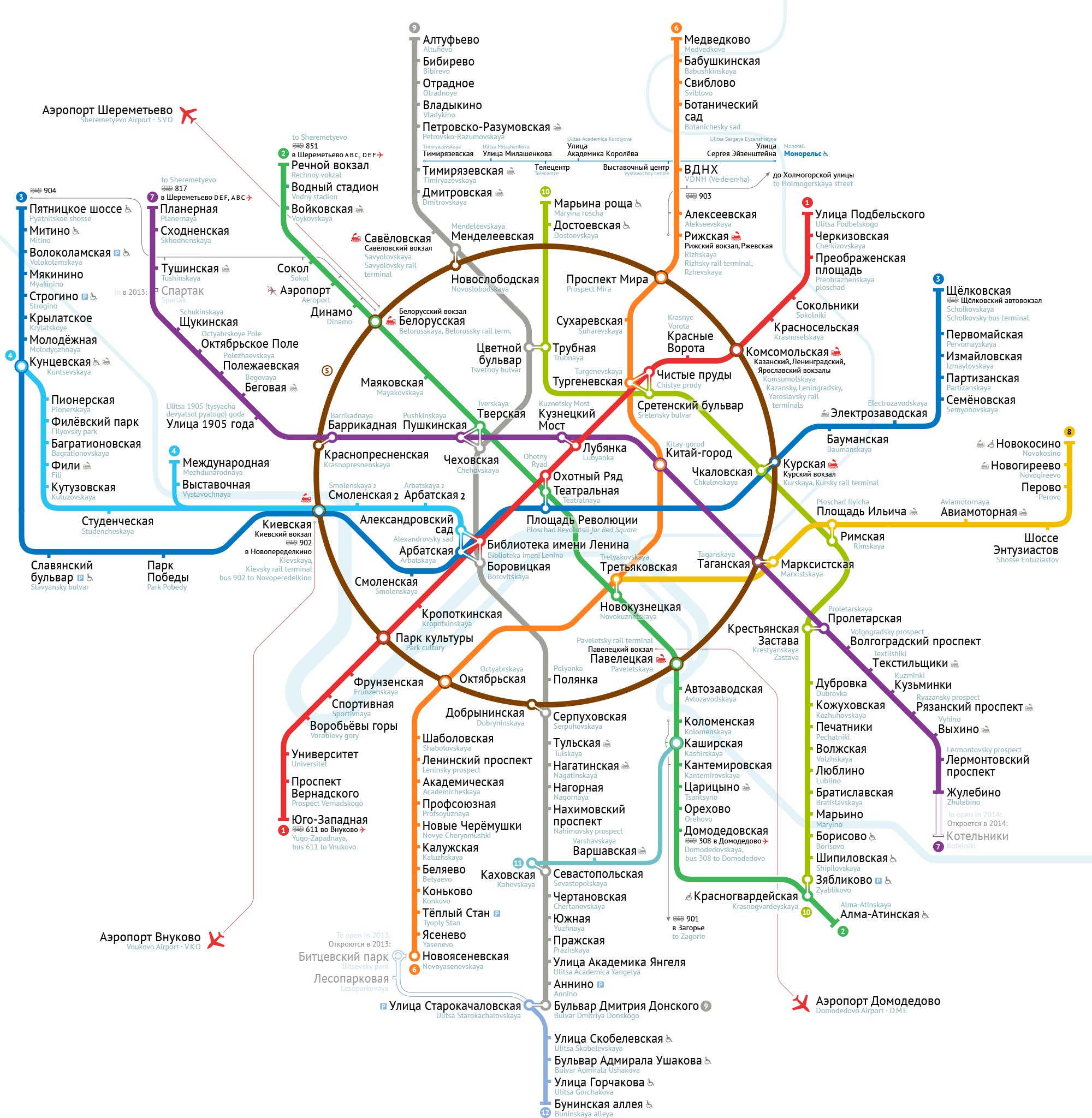
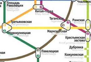
The challenge
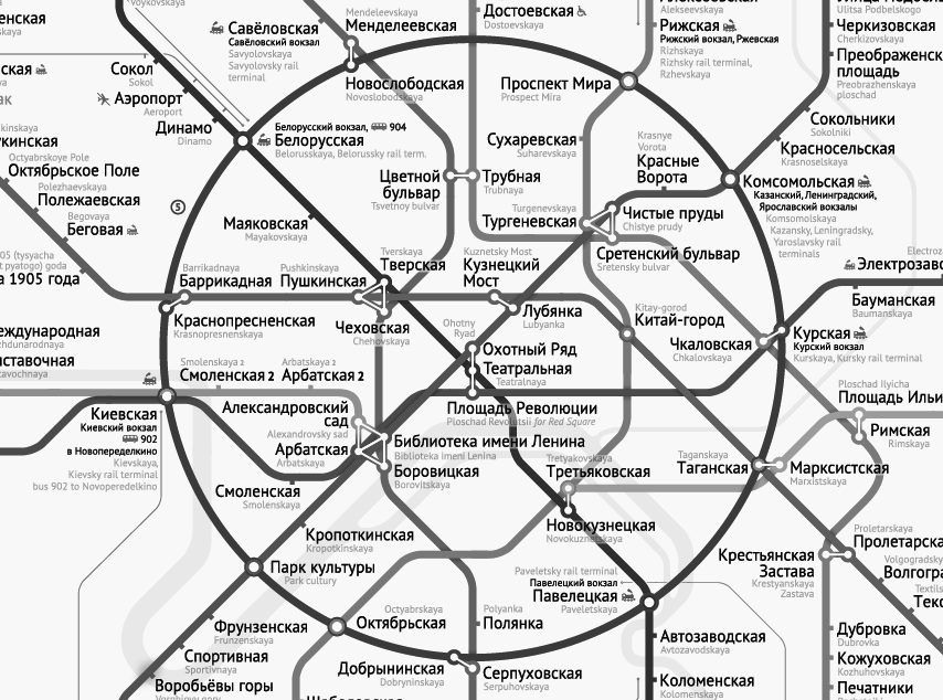
Moscow metro has a peculiarity: where multiple lines are connected with transfers, each platform is considered a separate station and usually carries a separate name. Instead of saying “at station A there is a transfer between lines X and Y”, in Moscow people say: “there is a transfer between station A of line X and station B of line Y”.
Because of this, the central part of Moscow metro map has to display many more station names than an average transit map, and it must be clear which name is used at which line. If you also consider the need to specify each name in both Cyrillic and Latin scripts, it becomes one of the hardest challenges in designing a map.
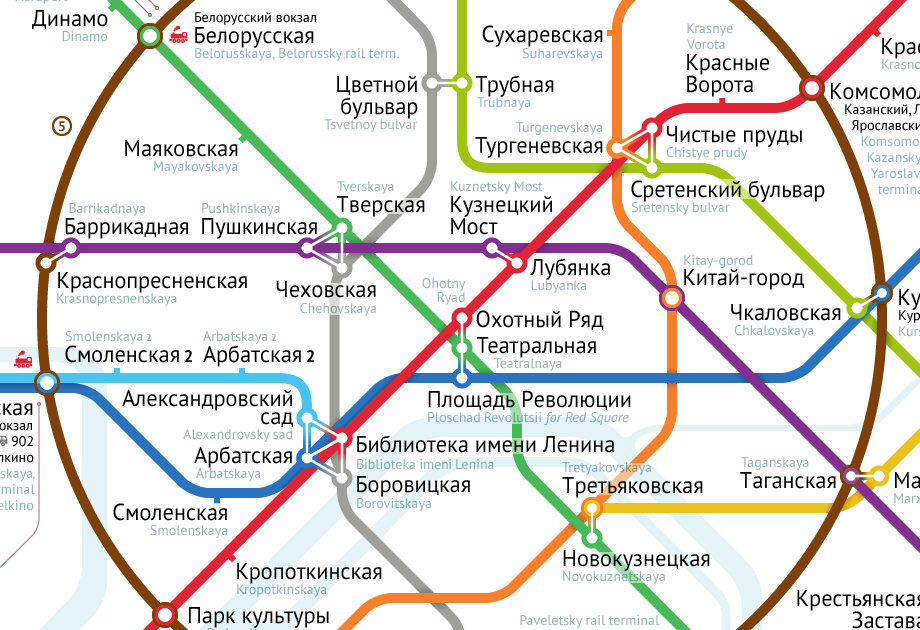
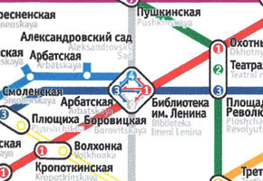
The case of Biblioteka imeni Lenina junction
The Biblioteka imeni Lenina station is a part of a four-station junction (just below the center on the image above). There is no direct transfer passage from Filyovskaya to Serpuhovsko-Timiryazevskaya line at this junction. You will have to pass through platform of another line. Local residents insist on displaying this detail on the map even though there is no other place to transfer between these two lines.
Designers have always either used complex geometry or even shown the transfer directions with arrows, adding to confusion:
|
|
|
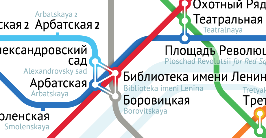
There is a way to display this junction in a compact, correct and unambiguous way without turning it into a maze:
Another subtlety: here the transfer from Sokolnicheskaya to Arbatsko-Pokrovskaya line is shorter than in the next junction (top right), which requires one to pass through Teatralnaya. That is why here the red and blue lines pass so closely.
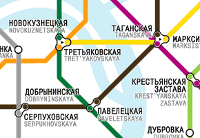
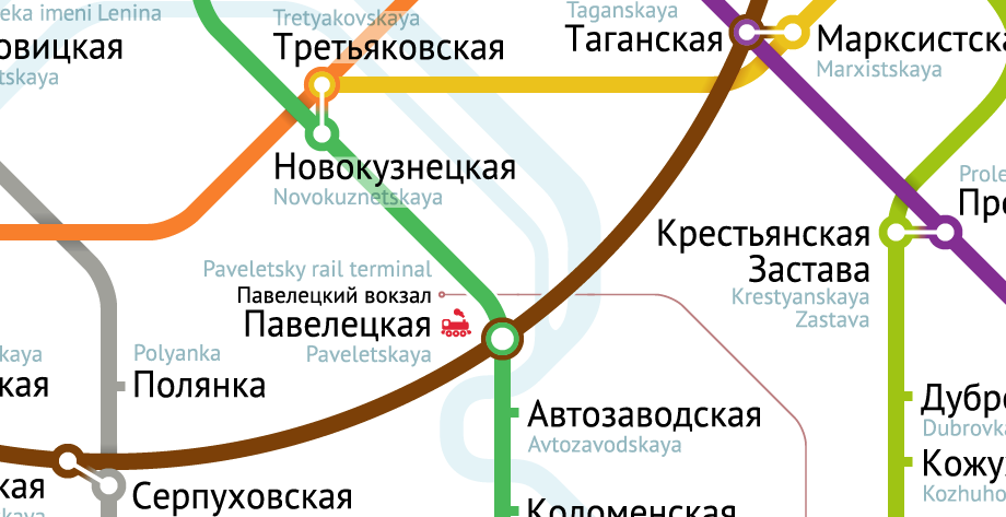
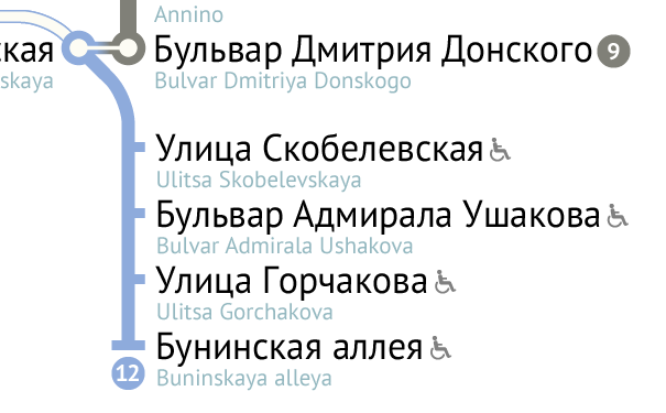
Shared station names
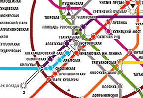
Sometimes connected stations share a name. There are even three-station junctions where two stations share a name, and one has a different one. In most of the previous designs each station was depicted by a separate circle, so that the number of circles and names differed. It was difficult or impossible to match them:
|
|
|
When you use the network every day, you know these junctions. You remember that the yellow and orange stations are both called Tretyakovskaya and that the green one is called Novokuznetskaya, so you do not get confused. But tourists will look for the missing names in vain.
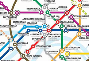
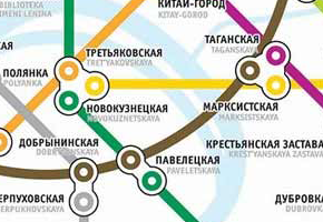
The solution “One circle, one name” makes station names obvious:
The translation
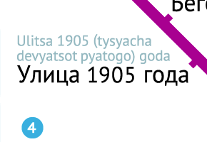
Foreign travellers are relatively rare metro commuters. But for the network serving millions of passengers a day this still means about a thousand guests from abroad. The station names are repeated in the Latin script to help recognise them in the voice announcements on the trains.
But a transcription of “Улица 1905 года” as “Ulitsa 1905 goda” is not very useful: a non-Russian-speaker would not know how 1905 is pronounced. That is why numbers and abbreviations are spelled as words:
The compass
The new map includes a station index in both languages:

Traditionally, indices are used together with grids so that object location is denoted by a letter-number pair such as E2 or B7. To find a station, one has to look up the name on a list, remember the letter-number code, find the grid on the map and figure out on which axis the letters are and on which axis the numbers are, and then look for the station in the appropriate cell. But the famous Circle line is itself a great coordinate system.
To help find the station and not to clog the map with a grid, it is sufficient to point the passenger’s eye in the right direction:

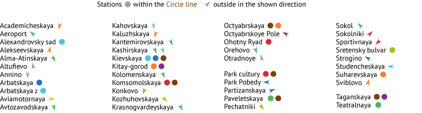
Since an arrow does not need a coordinate system, it works well even without a map. The text “The shop is near Kantemirovskaya ![]() station” immediately hints to the station’s location within a part of the city. So when one wants to actually find the station on a map, they would not even need to look at the index.
station” immediately hints to the station’s location within a part of the city. So when one wants to actually find the station on a map, they would not even need to look at the index.
Rail Terminals and Airports
The second most important thing after the metro lines are the rail terminals and airports. It is unacceptable to have someone miss their train or flight due to inability to figure out the map.
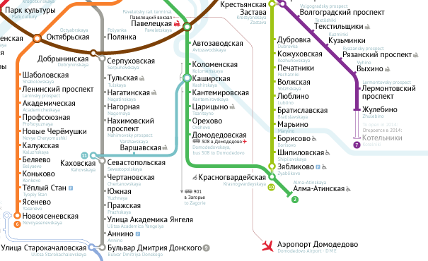
All nine Moscow’s main railway stations have metro stations next to them. These stations are marked  and the terminals’ names are given.
The only railroads presented on the map are the airport express train lines (thin red).
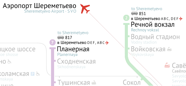
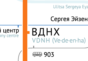
There are also bus services from Planernaya and Rechnoy vokzal stations to Sheremyetevo airport. A caveat: they go to the airport’s terminals in a different order.
To avoid confusion with the buses’ non-trivial routes, it is sufficient to list the terminals according to their route order.
Express Buses
There are express bus services 901 to 904 which connect remote districts to the central metro stations. The information about these services although important isn’t vital compared to the metro lines, railway stations and airports. A close examination of the buses’ routes allows to minimize clutter:
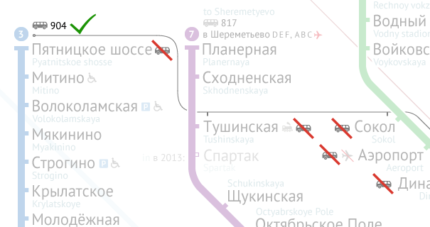
It is useless to cram the map with bus pictograms next to every station. One per line is enough.
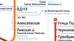
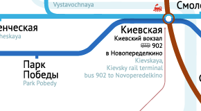
Just the part of the route near the metro is shown (left, bus 903). If a bus service has only one stop at a metro station, the line is not depicted at all (right, bus 902).
Colour perception
The map is designed with the colourblind in mind. All the line corners are always positioned outside of the station circles so that you cannot miss them. Even without colour your eye can follow each line:
Miscellaneous
Every detail is carefully thought through and designed for the commuter’s benefit:
There is no use in displaying the Butovskaya line in a special way and labeling it a “light rail line”, as it was done in earlier maps. This just provokes questions: Why is the line drawn differently? How do I transfer? Where do I buy tickets?
From the traveller’s standpoint, it is an ordinary line, just an overground one.
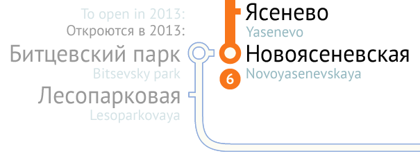
It makes sense to show just those stations under construction which will open soon. Instead of displaying the meaningless “Line under construction” it is useful to point out when exactly it is due to open.
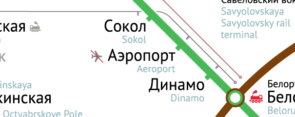
The Aeroport station is named after the old airport currently not in use. To avoid confusion, it should be noted that today there is no airport at this station.
I am a product, web and app designer. Among my professional interests are information display, web, user interface, typography, typefaces and layout. I am fascinated by transportation, signage and wayfinding. I would be happy to design a transport diagram for your city.