Logo and stuff for Driving Tests
Driving Tests is a website that helps to prepare for the driving licence exam in the United States.
I made a logo:
The shield reminds of the American interstate highway signage and also appears on the diplomas of some universities.
The logo has several versions for different situations:
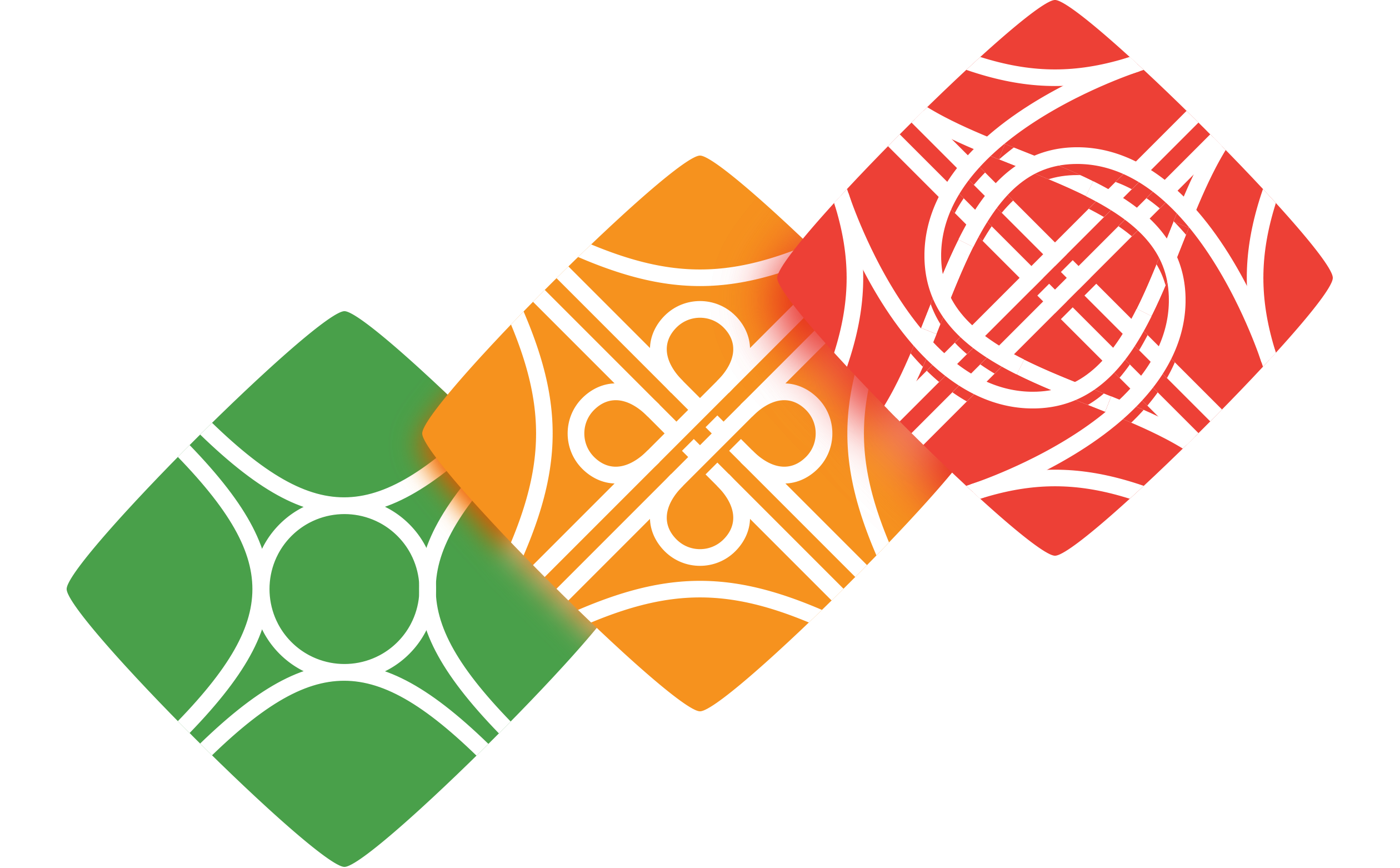
For individual tests, I’ve designed special signs. A roundabout, a cloverleaf interchange, and a turbine interchange signify the different complexity levels:

The Marathon, where the user is tested until he or she correctly answers all the questions in the database, has an impossible infinite interchange. The real exam emulation mode has a true-life interchange:

The whole set:
For the tests user interface, I’ve made a custom correct answer icon (click to see):
When the user makes a mistake, the website provides a hint. There is an icon for that also, a mix of a question mark and an escape from a serpentinous road:

Driving Tests want to be known as the best way to prepare for the exam. The idea is that when somebody gets a driving license with the help of Driving Tests, they would want to tell about the website to there friends who are going to become drivers, not just think they’ve “googled some tests”.
The new graphical elements will not only make the website more memorable, but will also be used for brand items like t-shirts or mugs:
