I’ve published a lot of stuff designed for Chelyabinsk transport over the years:

I’ve published a lot of stuff designed for Chelyabinsk transport over the years:
Let’s talk about software lag.
By “lag” I don’t mean things that take time in general. I mean delays that interrupt the flow of interaction, causing frustration. If your computer is downloading five gigabytes of data, compiling a large project, or rendering a video, those tasks may take a while — but that’s not lag. You asked the computer to do work, and it’s working. Now imagine the render finishes after an hour. The status changes to “Completed”, and the finished file appears on the desktop a second later. The first hour wasn’t lag, that last second was.
Theorem: every instance of lag is a bug, and can be fixed.
Technically, even displaying a status update or reacting to user input is work, just like rendering a video. However, this work must be completed in less time than a human can perceive. We’ll call that “instantly”.
Examples of lag in modern software:
In the early days of computing, lag was unavoidable. Hardware simply wasn’t fast enough to make everything feel instant. That hasn’t been true for at least the last twenty years. The computers have long been orders of magnitude faster than what is required to achieve instantness and therefore eliminate all lag entirely.
If an application lags, it simply means that, at the moment it should have displayed something or responded to the user’s action instantly, it was busy doing something else. That “something else” is unnecessary work at that particular moment. That’s a bug, and it should be fixed. The unnecessary work should stop getting in the way of the user.
So lag cannot be blamed on weak hardware; it is solely the weakness of its author.
I came away from this year’s WWDC keynote surprisingly optimistic.
For the past decade, I’ve been waiting for Apple’s marketing department to stop chasing spectacle and let the designers and engineers get back to doing their jobs. Every year the company tried harder to impress us with the scale of its announcements, while the substance kept shrinking and the quality of execution kept deteriorating. Great features from the past were left to rot. The system became less reliable year after year. Time Machine got flaky. Spotlight got worse. Even something as basic as drag and drop became less dependable. And on top of all that, they created Liquid Glass, making everything not only work poorly, but look bad too.
When Alan Dye left, I started hoping that Apple’s design culture might finally begin to change. The company was never going to come out and say, “We are reverting the changes”. But I kept telling friends that we’d be able to tell from the small details whether there was any reason for optimism. You don’t have to say “Liquid Glass was a mistake” (even though it clearly was) — you can make a handful of changes, call them an “evolution” of Liquid Glass, and anyone paying attention will understand that a different era has begun.
That’s pretty much what happened.
First, the interface changes were presented by an actual interface designer. He opened by saying something along the lines of: “It’s okay not to get everything right on the first try. We listen to feedback and improve based on what we hear.” On the one hand, that’s a terrible message: it’s not okay, that’s how design works in corporations that don’t really know how to design. Apple has the expertise to get things right from the start. But on the other hand, it’s a very encouraging message. It’s about as close as Apple can get to publicly admitting that last year’s design direction was wrong. More importantly, it shows self-awareness: “We know we shipped shit, and we know you think so too”. That’s the foundation of meaningful improvement.
Second, they fixed some of the most baffling design decisions. Toolbars are back. The awkward floating sidebar is gone. Window corners finally make sense again. Menu icons have been removed. Safari still looks crappy, but maybe there’s a setting for that somewhere, or maybe they’ll keep refining it over the summer. These are small changes. But if Apple keeps moving in this direction for a few years, the Mac might eventually become nice again. They also added an interface for accessing menu bar items that don’t fit on screen. It’s not particularly elegant, but at least it exists.
The design problems weren’t the only issues that had been piling up over the years, the implementation was also bad. The announced transition from Tim Cook to John Ternus gave me some hope. Cook is fundamentally a manager; Ternus is fundamentally an engineer. Still, I wasn’t expecting much.
Yet the keynote delivered several encouraging signals on the engineering side as well.
For one thing, Apple effectively admitted that Spotlight search — once one of the company’s proudest achievements — had degraded to the point of being genuinely unreliable. They announced significant improvements, and I hope they’re real. That said, I’ve learned not to get too excited. Apple has been promising keyboard autocorrect improvements every year for as long as I can remember, and it remains stubbornly bad.
More importantly, they acknowledged that many parts of their systems have become inexplicably slow, and they showed a slide listing dozens of performance improvements across the platform. Again, I’m trying not to get ahead of myself. But recognizing the problem is an essential step toward fixing it. One moment was hilarious: Apple said that the Files app on iOS would become five times faster, bringing it up to the speed of Finder on the Mac. I hadn’t used the Files app, but does this mean they were even slower than Finder?.. At that point you could argue it barely worked at all.
I noticed several popular tech commentators complaining that this WWDC wasn’t particularly exciting. That reaction makes me sad. The obsession with putting on an impressive show instead of building better products is exactly what got Apple into this mess in the first place. It reminds me of voters who reward the loudest populists, reject sensible alternatives, and then act surprised by the outcome. If anything, we should be encouraging Apple in this direction. Stop spending so much energy trying to impress us. Spend that energy making the products better, and we’ll be impressed.
I’d love every WWDC to look like this. Not “Here are ten revolutionary new things.” Instead: “Here are two hundred small things you use every day. We made all of them a little better.”
Dear Steve Lemay,
Please consider paying some attention to fixing the user interface problems Jony Ive and Alan Dye have made during their years.
This list is a mix of general interaction problems, performance issues, inconsistencies, missing feedback, data-loss bugs, and seemingly minor annoyances. These are the things I happen to encounter in my own workflows every day. Another user would produce another list, and that’s what worries me. No single person can even keep track of all the problems anymore. User interface quality has decayed at every level, from fundamental interaction design to tiny details that used to be polished.
A matter of honour:
Text input on Mac:
Text input on iPhone:
Finder:
Safari:
Photos app:
Preview app:
Settings app:
Music app (this is so broken that nothing would help, but still):
Notes app:
All Mac apps:
Quick Look
Spaces:
Wi-Fi on Mac:
Wi-Fi on iPhone:
Screenshots and screen recording:
Again, this is far from being complete, of course, it’s just something that bothers me every day and comes to mind automatically. These are not just my pet bugs. Fixing every single one of them will make the platforms only marginally better. This list demonstrates how Apple platforms increasingly feel unpredictable, unresponsive, and disrespectful to the user’s intent. The decline in user interface quality, especially on the Mac, has been profound, and Apple needs years to recover. I don’t expect Mac to quickly become as good, consistent, and fast as it was twenty years ago.
But I’d like to see some evidence that Apple at least understands the problem and takes some steps towards fixing it.
Good luck!
In airports and at public transport stops, you often see screens that need to show more information than can physically fit. The usual solution is to cycle through pages, which is poor design.
Let’s look at an extremely bad example from Hong Kong International Airport. It is now 13:22, but the screen is showing about an hour of departures starting from 17:30 (as we can see in the corner, this is page 5):
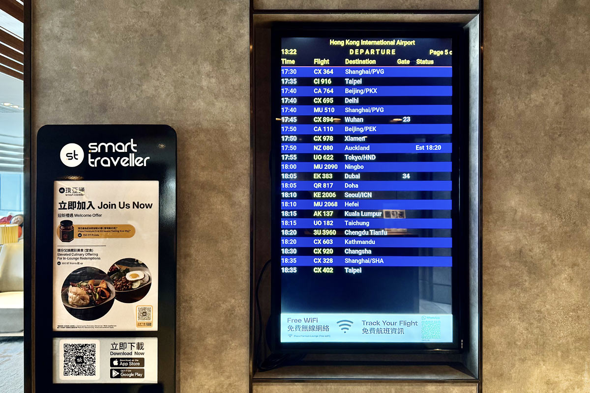
Every ten seconds the screen switches, but instead of showing the next batch of flights, it shows the same ones in Chinese:
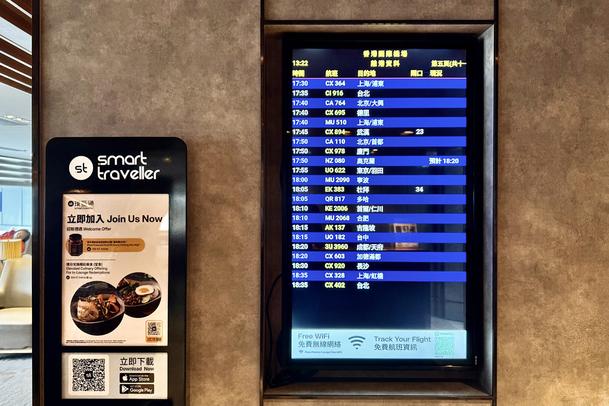
Only another ten seconds later does the next batch appear.
The cycling continues all the way to flights departing late at night. The last screen is number 16, which means a full cycle takes more than five minutes. I had to wait almost three minutes for my page. That is unacceptably long for an airport, where every minute may be critical. At the same time, most of these screens contain no useful flight information at all — not even gate assignments; they simply list the flights. By the fifth (out of 16!) page that you see on the photo, already only two flights have thier gates assigned.
Designing such a screen well only requires a minute of thought, but the problem in the design world is that almost nobody does even that. In what situations do people look at this screen, and what information are they trying to find? Obviously, those whose flights are departing soon need the information more than those whose flights are in five hours.
First, the languages should be combined. There is enough space to show both, and if there were not, abbreviations would be preferable.
Second, the screen should be split into two areas: the upper part should permanently show the nearest departures, while the lower part should page through later ones. Also, starting from a certain point, none of the flights have gates assigned yet. Among those, only cancelled or delayed flights are worth keeping visible; the rest should be removed from the list altogether (with graphical indication of the gaps, of course).
Third, the cycling section should have a clear visual indication of which page is currently shown and how many there are in total, with sections filling progressively so it is clear when the next switch will happen.
Fourth, next to every such display there should be a QR code that instantly opens the same display on your phone, so you can keep walking and always know your flight status. Something like what we implemented at Wildberries. I only just noticed there is a QR code on the screen, but it is almost impossible to spot in the footer due to banner blindness and its poor caption.
I would be glad to redesign the wayfinding system and all passenger information displays at your airport.
There’s no design in digital products anymore. It’s been replaced by evolution.
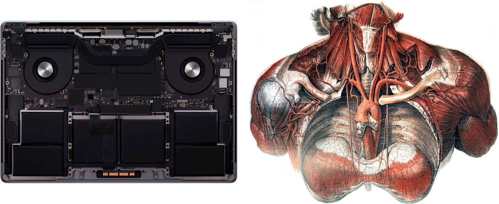
When I was reading Richard Dawkins about evolution, one example stuck with me: the giraffe’s laryngeal nerve. It connects the larynx to the brain, but in a giraffe it runs all the way down the long neck, loops around the aorta, and then comes back up. Logically, it should run straight from the head to the larynx. But the giraffe evolved from a short-necked ancestor that already had this loop around the aorta. As the neck grew, the nerve simply stretched.
Here’s another example: Instagram. It used to be a timeline of photos from the creators you liked. Then direct messaging was added, and the feed got scrambled with ads and videos. Then the developers copied Stories from Snapchat. They didn’t really fit the feed, so they were stuck on top as little circles that live separately from the feed and use different gestures. Then, in various places, they shoved in live streams (not the same as videos), something called IGTV (also different), and Reels lifted from TikTok (different again). Reels got their own tab with its own set of gestures.
There was a time when products were designed with intent. Sections were organized into a hierarchy, features were given logical places. You could feel a system behind the product: what parts it consists of, how screens are organized, what kinds of data it has. Users didn’t analyze it consciously, but it helped them navigate and gave them a sense of control.
That’s not how it works now. Instead, teams make hundreds of random changes, keep the winners, roll back the losers. In the end, nobody sees any logic in the product. Users post the same photos in Stories “just in case” (because nobody finds them in the feed anymore, and users know that). Reels, in turn, somehow leak into the main feed (because lots of people never visit the Reels tab, and the developers know that).
Just as a giraffe is a messy tangle of nerves, guts, and bones, Instagram is a mess of features with no logic, order, or plan. In neither case do you feel the hand of a Creator who carefully thought through how everything should be structured.
This shift from design to evolution is happening in most digital products around us. Sometimes it’s framed as the change in the designer’s role: we’re told that a modern designer should test hypotheses and analyze metrics. But that work can’t be part of design; it’s literally the antonym of design. Nobody designs anything; instead, people take random steps and keep the ones that happen to work.
You can call this evolution operator a “designer” if you want — words can change their meanings. But you don’t actually need a human at all to generate variants and see which ones survive: nature was doing it for billions of years before humans existed. Some people find the insides of a human more beautiful than the insides of a MacBook. That’s a matter of taste. The fact remains: to create human insides, a human wasn’t needed.
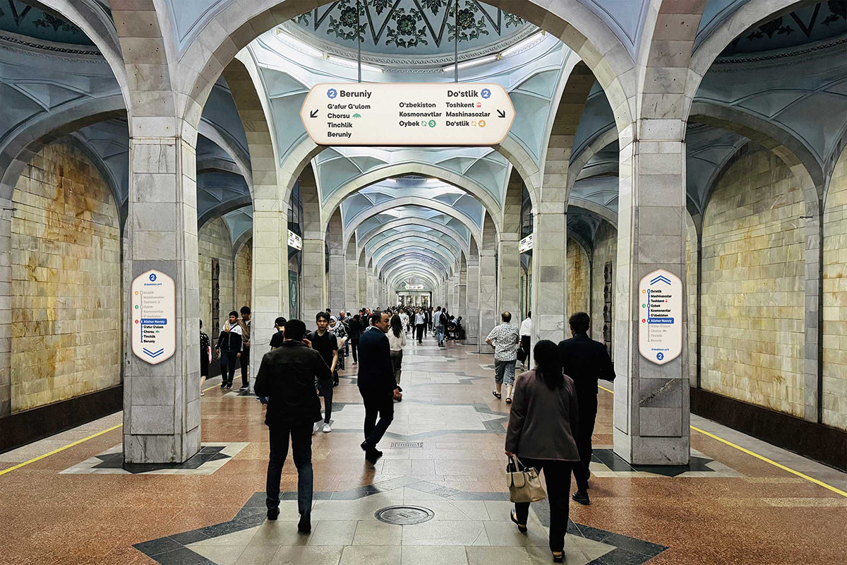
I’m happy to show and tell you about a great and very interesting project I’ve done last year. Tashkent Metro wayfinding:
The internet is celebrating the news that Alan Dye, Apple’s head of design, is leaving.
Alan has been the face of Apple’s interface decline in recent years. There was a time when the core principles of good interface design were easiest to explain using Apple as the example. Now Apple mostly serves to show how not to do it. Dye ended up with enormous power despite minimal competence: he simply doesn’t understand what makes an interface good; he lacks the education and isn’t even aware of it. Looks and surface-level effects completely defeated depth and thoughtfulness, and things still work only thanks to the extraordinary foundation laid long ago. Dye neither understood nor respected that foundation.
Steve Lemay is taking over. I hadn’t heard the name before, but he has been an interface designer at Apple since 1999, so there’s no doubt he actually understands what the job of an interface designer is. And judging by the reaction, the designers inside Apple can’t believe their luck and seem genuinely hopeful. Maybe he’s someone for whom “design is how it works” isn’t just nice-sounding words. And only a couple of weeks ago there was another rumor that this year Apple will focus on polishing and refinement rather than new features.
I very much hope Apple is headed for a revival. Maybe window sizes will once again be chosen so that elements actually fit instead of triggering a three-pixel scroll bar. Maybe we’ll get back the wonderful world where elements and their labels aren’t pushed as far apart as possible. Maybe animations will once again work to explain spatial relationships or bringing joy, instead of being accidental artifacts of implementation.
One more thing I hope for: Apple once led the world in making drag-and-drop a truly comfortable gesture. On Windows, it was basically unusable — if you dragged a file, nothing else worked until you finished. On the Mac, while “holding” a file with the mouse, you could scroll windows with the wheel to drop the file where you needed, and you could even hit space bar to activate an element under the cursor while the mouse button was already pressed. Today these things work only sometimes, in the places where Apple hasn’t yet broken them. Maybe Apple will suddenly remember the implications of Fitts’s law, and we’ll once again be able to drag files to the very edge of the screen to drop them into the Dock, instead of having to aim at the icon.
When Steve Jobs introduced Quick Look about twenty years ago, he explained that PDF parsing was built deep into the system, so even complex PDFs opened instantly, like ordinary image files. Today on the Mac, not only PDFs — even a regular JPEG takes noticeable time to appear. Just open a folder full of JPEGs and press the down arrow key to move through them. On the old Mac, the JPEGs would flicker past your eyes as they changed. Today, the Mac waits until you release the key, and only then lazily draws the JPEG you stopped on.
You simply have to not know how good things can be — how good they were — to believe that today’s Mac is good. The only reason to tolerate this misery is that everything else is even worse. If only that stopped being the only reason. Please.
In Norton Commander, as well as in Windows Explorer it’s always been the norm that folders go first, then files. On Mac, it used to be different: files and folders were always mixed together based on the selected sort order.
A few years ago, Apple finally gave in and added a proper sorting option to Finder: folders now appear first, files below.
In Norton Commander, as well as in Windows Explorer, and even in Finder, you’ve always been able to select a file in a list just by typing its name. I’m always surprised when people scroll through giant file lists looking with their eyes, instead of just typing a couple of letters.
So imagine you open a folder in Finder, and in it you have:
images/
index.php
You press the “i” key. Obviously, the highlight should jump to the images/ folder. But in reality, it jumps to index.php. Because even though Finder visually sorts folders to the top, deep down it still believes that index.php comes before images.
Vibe coding had not been invented then, but the implementation quality of Apple software was already at that same level.
How much can a design change when adapting it for mobile?
I go by this rule: the mobile and desktop versions should be mutually recognizable. If I’ve used a website on my computer and then open it on my phone, everything should be where I expect it to be — and vice versa.
If, say, there’s a row of six images on desktop and on mobile it becomes two rows of three — that’s fine. But if the images are replaced by a “View Photos” button that opens a popup — that’s not fine anymore. If there’s a large block of text on desktop and on mobile part of it becomes hidden with “Show more” — that’s fine. But if the text is edited down just for mobile — that’s not fine anymore.
I disagree with the idea of separating scenarios where people say things like: “On mobile, users are usually in a hurry, for them section X is more important than section Y, so let’s move it up”. That breaks the mutual recognizability.
You can put the mobile and desktop designs side by side and ask yourself: do they feel like two views of the same thing, just rearranged for screen size? Will someone who knows one version find their way around the other? If not — I’d ask for a redesign.