New road signs
Introducing the new clear and beautiful design for road signs:
But isn’t it an international standard?
Well yes, but even those need to be revisited every now and then. Road signs haven’t alwats been the same. Here are some examples from the Soviet era:


Some designs turned out to be poor, some became obsolete. It’s about time for another update.
Words come easy
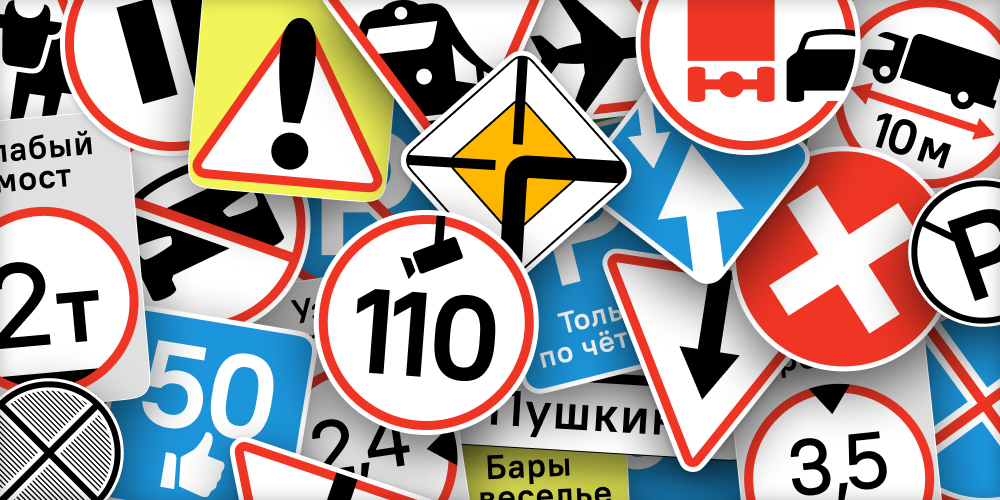
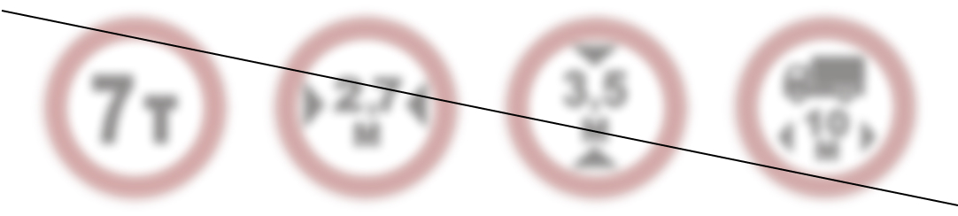
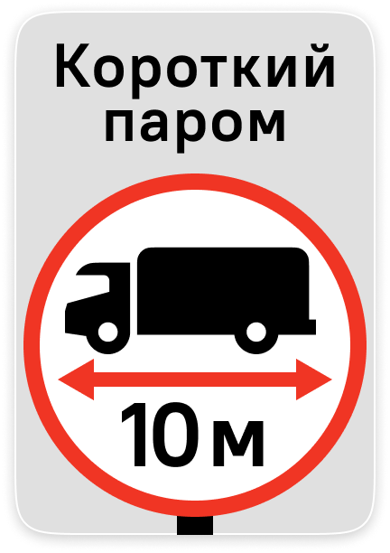
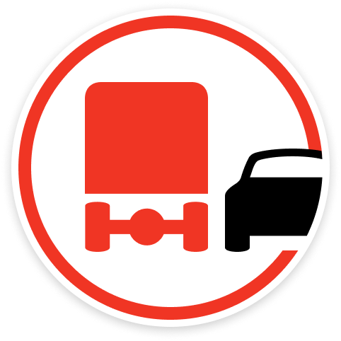
Signs limiting vehicle weight, width, height, or length do not explain the situation, and are easy to ignore:
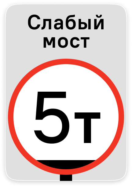
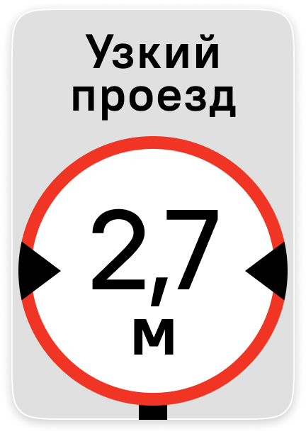
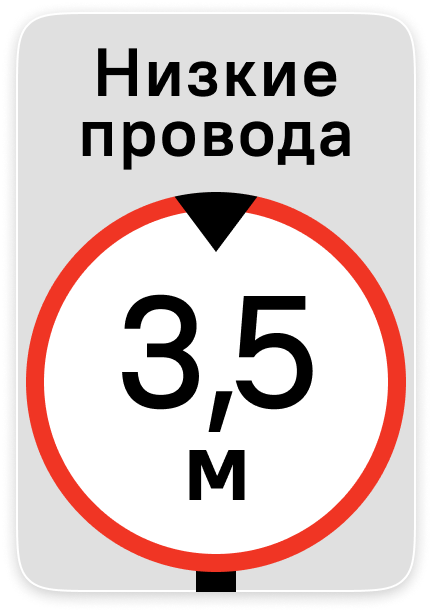
People better understand and are more likely to obey restrictions that have a clear reason. So now these signs necessarily include a textual explanation:
The red outline is thinner and more elegant — the color itself makes the sign stand out enough.
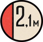
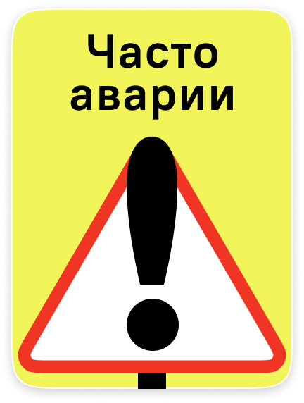
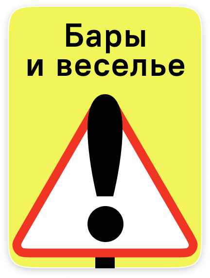
The exclamation point sign is useless: it attracts attention, but does not explain what to watch out for. Traffic police can’t resist the temptation to indulge in graphomania:
We can’t stop them, so we take the lead. Now the sign must contain a brief textual explanation:
Cross and pause
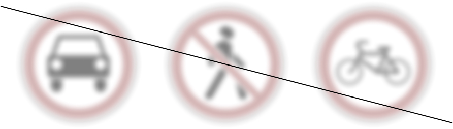
These three signs are being abolished:
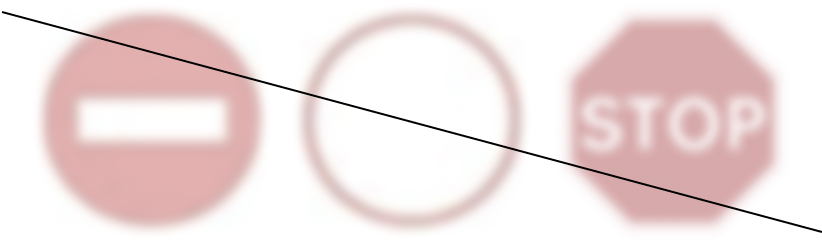
No one knows the difference between a “No entry” sign and a “Road closed” sign. They both forbid access, but not quite: each has its own list of exceptions. The “Stop” sign doesn’t forbid much, but has a custom octagonal shape and stays English even in Russia. No one takes it seriously anyway.
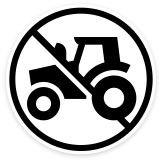
In order not to think in what sense and to what extent access is forbidden or restricted, new proper signs are introduced:
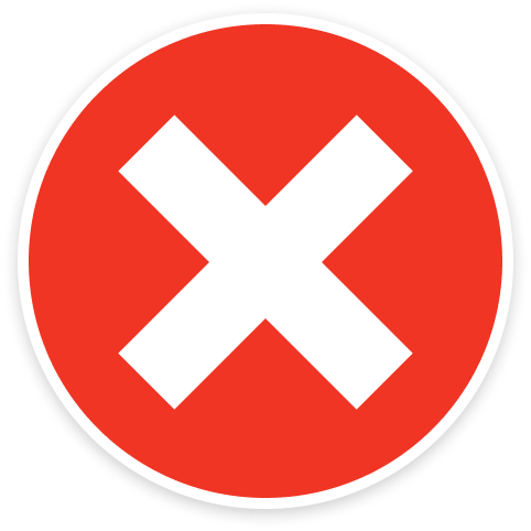
The cross simply forbids access. Bus drivers are taught that they are allowed under the cross if that is how the route goes. Operators of heavy machinery are issued special permits to enter construction sites. The rest of us are not burdened with this. If you don’t know why you’re special, you’re not allowed under this sign.
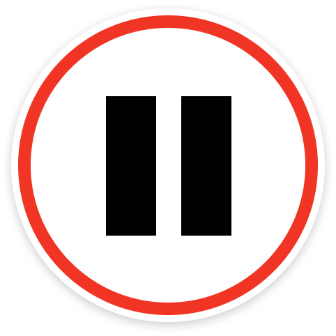
The pause, of course, means “stop, then go on”.
New signs of priority
The signs “Priority over oncoming traffic” and “Priority for oncoming traffic” make you stumble for an instant:
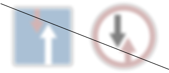
The left is blue, but the red element adds to the uncertainty. On the right one, the arrows are too similar.
These signs become priority signs and receive a familiar and understandable form:
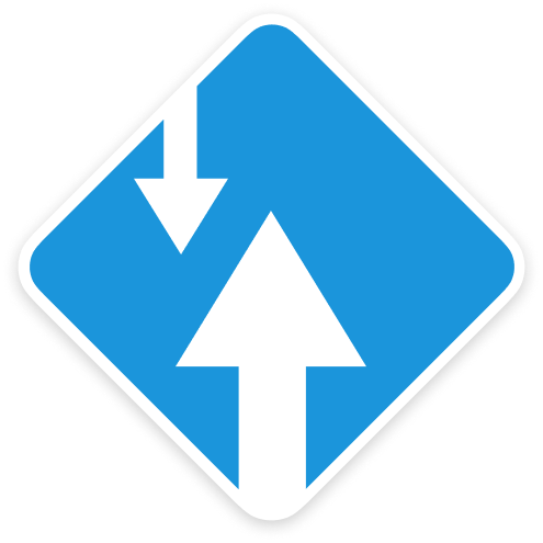
Thanks to the shape, the signs are recognizable from any direction, so no place for confusion is left.
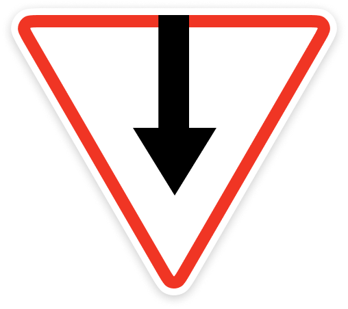
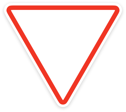
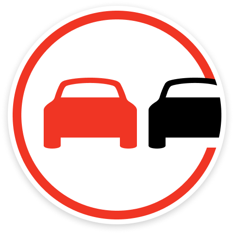
The classic “Priority road” and “Give way” signs, of course, remain in use in most situations:
These signs are sometimes accompanied by a plate with the intersection diagram. There are also priority signs that for some reason are designed as warning signs and use a different design of intersection diagram:
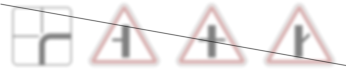
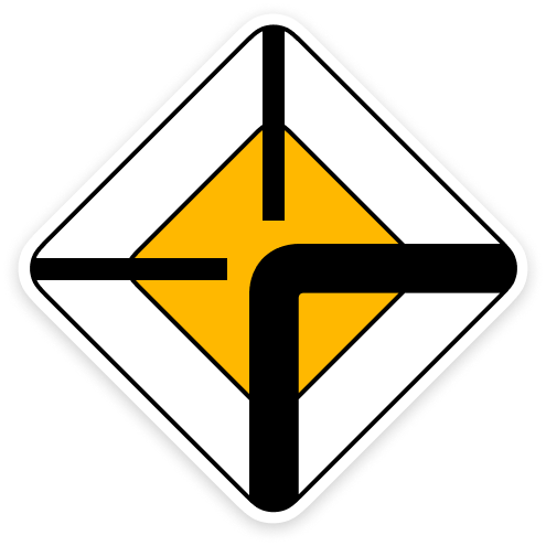
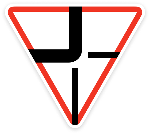
They, too, are being replaced by the system ones. If necessary, the intersection diagram is put directly on the priority sign:
The existing signs are a total mess around railroad crossings. A huge number of signs of various shapes and types provide tons of unnecessary details. The author was clearly a railroad fanatic and would talk about them for hours:
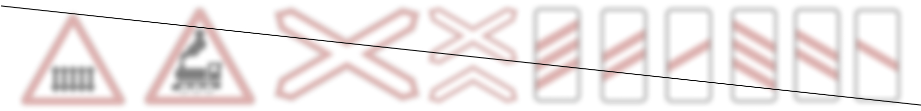
Instead of all this, a new obvious priority sign is introduced: “Give way to train”. When necessary, the features of a particular crossing, this is done with text:
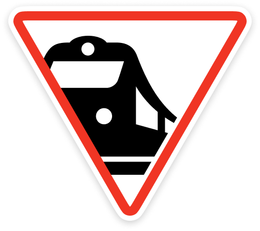
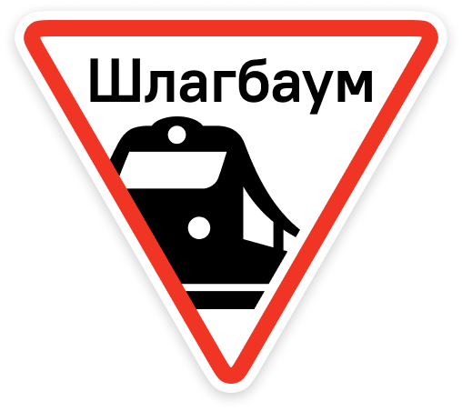
All other railroad-related signs are abolished.
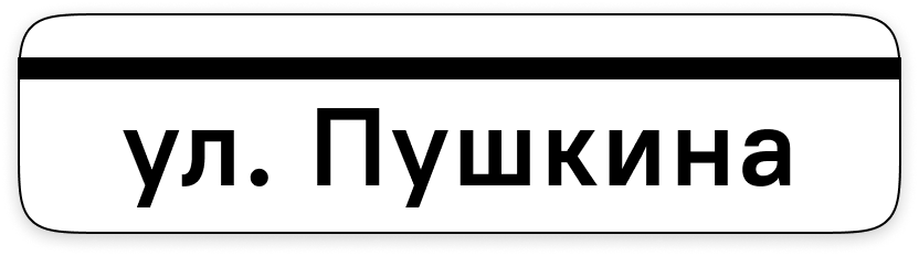
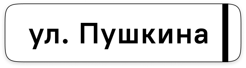
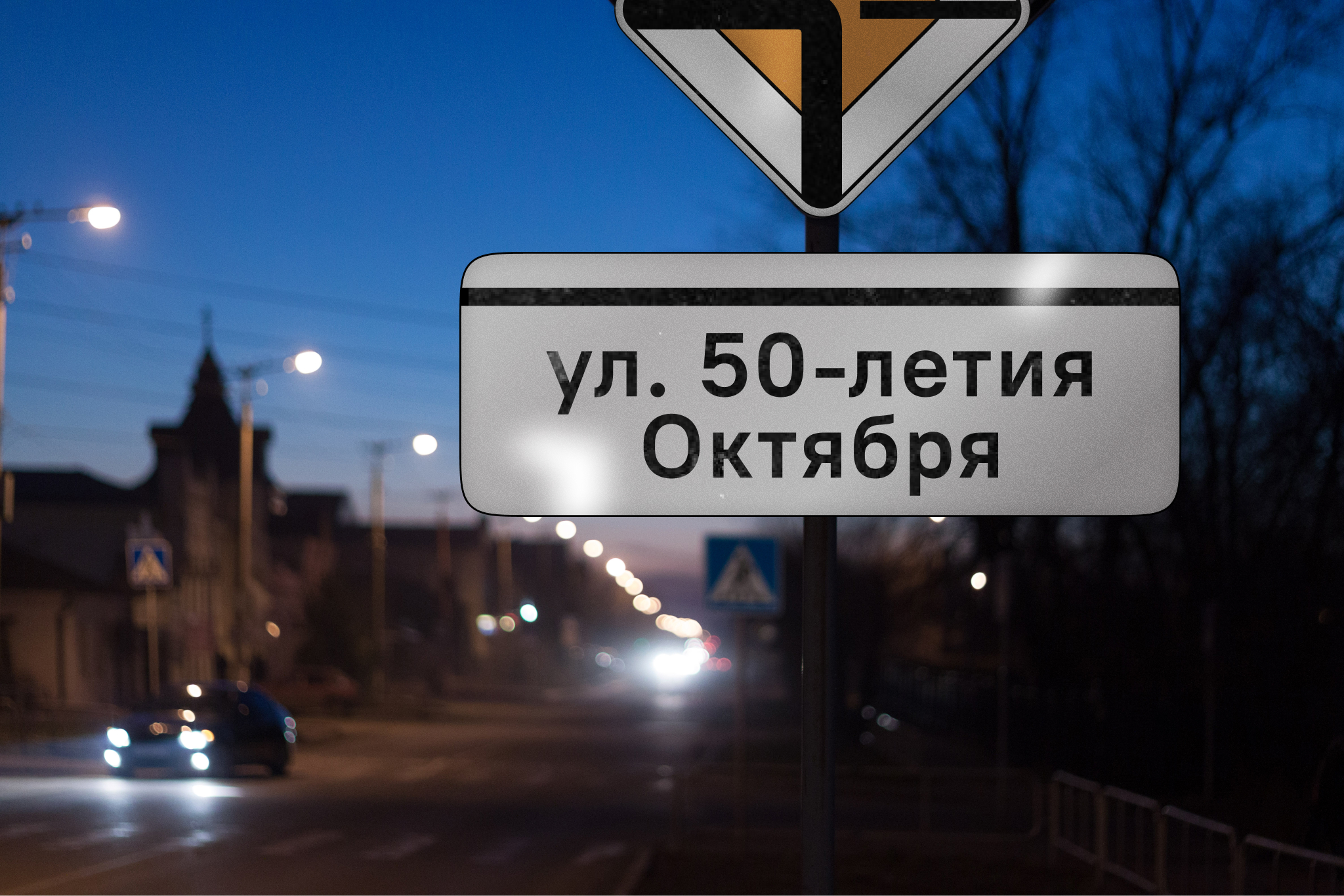
Street names
Street name signs are usually placed at intersections. Sometimes designers make a mistake of putting arrows on the sides:
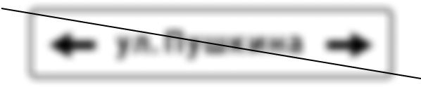
The arrows are unnecessary and misleading — the street may well be one-way.
A new sign with the name of the crossed street is introduced:
If you need to put the sign with name of street where the itself sign is located — no problem:
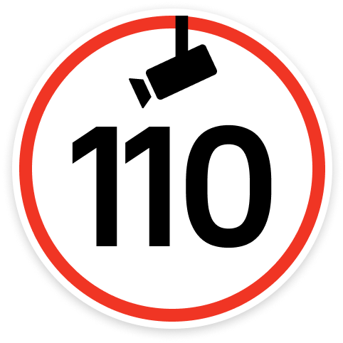
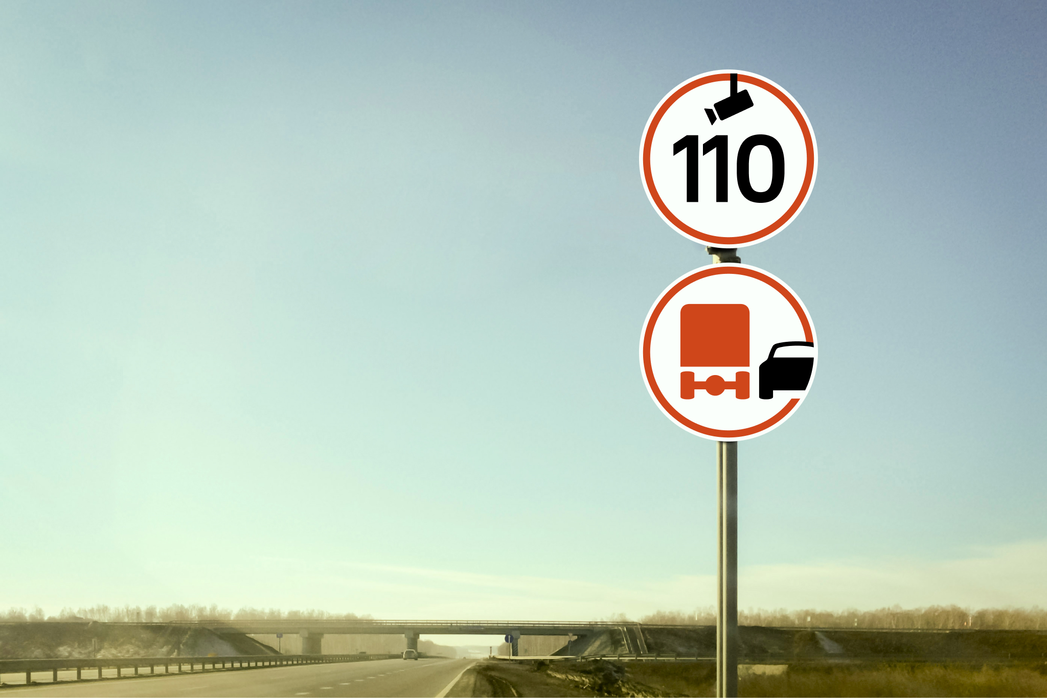
Speed regulation
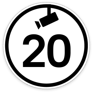
When speed cameras are installed, speed limit signs are supplemented with a “Cameras” plate. But cameras are ubiquitous now, so these plates clutter up the cities. Therefore, a special sign “Controlled Speed Limit” is being introduced:
There are also “Minimum speed” and “Advisory speed” signs:
They are rare and easy to mix up.
Now they are clearer:
Clear prohibition
Supposedly, the red circle means restriction, and the strikethrough means prohibition. However among the forbidding signs strikethrough is used randomly:
The ambiguity is over. Now if it is forbidden, it is crossed out:
The only exception is the signs that forbidd overtaking:
Instead of a red strikethrough line, they have red overtaking vehicles.
Parking and stopping rules
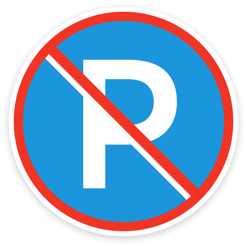
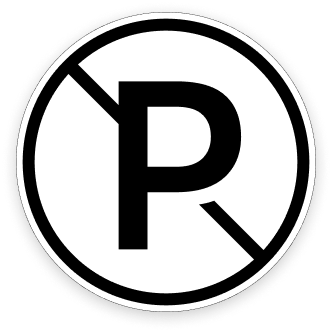
If “Parking” is a P, then why is “Parking prohibited” a bunch of sticks?
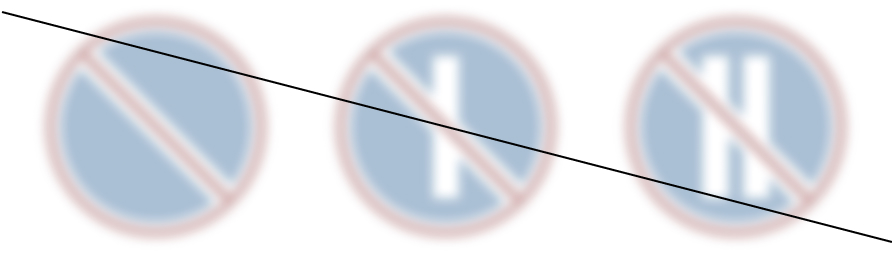
The sticks represent even and odd days, but they are crossed out. How should this be interpreted? Forbidden on odd days thus allowed on even once? Is this a logic test?
Now it’s better:
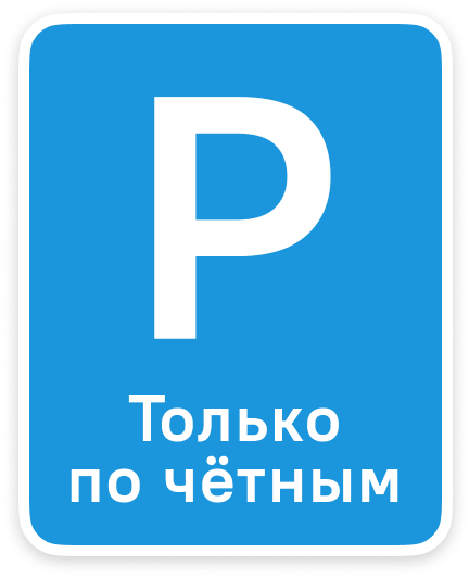
When parking is not prohibited, there is nothing to cross out.
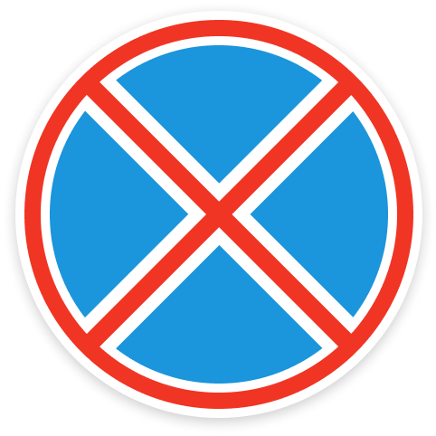
The “No Stopping” sign remains unchanged just because it’s very beautiful:
Monochrome design
In historical areas, it’s a good idea to forbid parking and limit speed without sacrificing beauty. Therefore, some of the signs receive official black and white equivalents in smaller size:

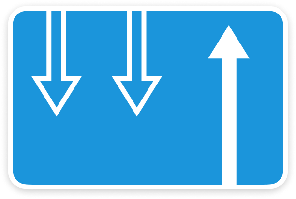
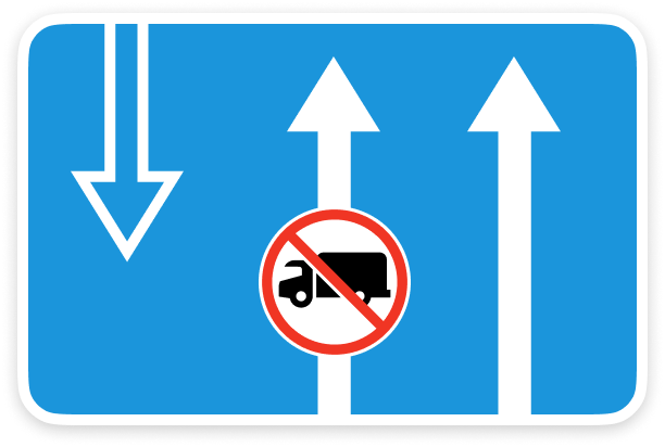
Lanes and directions
The problem with the traditional sign is that the arrows that relate to you and the arrows that represent oncoming traffic look equally important:
You have to draw solid and dashed lines representing road markings to better show the lane configuration, but that adds to the clutter.
The directions are now clearly contrasted:
Beautiful and large
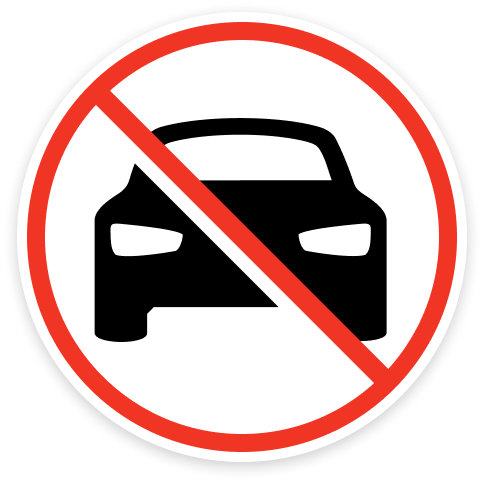
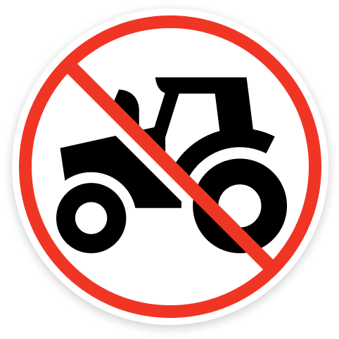
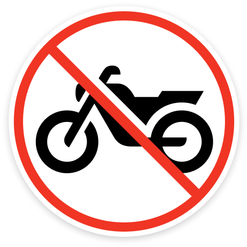
The objects and characters on the signs are redrawn by loving hands and synchronized with the reality of the world around us. Not only has the steam locomotive been replaced by an electric locomotive, but cars and tractors have become modern.
The objects are enlarged so that the most important or recognizable part is in focus:
We invite the road authorities to talk.
Ilya Birman
Art director and designer