Chelyabinsk transit reform communication
Chelyabinsk is undergoing a major transit reform, which includes improving the quality of communication with passengers.
For the reform, I designed multiple posters and announcements, created templates, and taught transportation agency staff how to use them and do their own communication.
Previously, communication was done inconsistently by transportation companies. Passengers did not learned about the changes or did not understand how to adapt to them.
Now the announcements are made promptly and in a standard fashion, contain a neat map of changes, recommendations for alternative routes, and are published on social media.
Route changes from January 1, 2022
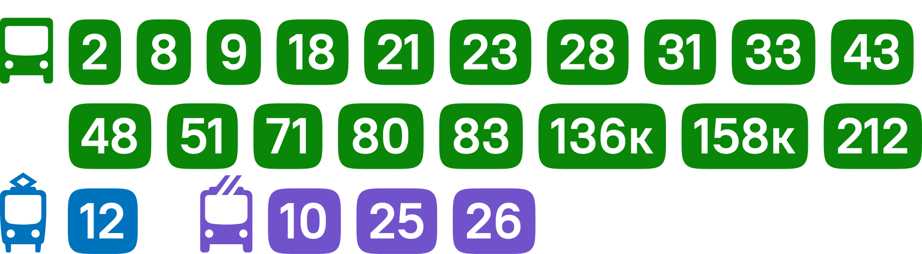
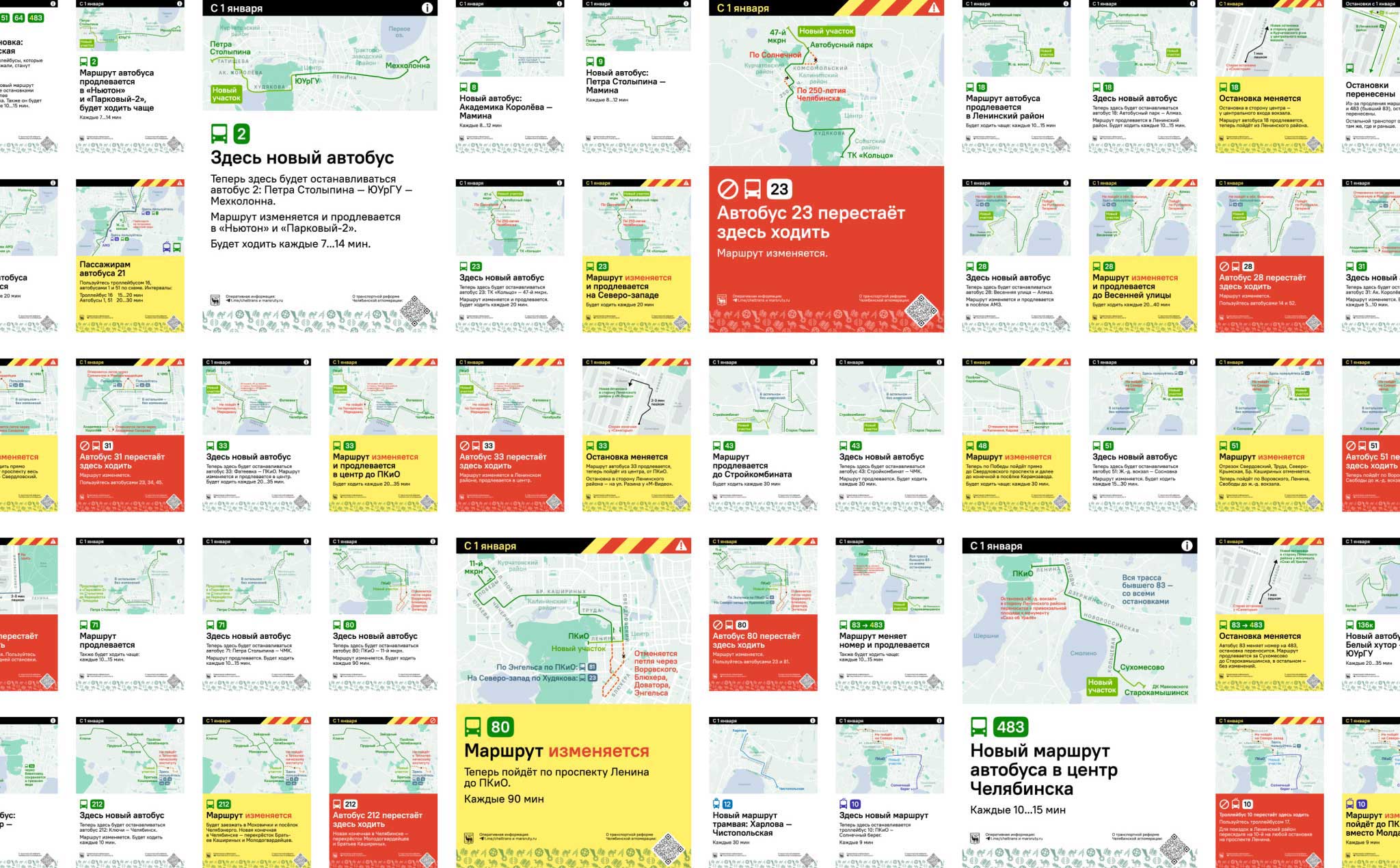
On January 1, 2022, two dozen routes changed at once — some only slightly, some majorly — and several new routes were introduced.
The changes were finalized only by the end of November. To notify about them in advance, we had to conceive, write and design the announcements, draw maps of the changes, devise a placement strategy, organize the production, distribution, and installation of posters and signs, and plan publications on social media — all in three weeks.
In total, about four hundred posters with 50 layouts were placed:
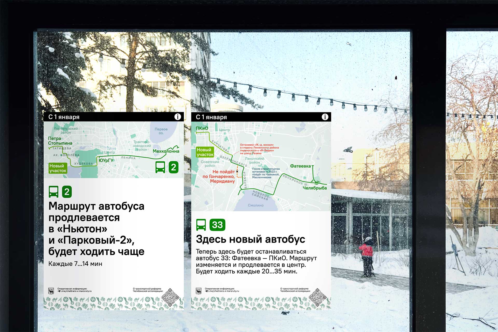
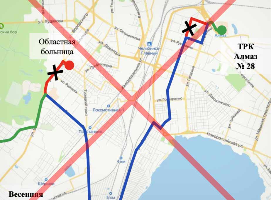
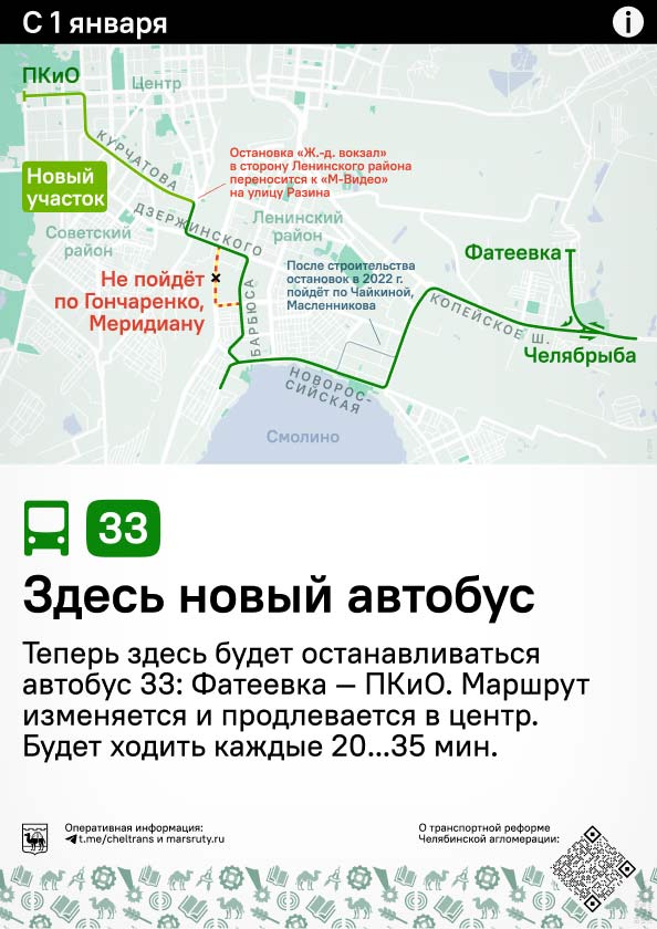
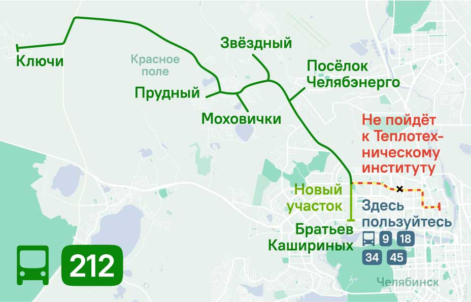
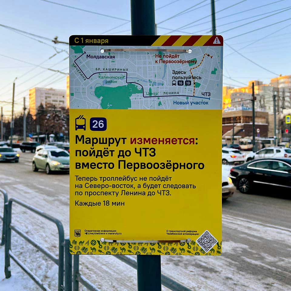
Consider the extension of the bus route 33 to the city center:
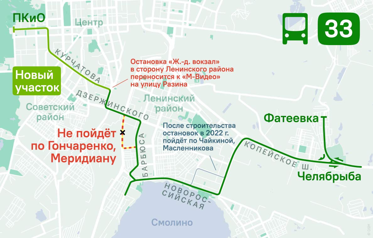
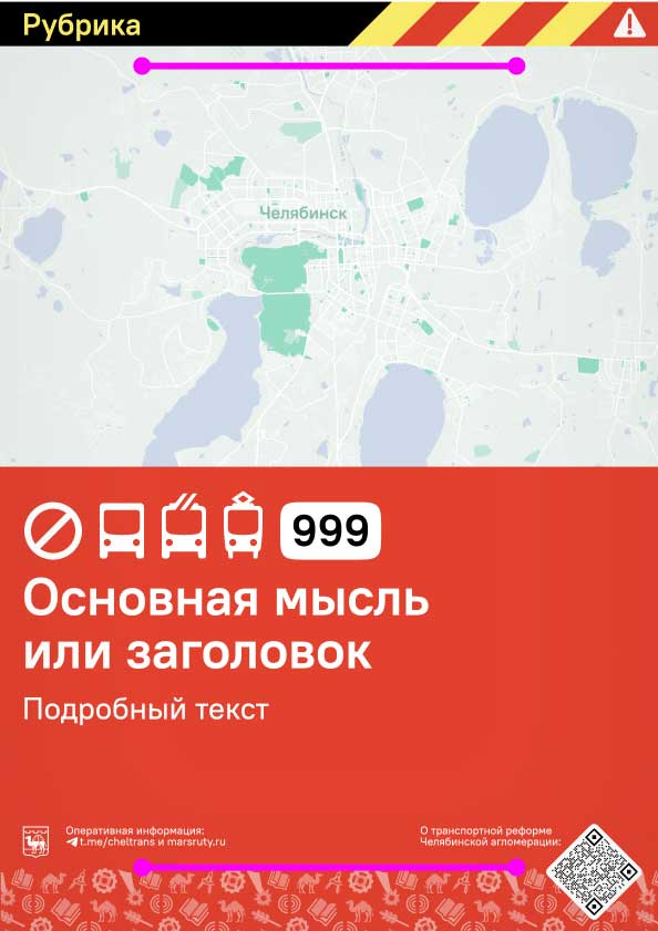
The change affects commuters in different parts of the city in different ways. For some people it is good news. Those who need to go to the streets labeled in red will have to choose other transportation. And for those who live on those streets, the route is effectively cancelled. At the Central Railway Station the bus stop itself is being moved, so you need to not miss it.
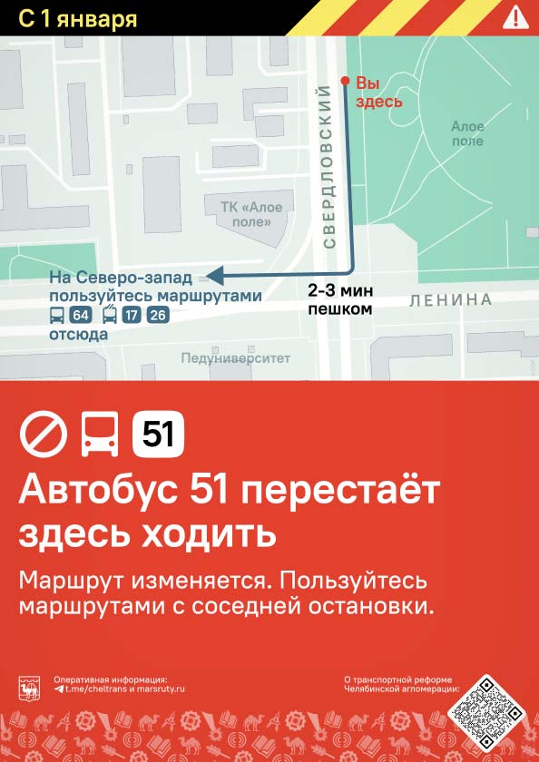
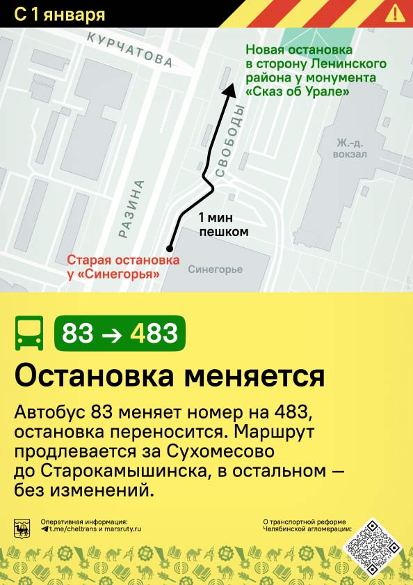
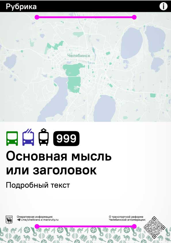
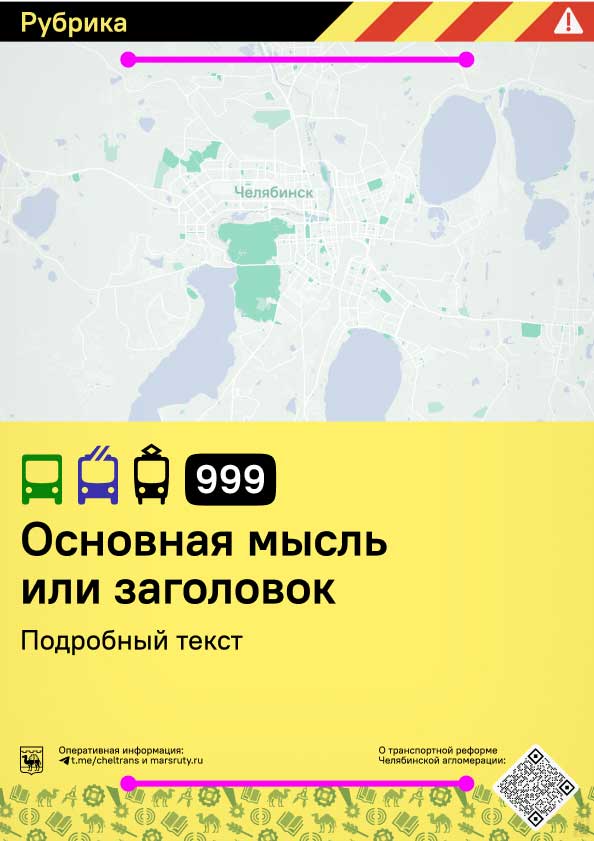
Therefore, the announcements were divided into three degrees of severity:
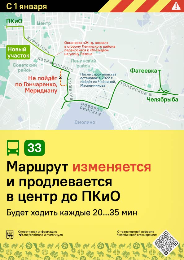
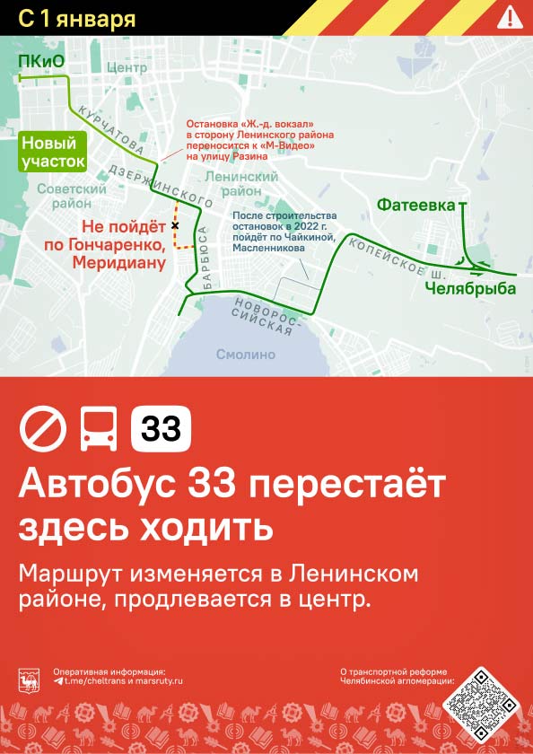
Thus for each change there was a bunch of posters — for stops in different areas and for use in the vehicles.
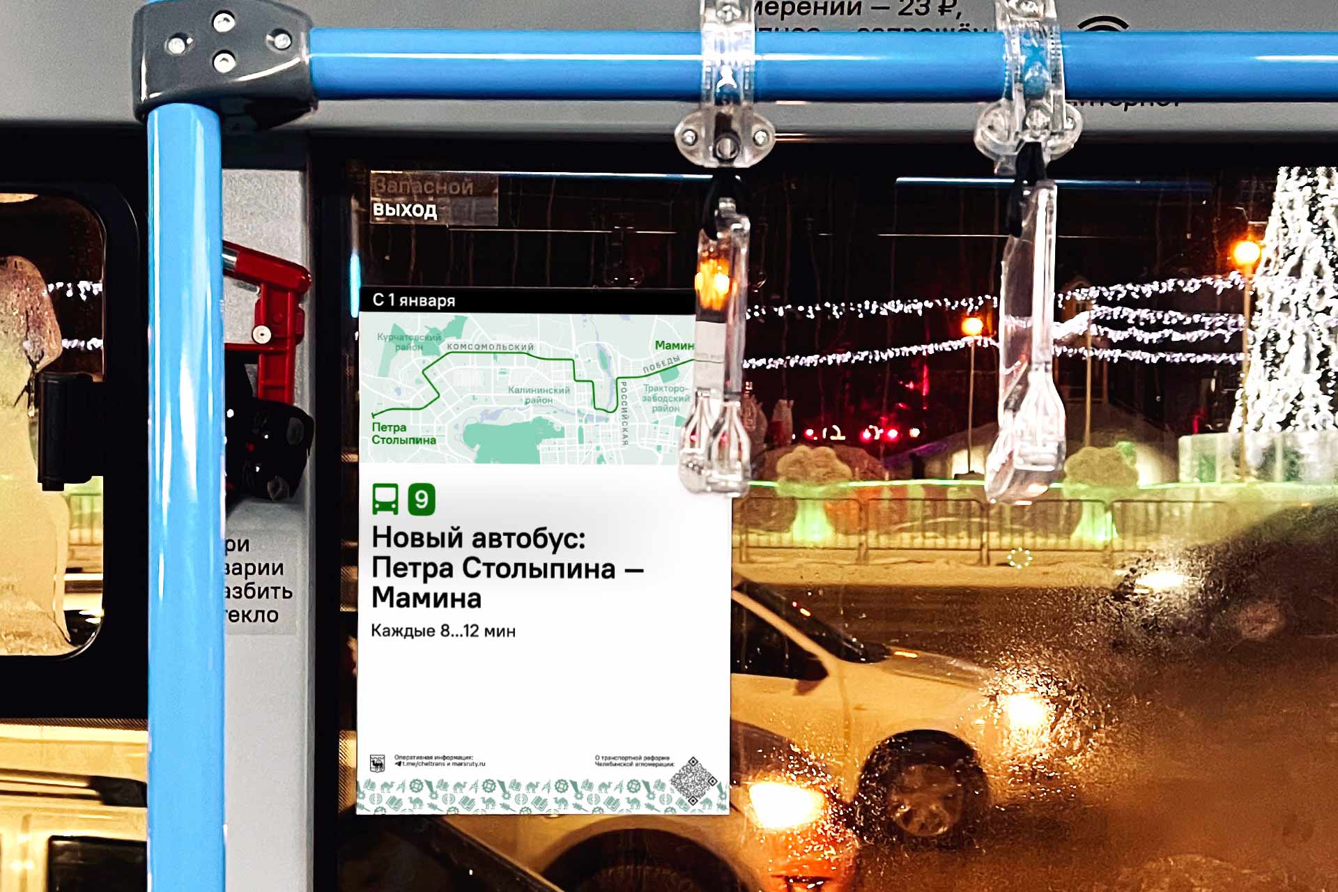
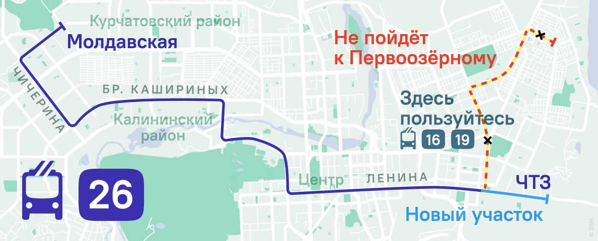
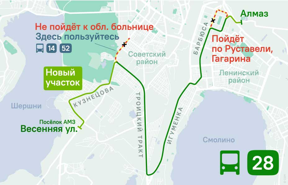
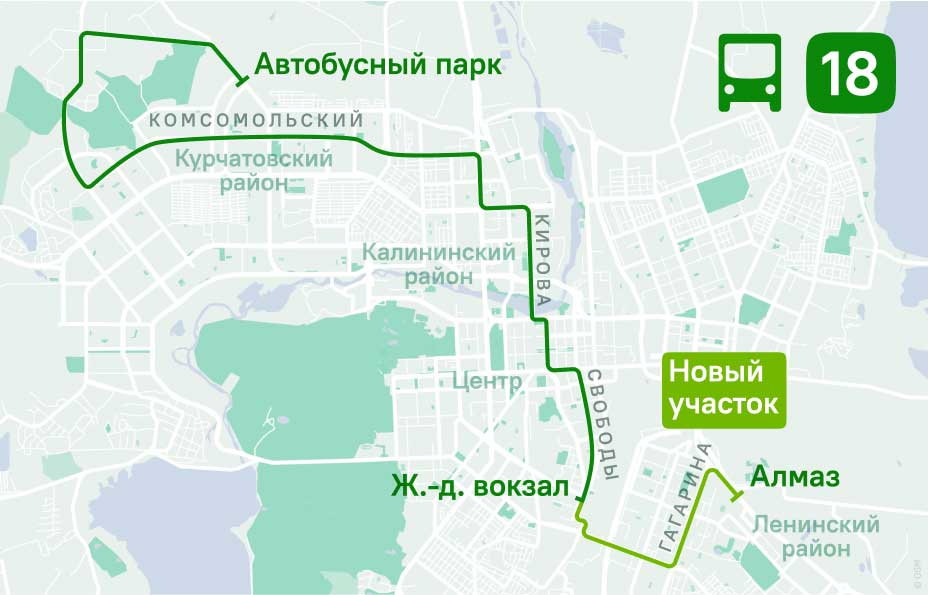
The announcements are modular: the map module is universal and is used unchanged in all three versions. The map can be in one of two proportions — standard, as in the examples above, and compact, if the route fits:
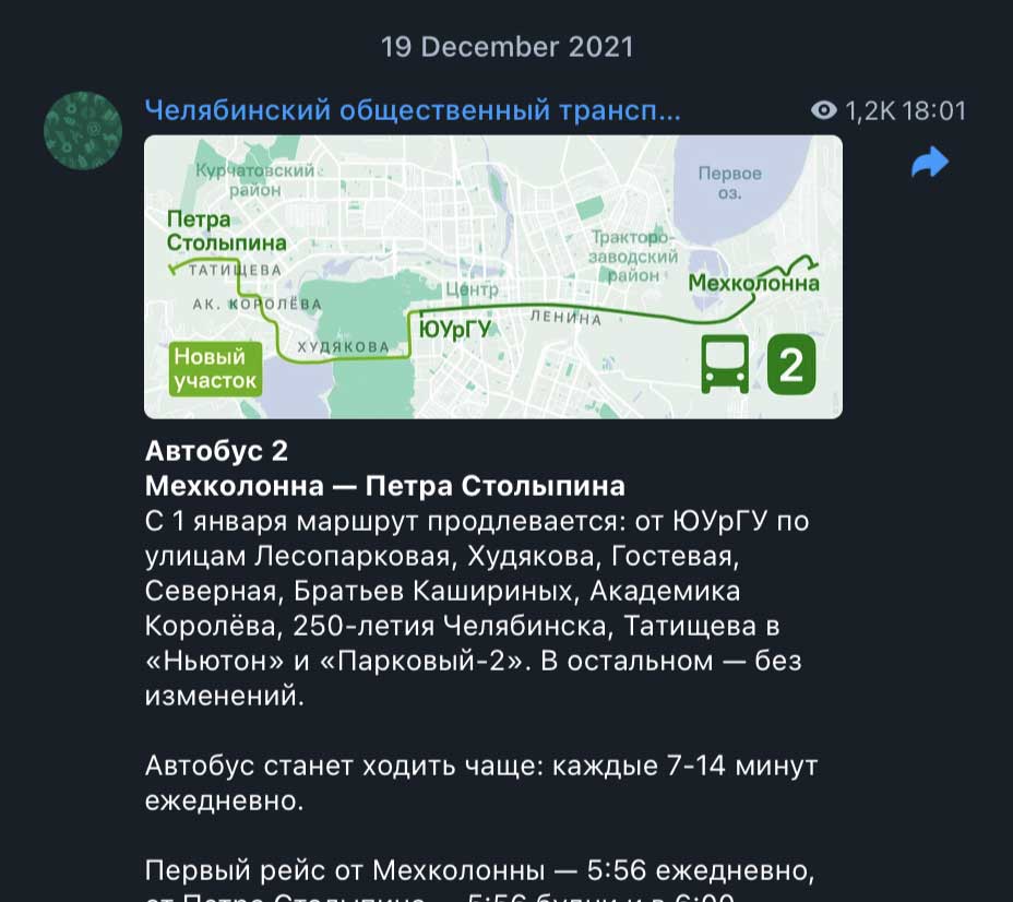
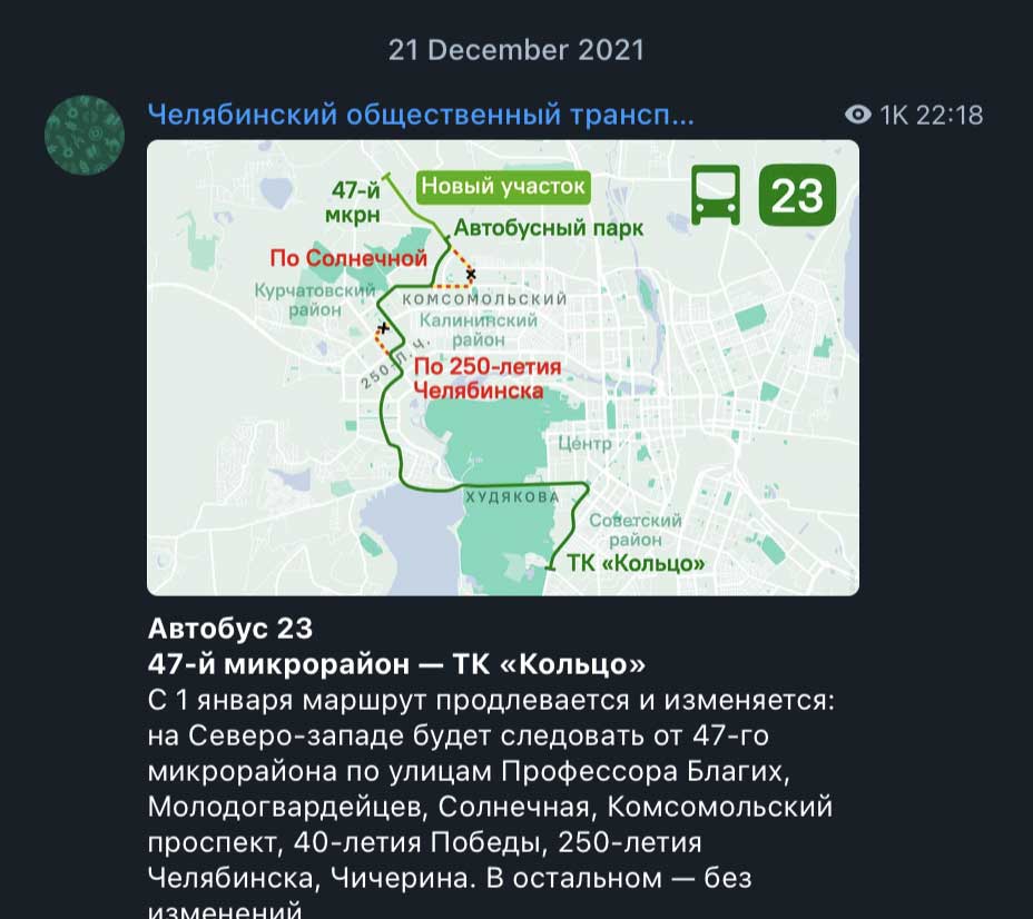
These same maps are also used in the announcements on social media:
In order to optimize map drawing, I had to create standards for Chelyabinsk transport cartography from scratch: prepare a pleasant cartographic backing, codify the styles of text, route lines, and other designations. Now only the objects that are significant for a given announcement are labeled on the maps.
Thanks to the standards, the maps look good side by side, even if they depict the city at different scales:
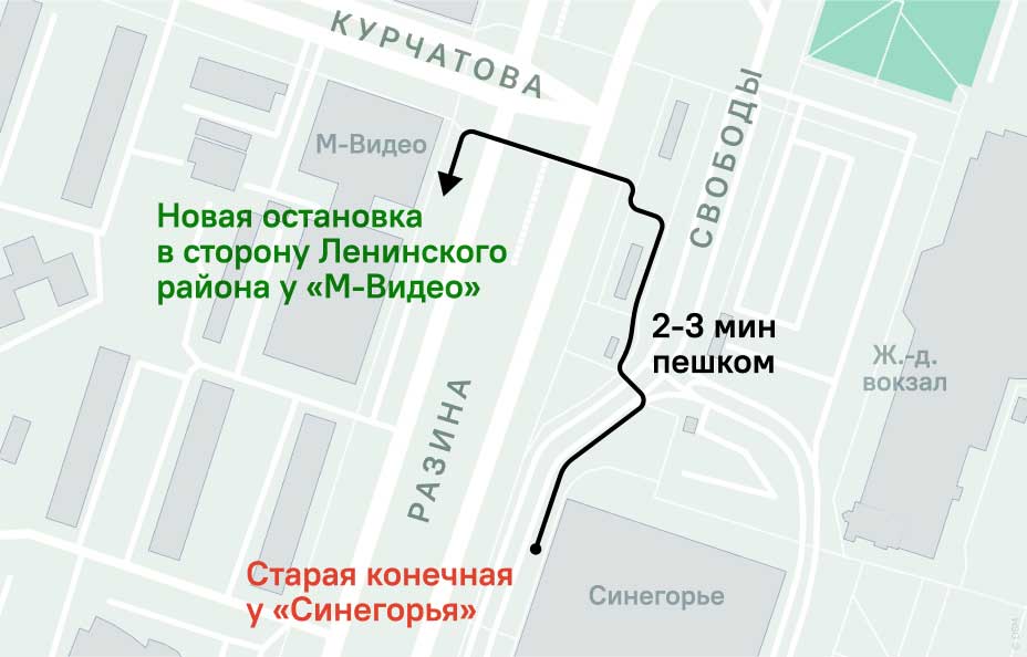
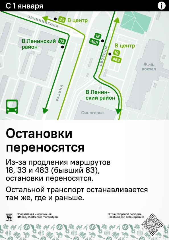
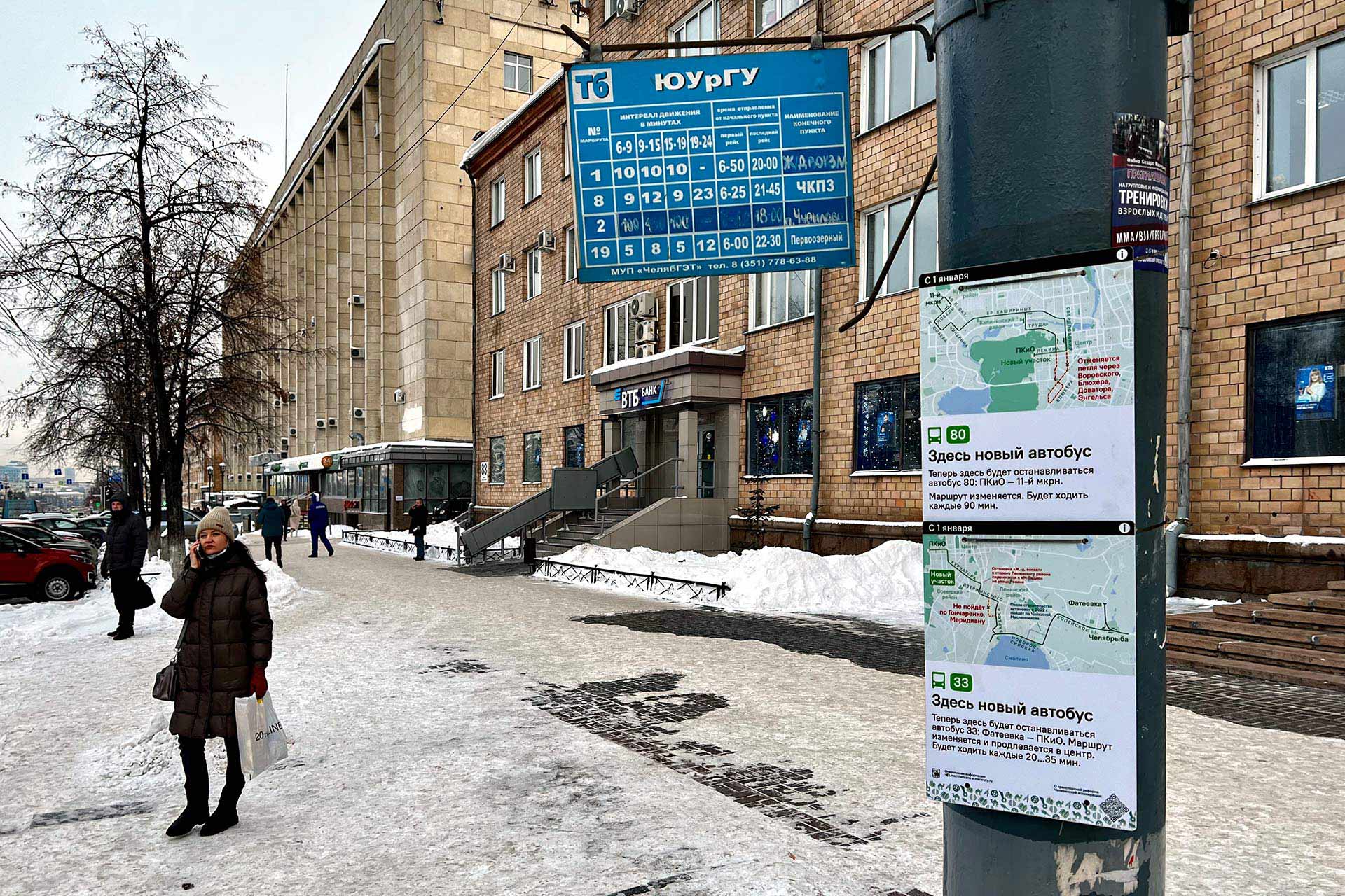
Local maps explain the relocation of stops:
The next step is information planning. Together with city transport specialists a large table was created, the Assignment for Distribution:
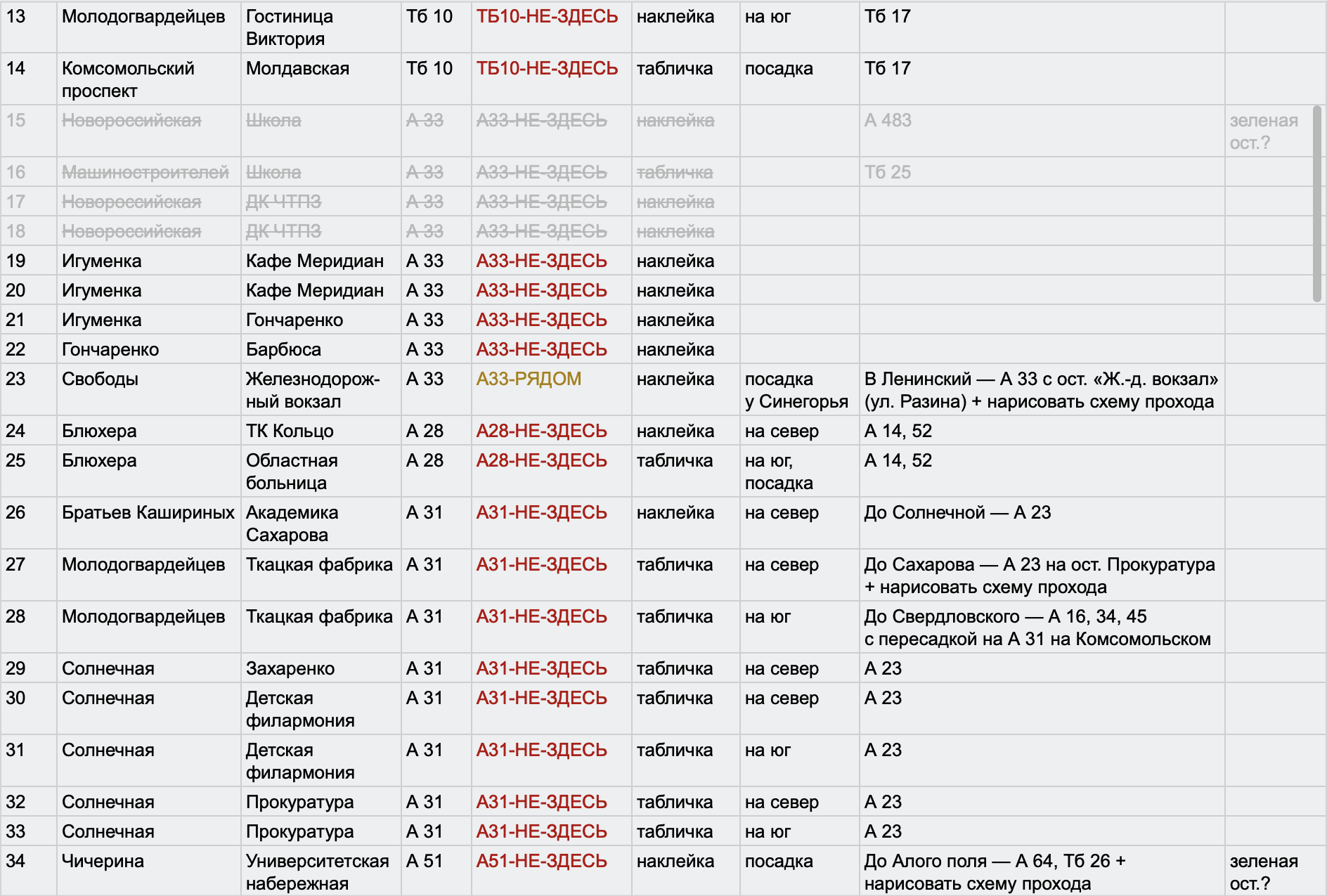
Some stops do not have proper surfaces for stickers. This data was also included in the table. At such stops, hard signs were affixed to poles.
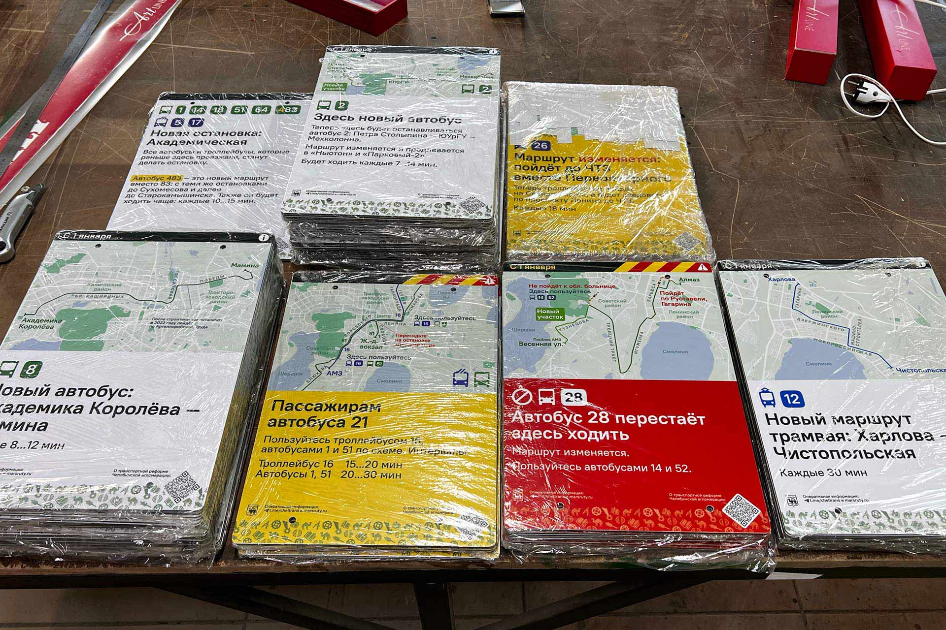
After that, we prepared a production task: a table indicating how many copies of which layout were needed in the form of stickers and how many in the form of hard signs.
Part of the result:
The product design and ultra-fast mounting technology had to be developed for the signs:
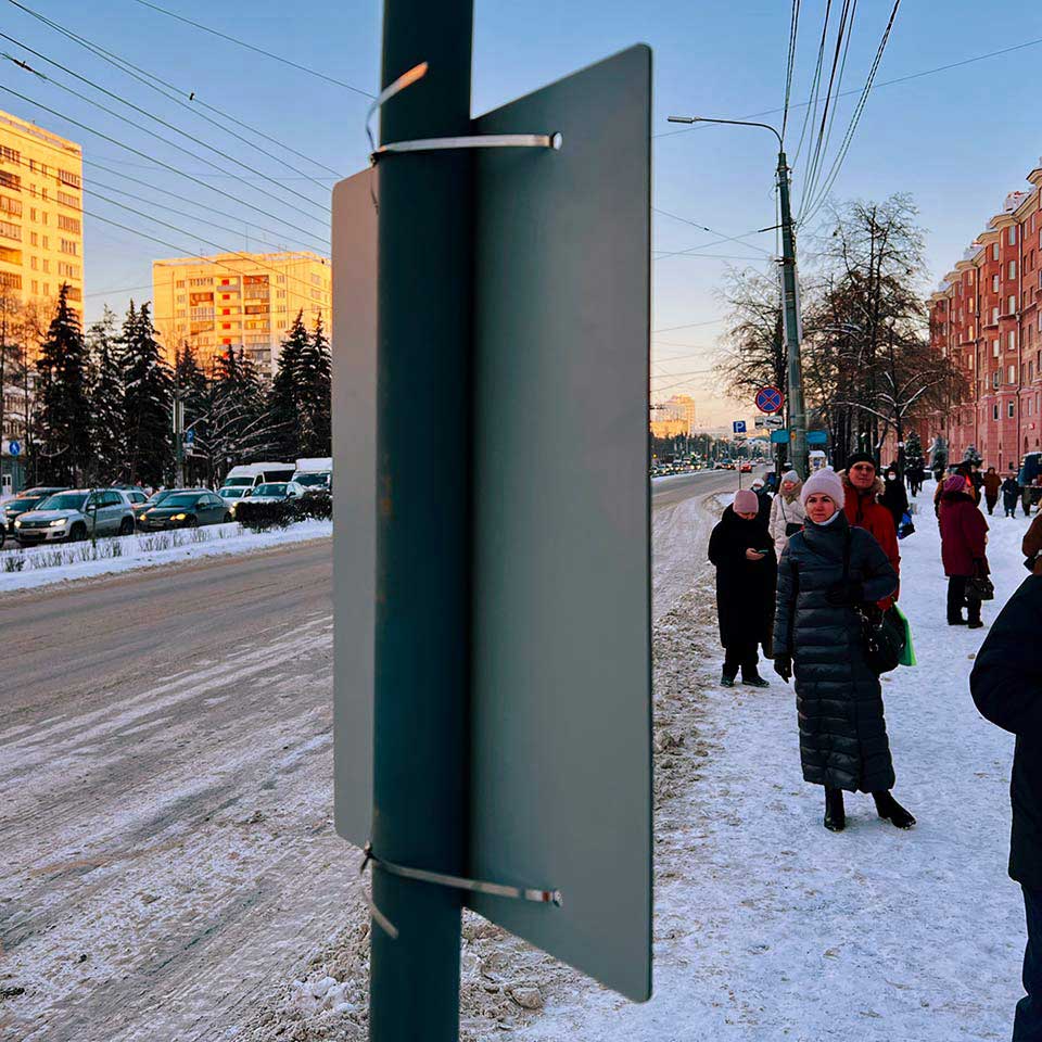
Each sign is a lightweight but durable A3-sized composite board with a sticker applied to it. The sign is affixed to the pole with metal straps through pre-made holes. Rounded edges add neatness and prevent injuries.
The location of the holes is standardized. To ensure that no important label on the map is lost, the holes and straps are drawn directly in the template:
The announcements appeared all over the city a week before the change.
Further communication about the transportation reform is based on the same templates.
Ilya Birman
Art director and designer