Dom Toma’s online store
Dom Toma (Tom’s Home) sells beautiful and nice things for the home. I designed the online store:

Attention management
The offline store resembles a museum: the owners choose each item themselves and are willing to tell you why it’s so special. Guests come in and curiously explore the curated collection, marveling at the things they wouldn’t have thought to look for themselves. But how to set up an online store with such an unusual selection? We want to both show the diversity and display individual items as large as possible so they’re convenient to view.
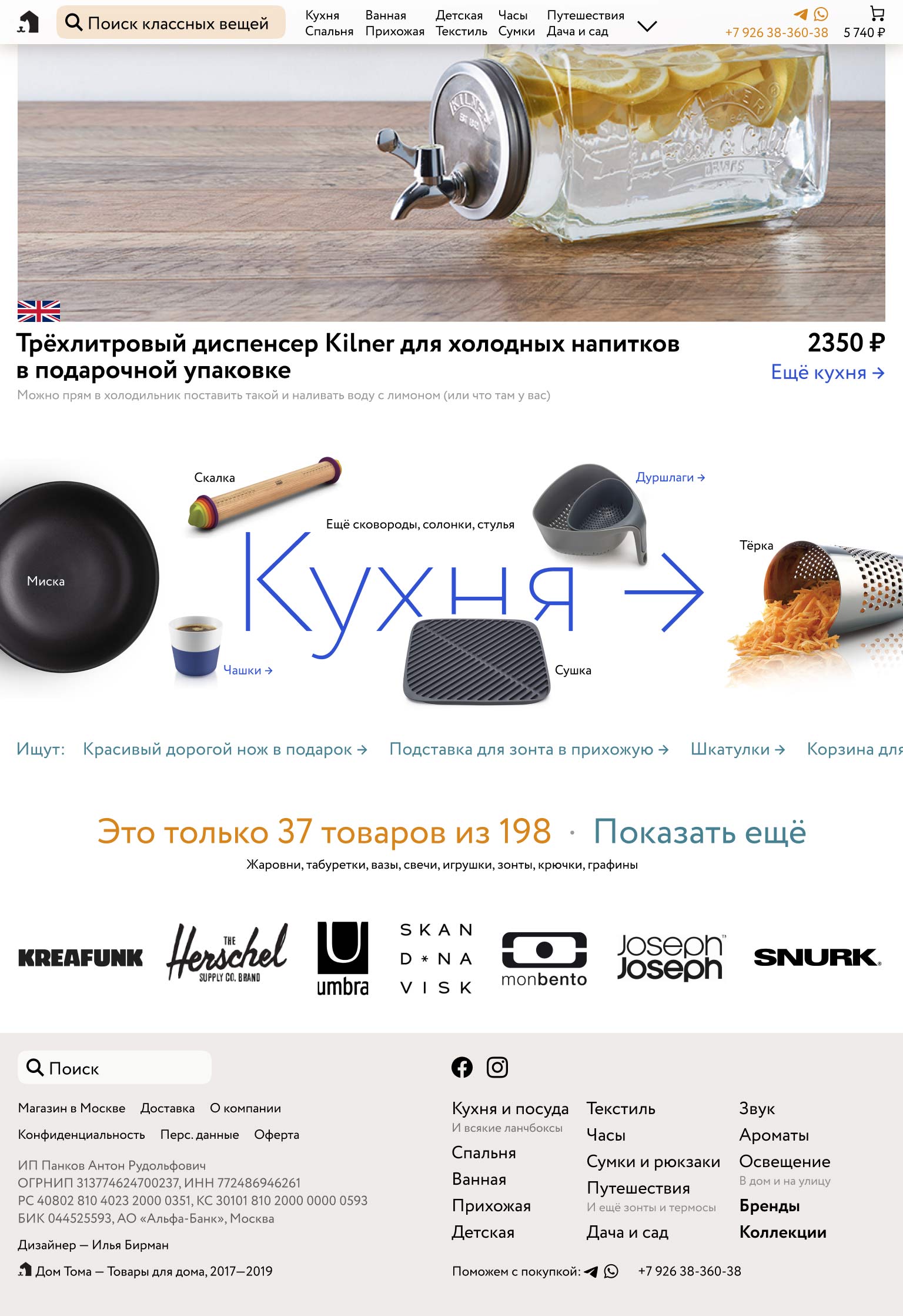
To convey a sense of consideration and care, each item is accompanied by a brief explanation of why it was included in the collection:

Also, each product represents and advertises an entire category. If you like this teapot, check out what else we have for the kitchen.
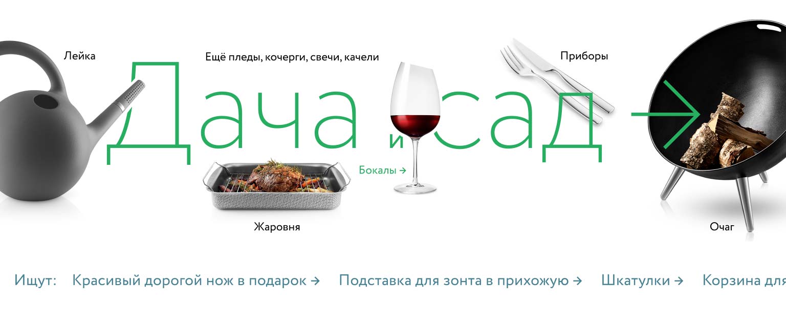
Beautiful banner-like sections with select items also lure into categories:

Examples of search queries at the bottom of the banner further spark interest and activate imagination.
The detailed main menu sticks when scrolling, while the page ends with a bunch of options of what else to check out:

The category page can be divided into subcategories, if necessary:

If a customer has not found anything to buy, but is interested, they are invited to follow the store’s Instagram and learn about new items as they arrive.
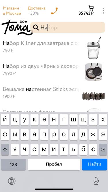
The mobile version retains all the richness — detailed menu, descriptions, beautiful categories, search:


Made in 2019