Bruxelles
For some reason I have always thought that Bruxelles was a boring and faceless administrative town.
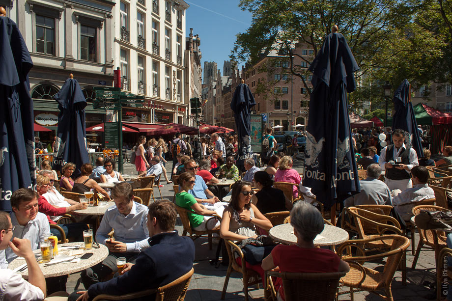
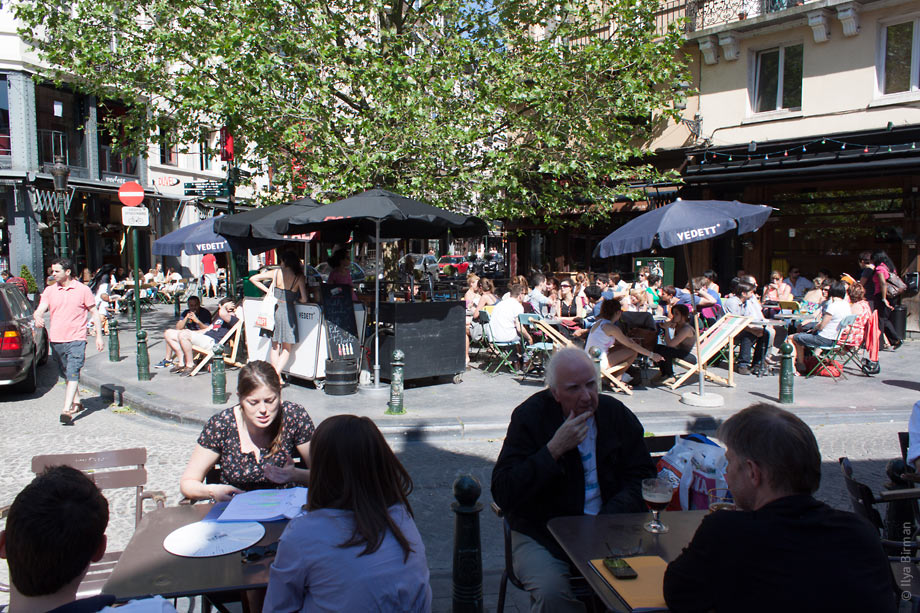
In the center every square foot is occupied by a café table:
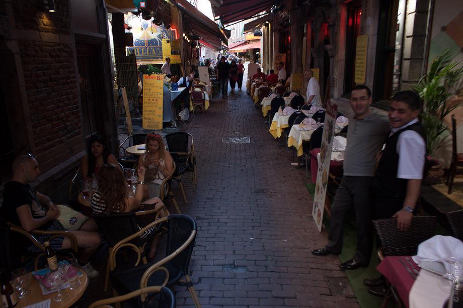
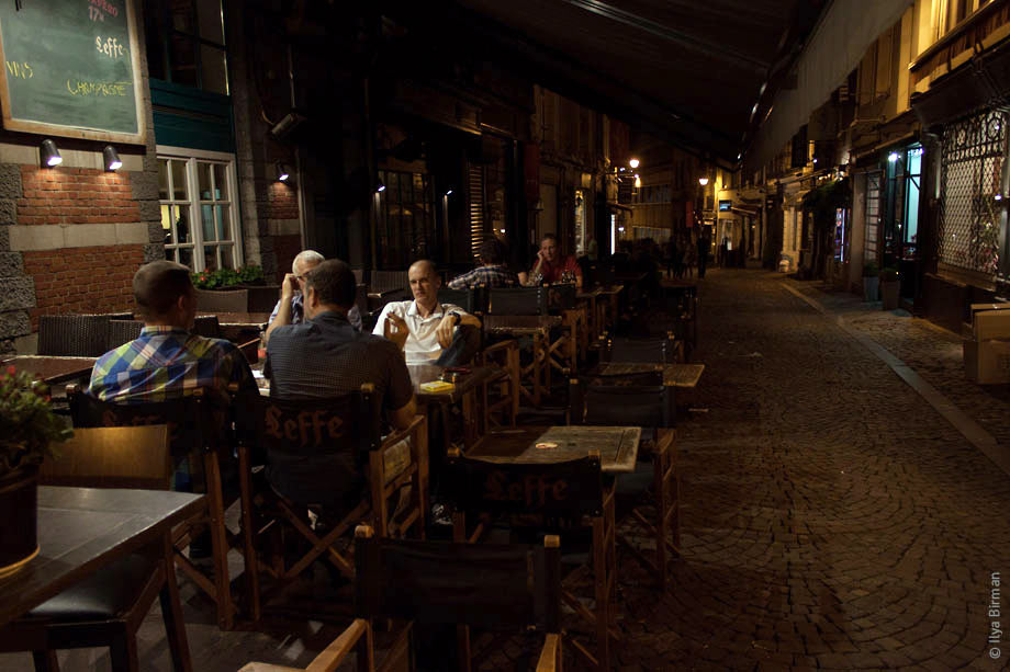
Even after midnight you can find a place to eat (not very typical of Europe):
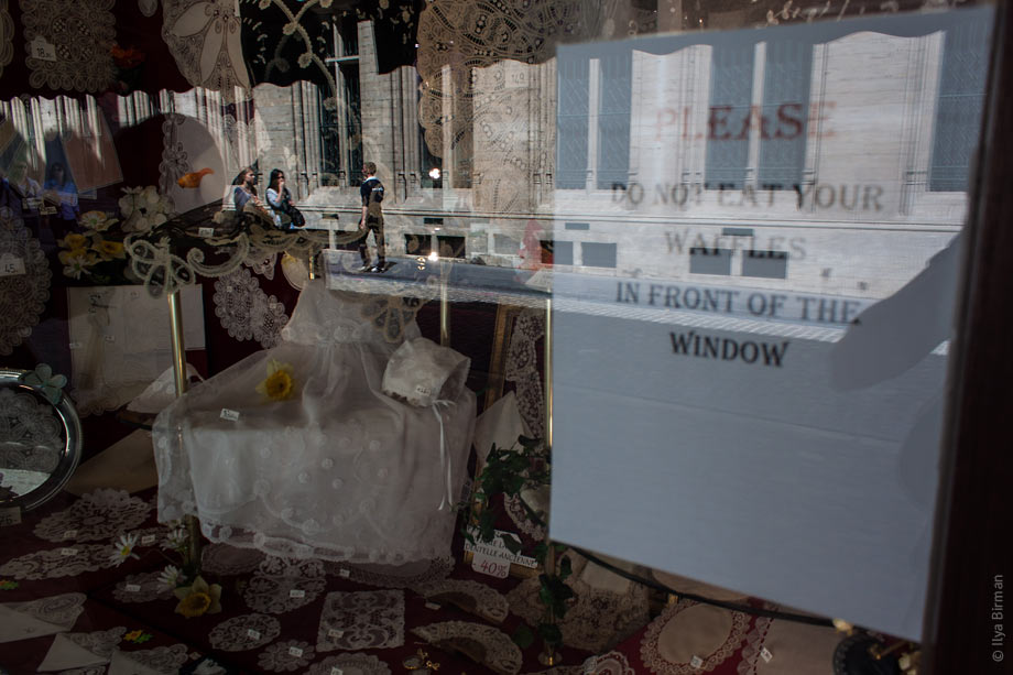
However, you cannot eat a Belgian waffle and stare at Belgian lace at the same time:
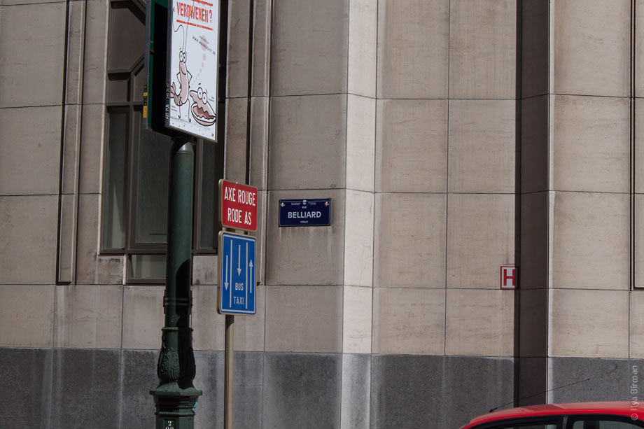
Street and square names are given in both French and Flemish. When possible, they are not just transcribed differently, but translated to preserve meaning:
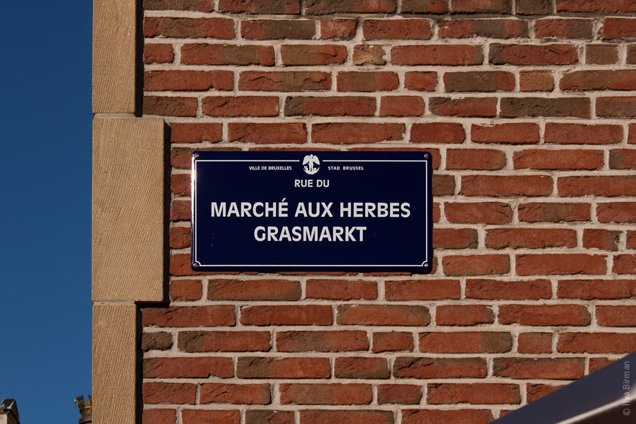
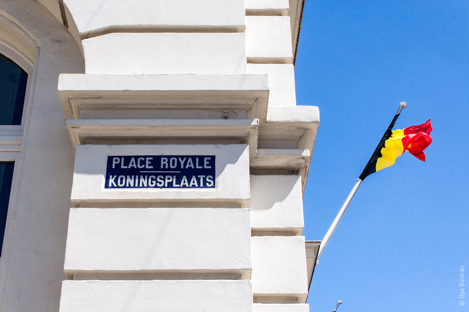
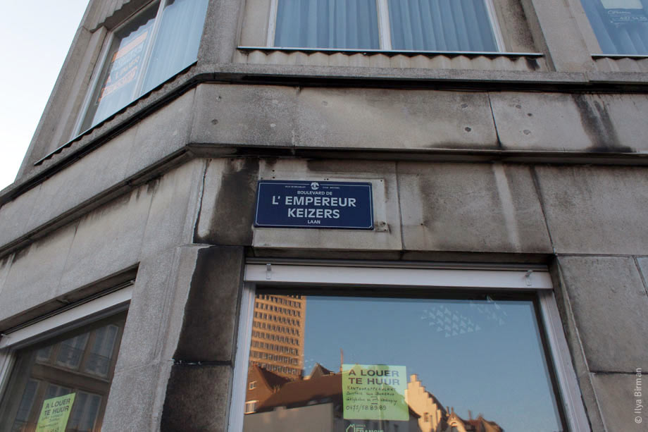
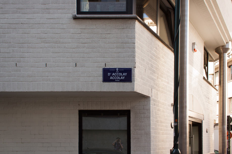
Only when transciptions in two languages are exactly the same, one version is left:
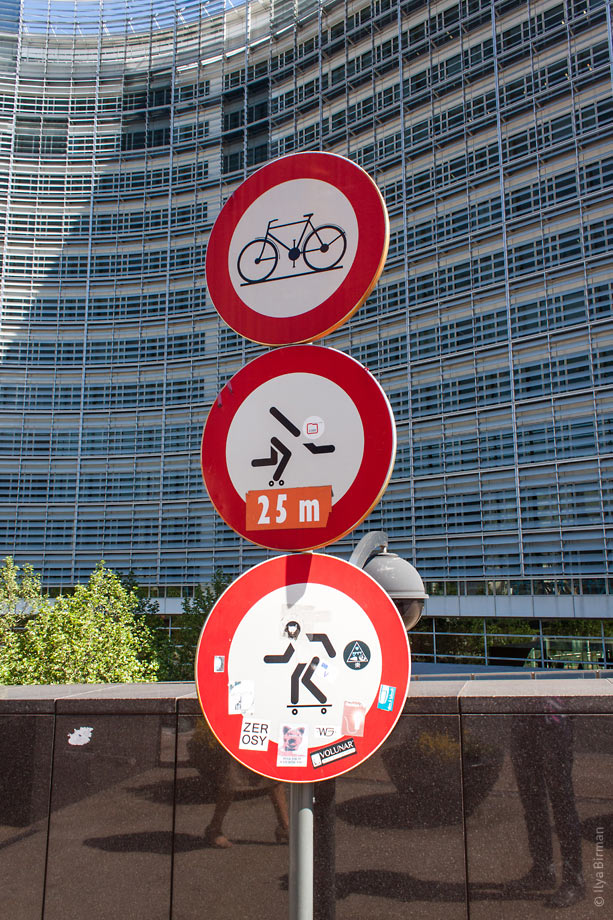
Road signs prohibiting skateboards and rollerblades:
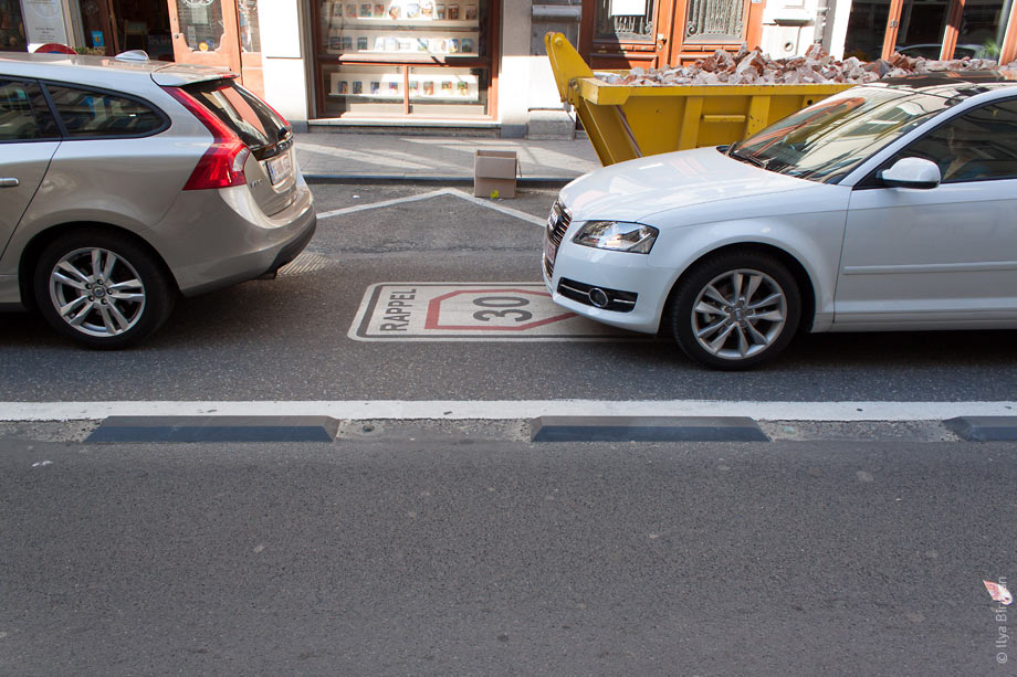
A strange speed limit sign on the road:
Temporary sign with dates written by hand:
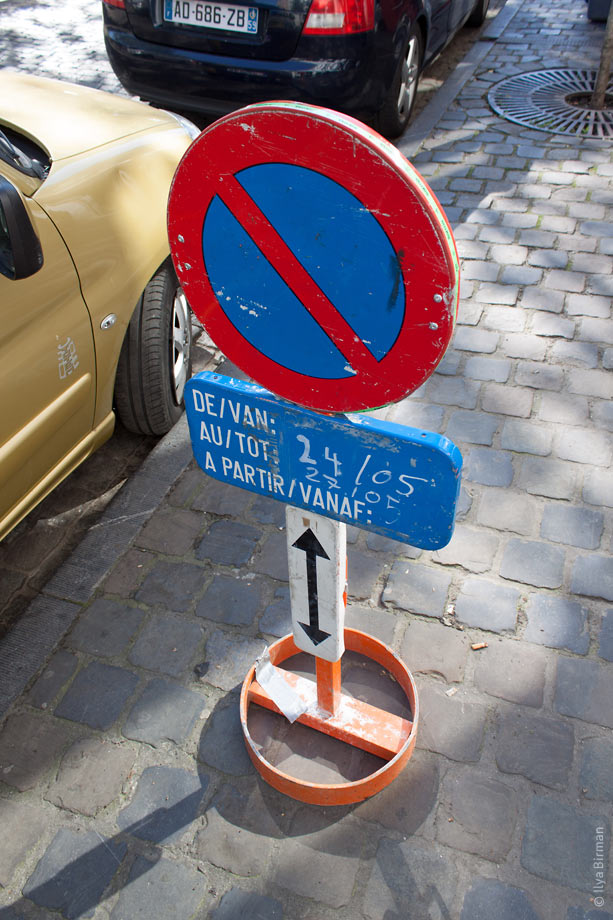
Pictograms are detailed:
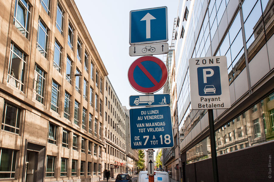
Also, check the text layout on a plate under the “no parking” sign:
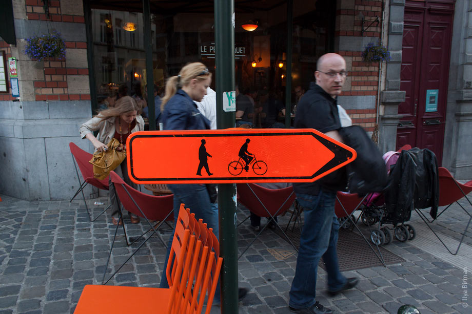
Pedestrians look like letters:
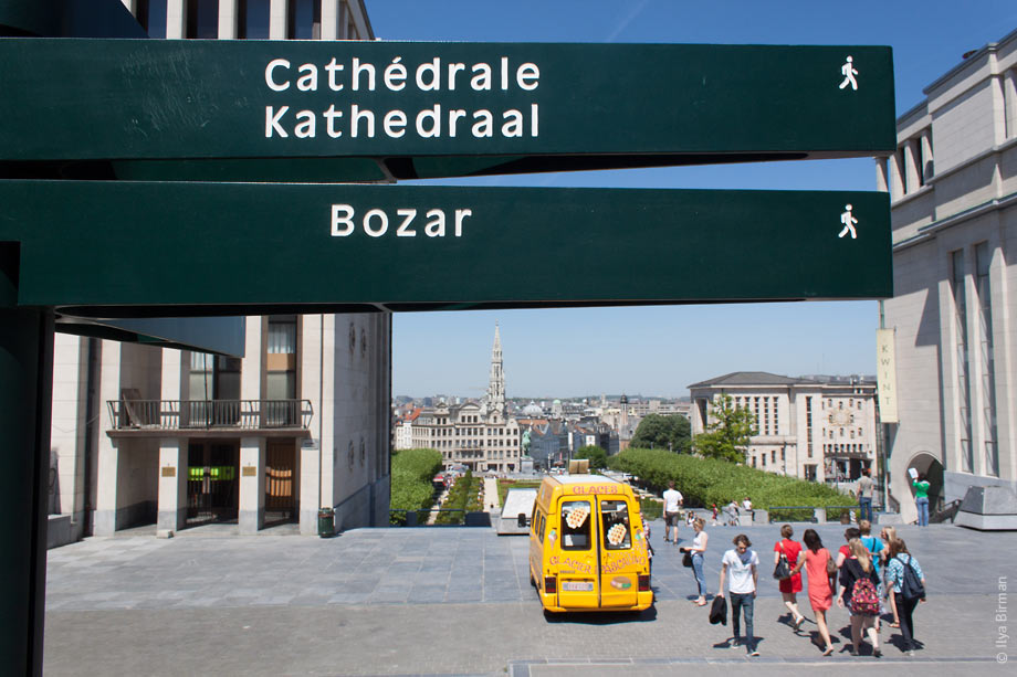
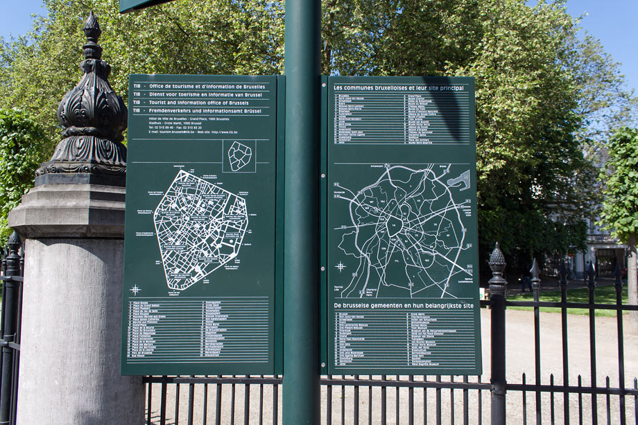
This park map is apparently not intended for human use:
A bike lane for left turn is between two vehicle lanes:
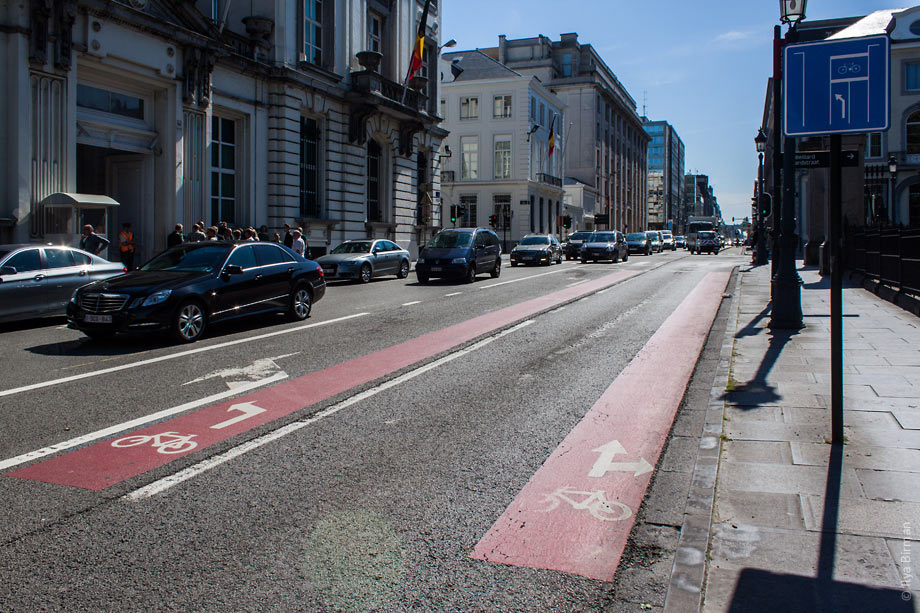
Brussels bike signs are confusing.
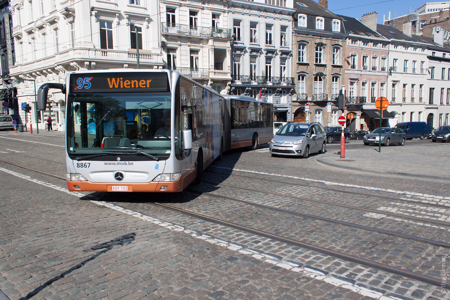
Every bus route has its color:
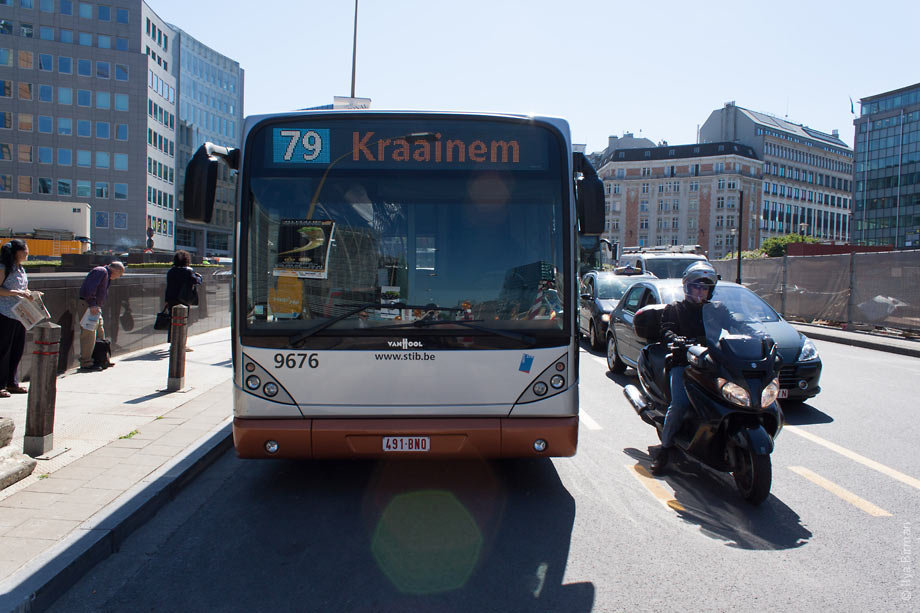
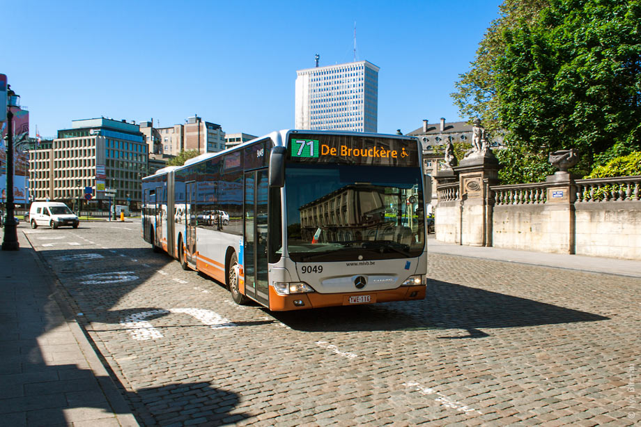
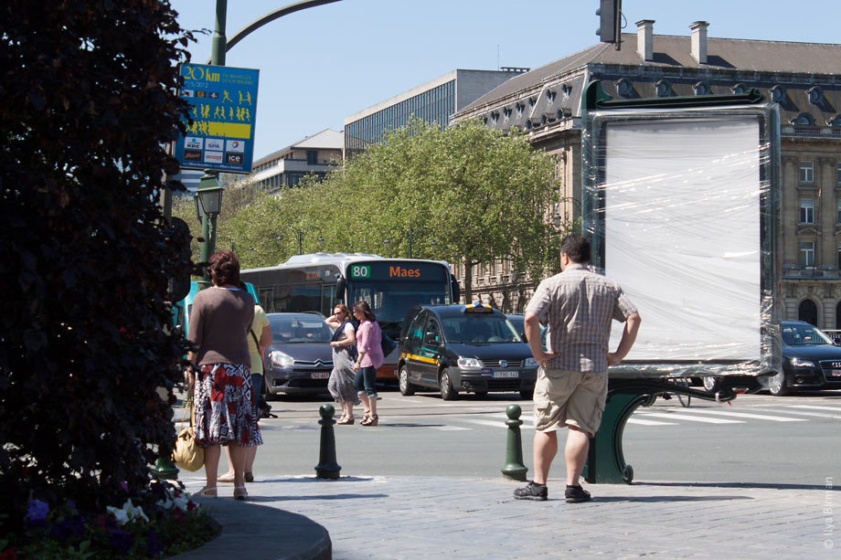
Sometimes the number is stroken out. But why is it important which route is the bus not taking?
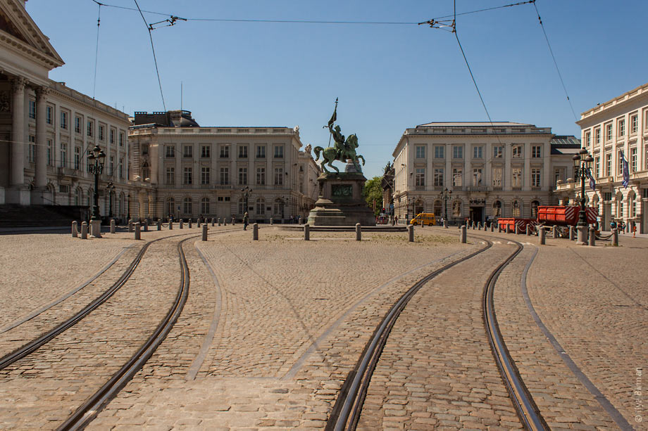
Tram lines bend around a statue:
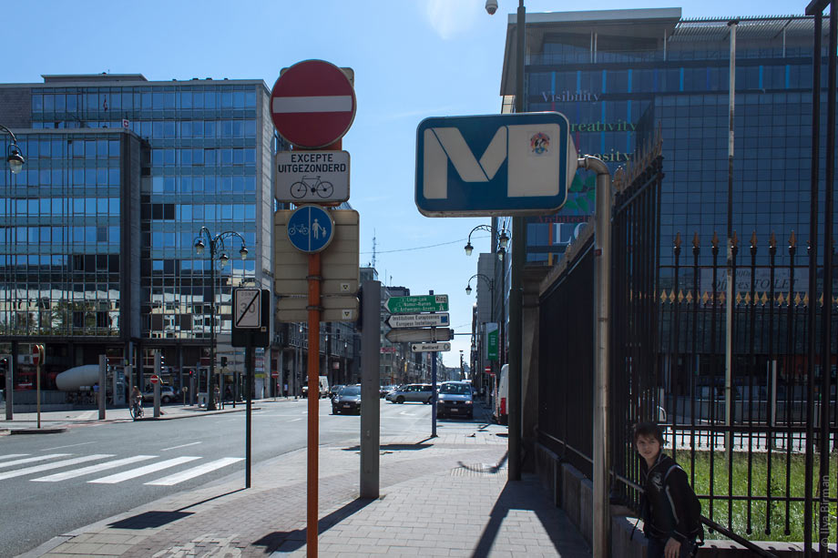
The sign of the metro is quite ugly:
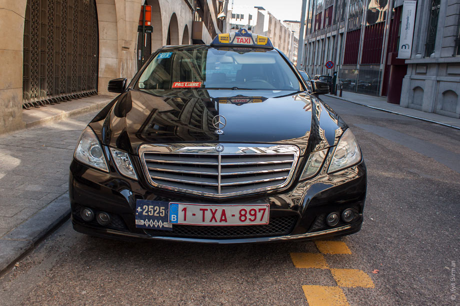
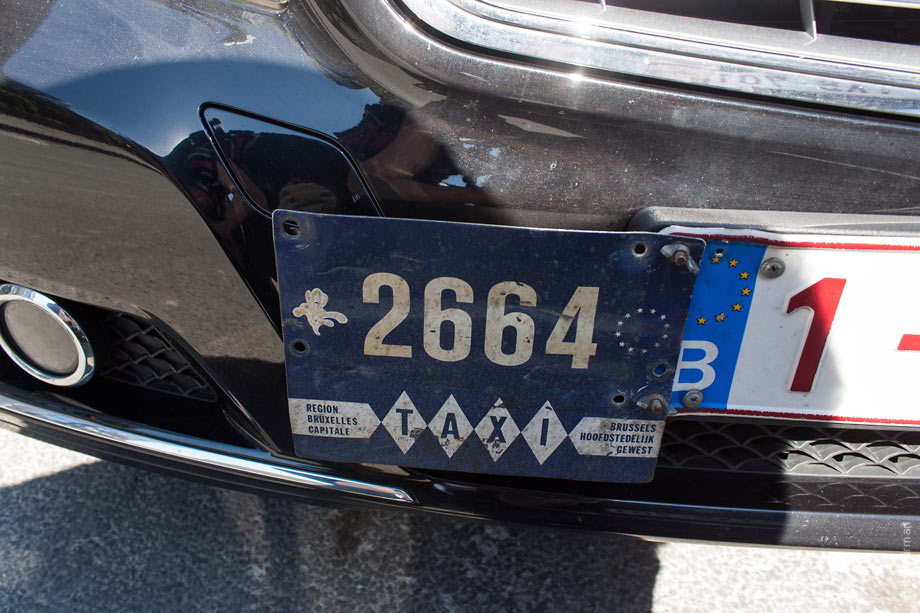
Taxis with all the bells and whistles look cool. But the number plates are not as beautiful as in Luxembourg:
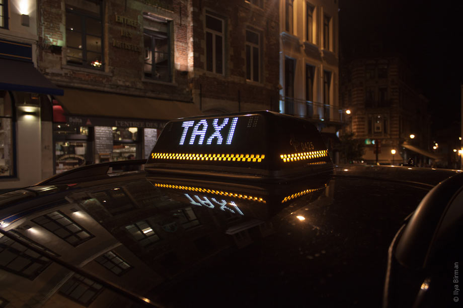
Pixels:
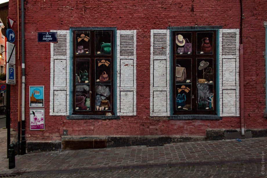
Paintings on the walls are quite ubiquitous:
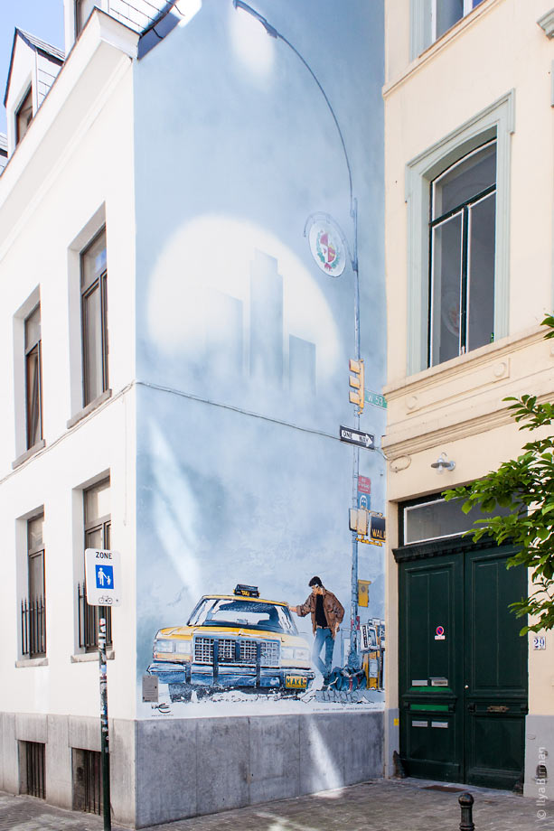
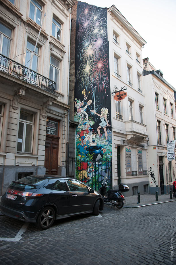
And at night there are projections:
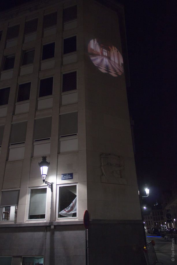
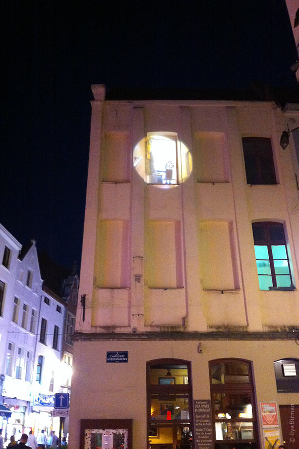
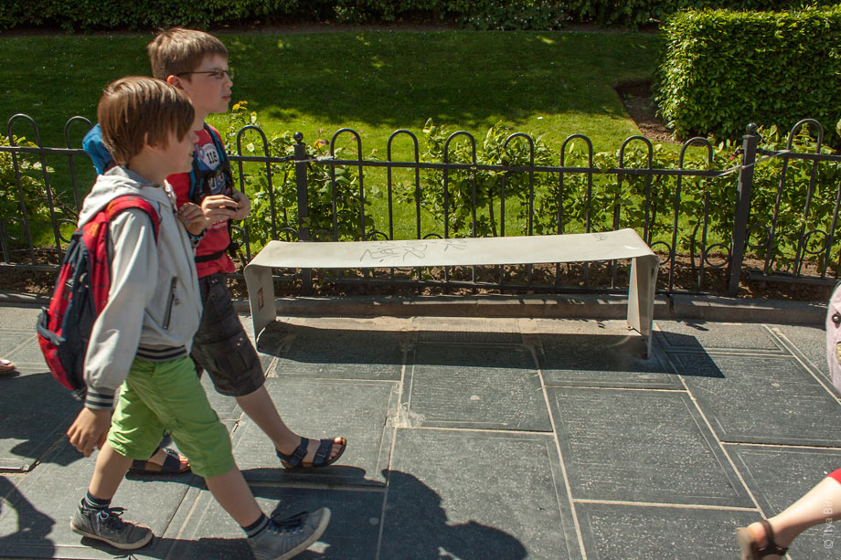
The benches are just bent metal sheets:
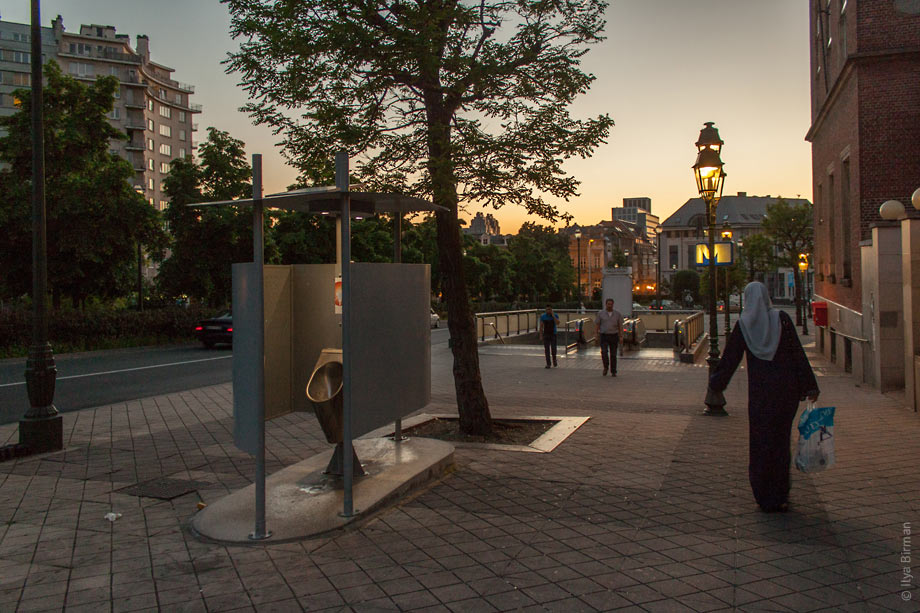
Street toilet:
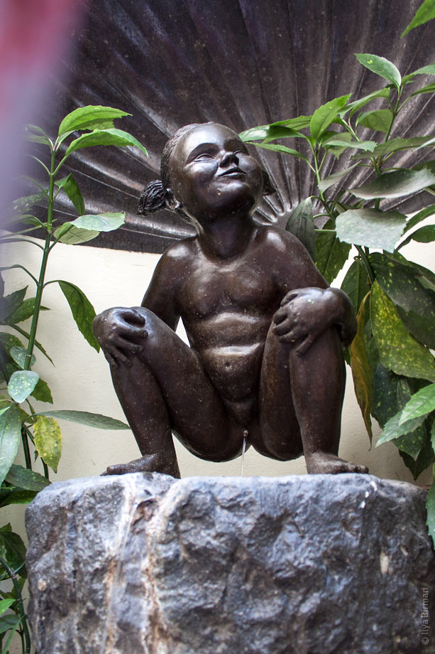
One of the main tourist attrations in Bruxells is the statue of a pissing boy. Why is it of any interest to anyone is beyond my understanding, but there are always many people with cameras it front of it. Much more interesting for sure is the statue of a pissing girl. It is not that easy to find though:
London | Luxembourg | Bruxelles ← Ctrl → | Bruges | Vlissingen | ||||||||