Chelyabinsk address plates
A new standard for street address plates and layout templates created for Chelyabinsk, Russia.
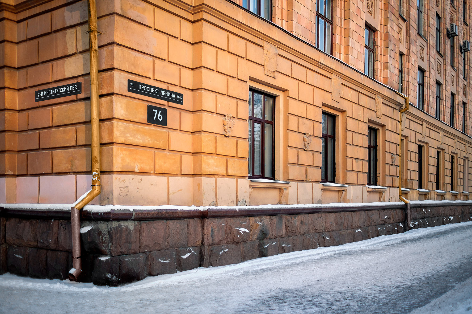

The typeface reflects the city’s spirit and history. Motor 4F is a rough industrial sans with a characteristic construction of the letters Д, Л, К, Ж, У, Я. This style is underlined by roughness of typesetting. Symmetry and all-caps allude to the Soviet tradition.
City blocks
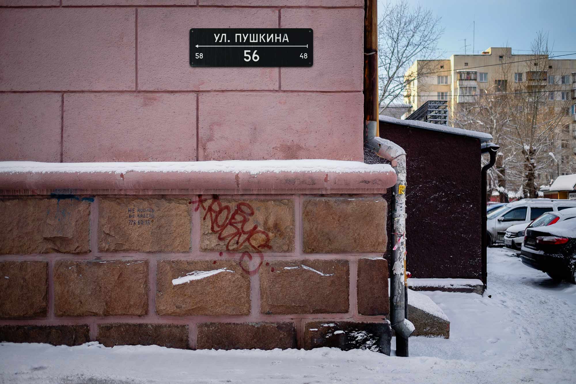
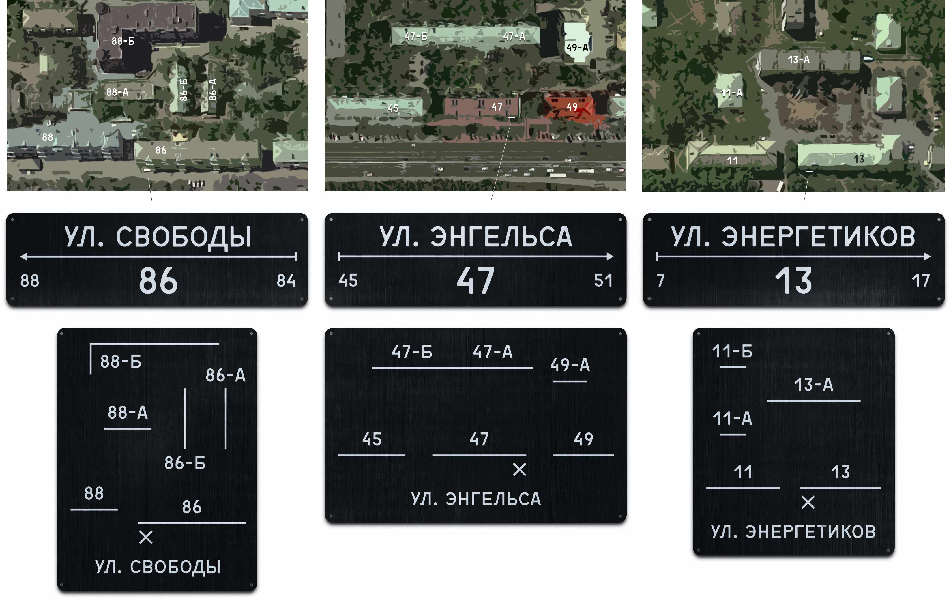
Address plates show the numbering direction and buildings at the block ends:

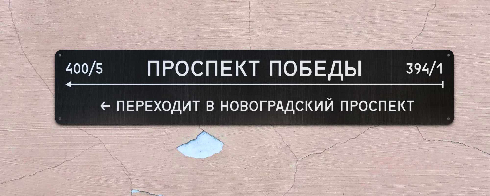
Sometimes a street changes its name as you go. This desorients: you see one name on a map and another one on the buildings. By the new standard, one block before the name change, the plates include a hint:
Additional information
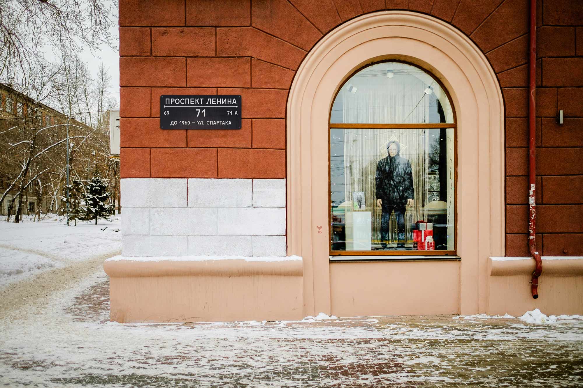
There is a place to put the neighbourhood name, old or informal street names, and information about those after whom a street is named:

Addresses and streets
In Russia, the address plates on the buildings usually include the house number. A plate saying “Lenin Av., 61” may not even face Lenin avenue, being mounted on another wall of a building. In Europe, such plates usually contain just the street names, while the numbers are indicated at the entrances. A street name plate may be mounted to a house or a signpost, but it’s always parallel to its street.
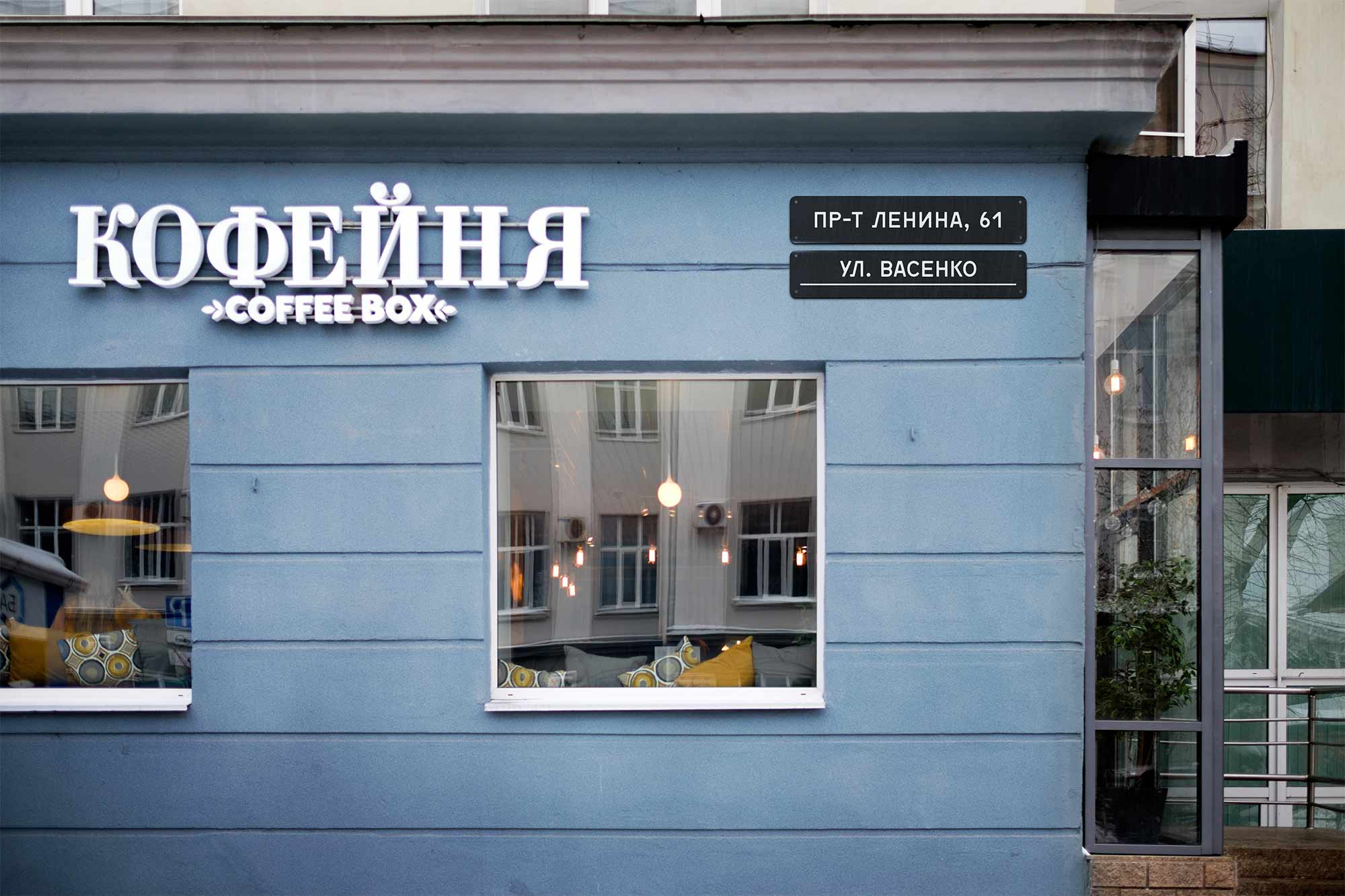
The new standard combines the Russian and European traditions making the plates more informative. It’s allowed to indicate both the numbers and street names. You now can indicate the street even on a building whose address is on another street:
If a plate is parallel to the street it names, it always contains a ruler or an arrow. If they are absent, the plate is not parallel to the street:
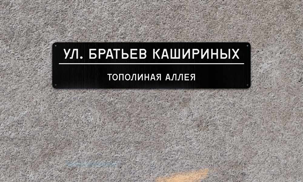

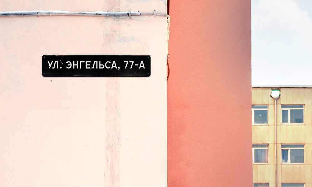

Some will not get the hint, but it will not confuse: in Russia, you don’t rely on bulding plates to tell you what street you are on. On the other hand, the hint will be useful to that who knows the trick. It is similar to how the male and female voices are used in the Moscow Metro announcements to hint at a train’s direction.
Block layouts
Sometimes houses are arranged weirdy within the city blocks. The standard include the new type of sign: a block layout:
The placement
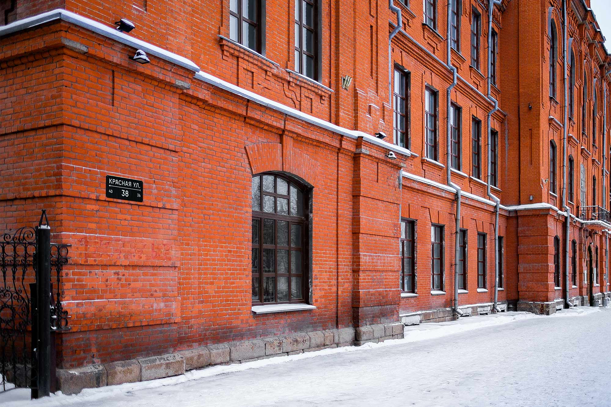
The placement accounts for the architectural features of the buildings. The plates are aligned with structural and decorative elements:
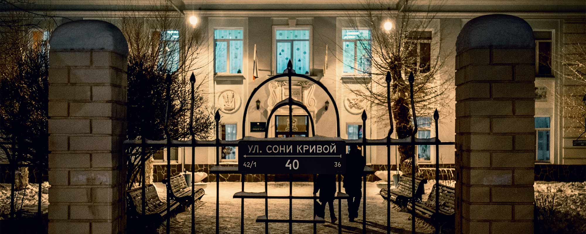
If there is a fencing around a building, an additional plate is mounted onto so that pedestrians and drivers can easilty see it:
The language
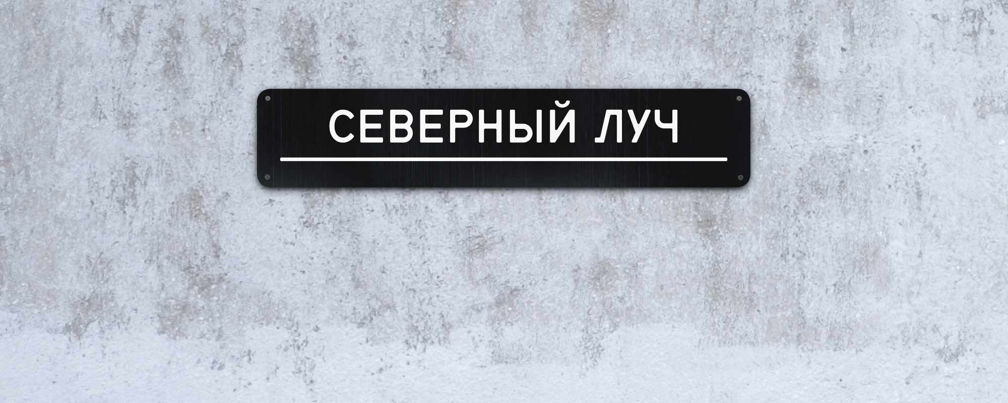
There are streets whose name don’t require the words like “street” or “road” (think Piccadilly or Broadway). With these words, the names seem too formal and strict (compare Champs-Élysées and L’Avenue des Champs-Élysées), so we don’t use them:
Depending on the name, it may be more natural in Russian to put the word “street” before or after it. Some signage systems insist on always putting the word “street” first. In our system, the natural word order is always used:
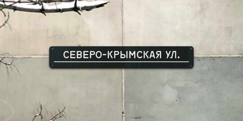

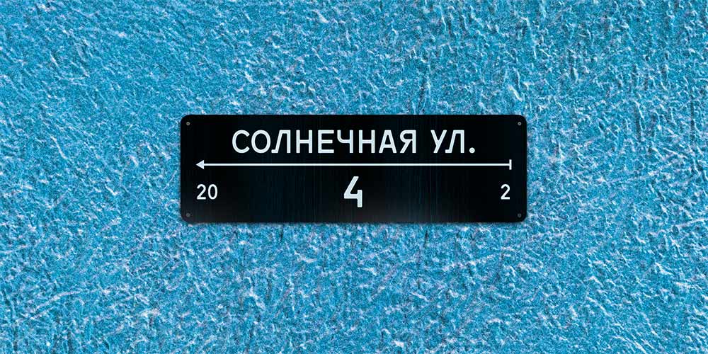

The characteristic Chelyabinsk’s roughness is supported by the mandatory reduction of the word “street” (улица) to just “st.” (ул.)
The system
The whole range of plates is using a common grid:

To cut the production costs, the number of used plate sizes is minimized:
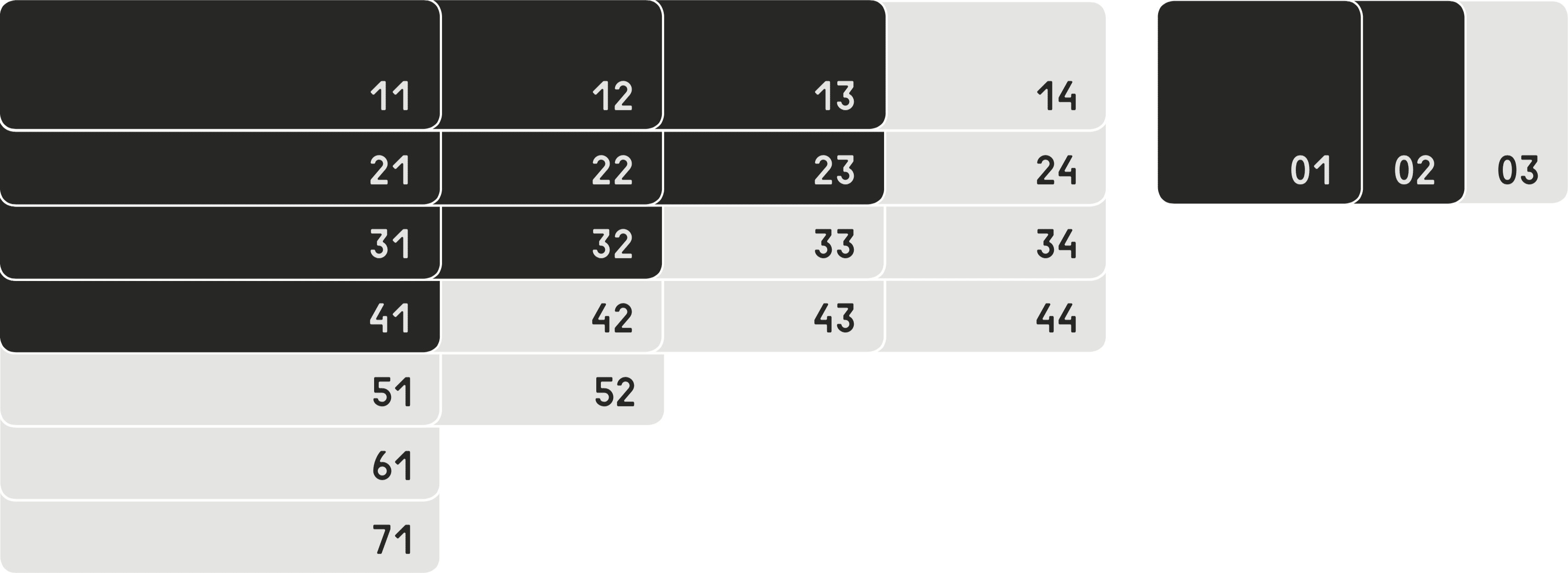
Instead of producing an individual base plate for each text, hundreds of plates of each sizes are made, and the text is put on the most fitting one. The sizes 51 and larger are only used for block layouts. The custom sizes are allowed for historical buildings, when none of the standard sizes work.