There is a principle in user interface design that I call “Let me click”.
I’ll give you three examples.
A group of checkboxes with one required
A tip from 2018 features an example where the user has several independent checkboxes. At least one of then must be selected for the form to be valid:
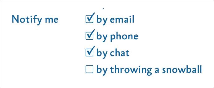
In other words, the person has to choose at least one way to receive notifications, but may select several, if they like.
One design idea was to prevent an empty set by disabling unchecking of the last checked option remaining:
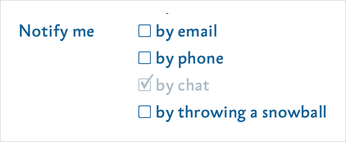
This is a bad solution: I may want to turn off the option I don’t like first, and then turn on the ones I do like. The restriction forces me to perform actions in a particular order. It also makes things confusing: if “by chat” is the only checked option and it becomes disabled, it looks as though chat notifications are mandatory, when they are actually not. I want to turn them off, but the interface will not let me click where I want.
A better approach is this: when the user turns off the last checkbox, immediately turn on some default option, such as “by email”. And if they turned that one off last, turn on the second-preferred option, such as “by phone”. This way, the interface does not get in the way of the user clicking where they want, while still preventing an invalid state.
A checkbox and a field
In Aegea’s comment settings, there is a “send by email” checkbox with an email-address field associated with it:

If the checkbox is unchecked, there is no point filling in the field: the address is not needed for anything else. If the checkbox is checked while the address is blank, the system cannot send anything as it does not know the address. In short, these controls are interconnected.
Logically you could disable the input altogether if the checkbox is unchecked — there is no point filling it in anyway. But that is irritating. What if I want to enter the address and then turn on the checkbox? It would be even worse not to let me turn off the checkbox when the address is filled in. I want to turn it off — let me click!
A better approach is to let the user fill in the field even when the checkbox is off, and automatically turn the checkbox on as soon as they enter something. In the other direction, be more careful: if the checkbox is cleared, do not erase the address from the field. You never know. User data is infinitely valuable.
Choosing a date
Here is one possible way to implement a date-of-birth picker:

As you know, some dates do not exist: there is no June 31, for example. And February 29 exists in some years but not others.
To prevent the user from entering a nonexistent date, some developers remove invalid days from the day field. That is, if 31 is selected, “June” simply will not appear in the dropdown. But what if my birthday is June 10? I may want to select June first, and then choose 10. Let me click!
There is an opposite problem: developers sometimes let the user choose a nonexistent date, then show an error message once it has been chosen. That is bad too: a good form does not bombard the user with error messages. It gently helps the user avoid errors in the first place.
A better approach is this. When the user selects a month that is incompatible with the currently selected day, clear the day selection. When the user selects a day that is incompatible with the currently selected month, clear the month selection:

If I choose February 29 and the selected year does not have one, clear the year selection.
A partly similar idea is that the “Buy” button should always work.
Having to cancel one thing only for another to pop up—like a game of Whac-A-Mole—makes me even more annoyed.
What’s your suggestion then?