Sovest user interface
Sovest s a deferred payment card. Like a usual bank card, but for payment by instalments. The task was to design the user interface for the new app to help the customer get the card easier and to get him or her involved in its usage.
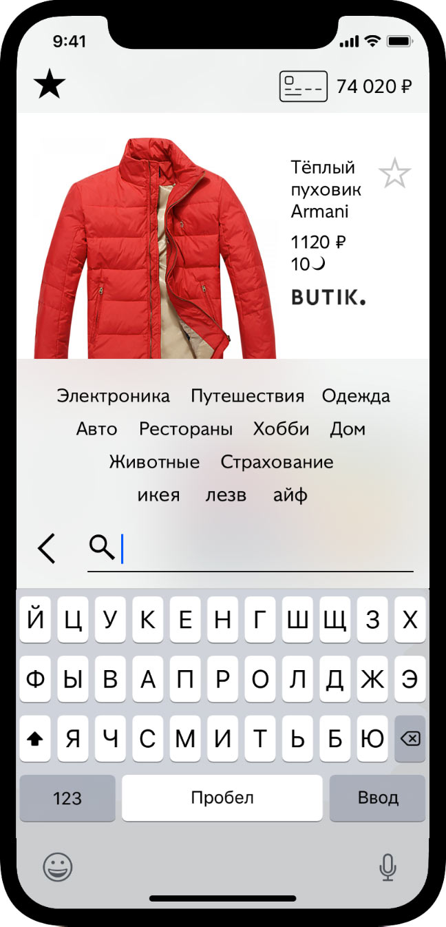
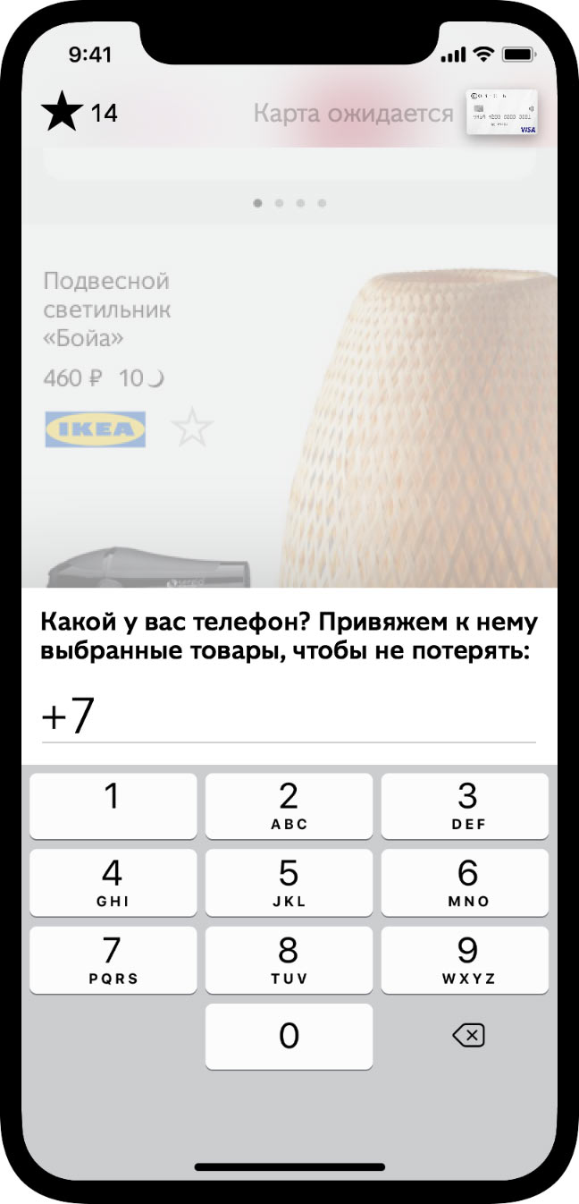
The main idea: instead of complicated forms and conditions, the app greets the user with a magazine of goods that can be paid for by instalments with the card. Most people don’t have the card yet, and it’s important to offer it, but this shouldn’t look as an obstacle. Thus the offer appears only after the customer has seen the magazine. It’s easy to swipe the offer away and get back to the goods.
The purpose of the magazine is to captivate with variety, but if you want a particular thing, there is smart search at hand. While you look around, the app asks you for the data necessary to get the card:
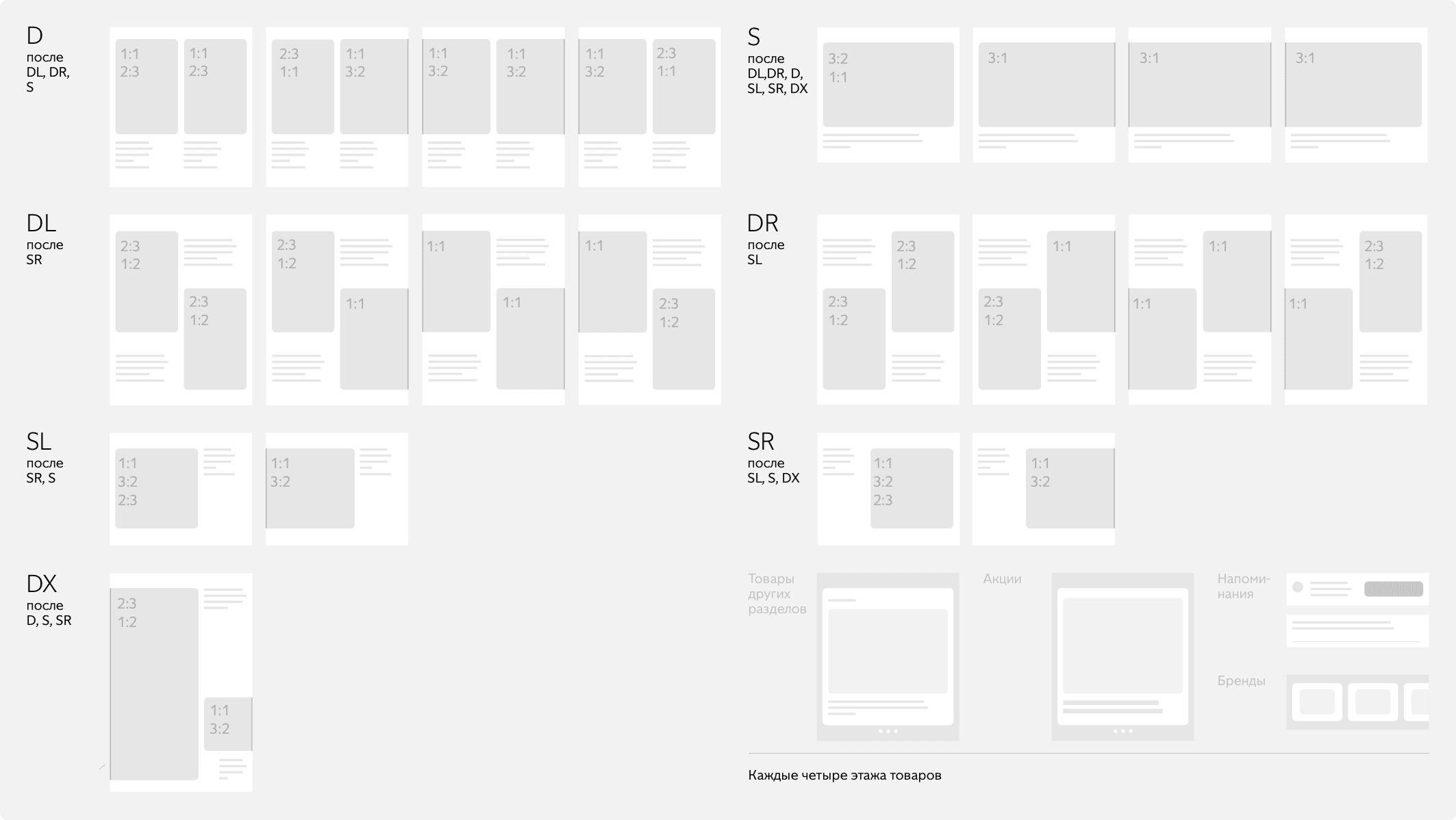
The magazine learns the customer’s taste, so everybody gets as “issue” built specifically for them. The feed is composed and laid out automatically using templates and rules that account for images’ proportions and type:
In addition to standalone goods, the magazine is populated by brands, promotions, and other elements. These help Sovest guide the customer in the right direction, better learn his or her preferences, and also make the magazine look more diverse.
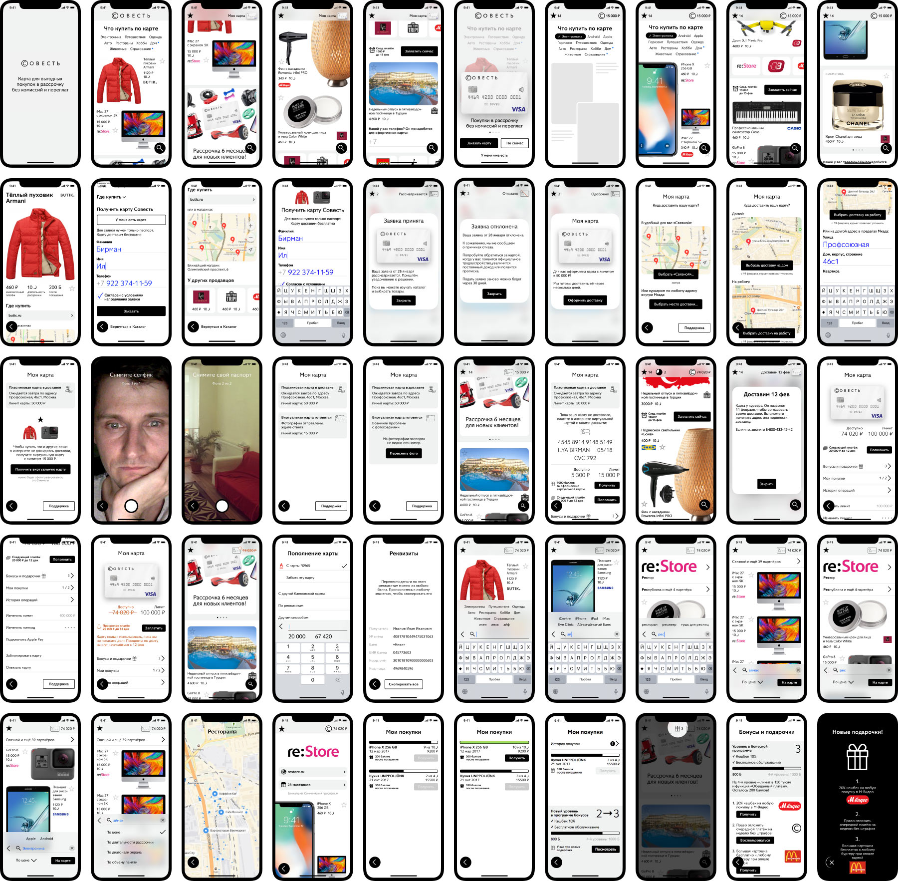
About a fifty screens and animations were designed for the application, covering the scenarios of choosing and viewing the items, search and filtering, different stages of ordering and delivery of the card, customer profile setup, paying off the debts, motivation for further purchases, loyalty program. For example:
Made for Youxi Project in six weeks from January 22nd till March 14th, 2018