Securige operator user interface
Securige is a program to remotely monitor the properties with panel protection.
Sensors in shops, banks and home transmit the status signals. Rapid response teams are on duty throughout a city. Operator watches the events and directs the teams with the program.
I’ve designed the user interface for the new version of the program:
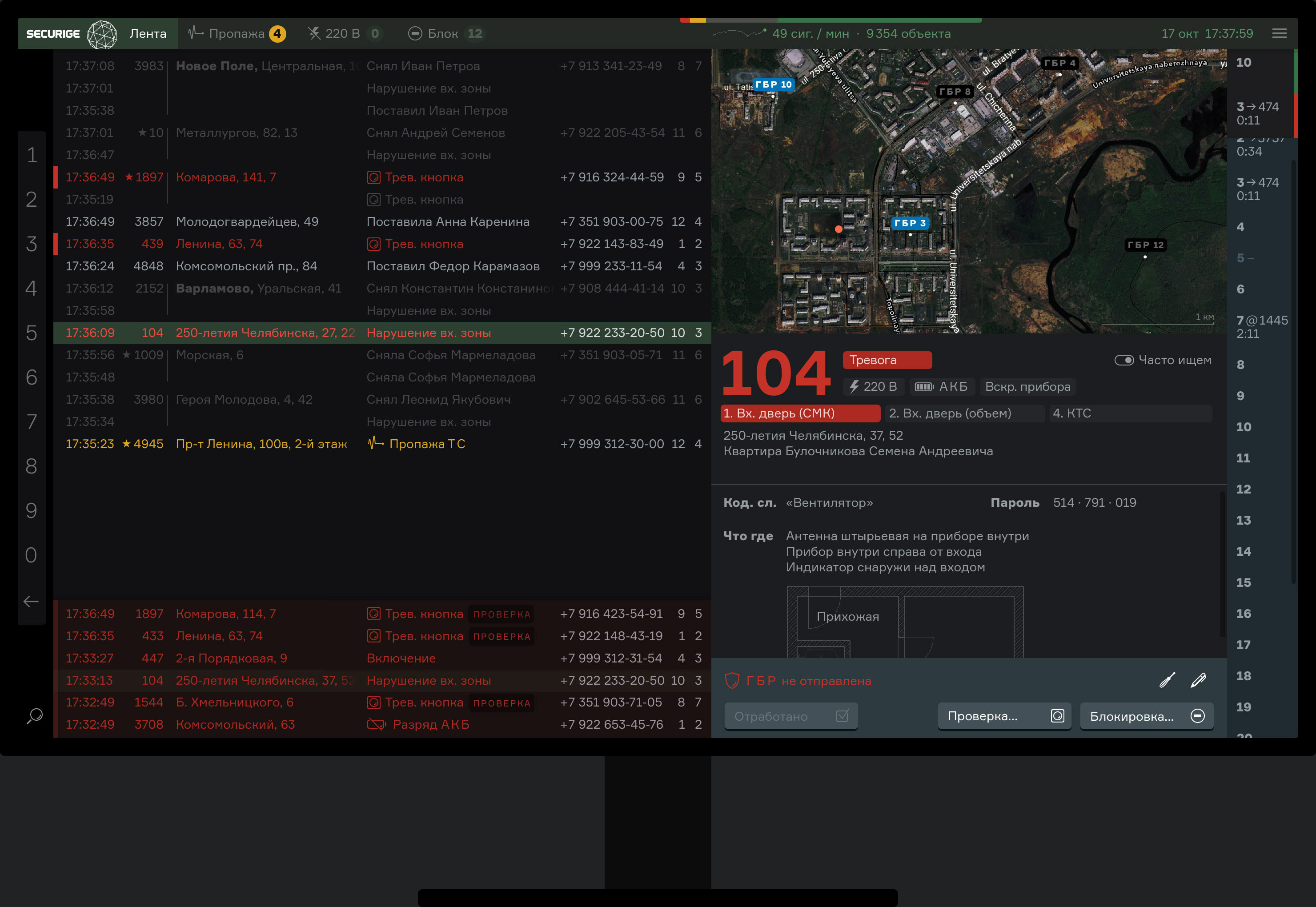
The user interface is designed so that one operator would to be able to observe more properties with less errors and less fatigue.
Watching
Status signals come from the guarged properties:
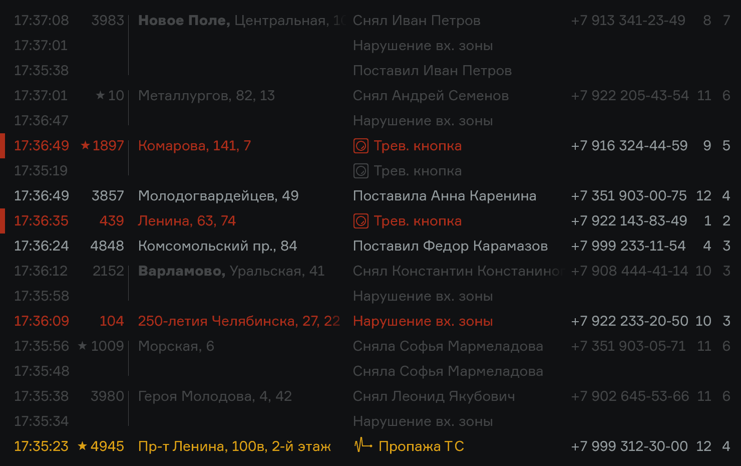
Before, the alarm signals were emphasised and drew attention even after the danger has passed. Now, the signals are classified dynamically: the intrusion signal becomes cleared when the client takes the property off-guard.
Red signals require immediate reaction. They get to the special zone in the bottom of the screen and remain there until the operator marks them as processed:

Yellow signals are secondary. They get into separate tabs:

The red signal zone remains visible independently on the selected tab.
The important idea of the new user interface is tranquility. In the old version, every alarm was accompanied by a siren. A permanent background noise sounded at the post. Now the siren sounds only if the operator doesn’t react to an alarm for ten seconds and the alarm is still not cleared.
Processing
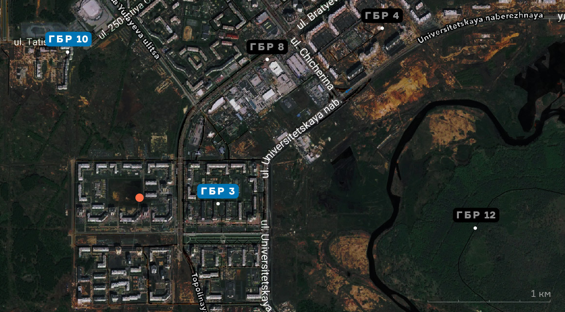
When the operator selects a signal in the list, the property information appears on the right. The property is shown on a map, along with the nearest rapid response teams:
The status and description of the property follows below:

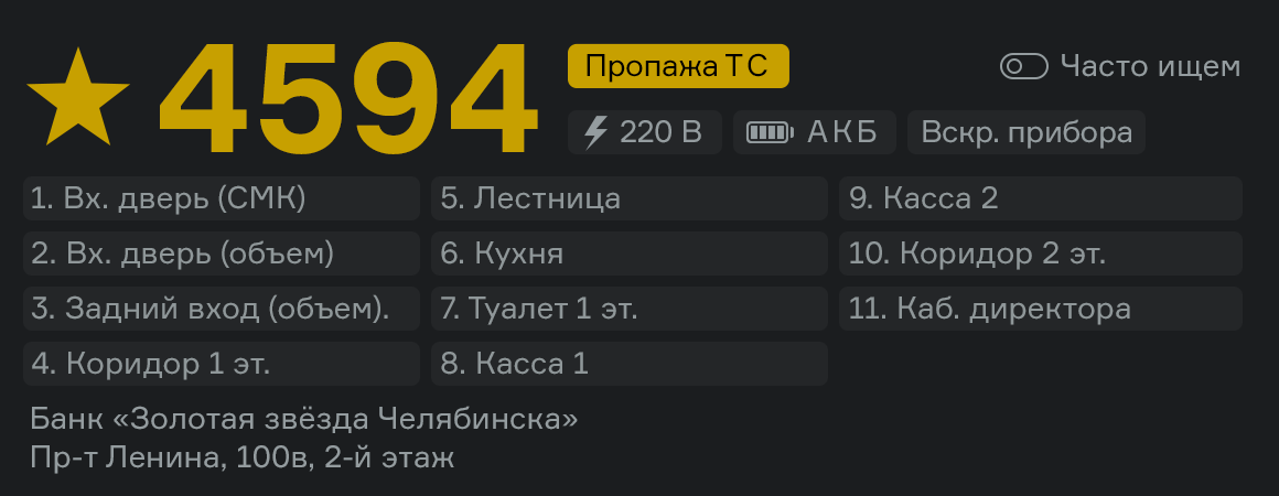
Properties usually have multiple guarded zones. Status of each one is displayed:
The full property description includes the used equipment, contact information and full signal history.
In the right panel, the teams status is shown. The operator decides which team to send to a property depending on their availability:
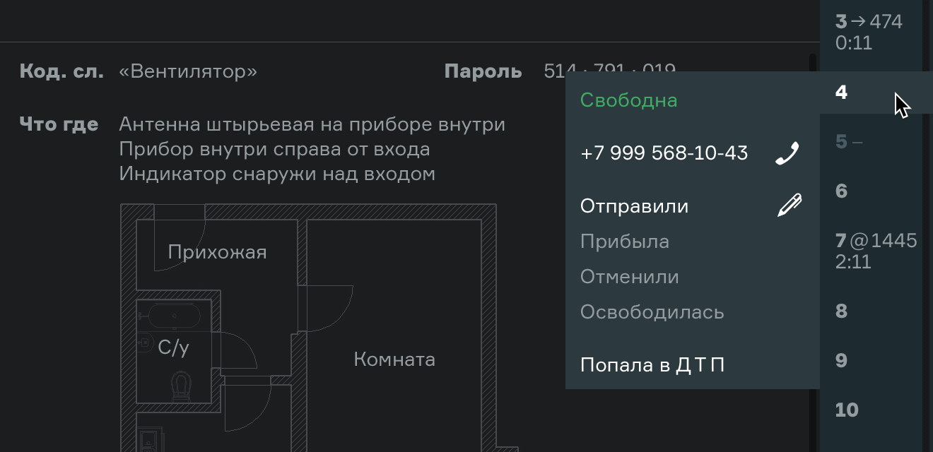
The programa makes sure evert alarm is dispatched correctly. To consider an alarm “clear”, a team must have visited the property, or the client must take their own responsibility for the property, or the operator must block the alarm signal:

In the latter two cased, the operator specifies additional information for the event register:

On top, a realtime signal statistics is shown:

Search
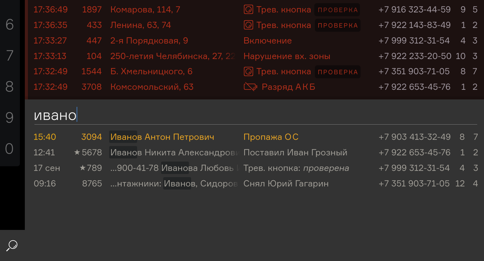
Just start typing an address, name or a property ID, and the input would be immediately interpreted as search. The search panel will pop up automatically:
On their desk, operators have phones, radio sets, the register and other documents. The keyboard often gets pushed away, so the operators use the mouse.
So there is a mouse-friendly search bar to help find properties by ID. The bar touches the left side of the screen, so the mouse cursor never overshoots it and it’s very easy to click. Operators find properties without keyboard.The screen layout
Other such programs use the standard windowed inferface. There are windows for the signals list, property information, the map, the rapid response team control panel, search. The windows overlap and obscuring each other’s information. The operator has to always move them around to make sure they don’t miss something.
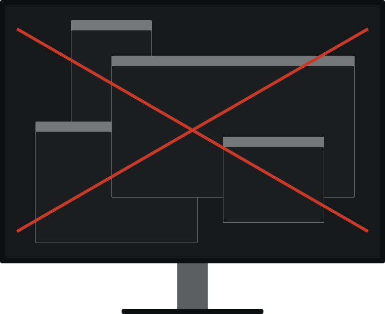
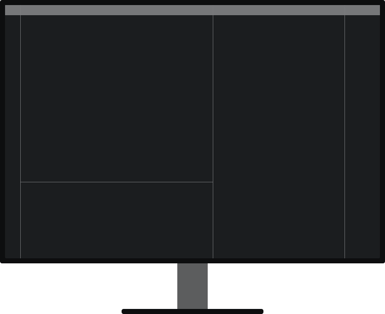
In the new Securige, operator does not resize or reorder windows. The elements are either fixed, or adapt their size to the content. Operator sees everything.
Even signing in is not done in a window. Instead, the name and password fields are displayed right in the main menu bar so that the live information remains in sight:

If the operator has two displays, they can select one of the pre-set screen layouts:
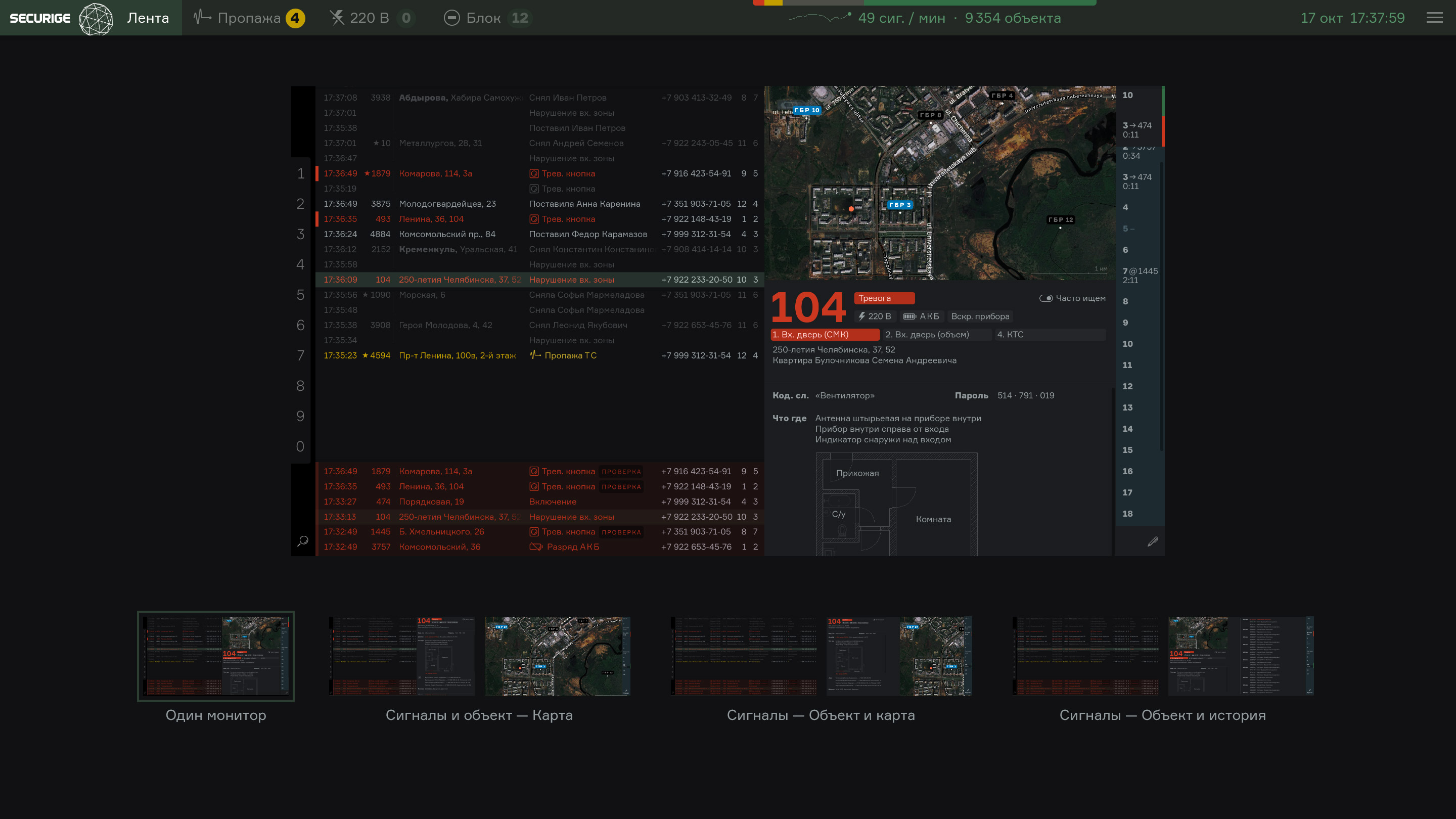
To lower the eye strain, the new version uses the dark background. This is great for professional tasks involving long times at the screen such as programming, architectural design, or market trading.
Pictograms
For the new version of Securige, I’ve also designed a pictogram set:
To use the program you have to become an operator in one of the security firms using the Securige hardware and software.