Ugly mail defames the sender. It may later occur that the sender was a good person, but life is unjust: a book is judged by its cover.
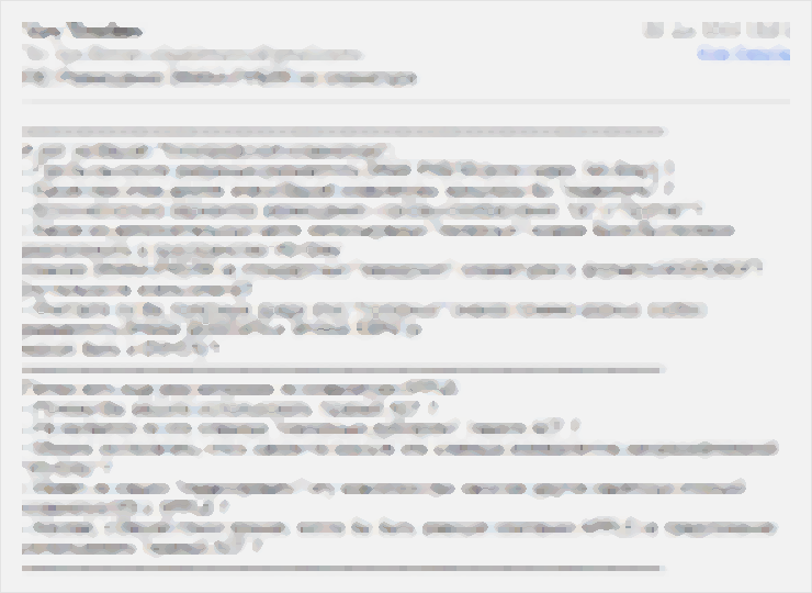
Examples of ugly mail
Random line breaks, an unwelcome line in bold with a blue highlight, multi-level colorful signature — the first thing you want to do is wash your hands:
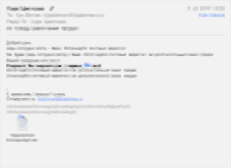
Two long links, a fly in the middle, no signature:
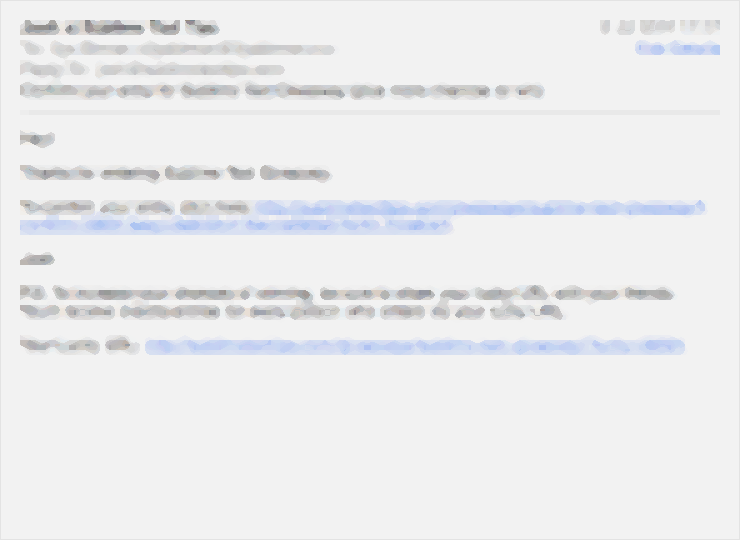
Shapeless text, strangely split paragraphs, three links in random places:
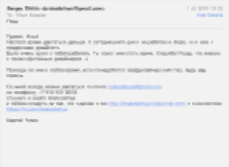
Lines start with lower-case letters, the signature is enormous — only ten percent of the body are actual information:
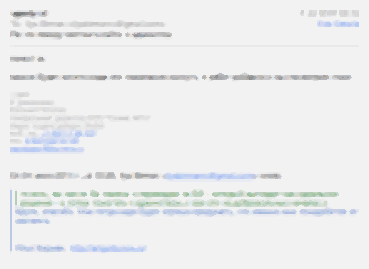
This one is just hell:
How to make a mail neat
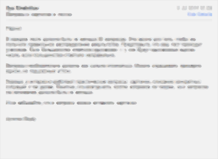
You don’t have to be a designer. Starting sentences with capital lettres and splitting it into paragraphs is something everyone is taught in school.
This one is pleasant to read:
So, little advice:
- Break text into sentences. A sentence starts with a capital letter and ends with a period, question mark or, rarely, an exclamation point. Sentences are separated with a single space. Excessive use of ellipses and parentheses blur the sentences boundaries.
- Separate paragraphs with an empty line. For a start, a simple rule will work: if you press Enter, press it once again. Do not break line if you are not going to start a new paragraph. Do not start a paragraph with a left indent (an email is not the same as a book). Paragraphs separated by empty lines and left-indented are the worst.
- Do not put long links inside a block of text. When broken into lines, such a link looks particularly bad. It is better to give it a dedicated paragraph. Or it can cling to the previous or the following paragraph, if it has to do with it.
- Do not include the whole history of correspondence. Quote only the part you reply to. Nobody likes to hunt for meaning. The shorter your mail is, the quicker you will get a response.
- Make your signature short. Does everyone need to know some obscure instant messenger ID you have long abandoned? Probably not.
- Lay out the signature in a clean way. A bad example would be separating the signature with a line of hyphens. Do not put the signature in a box, do not use a logo (sure, your logo is awesome). Do not colorize the text: any added color, including grey, adds clutter. Grey signature with blue links attracts attention, while the opposite is required.
- Leave two empty lines before signature. It is the simplest and the most effective way to separate the signature without adding noise.
It amazes me how some people pursue neatness in places where it does not matter (like in how the store their bills or how things are laid out in a car trunk), but don’t care how they look daily on the screens of others.