Tag: transportation
Popular
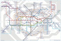
For many people, a map of a transport network is a given, an expected part of a system, something that just is — like a fire escape plan in a building


A couple of days ago I visited Beersheba, a city in southern Israel
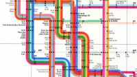
We made it with Nikita Dubrovin. The city is undergoing a public transport reform. The first bunch of bus routes have been simplified
Some landmarks were added. The bus-and-trolleybuses layer gave the previous version some visual richness, and it was interesting to scrutinise
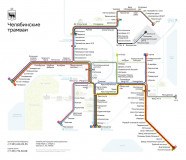
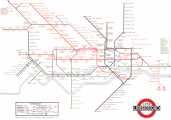
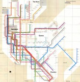
All these differences in maps were because of the differences in the cities or their transportation systems
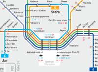
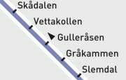
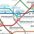
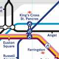
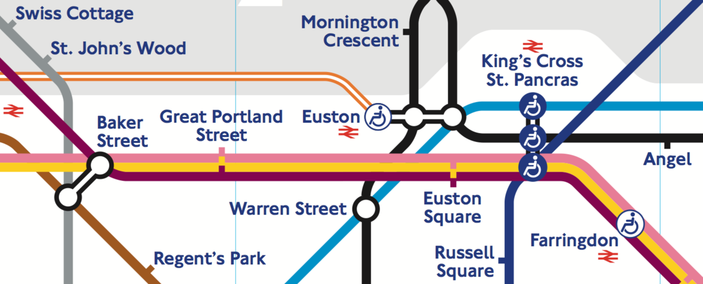
On stations, there are tracks for opposing directions. In some cities, these tracks are marked with the names of a line’s terminals
For many people, a map of a transport network is a given, an expected part of a system, something that just is — like a fire escape plan in a building
Earlier
Ctrl + ↓