What confuses a heck out of me is that so many articles on design and typography are being published on Medium. Why do designers choose Medium?

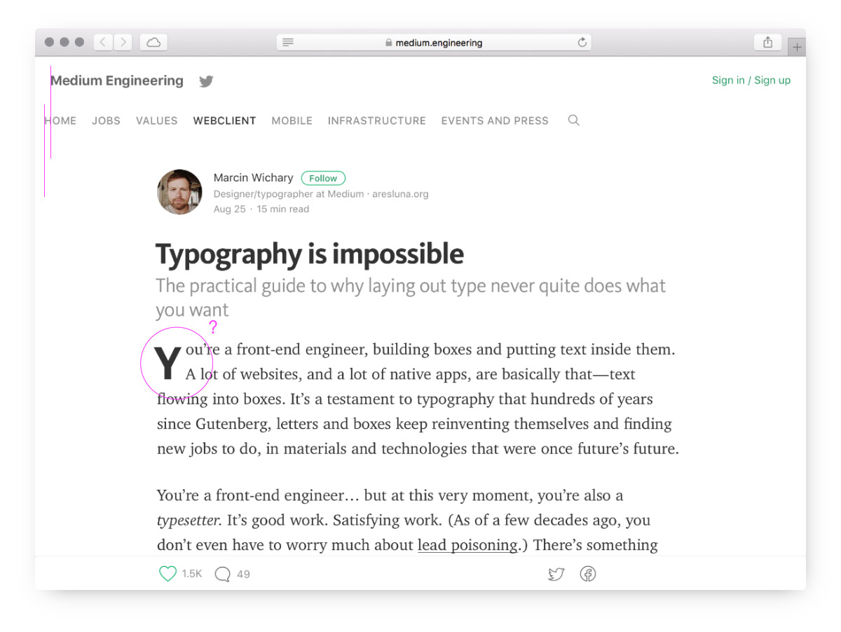
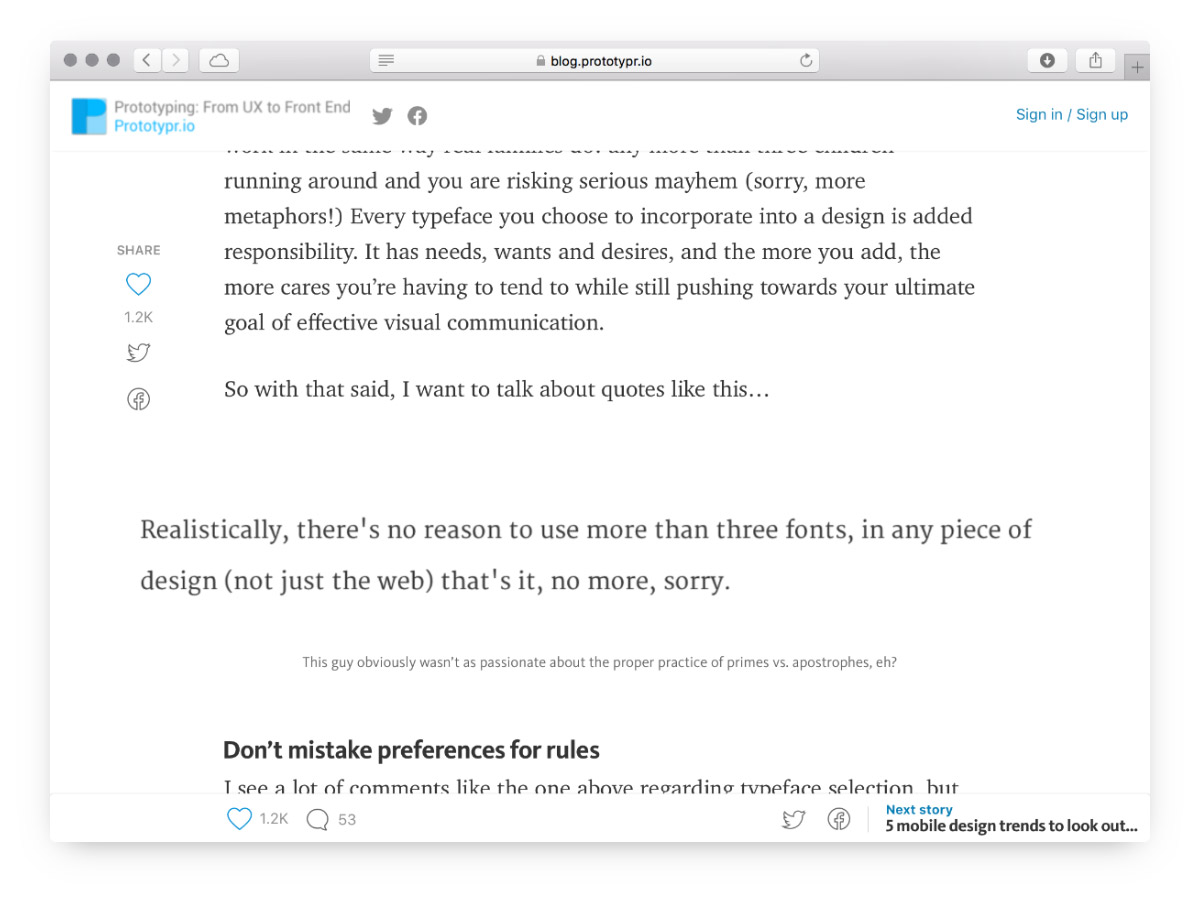
It seems like every element has its own font, size, alignment and shade of grey. Vertical spacing is broken: the subheading is too close to the heading, the paragraphs are too far from each other.
The article itself is great though.
I don’t consider myself particularly good in typography, but this?

It’s all random, isn’t it? And again, a great article.
(Shrug.)