Moscow Metro station names multiplication
In the Moscow Metro, there are usually only a couple of station name signs along the platform. You can’t see them from inside the train. To help the passengers alight promptly, let’s multiply the signs and place them better:
Most stations have a specific lettering for their name. This lettering is a part of the station’s architecture:
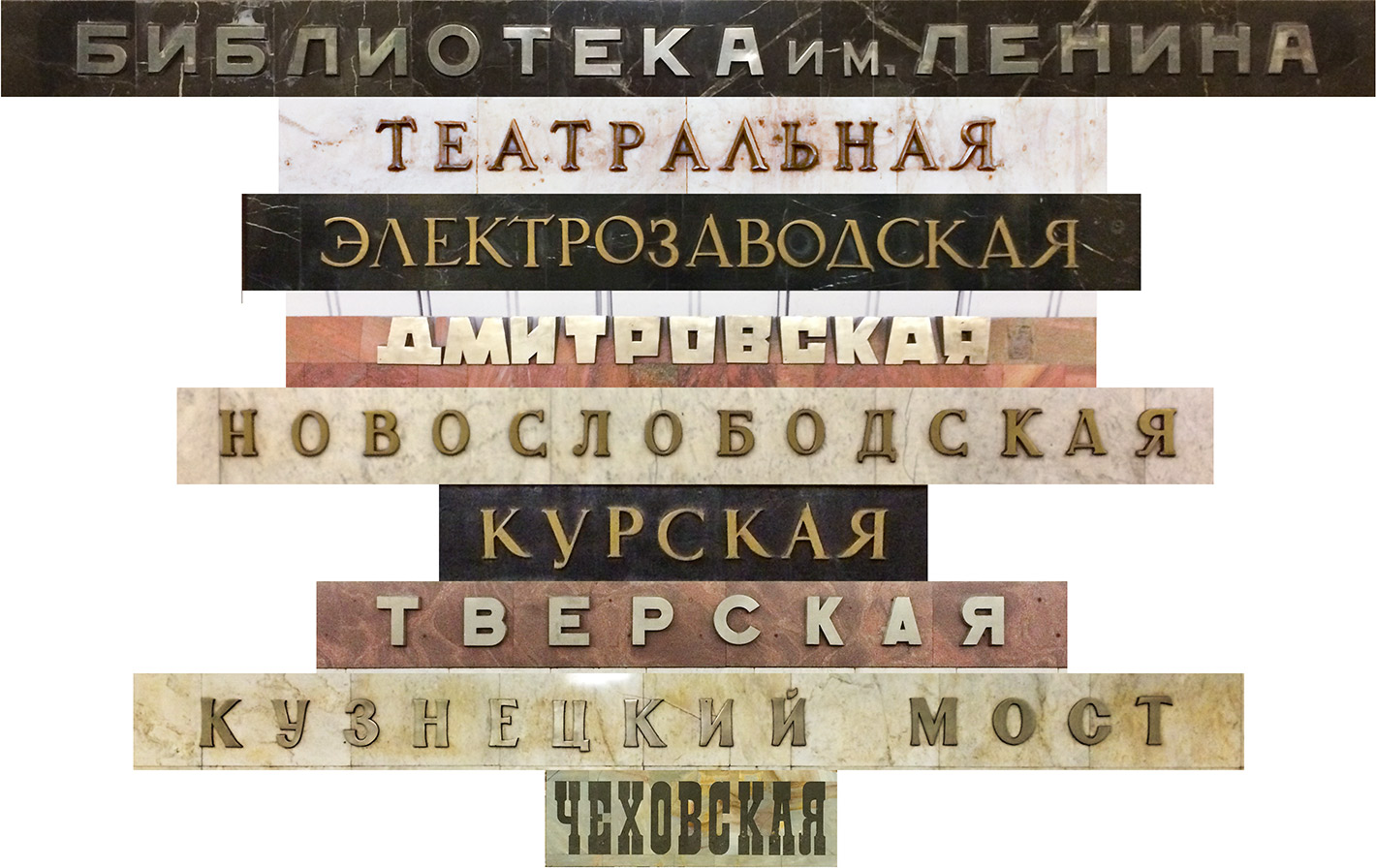
Let’s reproduce this original design in the new signs (with slight adjustments to the letter curves and kerning):
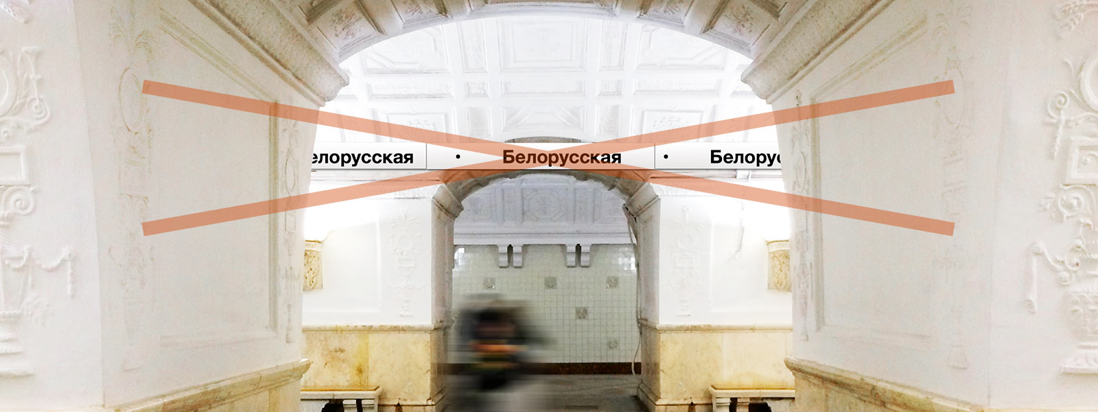
In most metro systems, they put the platform-long stipes with repeated station names. The names are typeset in a font standard for the local transport signage. This will not fit Moscow:
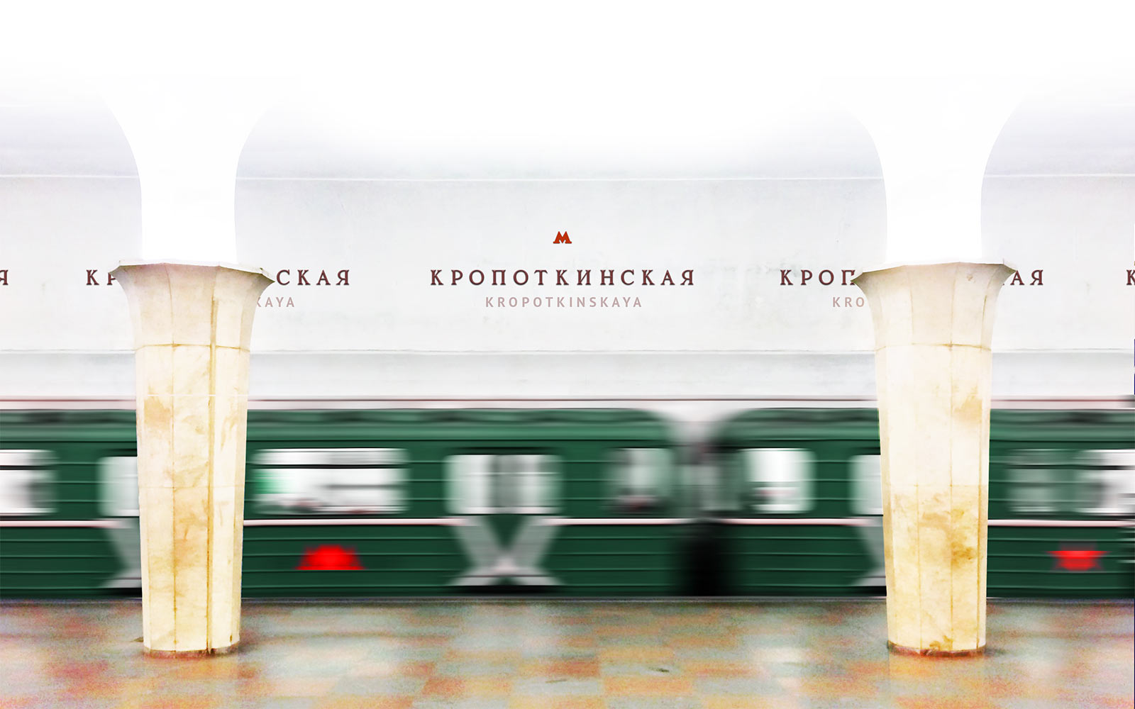
Here we select the best position of the signs individually for each station. It should feel as if the signs had been there since the station’s opening. And they should be visible from any window of any carriage:
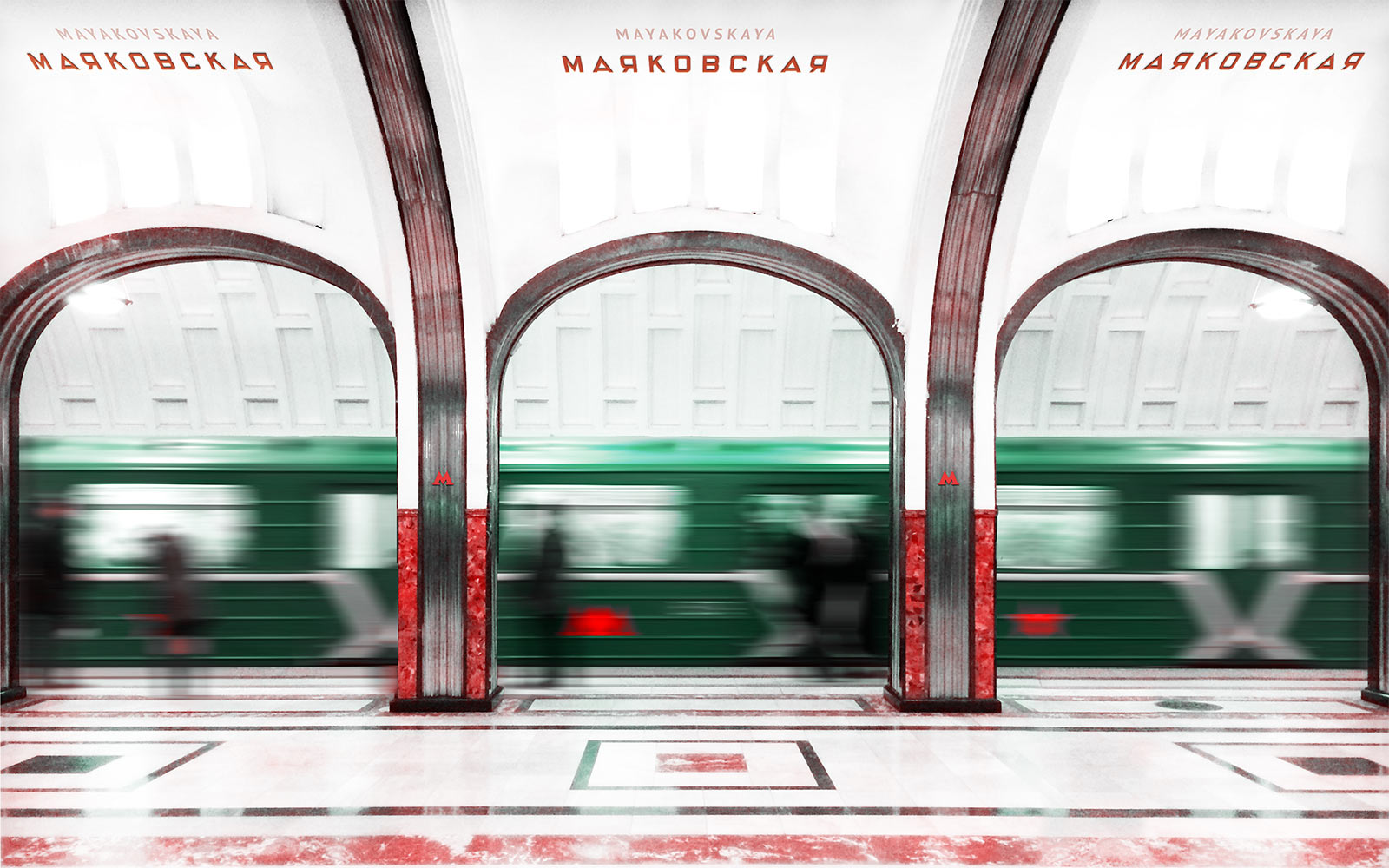
The signs are dubbed in Latin script (smaller, lighter, with uniform font). A transcribed name could be put above the original one when it gives the latter a better view.
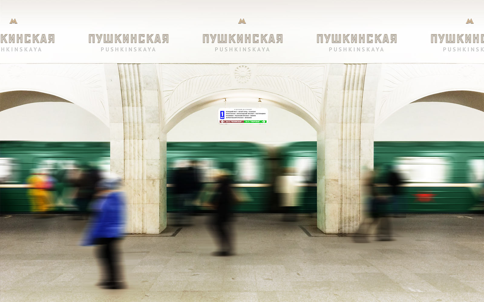
When there is space only for one line of text, the scripts alternate:
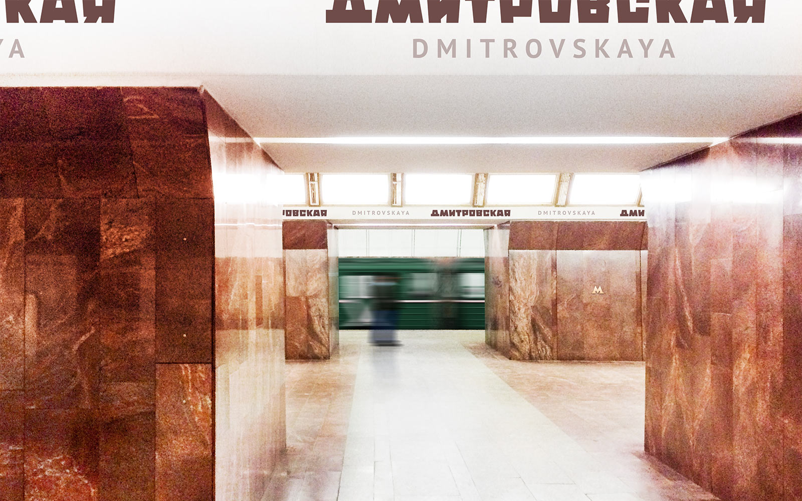
The new signs do not replace the old ones, but augment them.