Central Suburban Commuter Company (ЦППК) is the largest Russian commuter train operator. Nine out of ten passengers in the Moscow region use the company’s services. I’ve designed the new network map for the company:
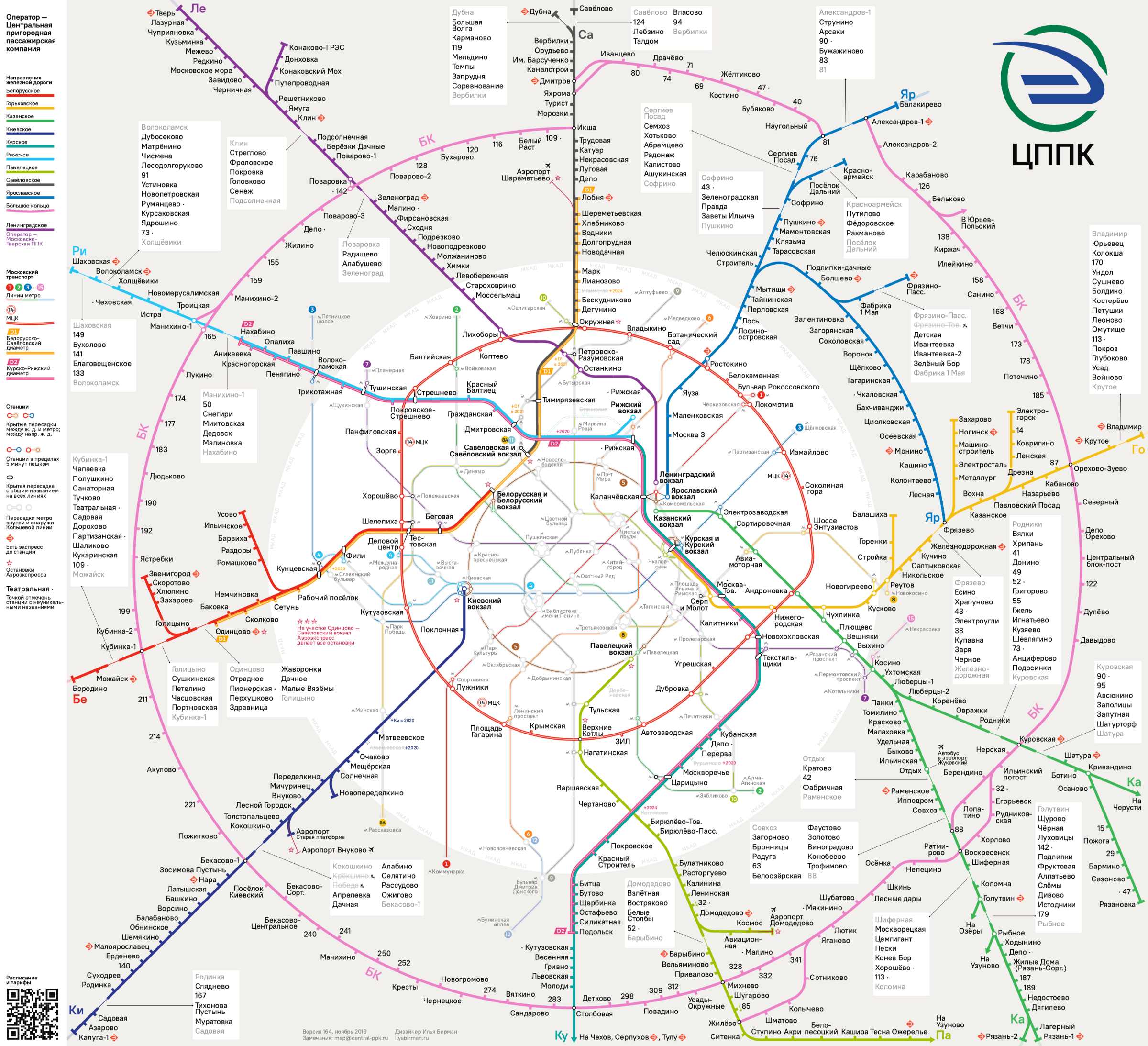
The main idea of this design is to incorporate the habitual image of Moscow with radial and ring lines. The
The old map looked confusing and ugly:
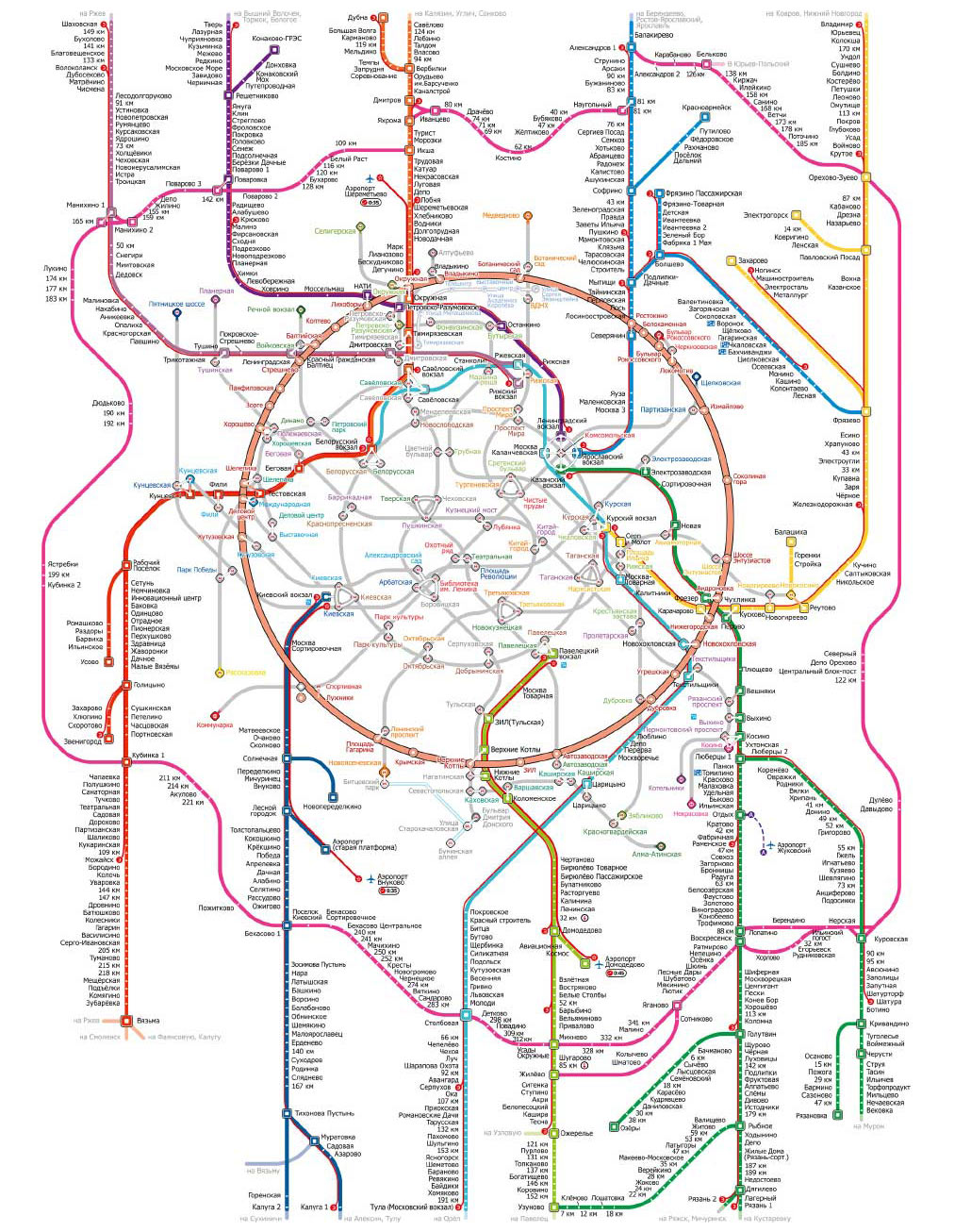
The most difficult thing for the passengers was to understand the intricacies of the lines north of the Metro Ring Line. In the new map, the rapid intra-city D1 and D2 trains have been added, but even with them the map has turned out simpler than the old one:
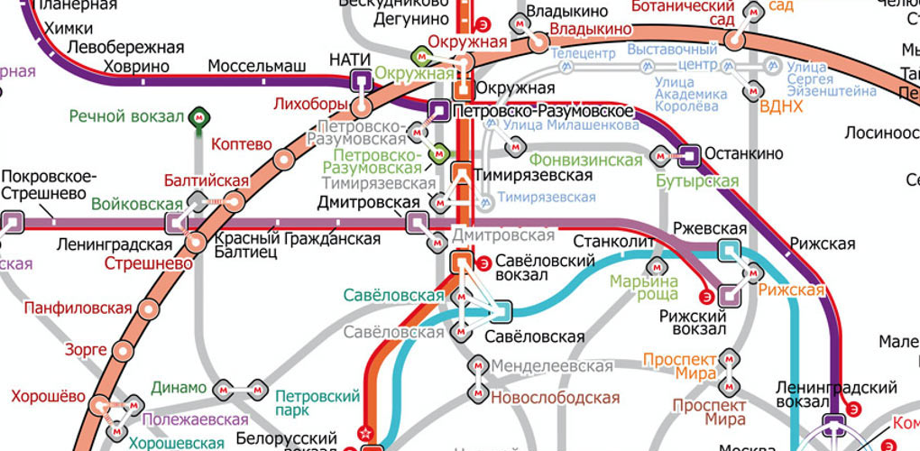

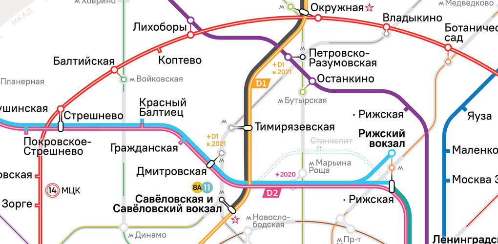

The Moscow Metro map is an icon and the main reference system of the city. That’s why the Metro network is depicted as close as possible to the Metro map: the lines are bent in the same way, the transfers have the same shape. The Metro lines are even marked with their usual colors in a way that does not interfere with legibility of the main rail information:
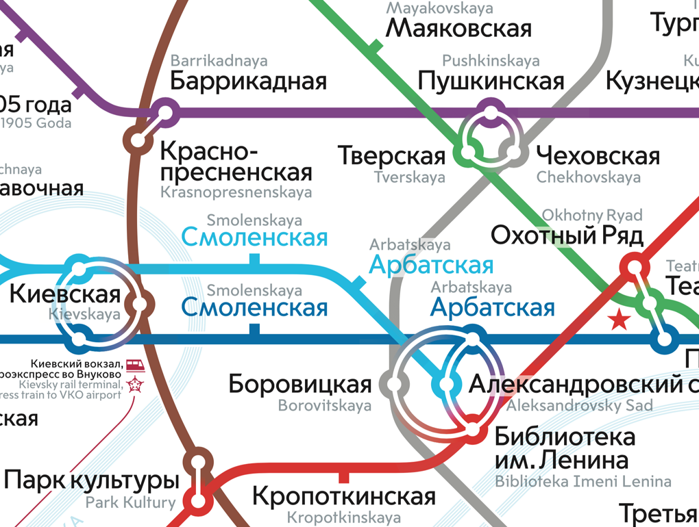

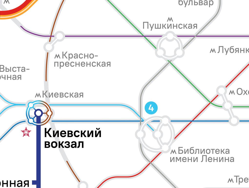

One can figure out even the most complicated connections:
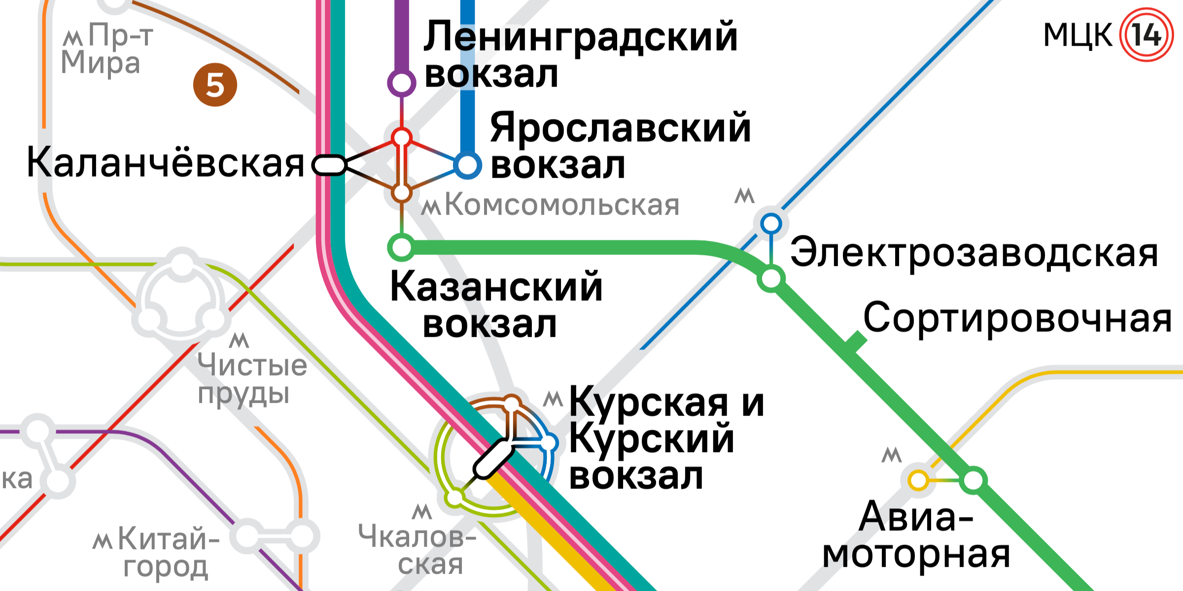
The captions unambiguously correlate with the stations:
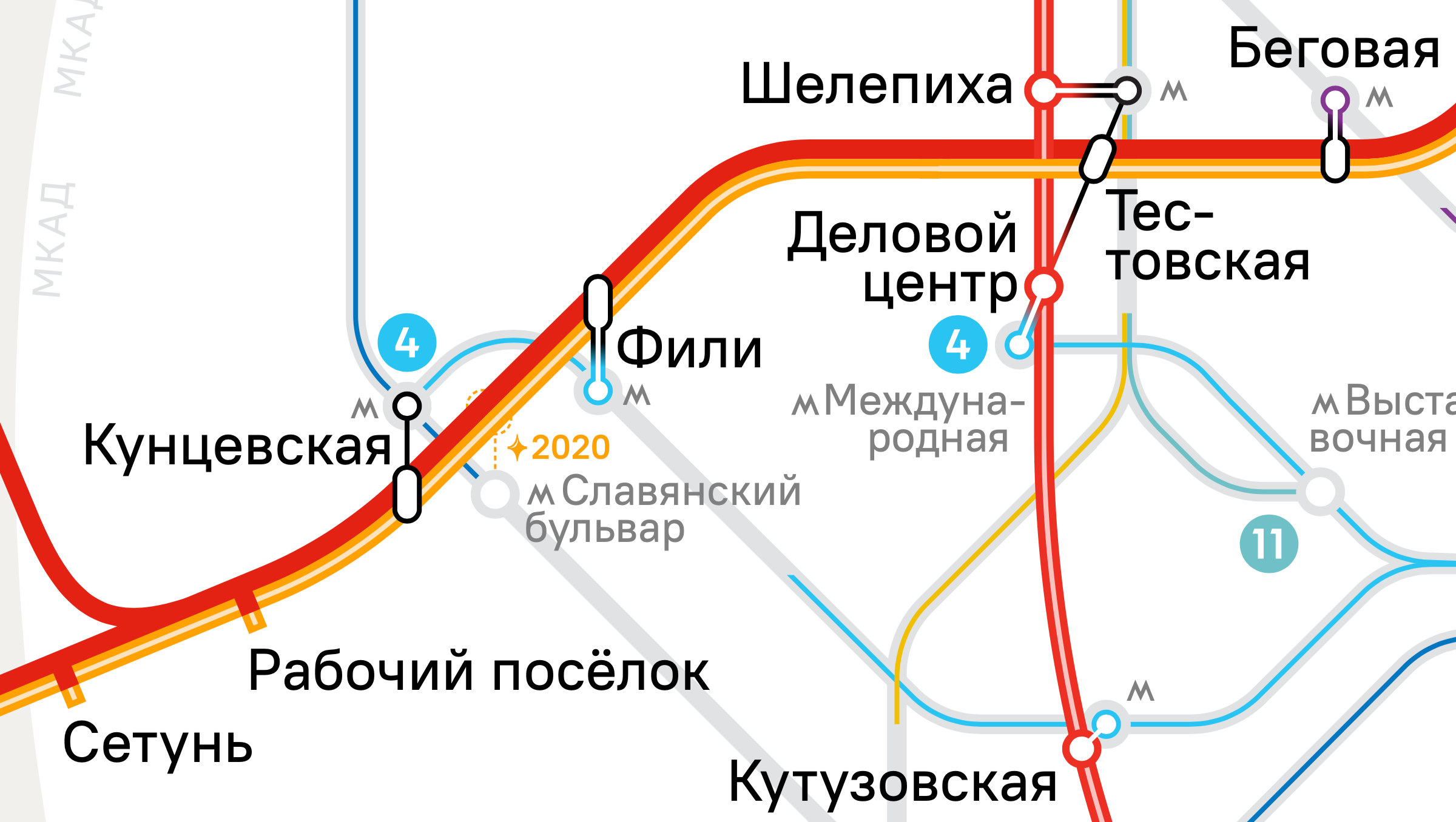
The map is designed for placement in cars and at the stations.