The popular way to make grids for your layouts is to account for gutters, like this:
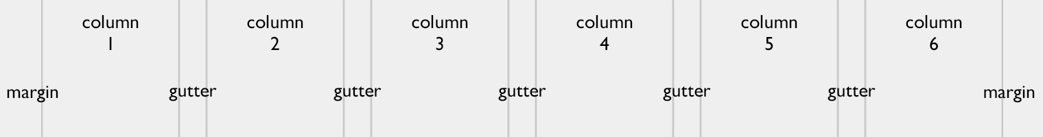
The layout here is 760 pixels wide with six 100-pixel columns, five 20-pixel gutters and two 30-pixel margins.
Now, quick: what will the column width be if we increase gutters to 25 pixels?
This is an overcomplicated, highly impractical way of dealing with grids. Given the overall width and the number of columns, it is hard to calculate the column width. The width of n columns does not equal n × col width. Creating or changing such a grid a work in itself. This is nasty.
The better way is to get rid of gutters:
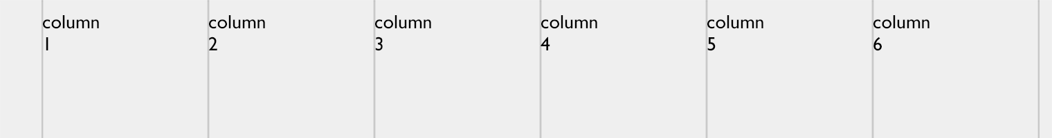
The layout here is 760 pixels wide with six guides at 120-pixel intervals and a 30-pixel left margin.
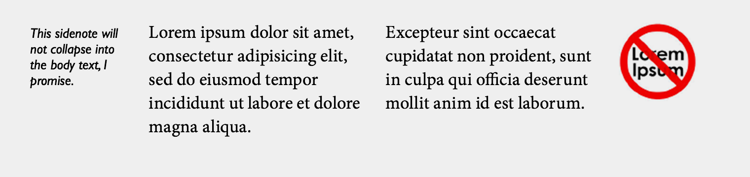
But wait, how do you make sure the text in adjacent colums does not collapse? Easy. You add a right padding to the containers:
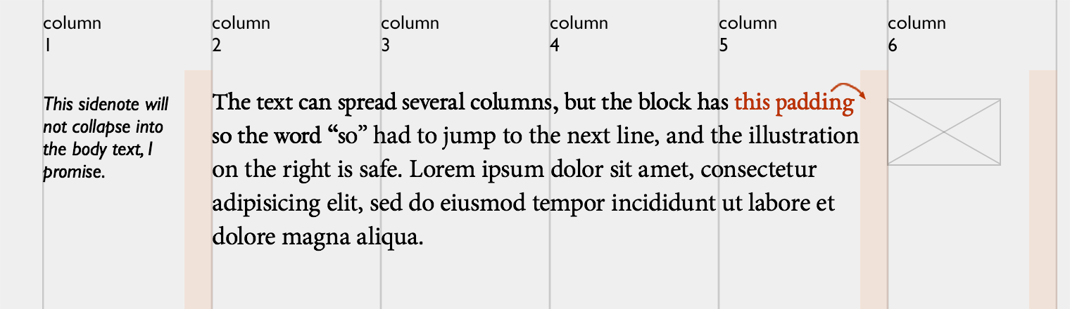
This approach gives you the freedom of adjusting the paddings in relation to the font size. If your main text is twice bigger, the 20-pixel spacing will not be enough, so you can use bigger paddings for its (and only its) container:
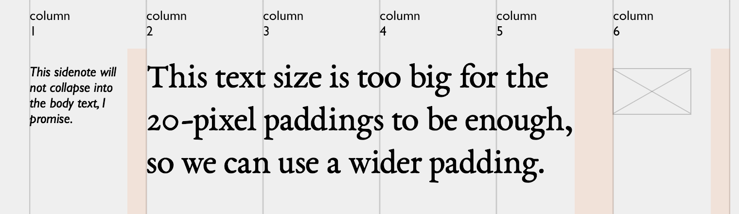
Alternatively, you can specify the padding in relative units (i. e. 1.5 em).
Here is another example, this time without any visible guides:
On the web, you almost exclusively use flush left, so viewing the grid as a set of guides instead of as a set of columns makes sense. The only “grid” is the grid of the invisible lines by which the text is aligned. So do not mess with gutters, they are not worth your time.
You should follow me on Twitter, here