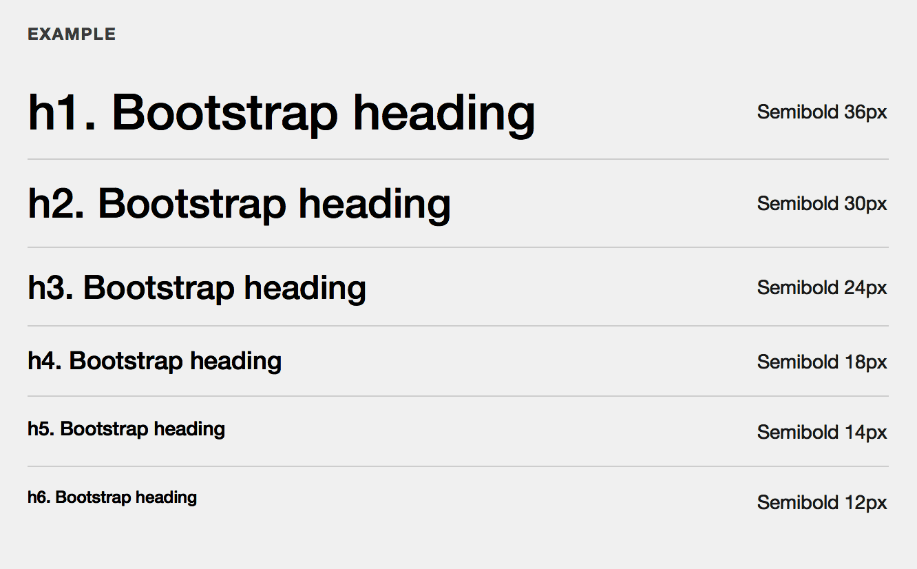
It’s a common mistake to denote heading level by its font size only. The popular Bootstrap CSS framework does exactly that:

When you see this picture, it makes sense: the higher the level, the bigger the heading. The problem: this works only when you put these headings next to each other. But when you use six levels of headings in a real text, these styles will not help establish the structure. From the reader’s perspective, they would be just randomly-sized headings. To see an example, open the Bootstrap’s own documentation in the middle of its page.
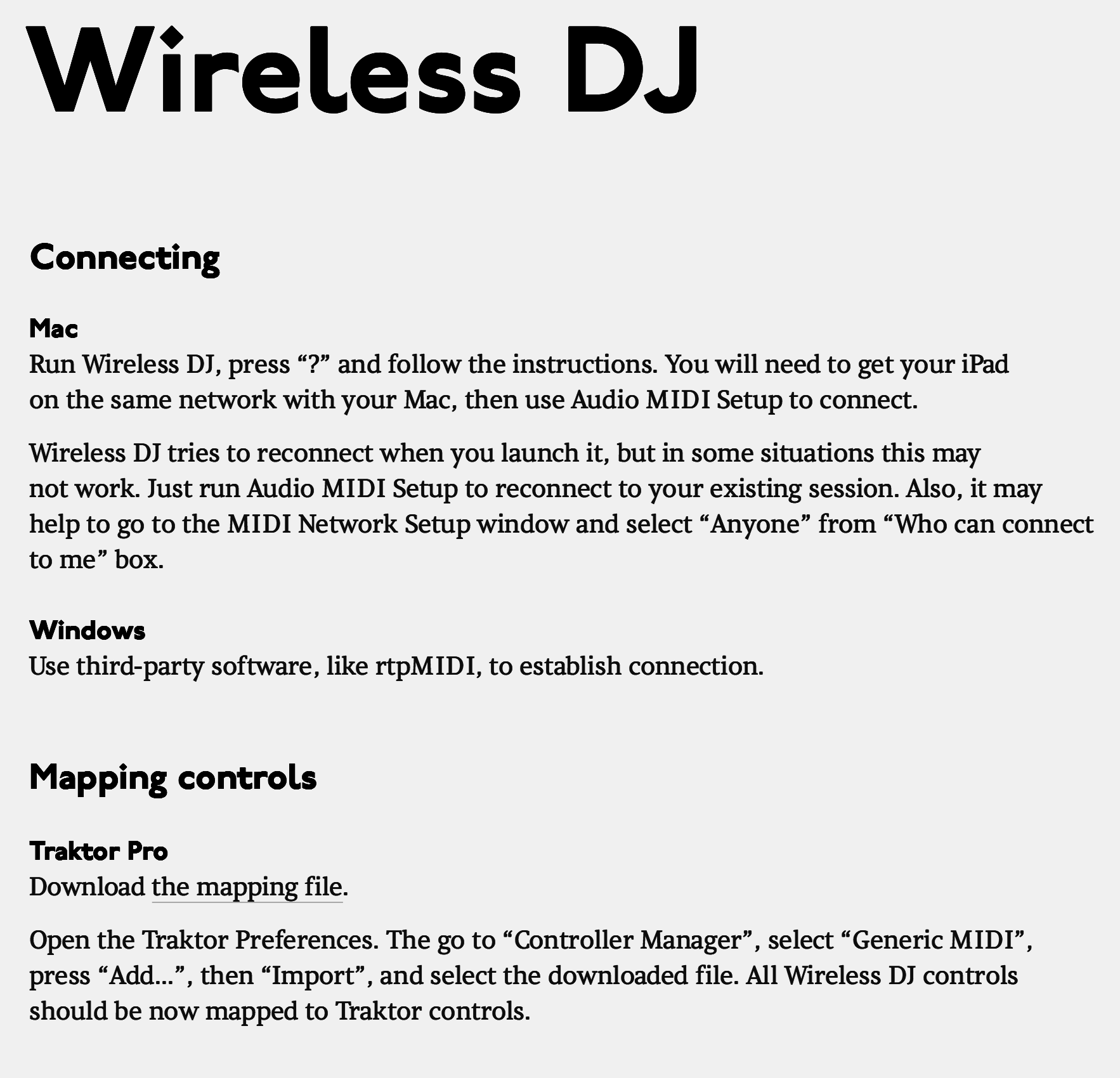
Now look at this example from Wireless DJ help page:

The progression of sizes is not the only design tool here.
There is only one main heading (aka h1) on a well-edited page, and it’s on top. So from the structural point of view it doesn’t matter what it looks like. It makes sense to make it large though.
The second-level headings (h2s) are larger than the body text, but what’s even more important, they have generous margins around them, and the top margins are visibly larger than the bottom ones. This helps link the headings to their text and separate the sections from each other.
The third-level headings (h3s) are not just smaller than the second-level ones. They are actually of the same size as the body text, but are bold. Also, they have no bottom margins at all. This connects them very tightly with their text.
If you want more than three levels, you won’t be able to make do with just font size and margins. You will need to employ other tools:

This example is in Russian, but it’s even better if you can’t read it. Just see how headings of different levels have several attributes that help you recognise them: alternating typefaces, italics, rulers, numbering.
Such a complex hierarchy may be necessary in some legal documents (the example above is from the Russian Civil Code), but in most cases, three levels of headings must be enough.