In Israel, many signs are given in three languages: Hebrew, Arabic, and English. The three writing systems are very different, but sometimes designers try to find somewhat similar fonts to make all three work together.
The idea is good in itself, but the result is often poor.
The first picture is of the light rail station in Tel Aviv:
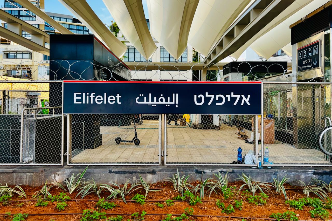
Everything seems to be equally low-contrast, straightforward, and close to pure grapheme. But the line heights and the stroke widths are all different, so it looks very sloppy.
The second picture is of a beautiful sign at the Rehovot police station:
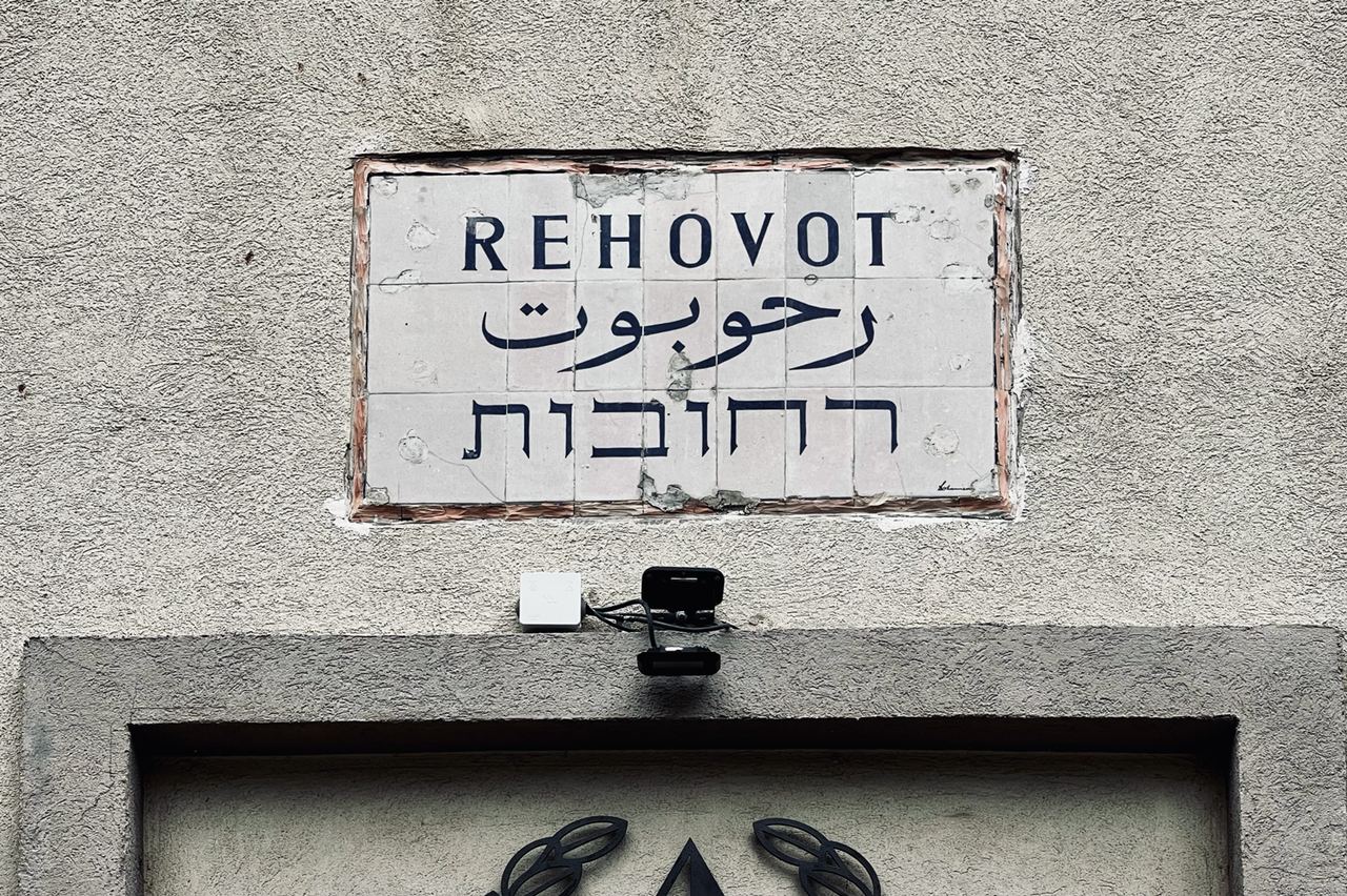
Each writing system is being true to itself instead of trying to mimic a foreign one, but the whole thing still looks very consistent due to the same range of stroke widths.