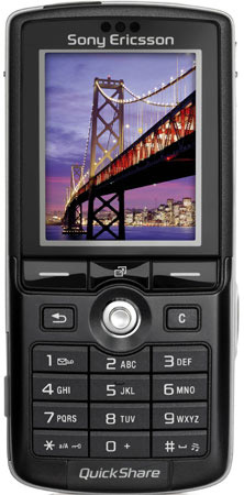
In user interface design, we define a Karaoke button as a button which exists solely to highlight the existence of some feature, often a gimmicky one. The button is visible on a product pictures or screenshots, so it’s more likely that the users will notice it and buy the product.

QuickShare, an example of a Karaoke button
Since Karaoke buttons do not solve any user problem, they do not make a product better. Actually, sometimes they make it worse, for they occupy space which could have been used better. But apparently they help sell the product.
On top of that, a particular class of Karaoke buttons is worse still: those that make product universally better when you press them. An example would be my air conditioner’s Quiet button. If it’s technically possible to do the same job quietly, why not just do it so all the time?