Often, transport diagrams do not accurately represent reality. But is this “lying” even acceptable? And if yes, to what degree?
Schematic depiction of the land has been done since rock drawings. By any contemporary measure these “maps” are ridiculously inaccurate. But they include enough detail for orientation.
This is an ancient road map of Roman Empire (created between −1 and 5 centuries; implemented in parchment in the 13th):

Here is Rome:
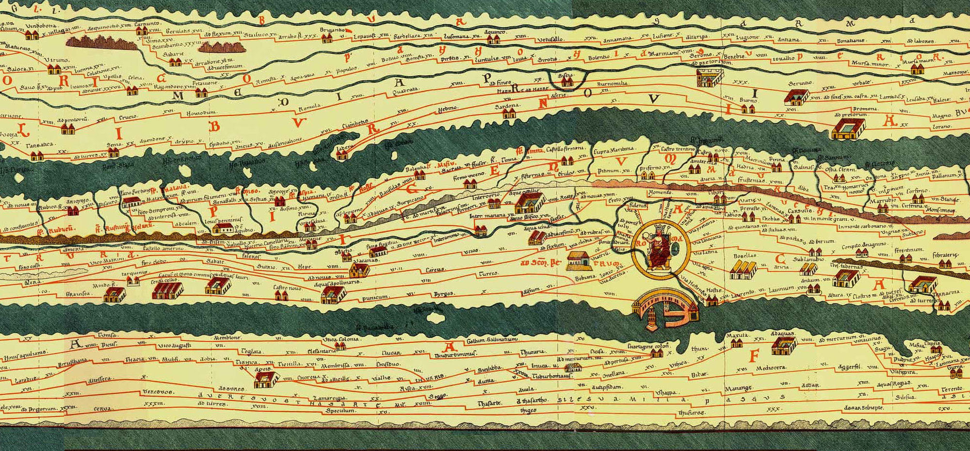
We are used to a very different appearance of these territories on a map. It’s quite hard to figure out what’s going on here. However, for a man who haven’t seen other maps, there is no reason to think that something is wrong: the roads actually connect the places.
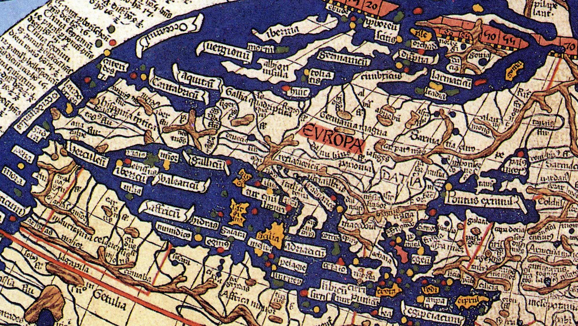
On Ptolemy’s map of the world (2nd century; reproduced by the engraver Johan Schnitzer in the 15th century) the outline of Europe gets somewhat familiar:
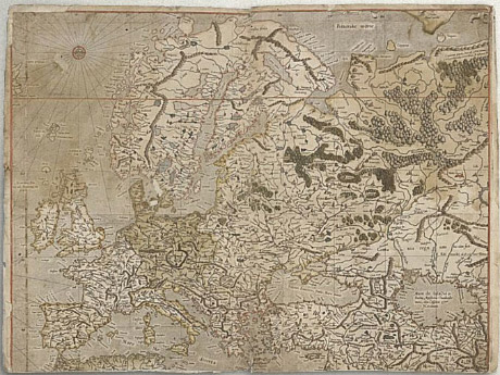
On Mercator’s map (16th century) it looks the way we are used to:
And here’s the whole world in Mercator projection:
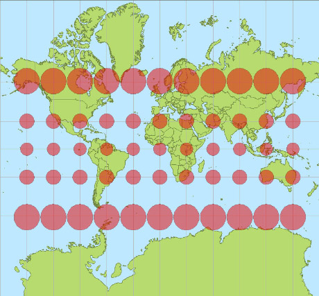
Greenland looks bigger than Africa. The area of Antarctica’s looks comparable to everything else combined. But the red circles actually denote the same physical area, which gives you an idea of how distorted the map is.
This is a modern Google Map:
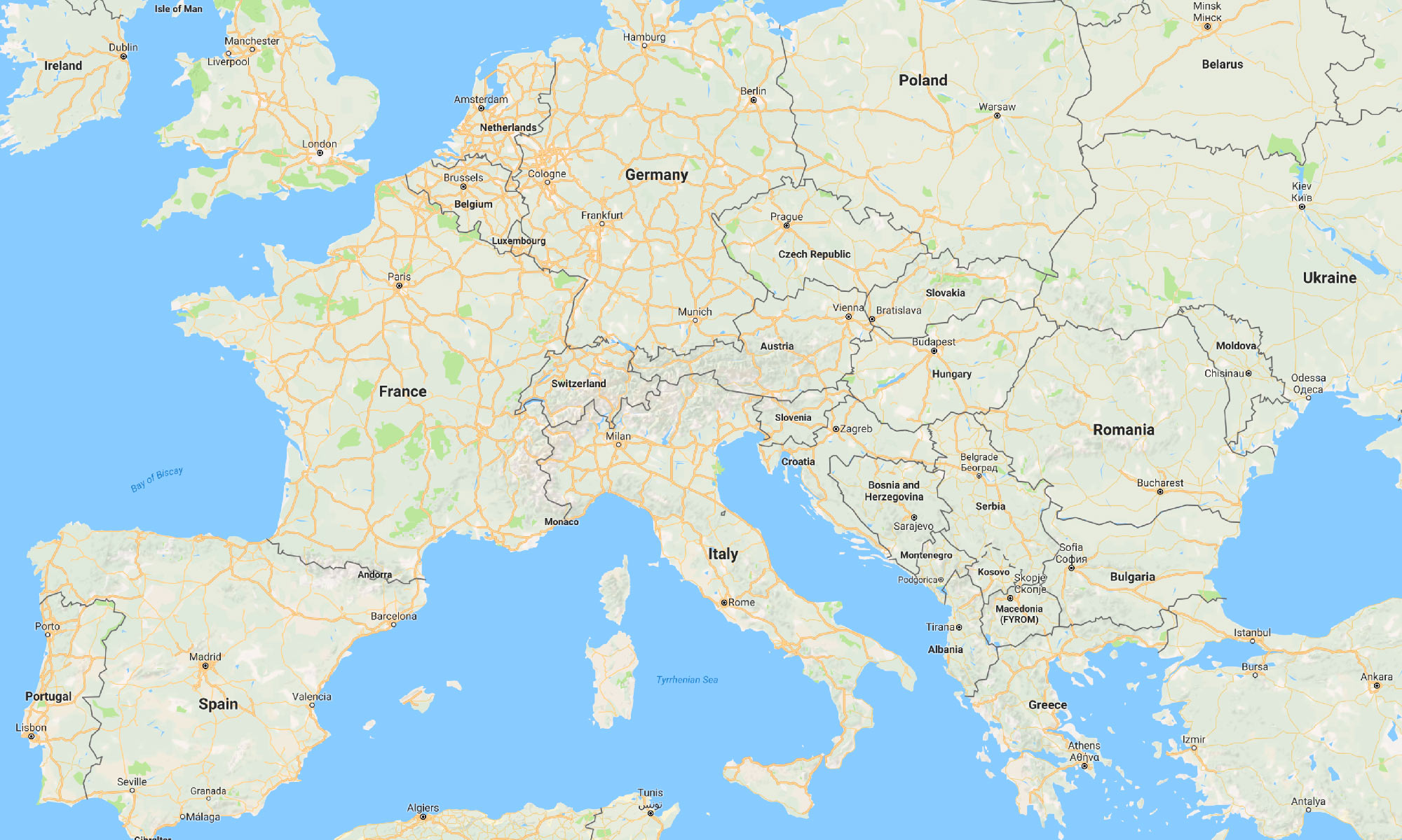
After a man had been to space, it seems, there are no more uncertainties about the shapes of land and sea. But can we say this map is actually precise?
The map is flat and Earth is “round”, so a precise map just can’t exist. Futhermore, let’s look from a distance:
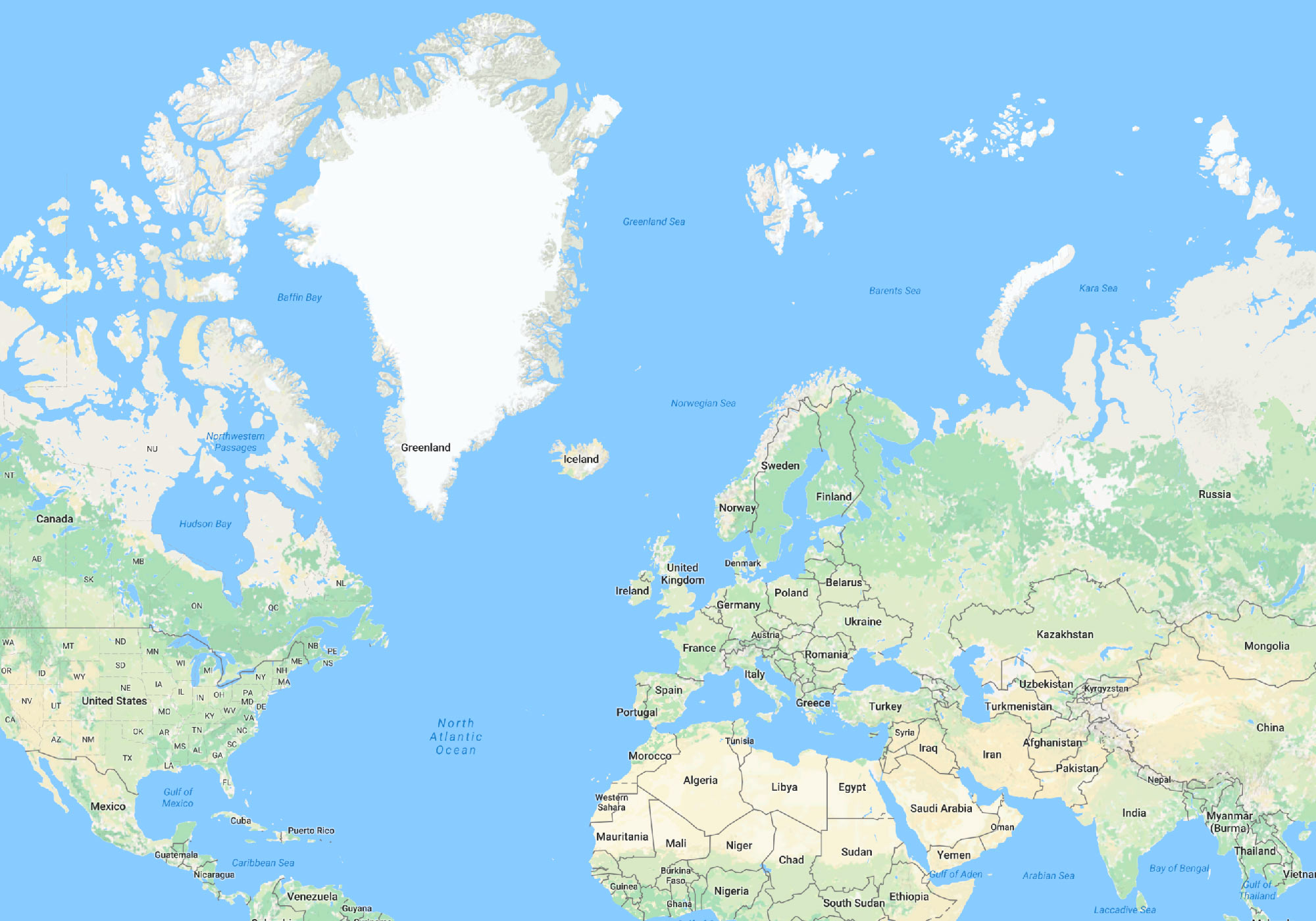
This is Mercator projection!
Mercator projection is one the most important map projections. Its main quality is that it preserves the angles. In each point the horizontal and vertical scales of the map are the same. That’s why when moving from the equator to the poles, the map is artificially stretched vertically the same way it naturally gets stretched horizontally.
Google engineer explains:
The first launch of Maps actually did not use Mercator, and streets in high latitude places like Stockholm did not meet at right angles on the map the way they do in reality. While [Mercator] distorts a “zoomed-out view” of the map, it allows close-ups (street level) to appear more like reality. The majority of our users are looking down at the street level for businesses, directions, etc… so we’re sticking with this projection for now.
Turns out, angles are far more important for navigation than the fair relative representation of land area.
The equidistant projection doesn’t distort area as much, but does distort the shape significantly:
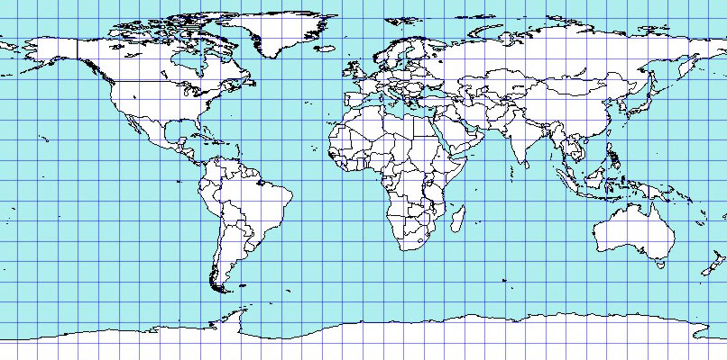
The map projections are actually classified by the types of distortions they make. Depending on task at hand, the lengths, angles, areas or shapes can be sacrificed.
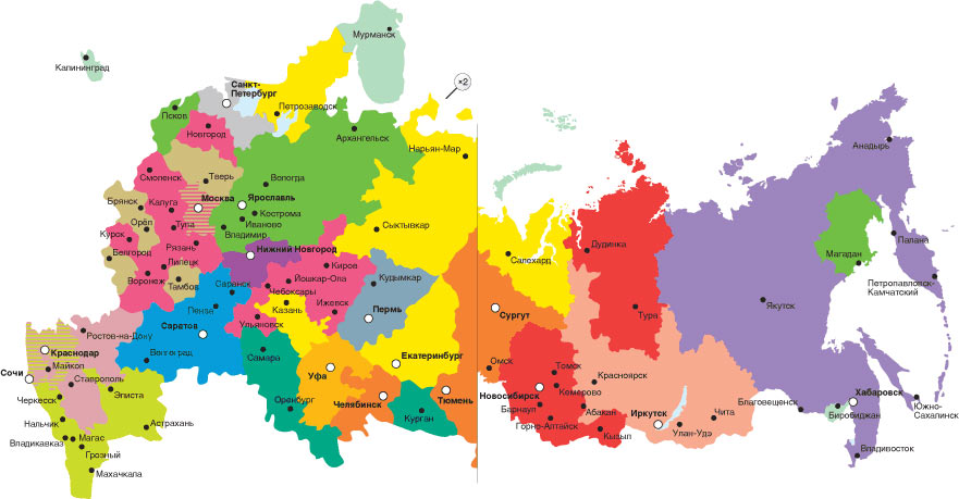
When I was designing a map of UZP plant dealerships in Russia, I even split the country in two halves. The Eastern part was displayed at twice smaller scale. This has let me show the much more inhabited Western part in larger detail (I didn’t know then that using such colours was not a good idea):
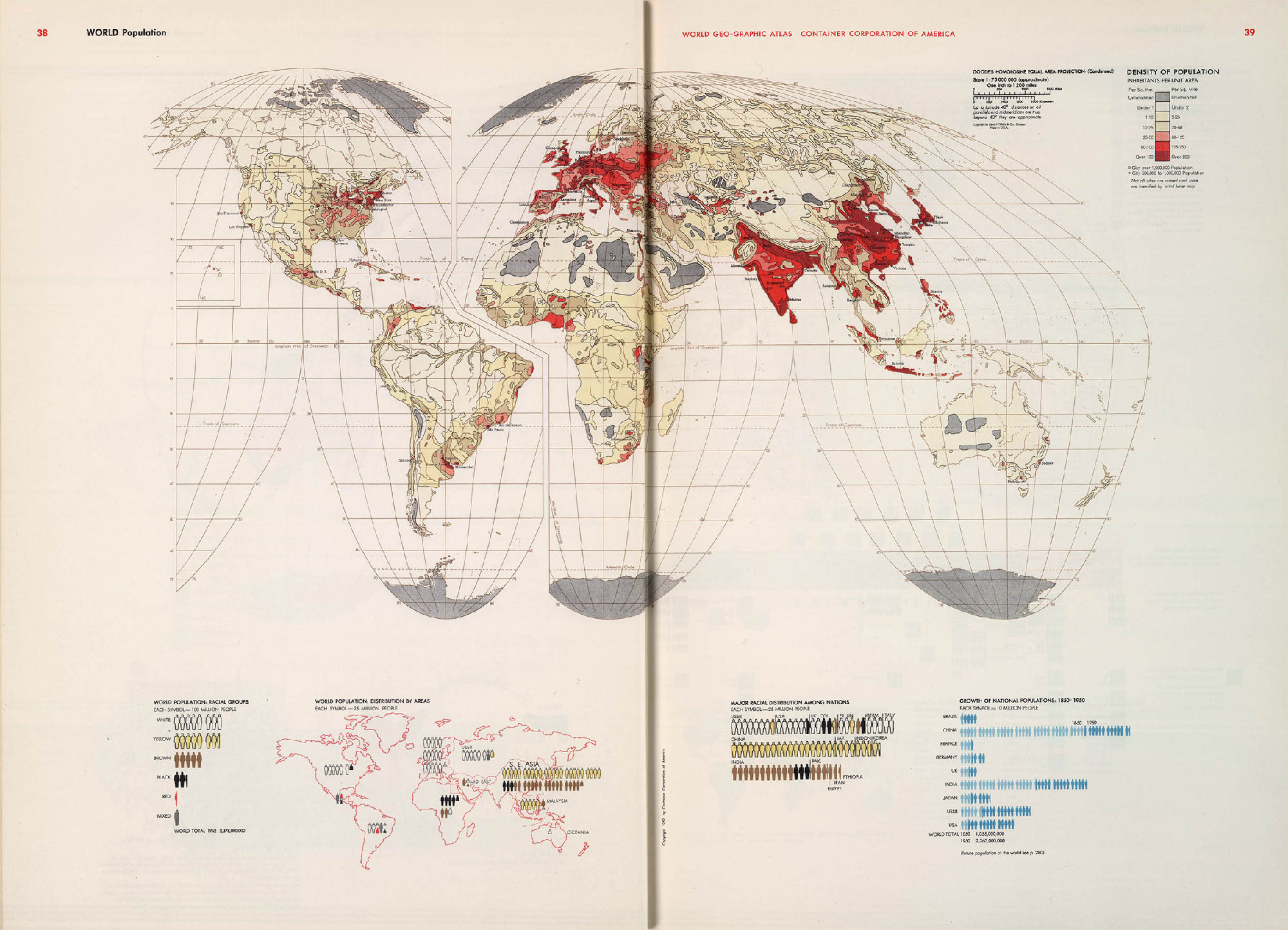
A map from Herbert Bayer’s “The World Geo-Graphical Atlas” the Earth is cut in pieces in order to preserve the shape of the mainlands. For a map that shows the world’s population the fair display of the oceans and Antarctica is not that important:
To some degree, any map is a lie.
Continued in Map and reality: layers.