In part 1 I’ve covered the difference between the Beck’s London underground map, our Ekaterinburg metro map, and the Vignelli’s and Hertz’s maps of New York subway. In part 2, I’ve highlighted the more subtle details specific to the transit maps of Barcelona, Paris, Oslo, Moscow and London.
All these differences in maps were because of the differences in the cities or their transportation systems. But there is another reason for the maps to be different: aesthetics.
The transport map is not only a tool, but also is a notable object of graphic design in a big city. So even if you can make do with the Beck’s design language, you will get a London map, no matter what you depict. The transport system must have a face, and aesthetics is as important as logic.
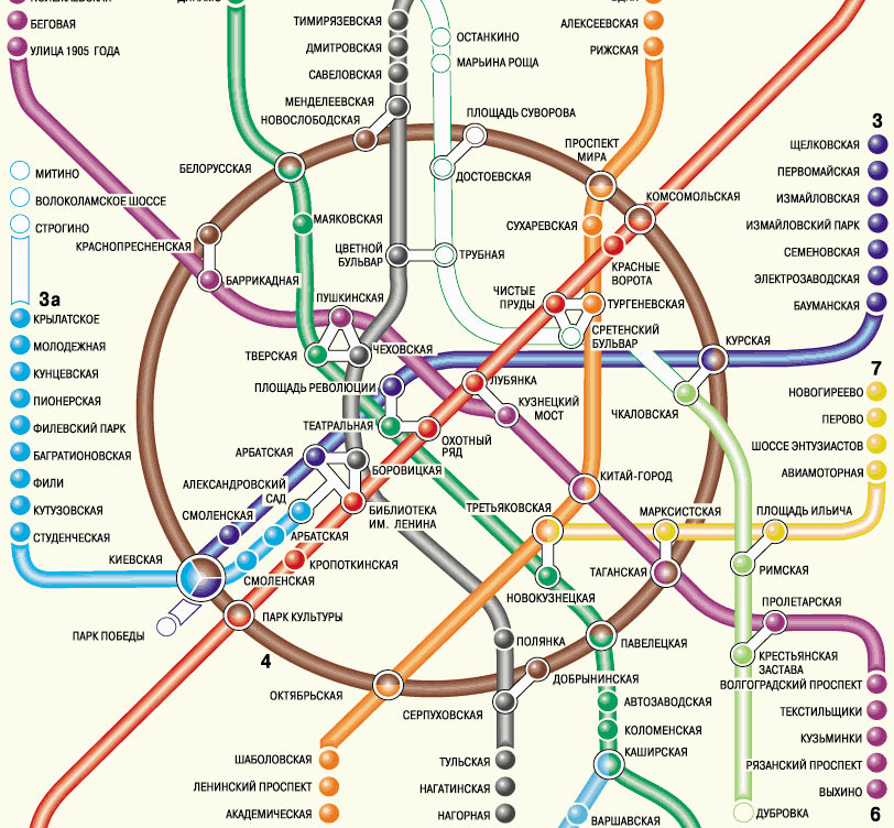
The main feature of the Moscow metro map is the Circle line. It doesn’t fit the Beck’s language, but it’s very important to Moscow. This is not Moscow:

This, on the other hand, is:
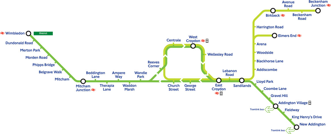
London also has Circle line, but it has never been depicted as a circle. Today, it’s not even a closed loop:
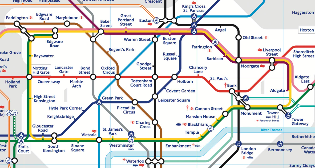
These Circle lines are large elements and form the overall image of the map.
But little details also influence the perception of a map.
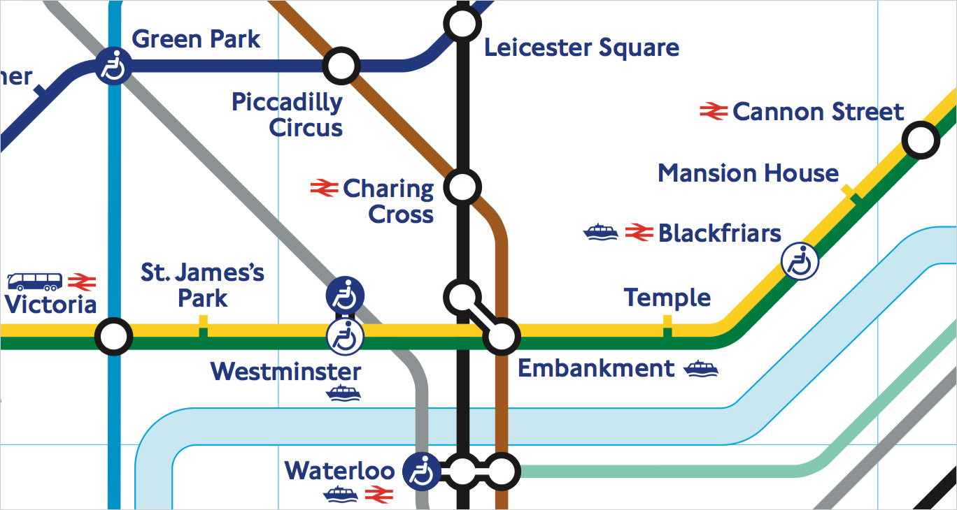
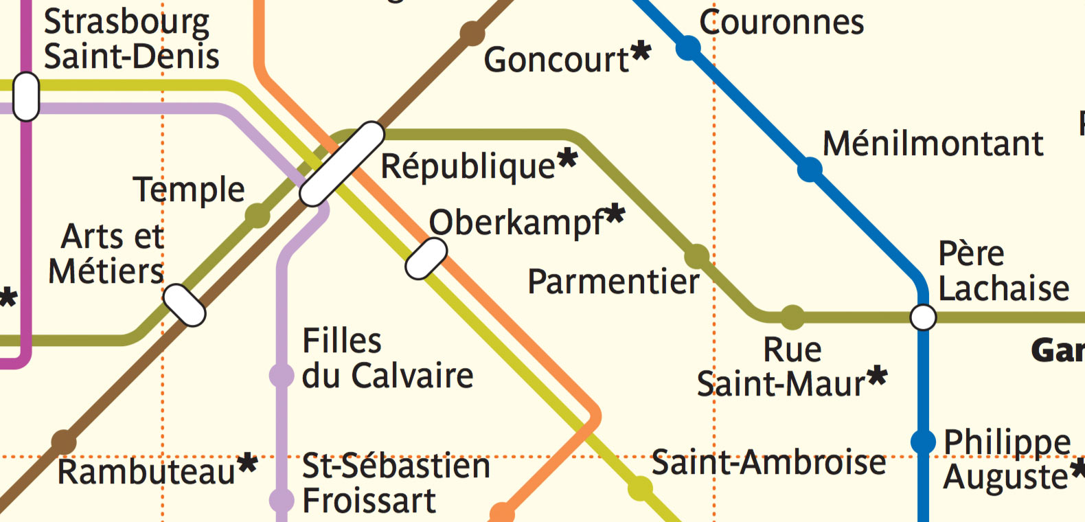
In London, the black rings of the transfer stations are noticeably thinner than the lines. The “corridors” are of the same width. The stations’ ticks are square, stick out at 2/3 of a line’s width. The names are typeset with blue New Johnston:
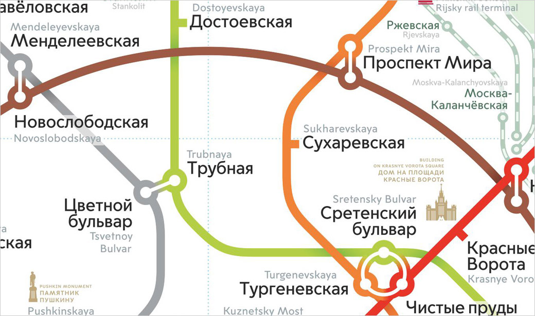
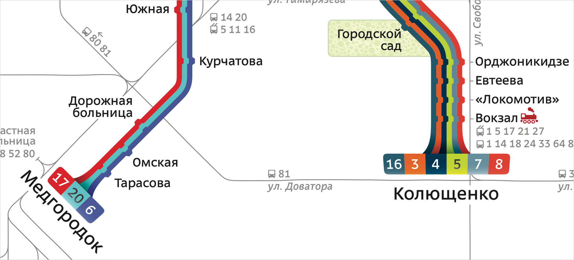
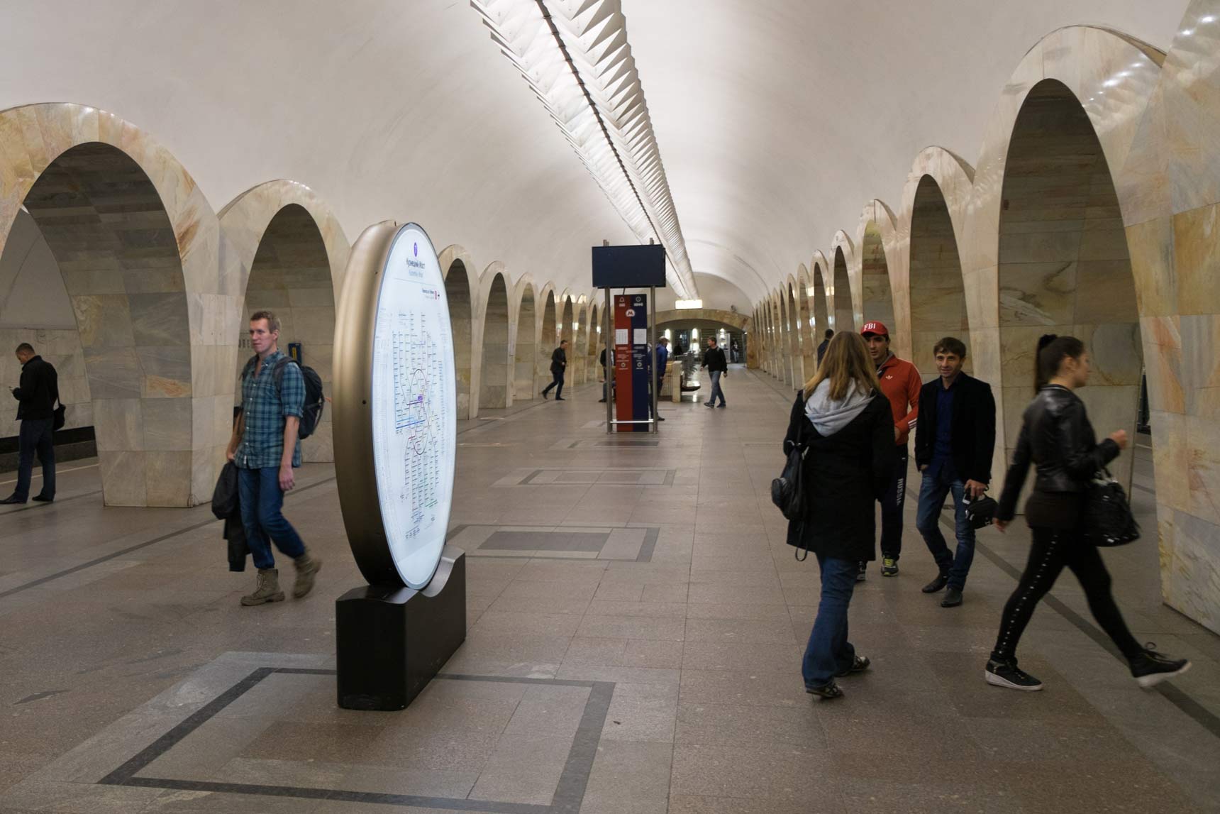
In Moscow, the fat rings of the transfers are coloured with their line’s colour. The “corridors” are much thinner and have a gradient. Some transfers are circular. The station ticks stick out at full line’s width. The names are typeset with black Moscow Sans:
Look at this tram map:
It’s obvious that it’s a London tram map, not some other one. It follows the London transport graphic design standards — the rings, the ticks, the captions.
When we see the beige background, the particular palette of the lines, the filled station disks and the distinct designation of the transfers, we immediately recognise the Paris map:
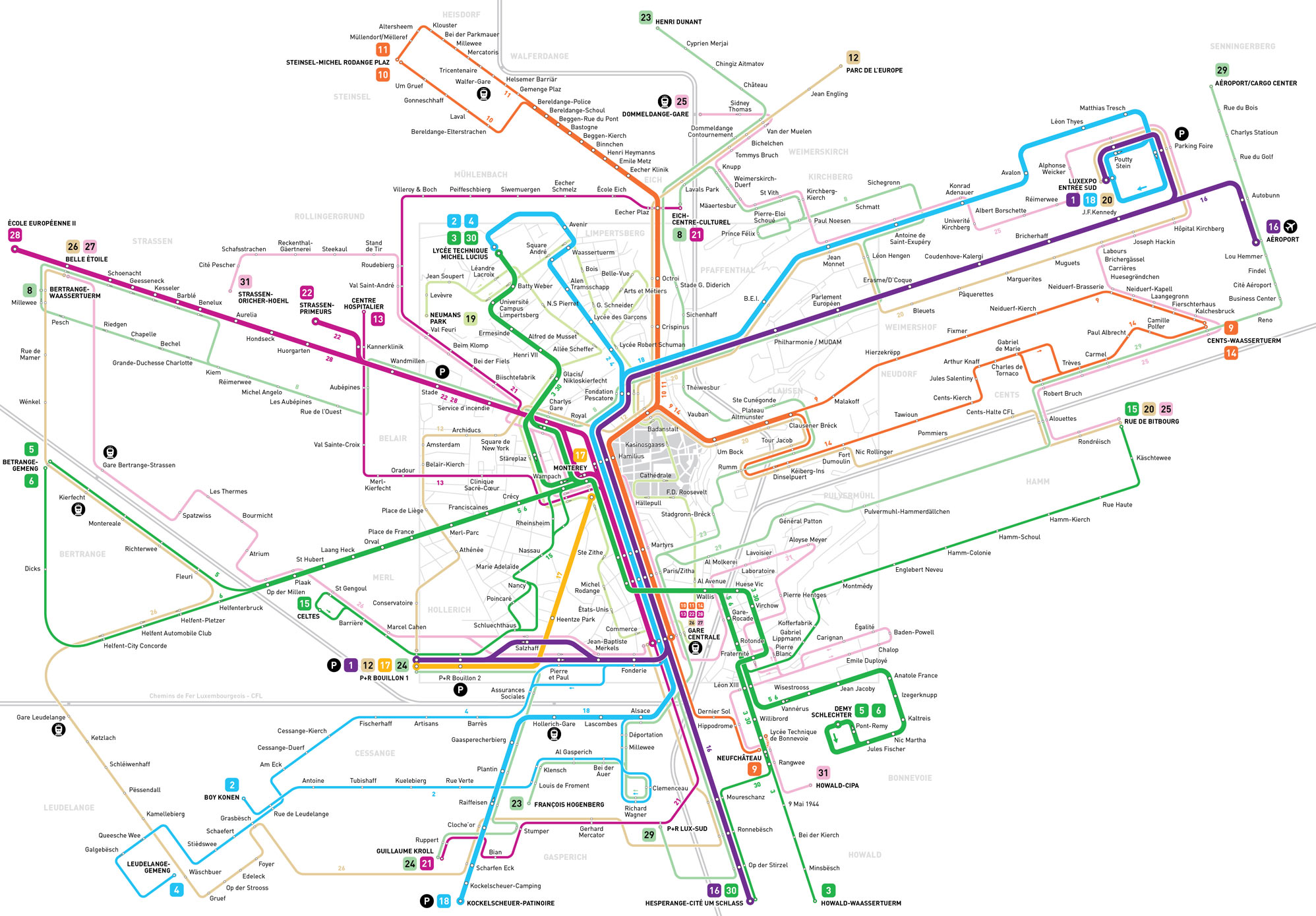
Jug Cerović follows an unusual 18-degree angle grid in his Luxembourg map. If you saw it once, you recognise it every time:
For the Chelyabinsk trams map we’ve come up with these 3D terminals:
Why are they like this? The only reason is that we wanted this map to look special.
It is not enough for a good transport map to just answer the question “how to get there”. Since it is used everywhere, it is part of a city’s image. And if its design is powerful, it influences the city in other ways.
The Moscow’s Circle line in has inspired designers to create these beautiful wayfinding steles:
The round designations of the New York subway train routes are used in all the signage and have even made it to the dots above i in the pedestrian city maps (in the classic Helvetica these dots are rectangles):
And in London, the Tube Map has given birth to the graphical language of all the transport-related signage:
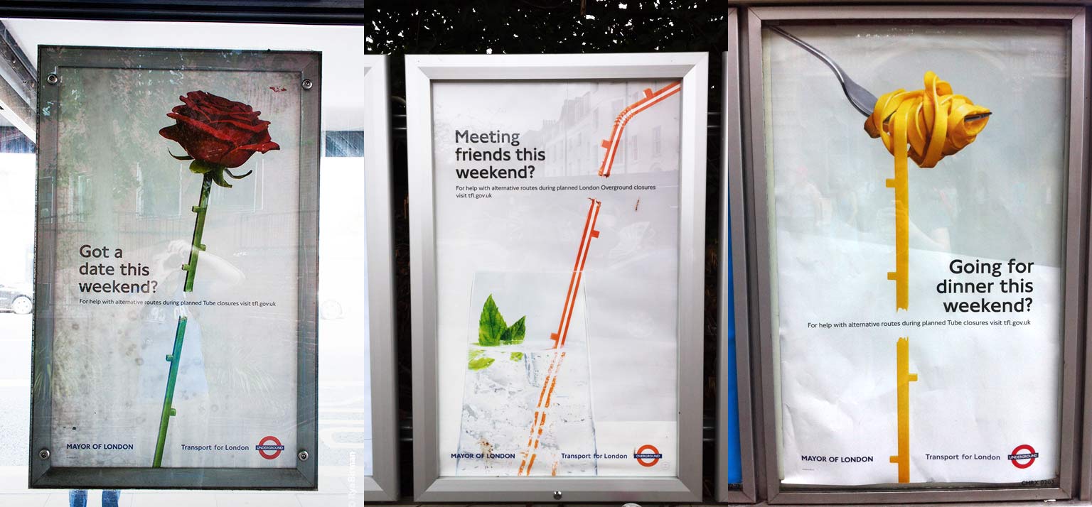
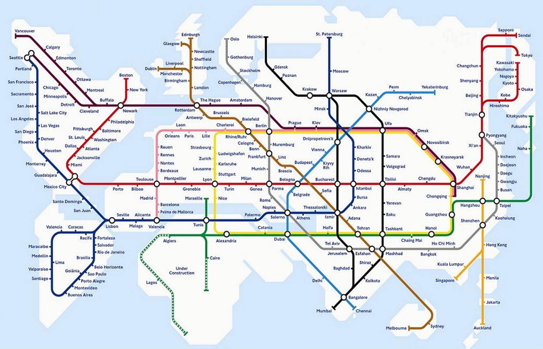
This graphical language is so iconic that you can even buy all sorts of souvenirs with its elements: t-shirts, umbrellas, shower curtains. This design has spread not only beyond the Tube, but beyond London. There are all sorts of maps done in this style:
Strong graphic design of the transport systems makes them more attractive. This helps cities get rid of private cars. People spend more time outside, interact with each other. This gives small businesses a boost and makes cities more pleasant to live in.