In Sayve 1.3, we added the ability to display a badge with the number of unsorted audio recordings:
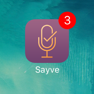
This is for those of us who don’t like their audio recordings to pile up. Actually, we wanted this in 1.0, but it didn’t get there. Why? It wasn’t that easy to design.
OK, this must be laughable: what even is there to design? The badge is a system feature that has a fixed look, just take it. But you can’t.
This is going to be a long and boring post, by the way.
Since iOS 10, displaying a badge requires an app to have asked user’s permission for sending notifications. So if we just tried to just show it, the user would see the system dialog asking for the permission.
We already ask for two permissions on first open: microphone and speech recognition. For iOS these are two separate things, unfortunately. Before asking, we show this screen:
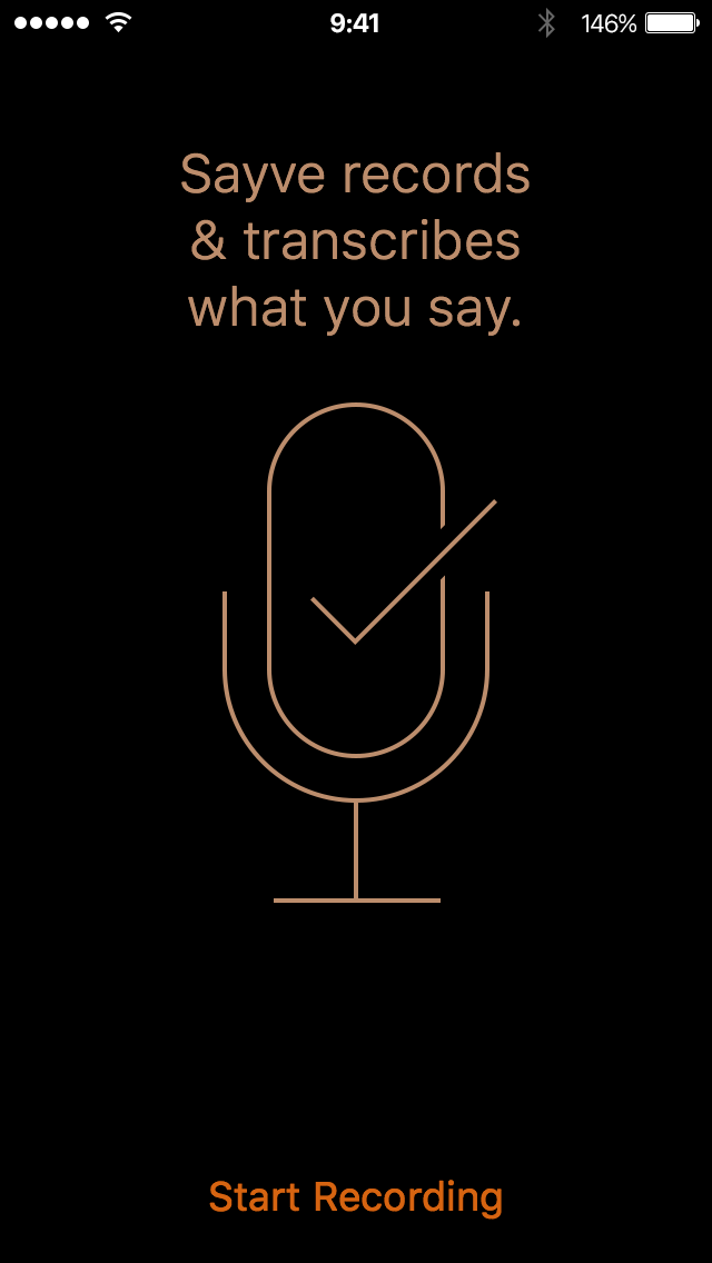
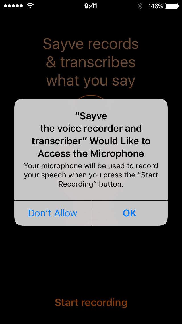
This prepares the user for the system questions and helps us get a “Yes”. Microphone:
Speech recognition:
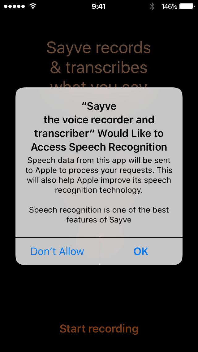
Notice that we can also add some of our own text in these dialogs to explain why we are asking for these permissions.
We could add a “tutorial” screen before asking about notifications: explain that we are going to display a badge and only then ask for permission. But adding another such screen and third permission question would make the first-launch experience really clumsy. And what’s more important, many users would still presumably press “Don’t Allow”, because at first launch they have no idea about how they would use Sayve and why a badge might be useful to them.
And what should we do if the user answers “Don’t Allow”? You can ask for a permission only once. How would the user even know they could change their mind later? For comparison, when the user answers “Don’t Allow” to any of the two sound-related questions, Sayve just cannot work, and we show this screen until both permissions are given:
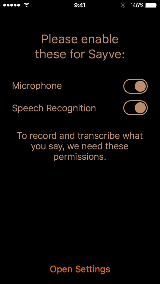
We can’t do the same for the badge permission, because the badge is not necessary, it is just a preference. Some users would like it, others would not. So if the user says “Don’t Allow”, we would need to explain how to enable the badge later. But where and when? We don’t even have an About or Settings screen.
We could go and add a Settings screen just for this one setting. See how this is getting complicated?
Adding in-app Settings screen makes little sense: iOS already has notifications settings, and this is the only “notification” feature we use. So the next idea was to make this setting configurable only in the Settings app:
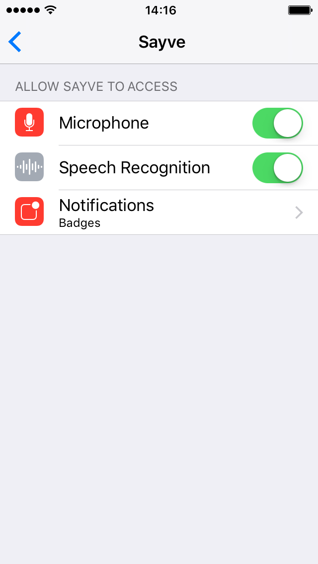
Let’s just display a badge when the user has enabled notifications. And we could explain this option in the app’s description.
This also didn’t work. Turns out, you can’t just put this “Notifications” element to the apps settings screen quietly — it would only be added there after your app has asked for a permission. So we have to ask for a permission even to get a “No”! By the way, the question starts with the text “Sayve Would Like to Send You Notifications”, which is not true:
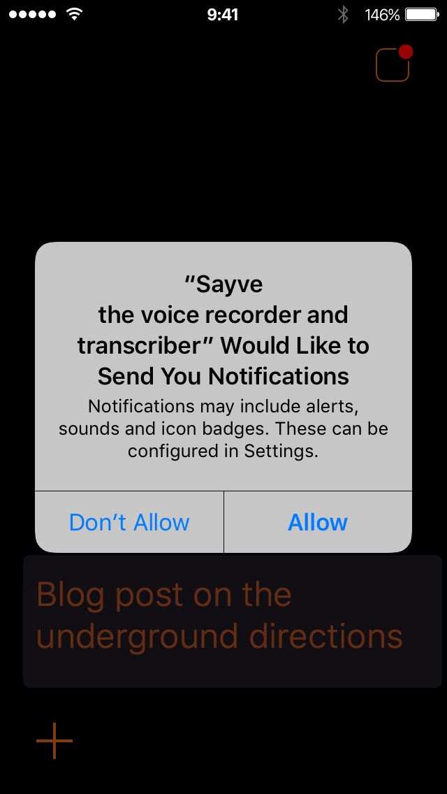
We would not like to send any notifications, and we don’t even have them. As to the badge, we just can, but not would like to use it. To make things even worse, in this dialog, unlike the two previous ones, you cannot even put your explanatory text.
But this is not something we can change: the question is asked by iOS, not us.
So we added this icon to the top right corner:
The idea was: when the user taps this icon, we would first ask if the user would like to see the badge, and if yes, we’ll ask for the system permission to enable notifications. And we would remove the icon then.
Do you think this worked? Of course not. What would we do if the user declined the first time? There would no way to add the notification permission setting to the system Settings app then. So we cannot ask the user if they want a badge, we must just tell them that the notification permission dialog will follow and it is there to display a badge if they want.
So, in 1.3, when you tap the icon in the top right corner, you’ll see:
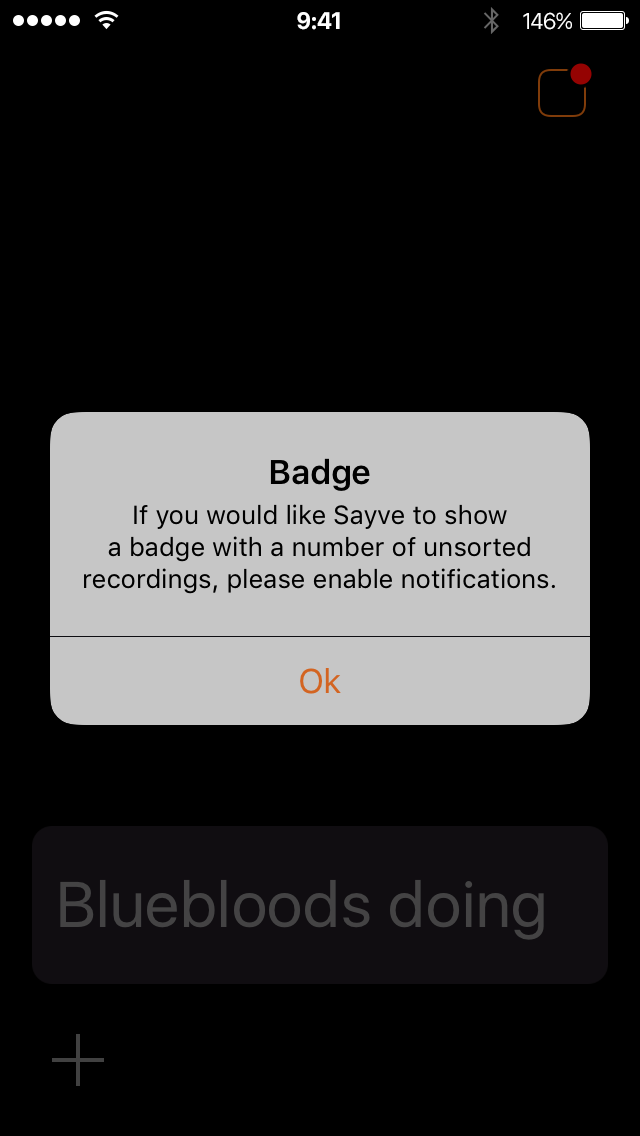
And after you press “OK” (which is misspelled as “Ok”, unfortunately), you see the actual, system notification permission dialog where you can decide whether you want the badge or not.
After having shipped this, we see that it’s better to say “Continue” instead of “OK” in the box above, otherwise it may seem to the user that they have no choice.
Is this the best design of a feature? I don’t think so. But that’s the best that we could come up with given the system limitations that we have.
We hope you like Sayve (we are Mihail Rubanov, the developer, and myself).
The button: