“Polytech” writes about scientists with disabilities and shows this cover image:

It’s a widespread design flaw: you put a set of similarly-shaped pictures of people side by side, but forget to adjust the scale of those pictures, and they end up very different.
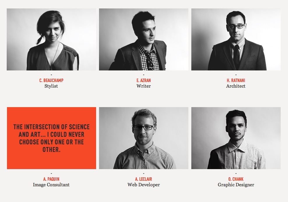
It’s more neat when all faces are the same scale (colour, lighting). Minor differences in perspective or headdress can add a touch of life:
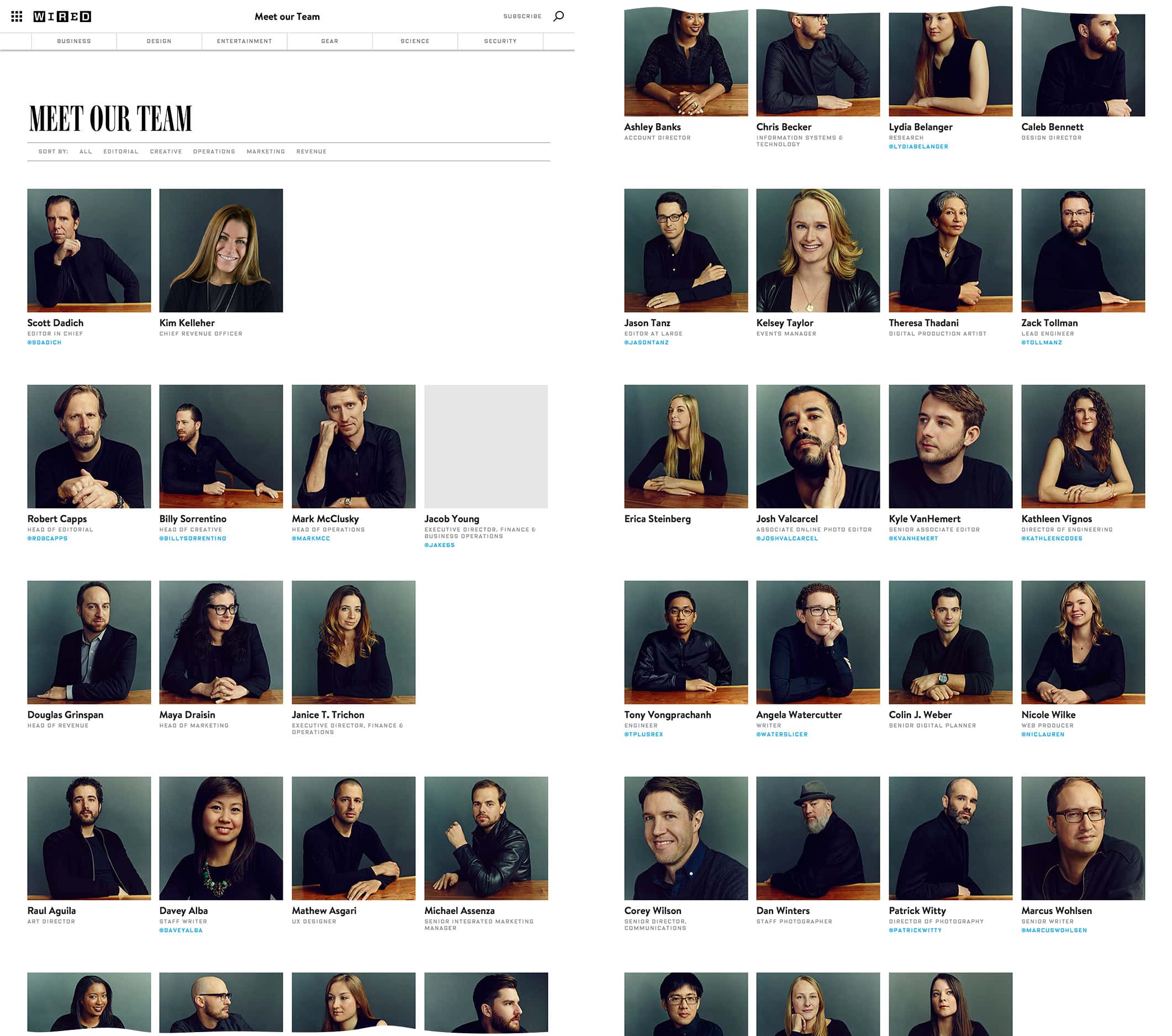
“Wired” once broke the rule of scale, but they put everyone at the same desk, dressed them in black, and colorised them in the same cinemtic teal-orange: