The new version adds the new Circle Railway (not to be confused with the Circle Line):
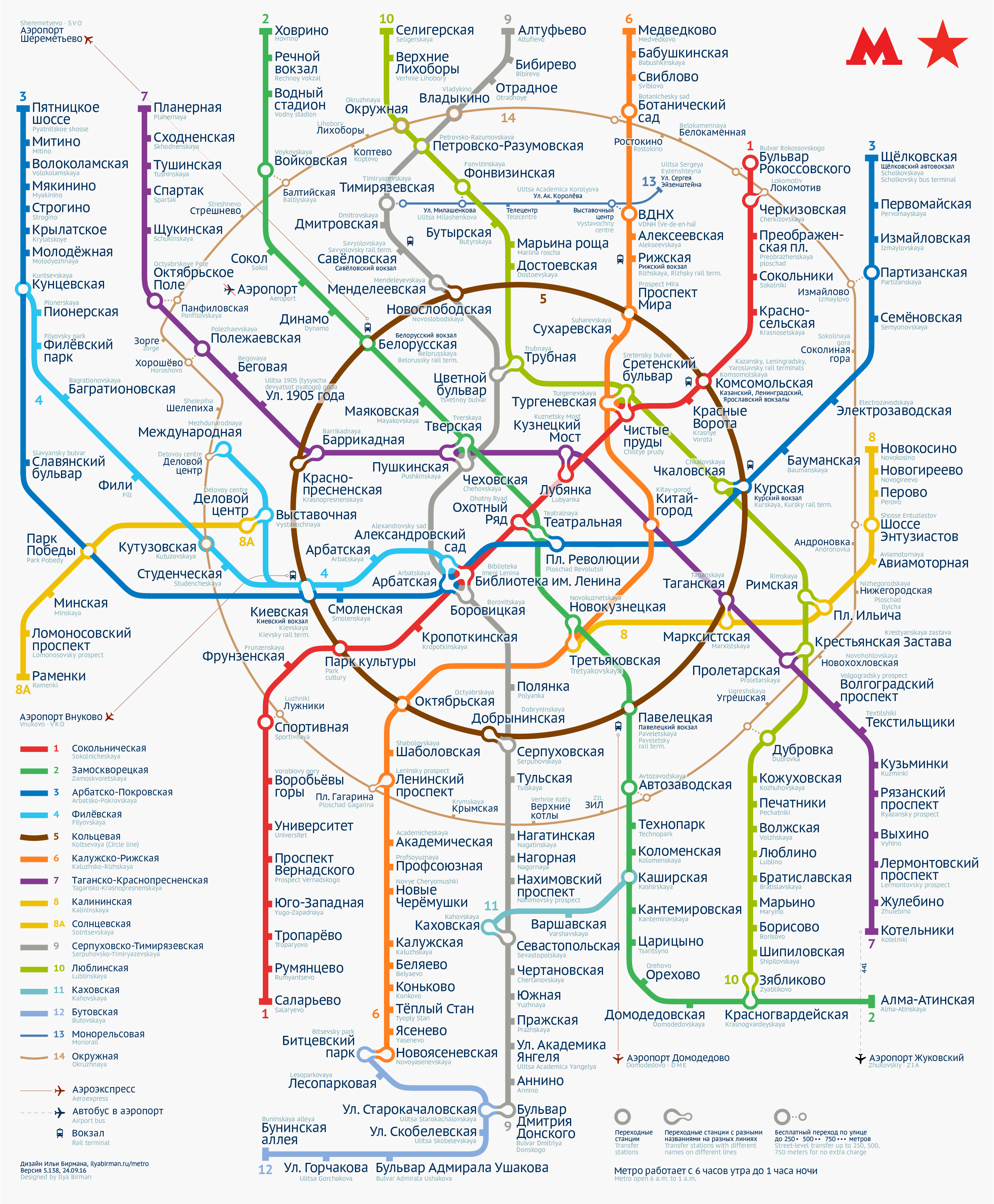
The even distribution of stations is maintained: there are no “holes” on the map. The Circle Railway is made of concentric arcs:
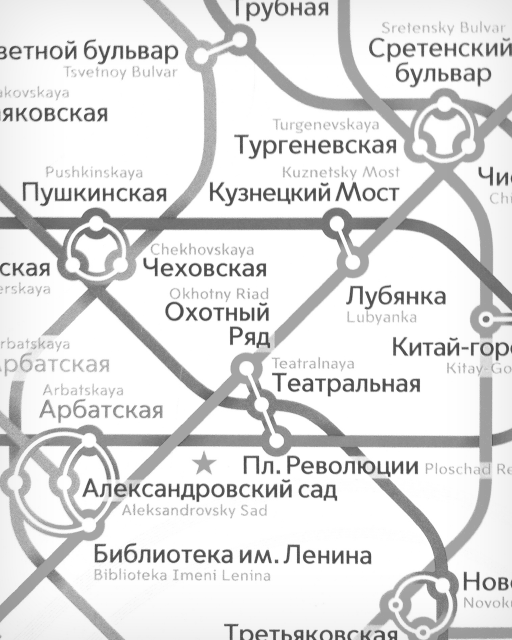
Compared to the official map, this map has almost 35% larger font when printed as same-size poster:
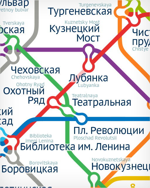
Some interchange stations on the Circle Railway are not “real”: you have to exit, walk and re-enter (no extra charge):
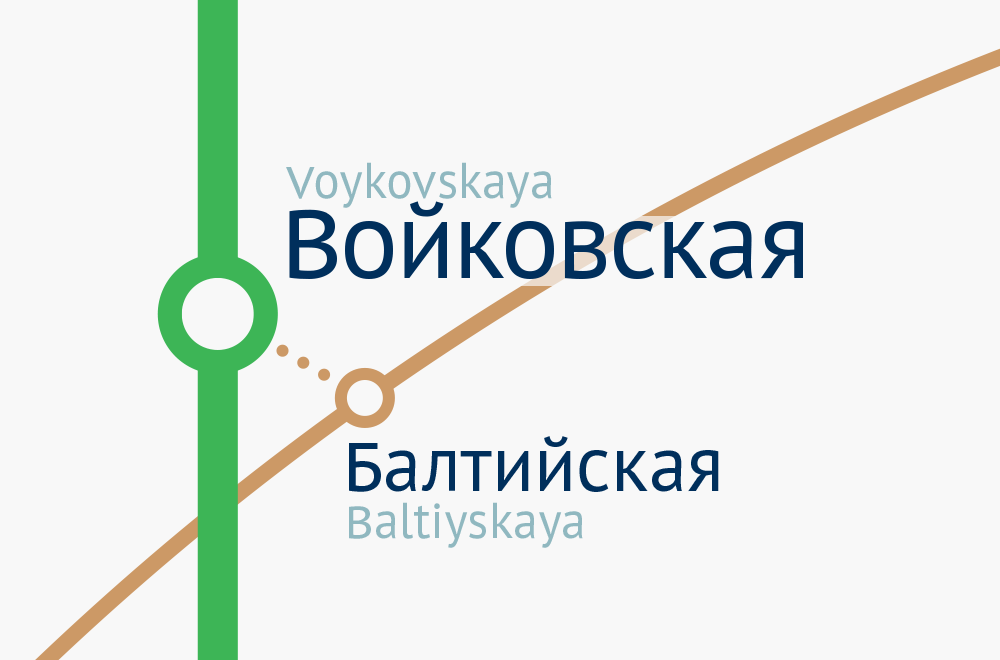
The distance to walk is denoted by the number of dots:
Earilier in Version 2015: perfect balance witin the Circle Line, getting rid of the “shelf” on the left, large text, PT Sans Metro font, beautiful transfers.
In Version 2013: simplicity and unambiguity of transfers, reduction of visual clutter, the gridless index and accessibilty for the colour-blind.
Ilya Birman
Designer
Ilya Kharitonov
Assistant