The revolution in the mobile user interface
It’s about time to flip the mobile user interface vertically.

It was easy to tap “Back” or “Edit” with your thumb on the original iPhone. On iPhone 5, it became harder. Since the 6, it’s almost impossible.
Apple has added two features to make things less bad. The first was a gesture where you slide from the left edge of the screen to get back. The second was Reachability, where you double tap the Home button to make everything on the screen shift down so you could reach the top row of buttons. This already felt like a duck tape fix.
The question is: why put buttons on top and then add obscure gesture to reach them when you could just put the buttons on the bottom in the first place?
Windows Phone has the browser’s address bar on the bottom:
Apple, when will you do the same?
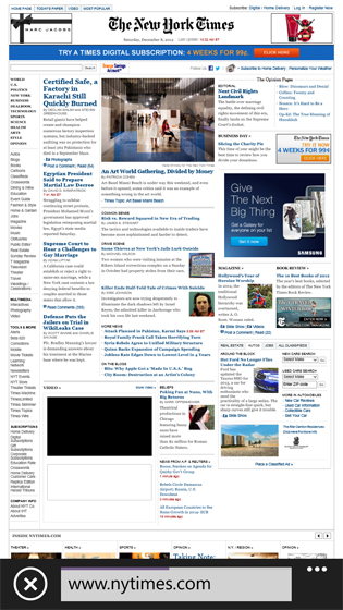
It’s interesting that the revolution has already happened in Maps. Before and after:
The search field and results have moved to the bottom. Why did this change only in one app?
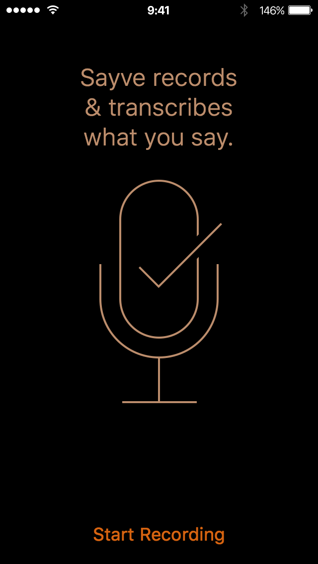
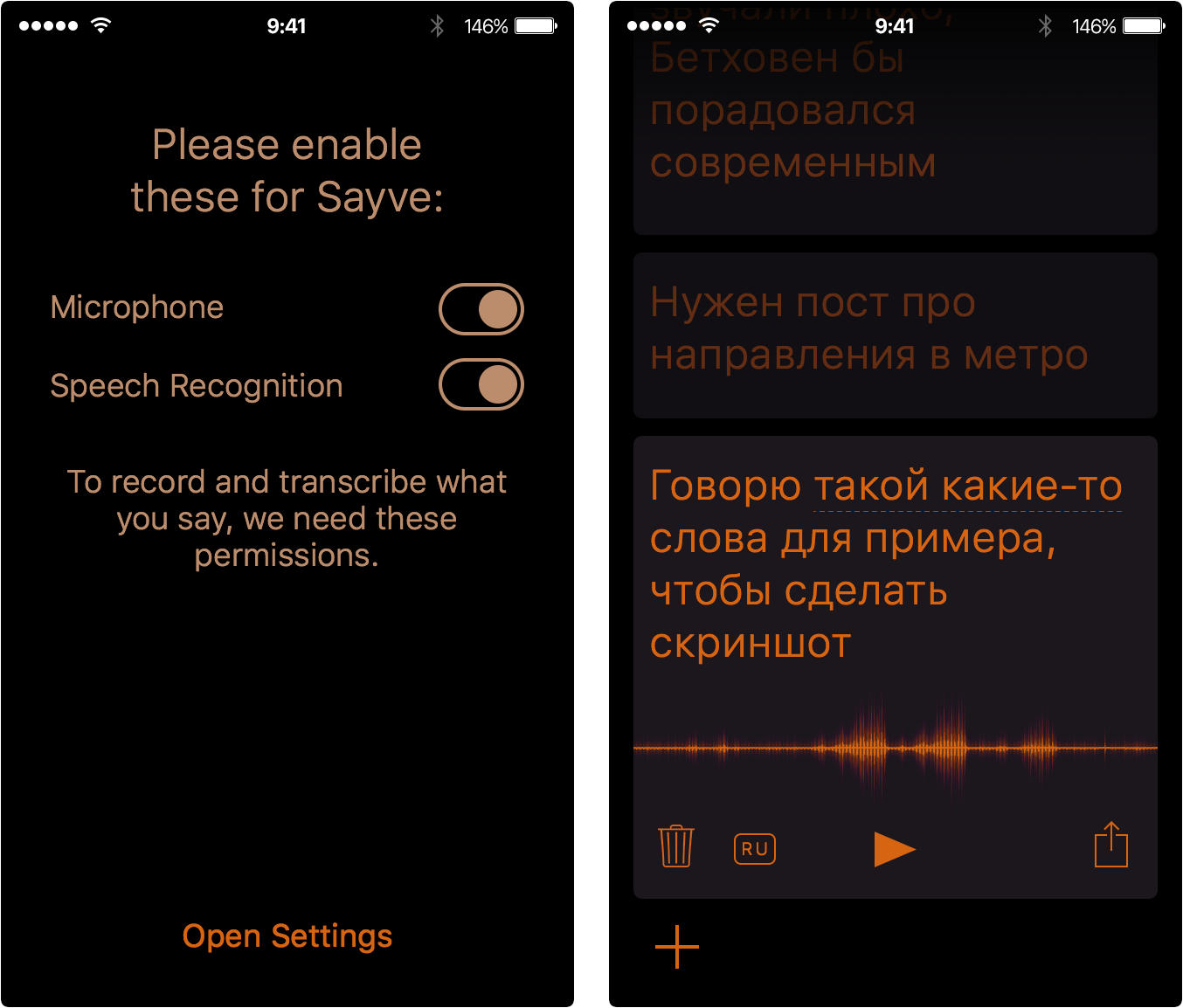
We’ve designed Sayve, the smart voice recorder so that all the important controls are reachable. A couple of intermediary user interface layouts:
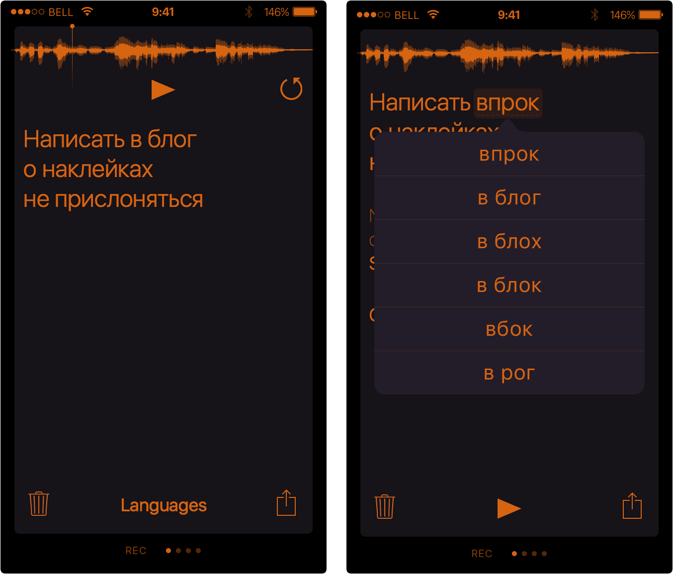
At first, the audio controls were on top (the left layout). Then it moved down (the right layout).
Finally, all the user interface changed to gravitate towards the bottom:
I’m hopeful that Apple will do something similar throughout iOS 11.
When you turn the things upside-down, you may not like the result aesthetically at first. But our idea of what’s beautiful is largely formed by the technology.
The rule: in the mobile user interface, put the controls on the bottom.