The dark secret of yellow
The dark secret of yellow is that there’s no such thing as “dark yellow”. Many designers have technical background, and so they fail to acknowledge this fact.
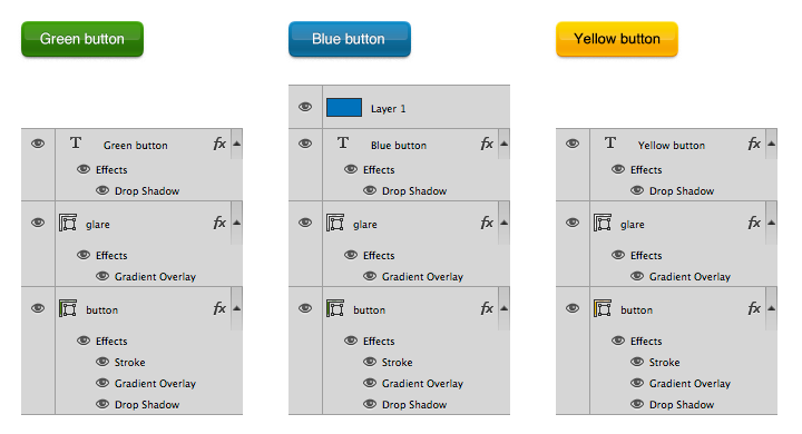
Let’s say we need to create a series of color buttons for some UI. I’ve started with a green one and then quickly made a blue one. Here are the buttons and the way they are constructed:
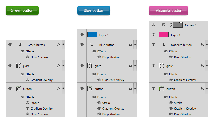
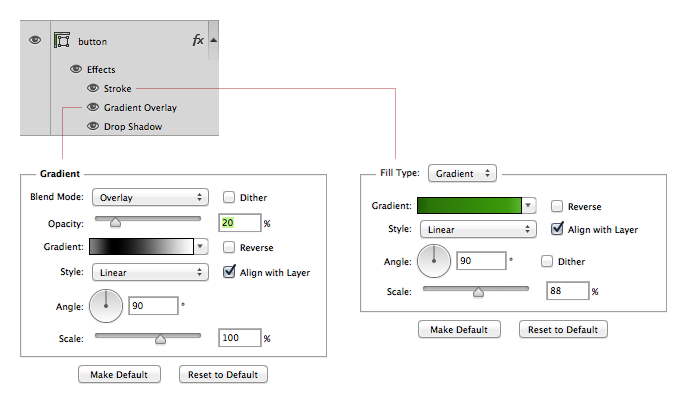
As you can see a blue button is just a green button with a blue Hue layer on top. And the Magenta button also has an adjustment Curves layer, because otherwise it looks too dark. The bottom two layers are all identical. The base one is a green fill layer with a gradient overlay for button not to look flat and a gradient stroke for sharp edges:
So you can make a button of any color by just adding a Hue and an optional Curves layer, and it will look OK.
Unless it’s yellow:
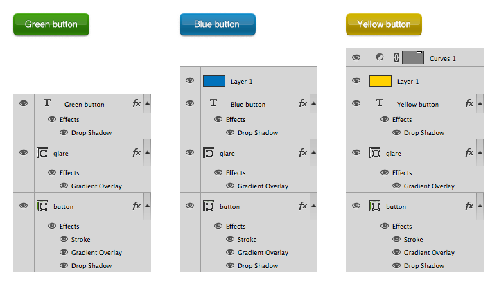
If we use this method to create a yellow button, it will look like shit (literally, sometimes). Let’s be honest, It’s not yellow, right? And no Curves will make it look good.
Here’s another take on the yellow one:
Now this is yellow. The button was re-made from scratch. The base layer is changed to yellow, but the main change is the change in the gradient overlay:
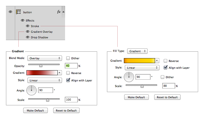
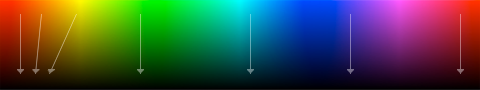
It’s not black and white anymore, it’s red and white. The problem with a black and white gradient is that it will try to make a “dark yellow” color which is not yellow at all. The darker you want yellow to be, the more you should shift its hue towards red:
For the button’s body I’ve used a red gradient overlay, and it worked fine. As of the egdes, I’ve just hand picked colors for the new gradient stroke. I’ve also made the glare twice more intensive, because otherwise we’d barely see it. Oh, and the shadow of the yellow button is slightly lighter, because otherwise we’d percieve it as too dark.
Let’s take an eyedropper and see which hues are there now:
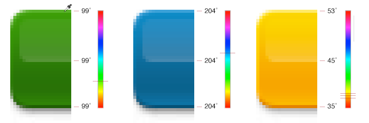
The yellow button has different hues, but looks good. So maths isn’t always your best friend, unfortunately.
I have to point out that every button can be made better by hand-picking colors instead of relying on maths. But while for most colors shifting hues works rather fine, for yellow it’s absolutely unacceptable.