UI Museum: Norton Commander 5.0
All screenshots for this post were made by Rakhim Davletkaliev.
The main interface
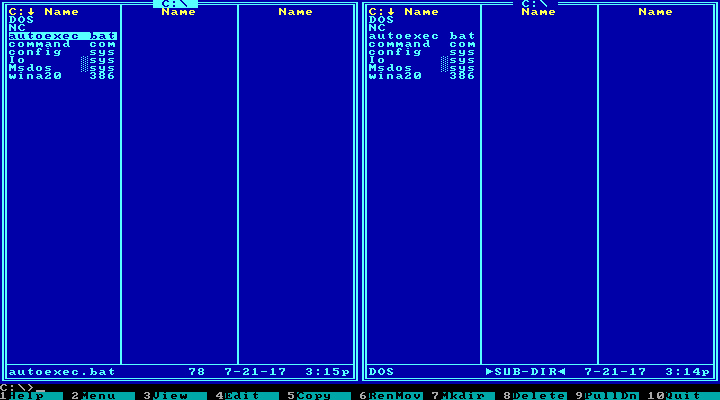
The canonical view of two directories in the Left and Right panels:
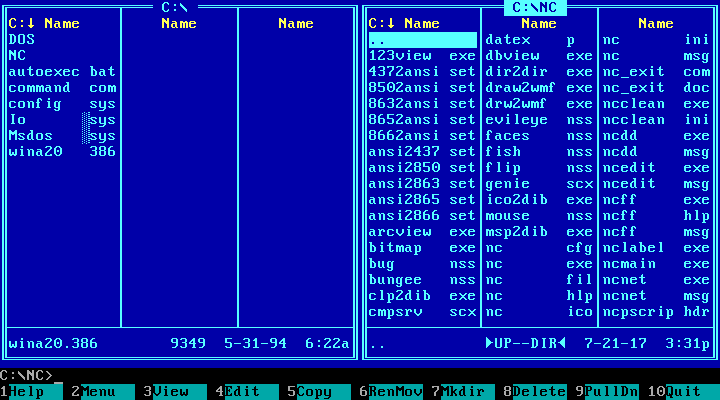
The right panel is active — you see the cursor and the highlighted path in the title. Use arrows to navigate the files. Change currently active panel with Tab.
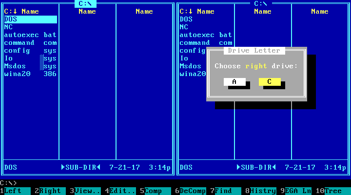
Alt+F1 or Alt+F2 changes the displayed volume in Left or Right panel respectively:
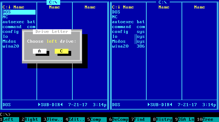
MS-DOS uses drive letters for volumes, and the letters A and B are reserved for the floppy drives. Most computers had just one, and then the main hard drive was C.
Hide the panels with Ctrl+F1 or Ctrl+F2:
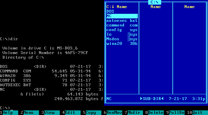
In MS-DOS, the filename’s length is limited at 8 characters, and the extension, at 3. The dot between the file’s name and extension is not shown. Unlike the command prompt, Norton Commander displays filenames in lowercase letters and directories in all-caps. There is a special halftone pattern separating the extension of the system files like Io.sys and Msdos.sys (also they have their first letter capitalised).
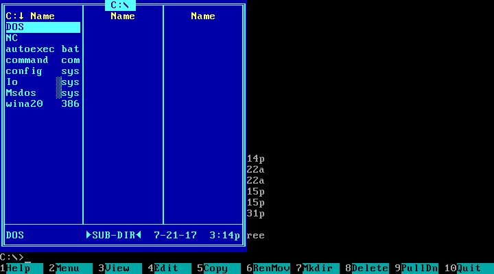
Ctrl+O hides both panels, for work with the MS-DOS prompt:
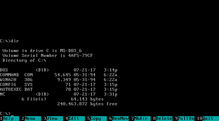
The main menu
The main menu is the one displayed on the bottom, with keys F1 to F10 mapped to the most-used functions.
F1 for Help was a standard for many MS-DOS programs. I’m not sure if Norton Commander originated it.
F2, User Menu. The items can be programs for quick access. Here, the User Menu is empty:
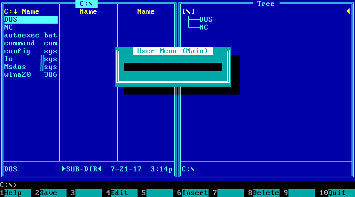
The user has to edit a text-based configuration file to add items to this menu (press F4 while in this F2 menu):
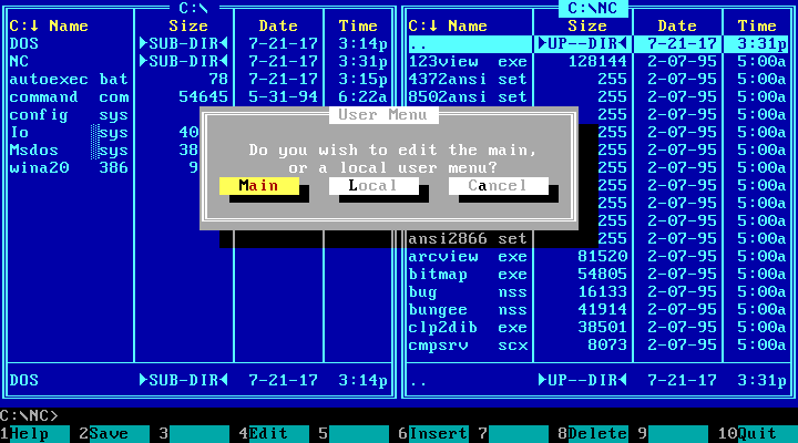
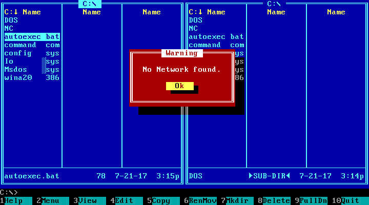
The main panels are blue, the menus are cyan and the dialogs are grey. Unless they are error messages:
F3, View. Opens text view of the currently selected file:
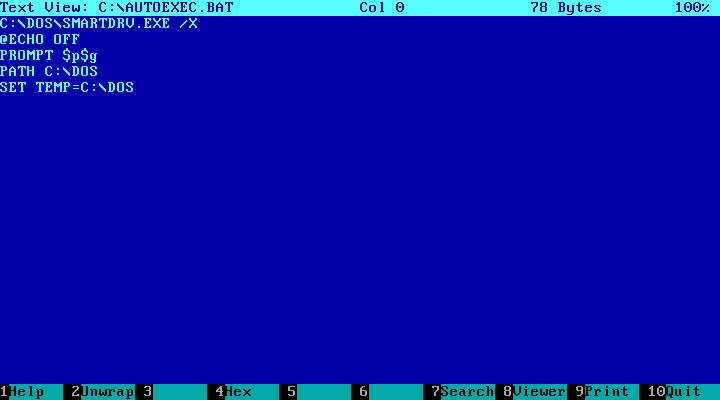
Of course, for executables it shows “garbage”. But as far as I remember this version has the ability to set up external file viewers, so you can make it display images as actual images.
F4, Edit:
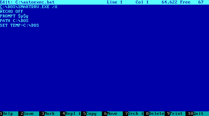
See the Mark item in the main menu inside the editor? It has something to do with a clipboard. There was no system-wide clipboard, of course, and the programs that had this feature used very different keyboard shortcuts for it. In Turbo Pascal 5.5, I remember, there were crazy combinations like Ctrl+K,B and Ctrl+K,K.
F5, Copy:
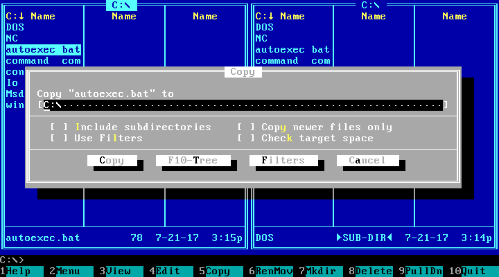
The Copy command opens the Copy dialog where the user enters the destination path. The input is pre-populated with the name of the directory in the opposite panel, and normally the user doesn’t edit it.
F6, Rename or Move (shortened to RenMov in the menu line):
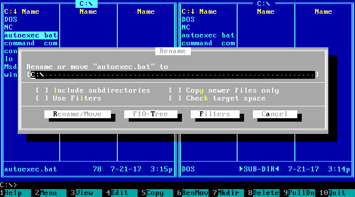
Why Rename or Move is one command? Because from the system point of view it’s the same: while you are within the same drive, it just changes the full name (i.e. including the path) of the file. Again, the input is pre-populated with the path of the directory in the opposite panel, so just press Enter to move there. Or type a name instead of the path to rename the file in-place. Or add the new name to the end of the path to move and change name at the same time.
Moving between volumes involves actual copying and then deleting the original, but it was also done with this menu.
F7, Make Directory:
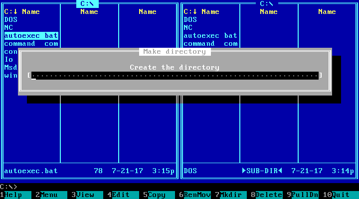
Interestingly, the window has no confirmation button, unlike the previous ones. Just press Enter. Also notice that in the main menu bar it’s called Mkdir, not MkDir. Why? Probably, because that was the name of the MS-DOS system command to make a directory.
F8, Delete. No question mark:
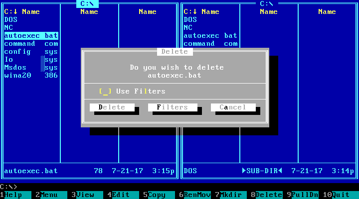
Before invoking the file operations like Copy or Delete, you could select many files with the Insert button, and they would display in yellow:
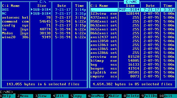
When files are selected, the bottom line changes to reflect this state.
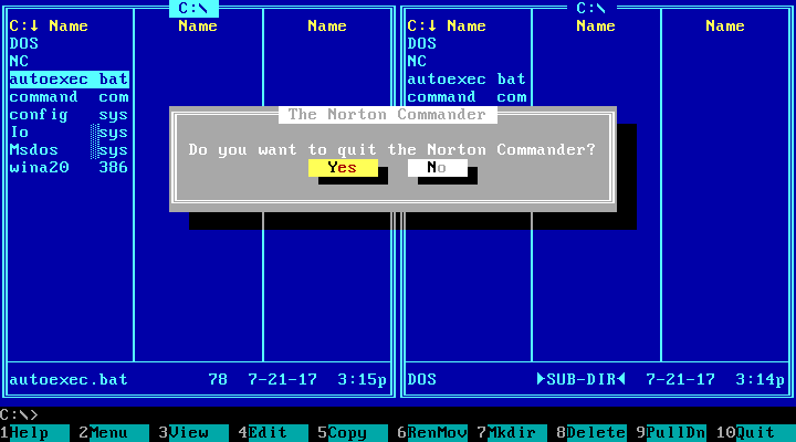
F10, Quit:
The pull-down menu
The top menu, or the “Pull-down menu” is shown when the user presses F9 (or clicks the top line of the UI, if your computer has a mouse).
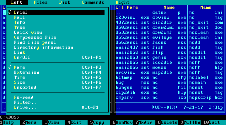
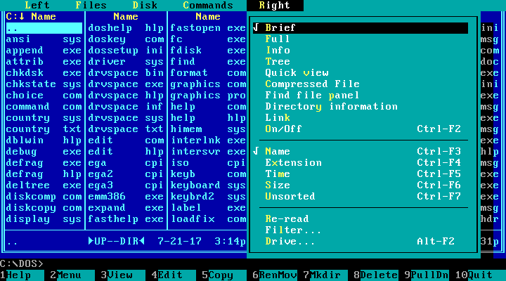
The Left menu sets up the Left panel. You may see many options of what to display in the panels, then how to sort it and more:
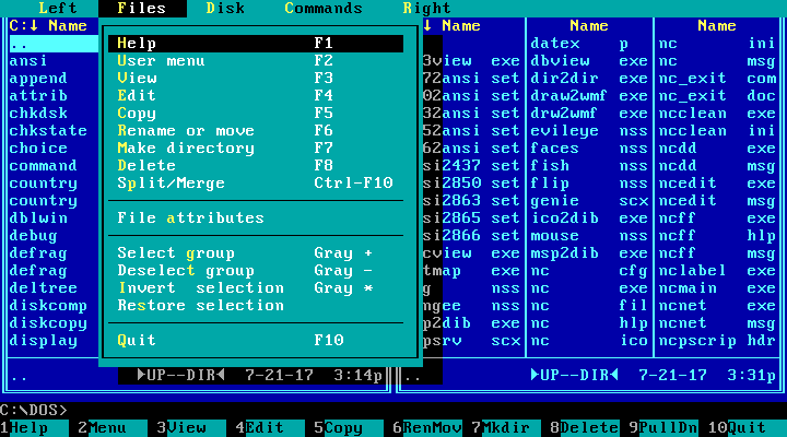
The Files menu lists many elements that have nothing to do with files, including Quit — not dissimilar to how the File menu is used in today’s applications:
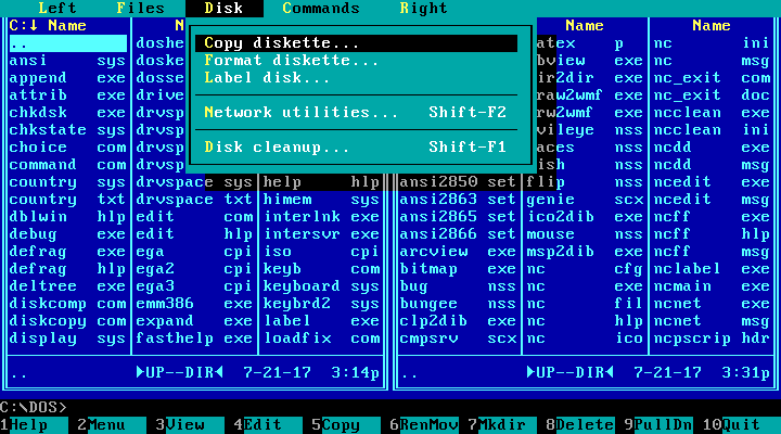
Disk:
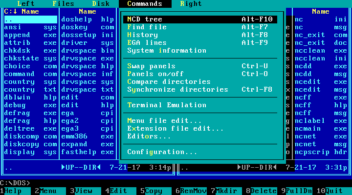
Commands:
Right, same as Left:
Panels setup
As you see in the menu, the panels could display a Brief or a Full view. The Brief view just shows the files, in three columns (as in the previous screenshot). The Full view shows one column of files with details:
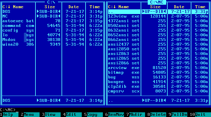
In this mode, each line looks exactly like the bottom line in the panel, so why not just remove it to show two more files?
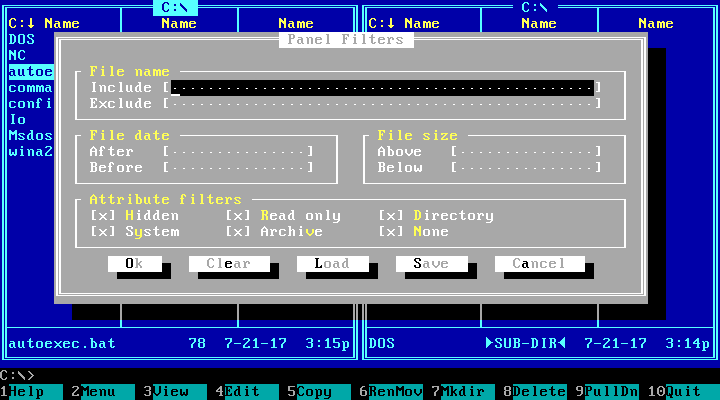
You could also set up file filters:
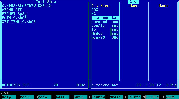
Use a panel for file preview:
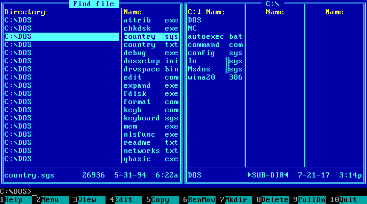
Or for search results:
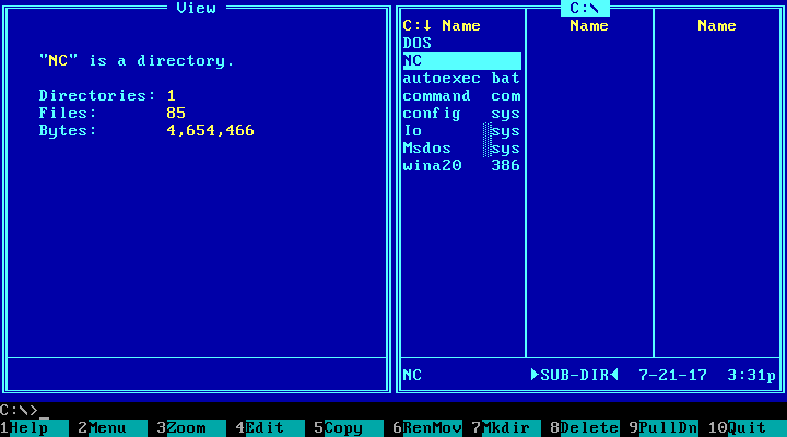
Or for item information. Directory:
File:
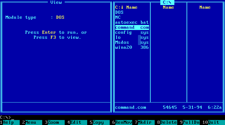
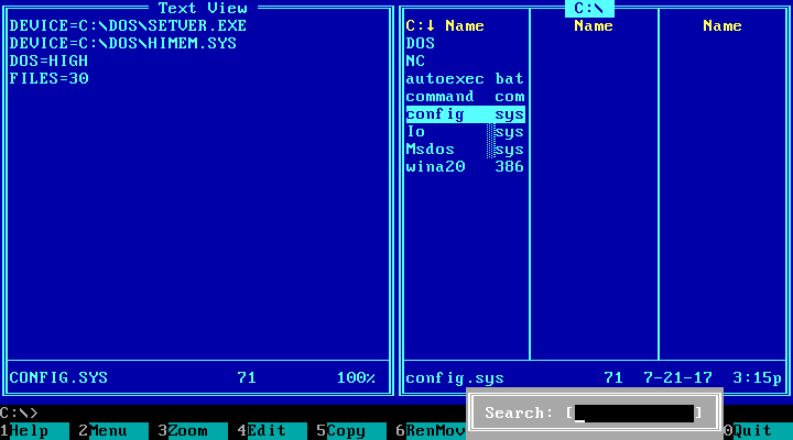
Go to file (in the current directory) by typing a couple of letters of its name:
Other dialogs
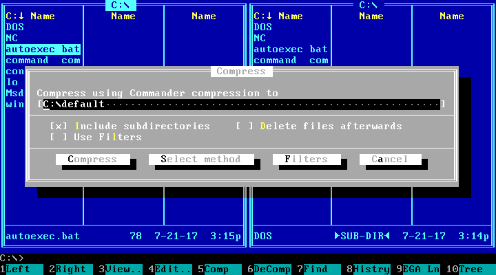
Compress:
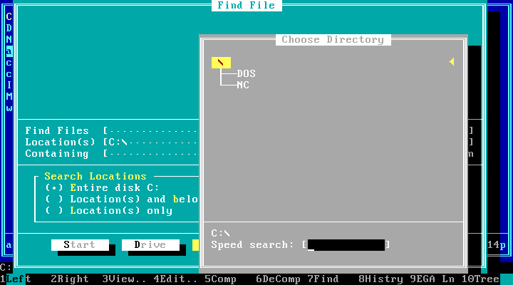
Find File. The dialog windows that have other dialog windows inside, are cyan, not grey — for contrast:
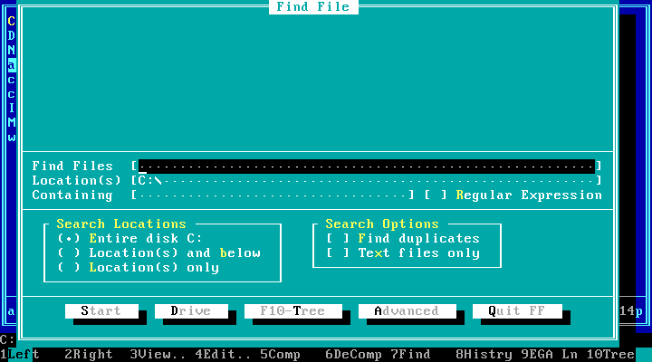
The inputs are shown with square brackets and dots between them. The focus is shown with a black background. Advanced search options — this window is grey:
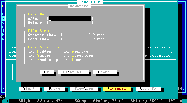
Notice how checkboxes differ from radio buttons.
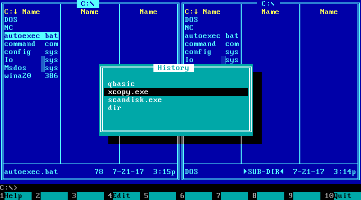
History:
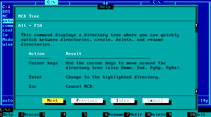
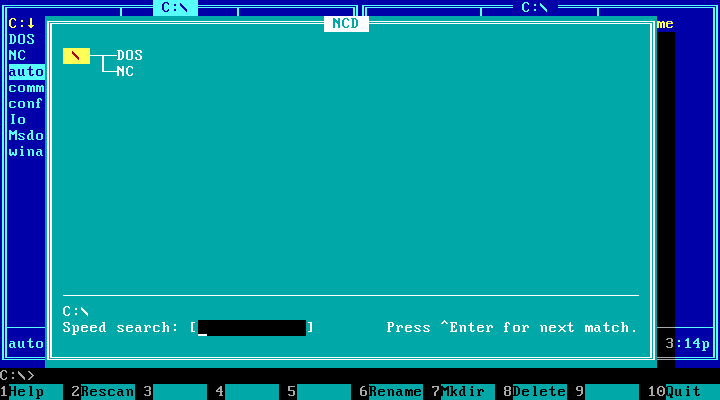
NCD (Norton Change Directory? I’m not sure), a fancy way to navigate the folders on your disk:
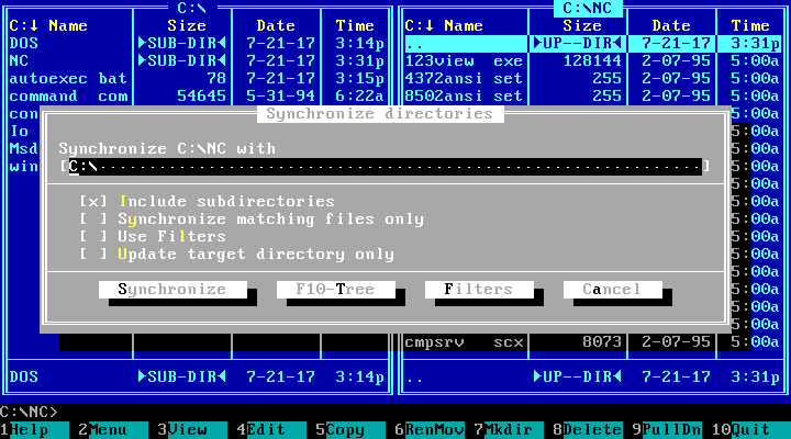
Synchronise directories:
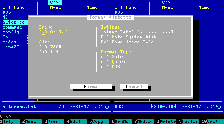
Format diskette:
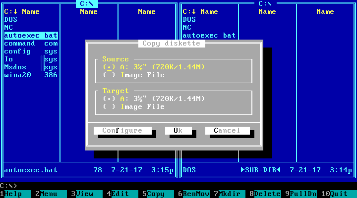
Copy diskette:
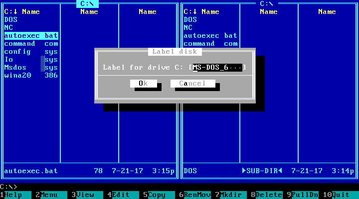
Label disk:
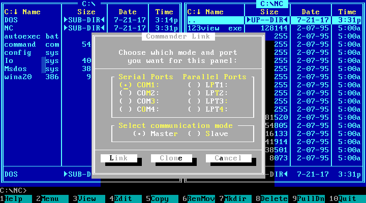
Commander Link:
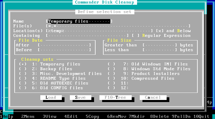
Commander Disk Cleanup helps find files to delete:
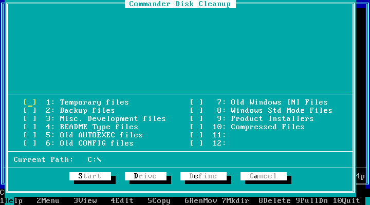
Honestly, I don’t remember this feature at all (but I didn’t use Norton Commander at that time because there was DOS Navigator, which is a whole different story).
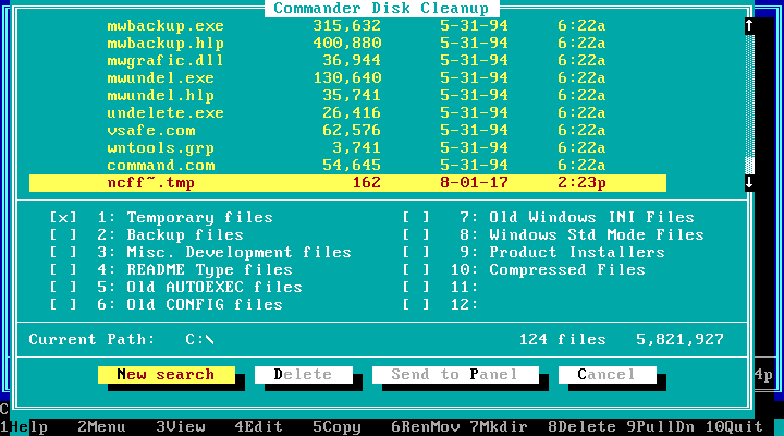
Found something. Here, files are displayed with the dots in the names:
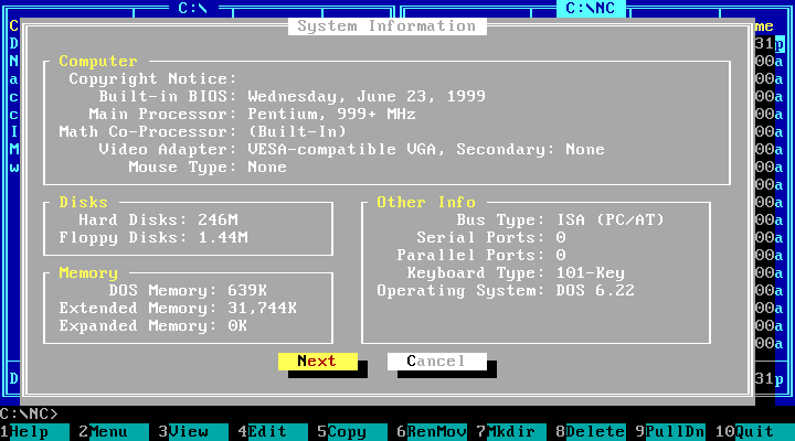
System information
System information:
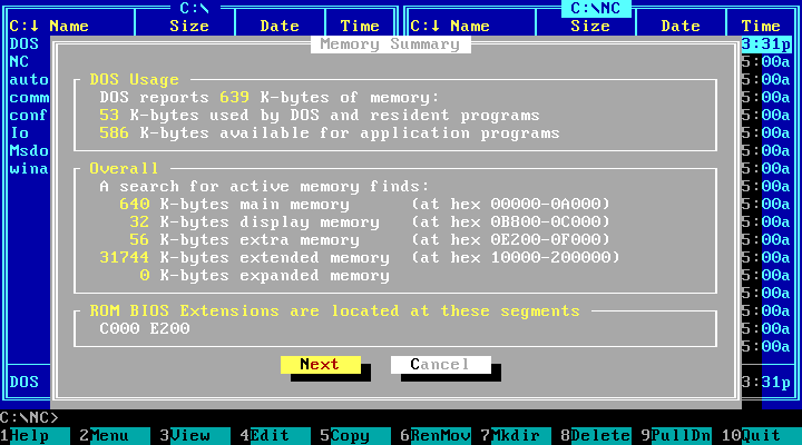
Memory summary:
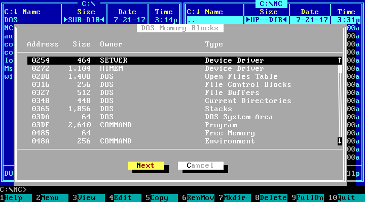
DOS memory blocks:
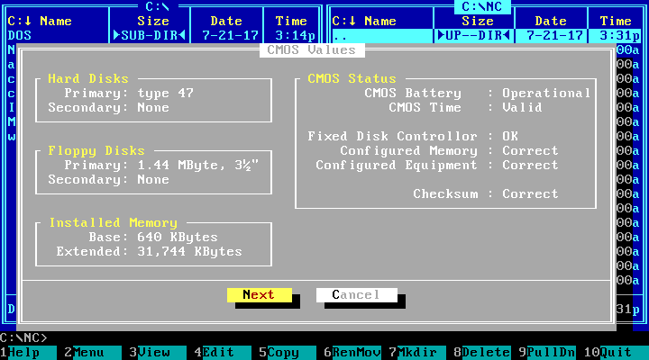
CMOS values:
Configuration
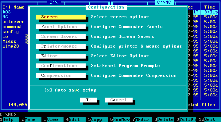
Now let’s look into the configuration dialog. Notice how the controls are organised and grouped:
By the fifth version, Norton Commander got colour schemes:
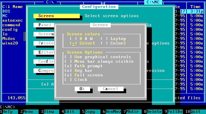
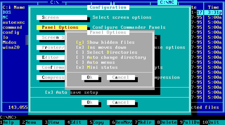
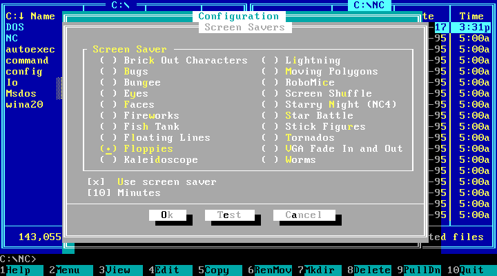
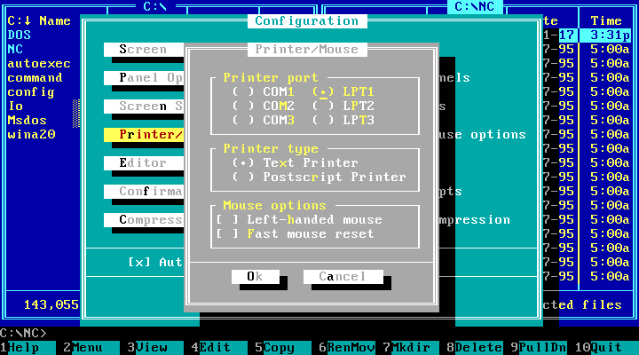
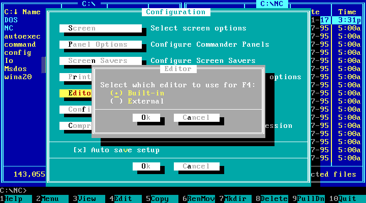
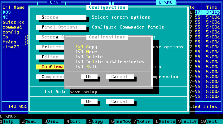
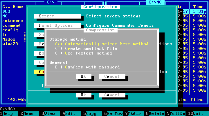
The palette was limited to 16 colours. There was no way to make the colours darker in the shadows, so to simulate the darkened cyan-on-blue or white-on-cyan the applications of the era used grey-on-black. I’m not sure, but I guess Norton Commander has borrowed this visual style from Turbo Vision. The earlier versions had no shadows. If you go back to the Main menu section, you’ll notice that the help window has no shadow for some reason.
EGA Lines is a mode where twice as many lines of text fits the screen. Nobody I knew ever used it:
 .
.
Fun fact: this post has 57 full-screen full-quality screenshots. Their aggregate size is 271 kilobytes.