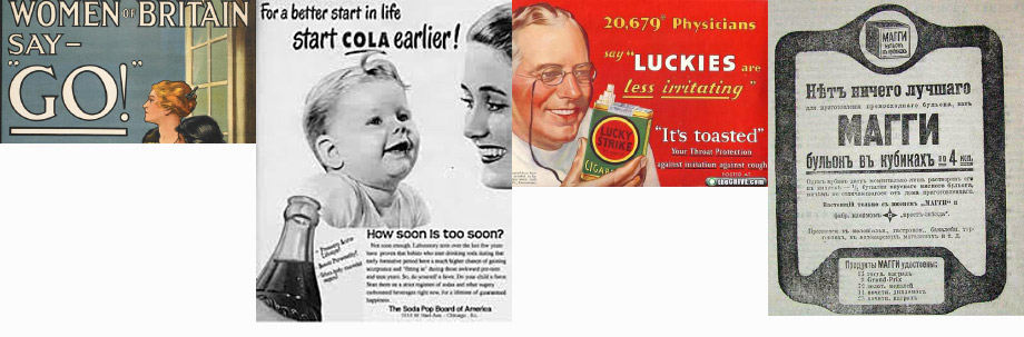
Traditionally an underline was used for emphasis:
Some logos use it to look important:
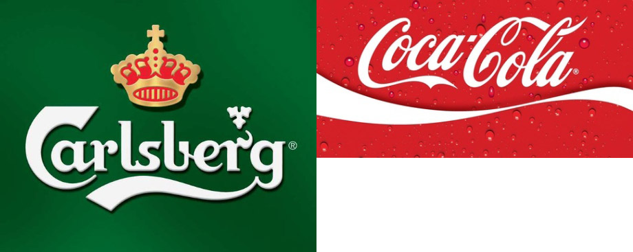
Above, underlines are part of the message: they interplay with the letters, drawing the readers’ attention to the underlined words.
But the use of underline for links, especially in paragraphs of text, is semantically different from this classical use. Such underline should not be an obstacle for the reader who choses not to care about the link. The design should only hint at the option to click the link, not scream about it. In fact, the words should not change their meaning the slightest when the linking is removed (i. e. when the text is printed).
In Crafting link underlines on Medium, Marcin Wichary says that an “ideal” link underline would look like this:

But this is not ideal, this is exuberant. You don’t want to break one underline into six stubs with funny optical effects at the gaps. You want the underline to be modest and quiet.
This is not as bad as the new Safari rendering though:
Only four lines here, but they are thick as logs. And the vertical distance from the text is smaller than the white area around the descenders. Only a blind person could come up with this crazy design.
To make the text and the underline both clear, put them in separate visual layers (see Tufte’s Envisioning Information, Layering and Separation). Make them ignore the existence of each other:

Notice how this underline is very thin. It resembles a hair on a piece of paper.
Why not thicker? Again, because it is not a part of the text, it should not divert the reader. It should be as thin as possible, as long as you can see it (see Tufte’s Visual Explanations, The Smallest Effective Difference).