Duolingo used to be a great app. I opened in to practice almost every day. But then they changed the design:
The redesign rolled out gradually — apparently they were testing it. There was a period when the iPhone was already broken, but it was still possible to use it with an iPad or on the web. I chased the old design for a while, but soon after the final switch to the new one I lost interest in studying.
There was a lot of outrage online about the change, including in the comments under this video. But the design has not been rolled back, which means Duolingo’s numbers are good.
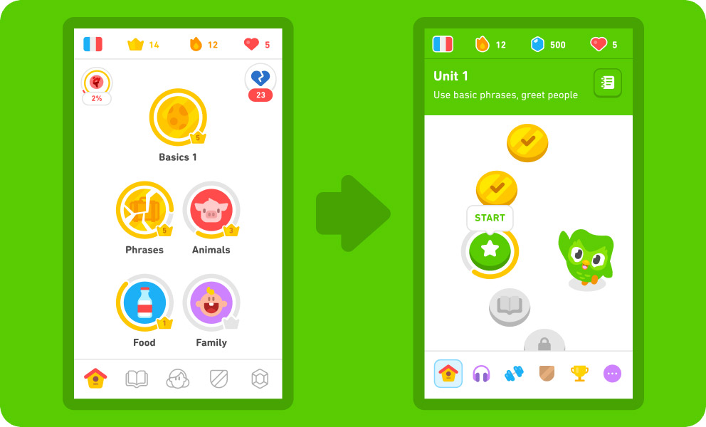
Before and after:
In the old design, as you went through the lessons, the next ones opened in bundles. In the example on the left, you could choose from: basics, phrases, animals, food, family. Sometimes I was in the mood to learn something new, so I tapped an untouched topic. Sometimes, on the contrary, I wanted additional practice in something I already had an idea of, so I went there. When I made a choice to learn something, as the owner of my choice, I was motivated to learn it. The interface was informative and engaging with a variety of topics. Sometimes it was fun to scroll up and be pleased with how much I already learned. Sometimes it was interesting to scroll down, to the lessons locked so far, to be inspired by what awaits next. Maybe the remaining required lesson isn’t very appealing, but look at what’s there to learn afterwards!
The new design has none of that. The endless wave of identical coins means nothing, you just have to tap the green one: you have already completed the previous ones, while the next ones are not available yet. If you scroll up or down, the endless wave of already completed or not yet available unsigned coins continues, and there will even be a button to scroll back to the green coin. The informativeness of this screen is literally zero, it gives you no choice, it exists only for you to tap the one single button! Even the iPad cat games are more interesting.
In the video, they tell us that was the intent:
We’ve redesigned the home screen to better guide you through lessons.
Translated from marketing speak, “now we decide what you learn”.
Follow a path crafted by our learning experts to help you better reach your goals.
It’s different for everyone, but for me, “reach your goals” is the weakest motivator in life. I want to effortlessly enjoy the process and then suddenly be thrilled to discover my own accomplishments. Duolingo doesn’t give me that anymore.
And don’t worry, we’ve kept all the progress you’ve made so far
What are you talking about? I no longer see the huge list of topics I’ve completed. From my point of view, all the progress I had, I’ve lost.
Anyway, it was a great app.

I recommend you to check the app again, because it’s quite good at showing the progress.
You can track your level because all the lessons devided to the sections and each section devided to the units. Each unit has the topic (for instance “describe a story” or “talk about recent events”) and it also has theory block with all necessary info and it’s possible to scroll up and down and read them to revise or to fulfill the curiosity.
I don’t know how for the others but for me “decision what to learn next’ or ‘should I repeat this theory’ is the hardest one and I’m happy to deligate that to the professional team. I also using another app which allows me to do any topic any time and I usually don’t think a lot, just click to one that will make my progress bar grow. With Duolingo I’m more secure about learning because they are making a magic to make me repeat the topic I’ve learned two weeks ago. I think that’s the main rason why we have linear structure now.
Yes, they made more ‘social’ features compared the previous version, that can be uncomfortable and overwhelming for some people. But I like that I can be connected with my family and friends making a small progress in our journey.