Pinpointing individual problems with the Facebook’s user interface is odd, as everything there is done with contempt for the user. However, I keep stumbling over this nonsense every time, and I just can’t understand why someone would do that.
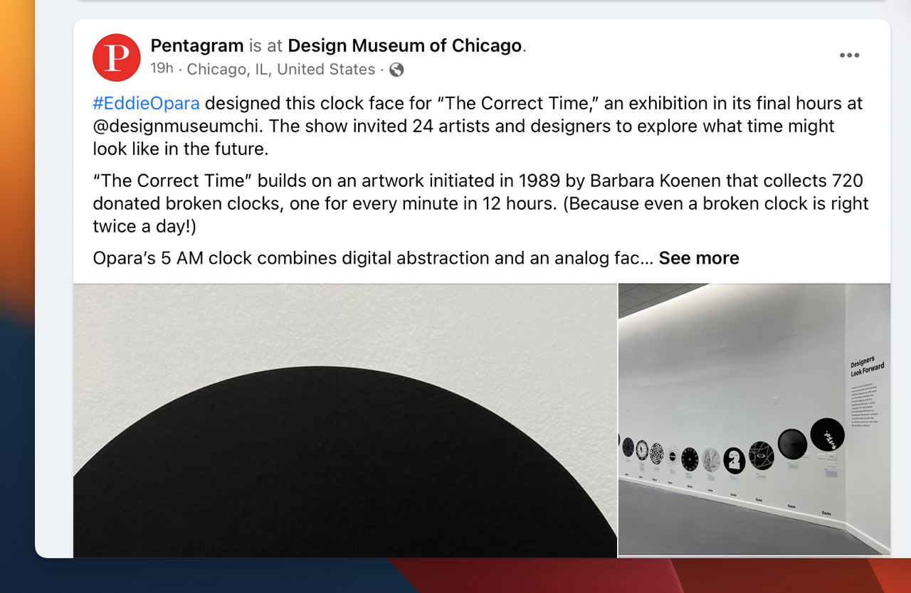
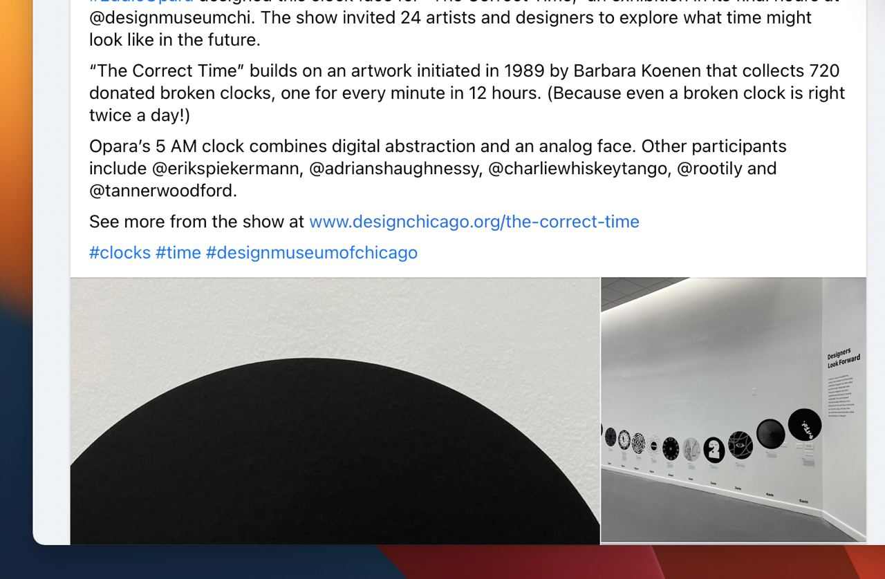
So, Facebook trims long posts at a random place (moron) and puts a “See more” thing there. If you click it, it expands the full post. But instead of expanding it downwards, it expanding it upwards! The text that you were reading a second ago and hadn’t yet finished reading, jumps who knows where, and now, there is something absolutely unrelated in front of your eyes:


By the way, once in ten times, “See more” would open a post in a new tab instead of expanding it on the spot.