Sometimes my students would come up with a layout like this:
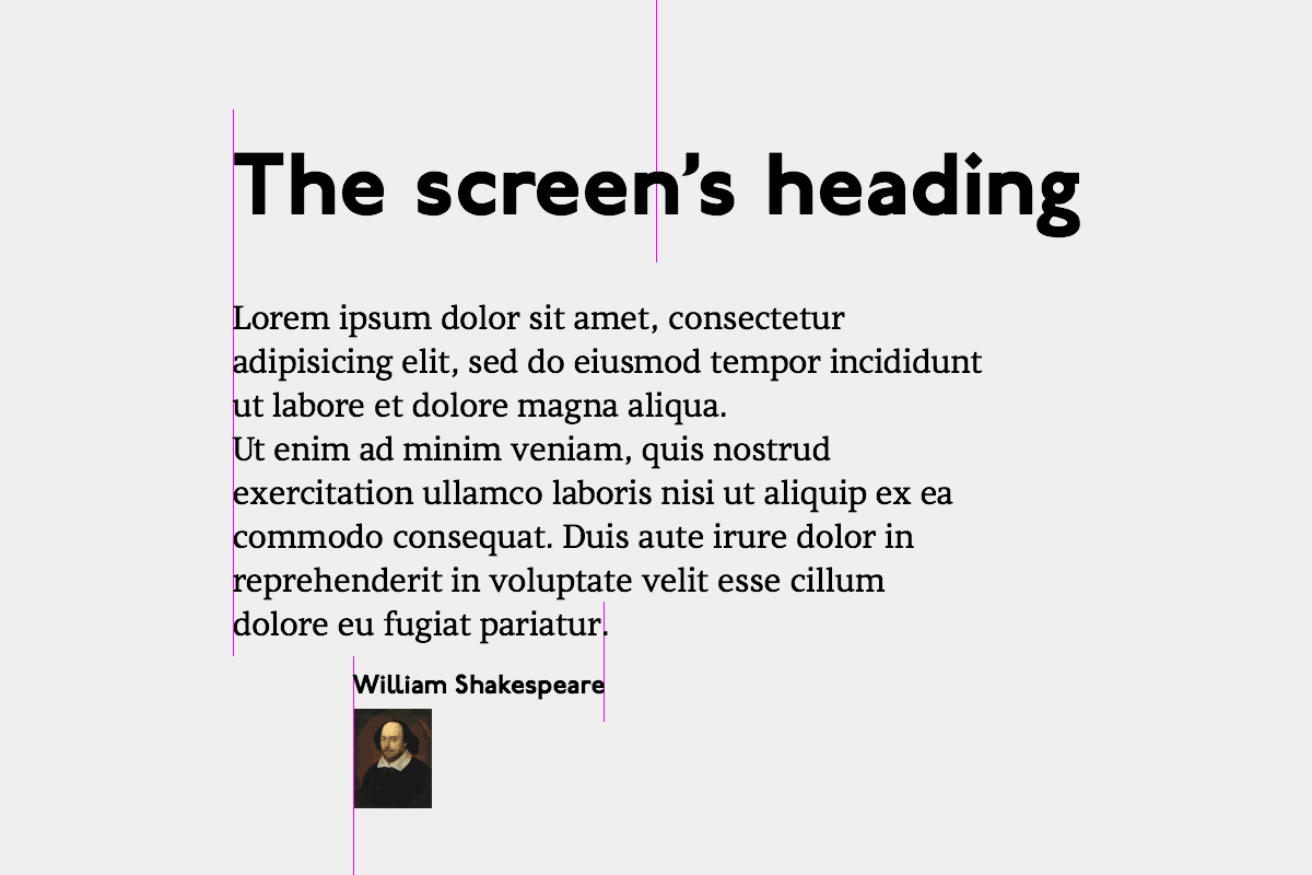
It may seem that things are aligned, but they are not. Can you see what’s wrong? I would ask, how is the heading positioned? They would say, it’s centered:

How is the text aligned then? They would say, it’s left-aligned:
And how was the left margin chosen? They would say, it’s aligned with the heading. But this means that the position of text depends on the length of the heading. What would you do with this if the text changes on another screen?
This doesn’t work as a system, because this structure is unstable. It reminds me of the fragile Windows Start menu:
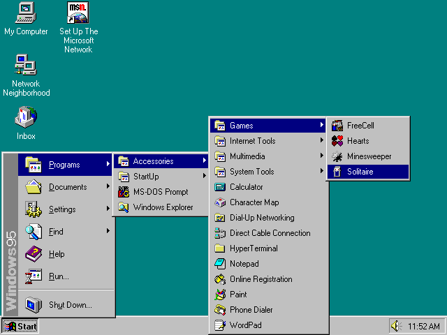
You must be careful enough not to breathe, or the whole thing will fall apart.
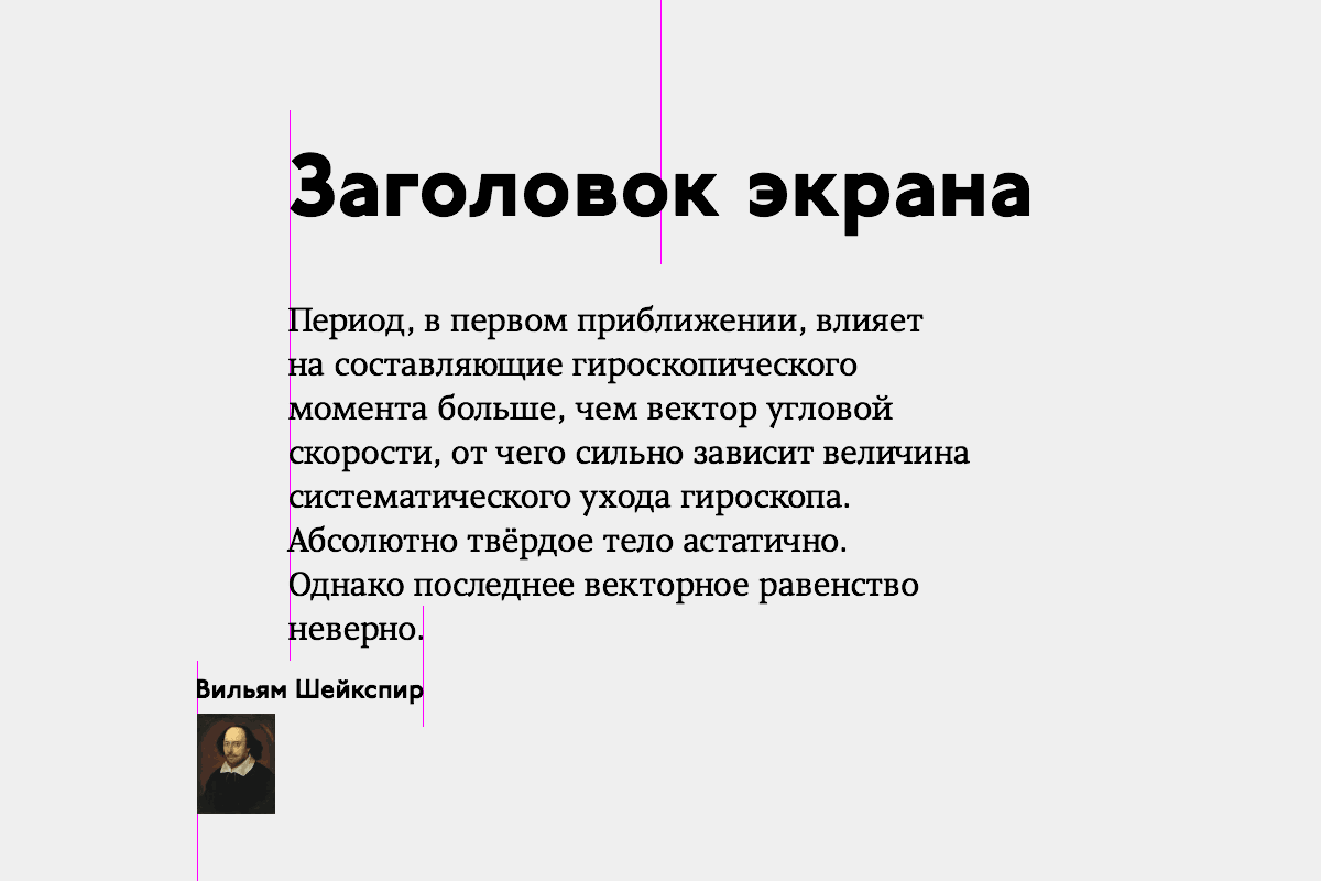
So, generally, do not align a piece of text to an itself-unaligned part of another text:
Because when you translate this text into a different language, really weird things will happen: