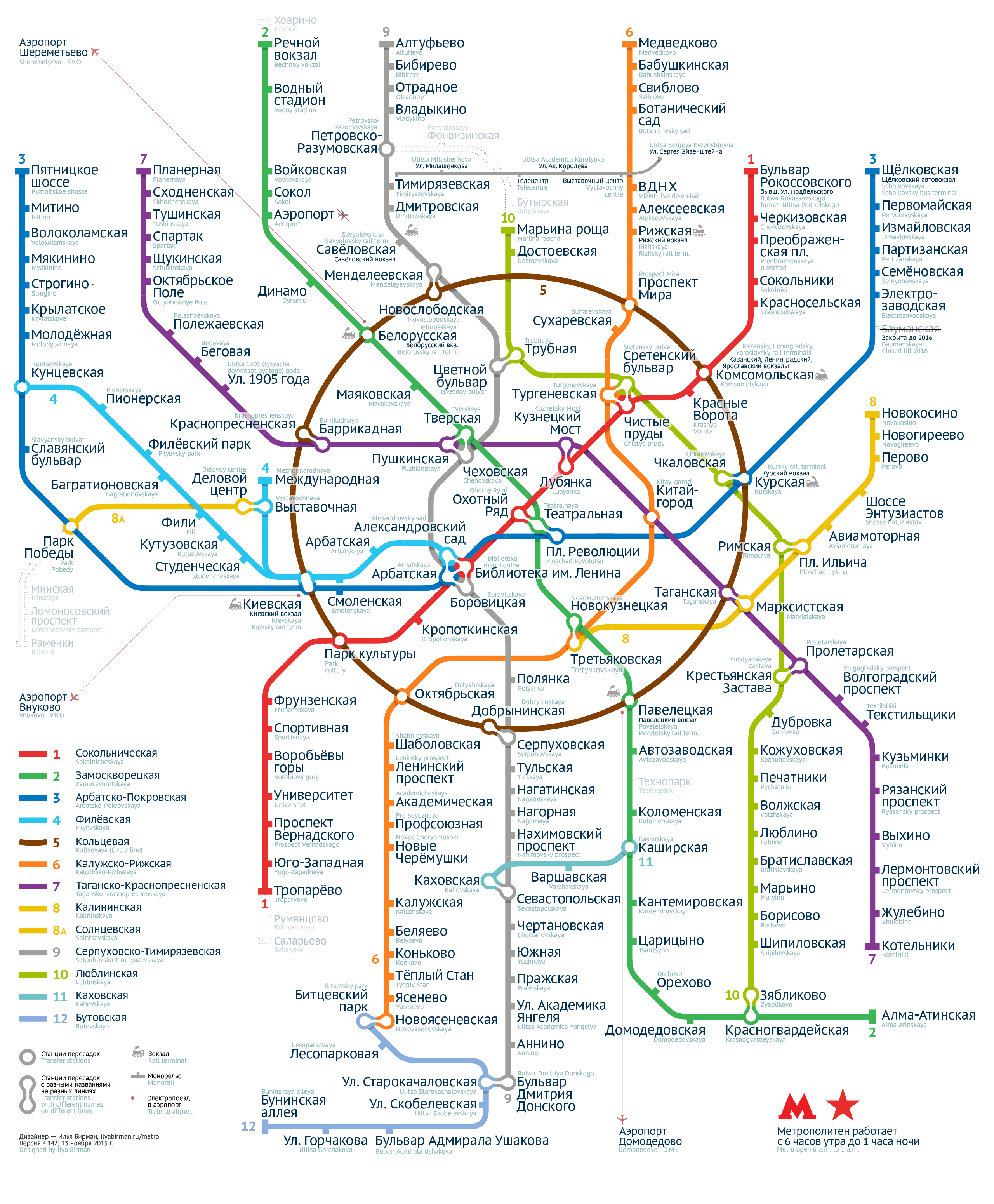
The new version of the map is a leap in aesthetics and font size:

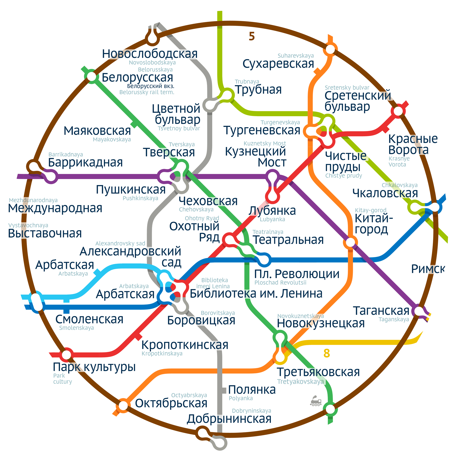
The stations within the Circle line are now perfectly balanced to occupy the space evenly and let for the maximum font size:

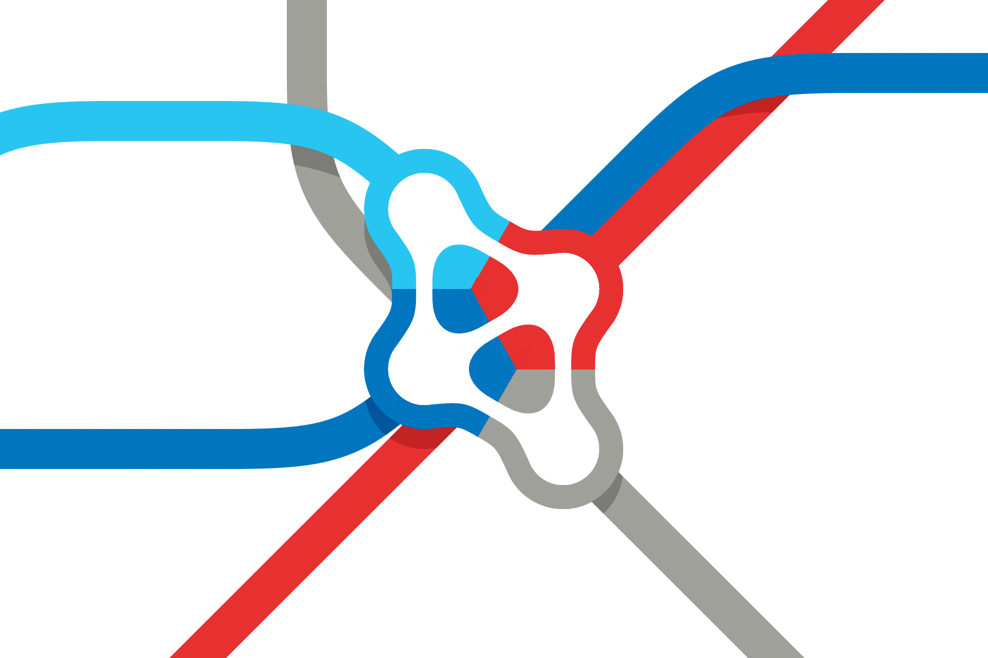
Great attention was given to the design of the transfers:

A special version of the font PT Sans was developed for the map. The uppercase letters were reduced so that station names could be set with minimum line height and still look good:

Оn the achievements of the previous version: simplicity and unambiguity of transfers, reduction of visual clutter, the gridless index and accessibilty for the colour-blind.
Ilya Birman
Designer
Anna Danilova
Type advisor
Tweet
Share
Share
Pin