The use of Photoshop’s standard Drop Shadow effect is immediately visible. It usually produces unrealistic and dull shadows:

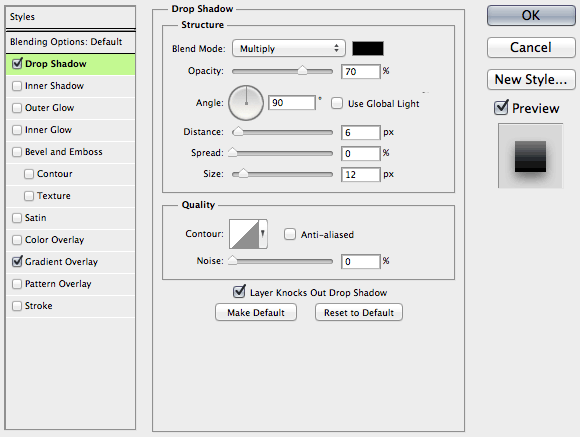
Here’s how the shadow is constructed: the object’s mask is put beneath it, blurred and shifted. Here are the parameters of the above shadow:

However to make a shadow look better, you don’t always have to draw it “by hand”. The “Quality” group of parameters will help.
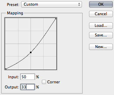
Number one is contour. You can change it by bending this graph:

The graph defines the fade of the shadow. For some reason it’s reversed: the point farthest to the object is on the left, the closest one is on the right. In most cases dragging the midpoint down is the right thing to do: you want the shadow to be lighter halfway from the object.
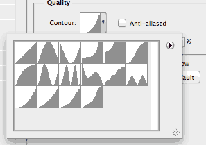
Photoshop includes some crazy contours that make no sense at all. This adds to the relative unpopularity of the feature (see the first two rows):

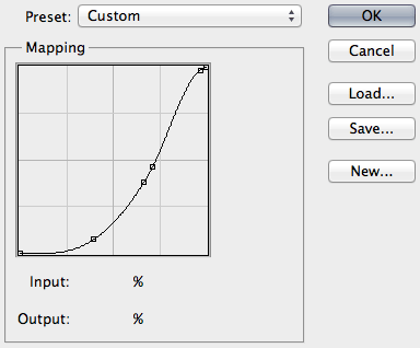
The last four contours are mine. Don’t hesitate to save your good ones there so that you can pick them faster. Like this one:

The real shadow does not fade linearly because there are many light sources. Bend the curve until it looks fine.
Number two is noise. Just add noise at 2 to 3 percent:

Here’s the above button with adjusted contour and added noise (other parameters intact):

No doubt hand-made shadows are better (if made by a good graphic designer). But the production cost is also higher, sometimes too high. Here everything remains scalable and you can transform the button, clone it etc.
A possible shortcoming of this approach is that you can’t make this button with pure CSS. In some cases manufacturability is more important than beauty. And of course all this is about UI shadows (as in buttons, toolbars and such). When you want a real shadow of a real object, Drop Shadow is of no use.