Over ten years ago I made the diagram of Chelyabinsk trams and trolleybuses. That design turned out to be very successful: dozens of designers used it as a reference for building their own diagrams. It wouldn’t be as good if not for Artem Gorbunov’s generous help.
Three years ago, together with Alexander Karavaev we made a new version of the diagram. It had a lot of design inventions: the “pencil-drawn” layer for buses and trolleybuses, the “watercolour” rivers and lakes, 3D terminals, the new shape of the stops’ ticks. With that diagram, a logo for chelyabinsk trams was born: the city’s coat of arms decorated with a pantograph.
Then Polina Lesnikova joined the team. She re-drew the map to account for the changes in routes. Together with Alexander, they changed a lot of details after testing the legibility of the previous version. Thus we arrived at the new diagram:
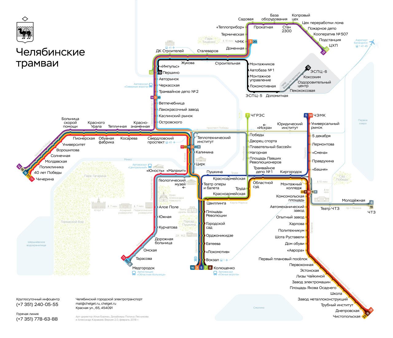
Some landmarks were added. The bus-and-trolleybuses layer gave the previous version some visual richness, and it was interesting to scrutinise. Unfortunately, it didn’t provide any notable utility, so we decided to remove it. This helped to simplify the geometry of lines and make the fonts bigger. The new diagram looks stronger.
Designed by Polina Lesnikova and Alexander Karavaev, art-directed by myself.