Following my post on the topic in Russian, Opera’s Vadim Makeev asked me to reproduce it in English so that other guys from Opera could fully enjoy it. So here are some screenshots from my dear Opera browser, which I’ve been using for years, and have just switched from to stupid Safari a couple of days ago. Safari sucks, as well as any other browser, but at least it looks good.
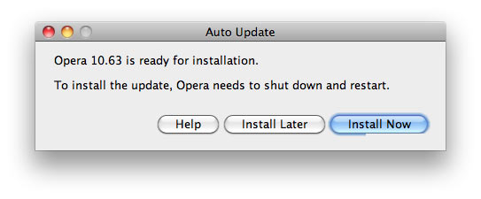
Here’s how Opera says it has to update:

Everything is just awesome. The copy. The order and positioning of buttons. The very existence of Help button. But the winner is the crippled glow of “Install Now”.
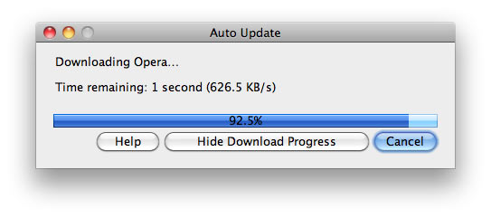
And here’s the update process:

This one is also great. The download speed is specified up to a tenth of a kilobyte. The progress bar has a custom glare. The percentage of progress is in the middle and is displayed as black on dark-blue, again with high precision. “Time remaining: 1 second” instead of “1 second remaining”. Charming selection of buttons, with “Cancel” as the main one.
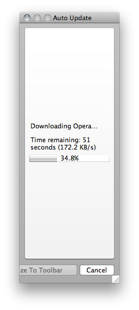
But the sweetest treat here is that this window is resizable:

This one is from some other version (notice how the weird button is called Minimize To Toolbar here).
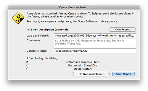
But update is not the only thing Norwegian designers are keen at. Here’s a window stating that Opera has crashed:

All measures are taken to make sure that the news freaks out the user completely. Nothing fits anywhere. The radio-button labels are centered (they should patent it!).
By the way, the default button is Send Report, which is an outrage on humanity: a browser crash is no fun in the first place, and then I have to send some crappy report? It’s kind of obvious that if you want a report, you just send it in the background and shut up. If you click the button, a page opens in the browser to imitate report sending, but in reality nothing happens. I’ve typically waited for some time, with a maximum of 3 to 4 minutes, with no success. Maybe by design it needed 15 minutes to send the report, who knows? Anyway, I got used to clicking Do Not Send Report.
The icon is nifty, but if you think about it, they have designed a custom icon for a browser crash. Crashes are important aspect of the user experience with Opera, so I guess that sort of makes sense.
Also, Opera is a unique application. After crashing it manages to do one impossible thing. It restarts and a new Opera icon appears on the right side of the Dock (while the old ones remains in the Dock). The new icon starts jumping happily, while the one to the left stays calm. How’s that even possible? I have no clue, but apparently Opera does. Because of this, after every crash it is necessary to remove the old Dock icon and then move the new one into its place.
One day the new icon didn’t appear immediately, so I clicked the old one. It started jumping, and then the new one appeared, also jumping, of course. That was real fun, since they both started to bombard me with error boxes, saying something about conflicting resources, and then they hung so I had to force quit both. Epic.
But hey, Opera has “Unite”.