See an earlier post on Berlin U-bahn station lettering. Now, to the rest of the U-bahn.
Typical station entrance:
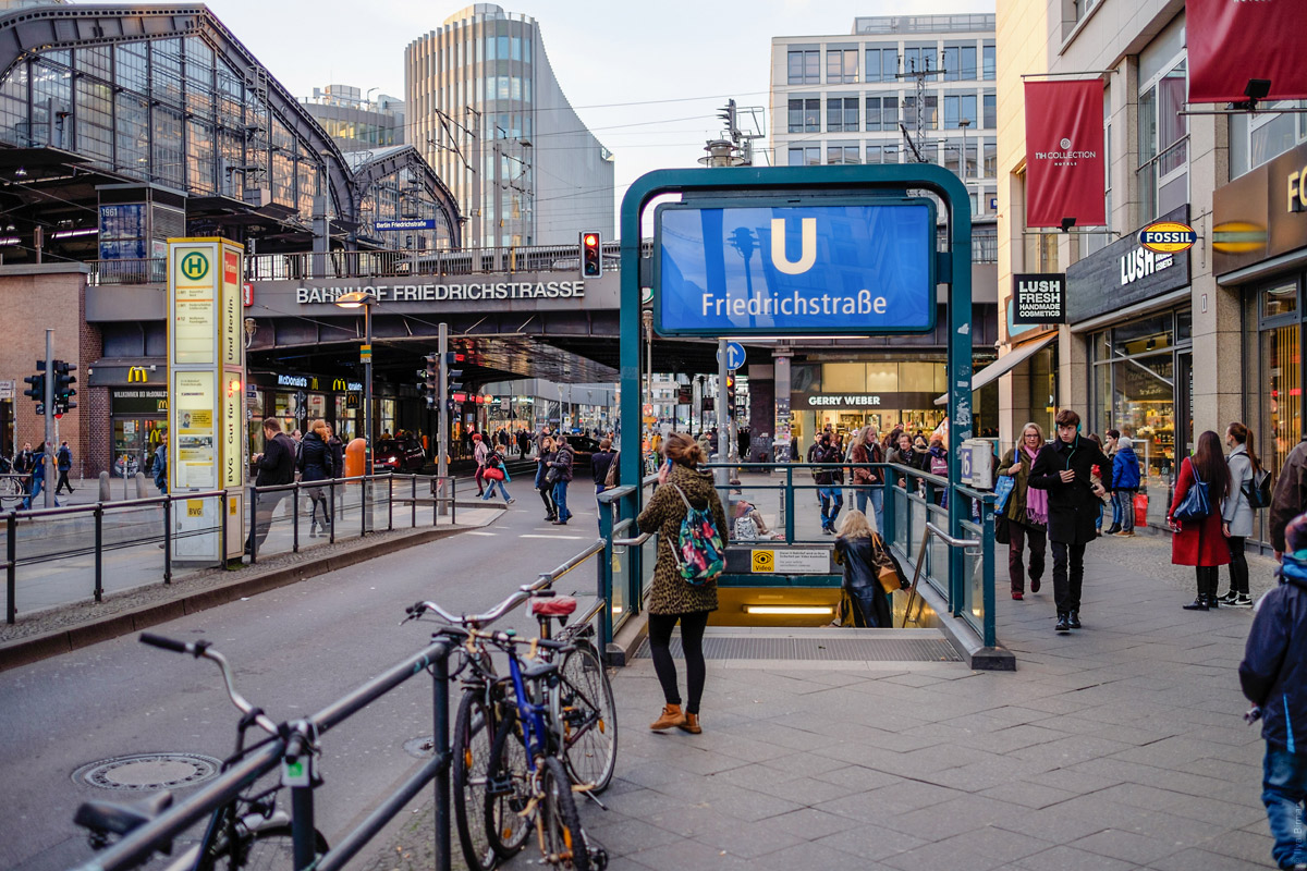
There is also a tram stop to the left and a train station above the road.
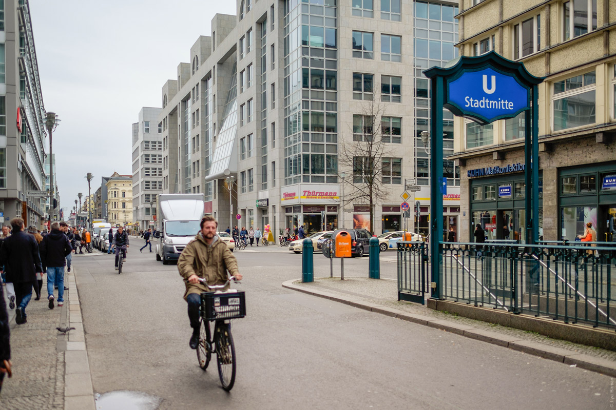
Stadtmitte station has its own entrance sign design:
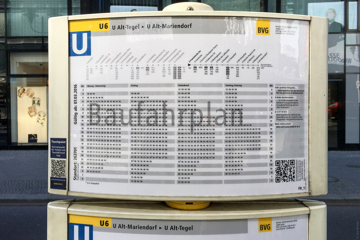
A schedule at the entrance:
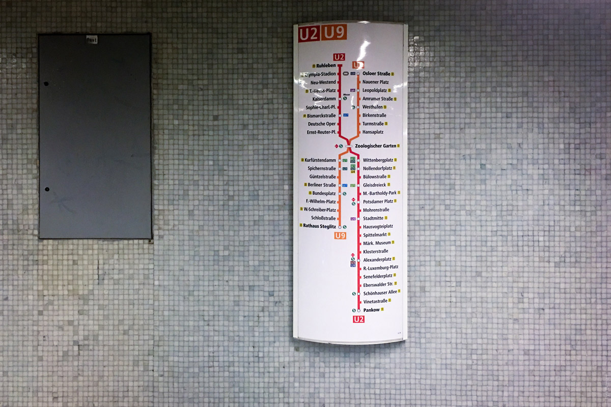
Elements of wayfinding inside the stations. The list of the remaining stations of a line:
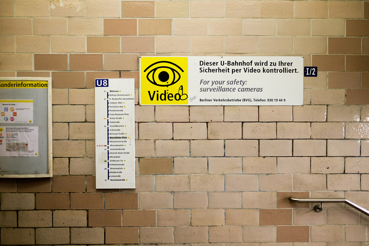
Another one:
No turnstiles, as usual in Germany. To the left of the ticket machine (white and yellow), there is a small validator (yellow and white):
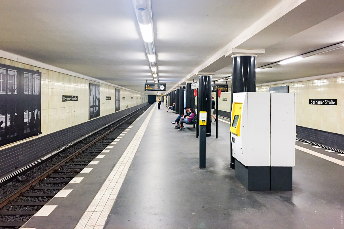
At the centre of a platform there is usually an element with the station name and exit guide:
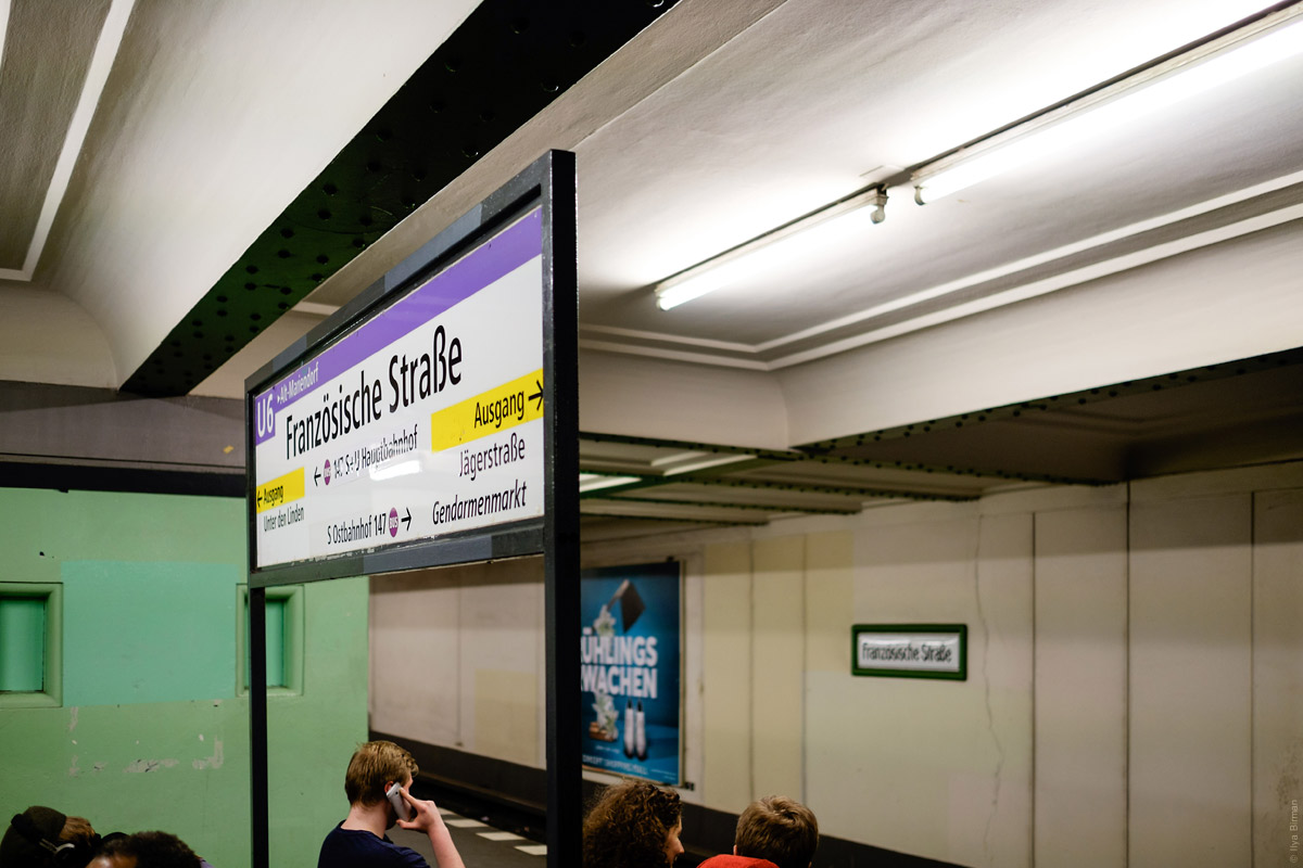
A similarly design element, but wall-mounted:
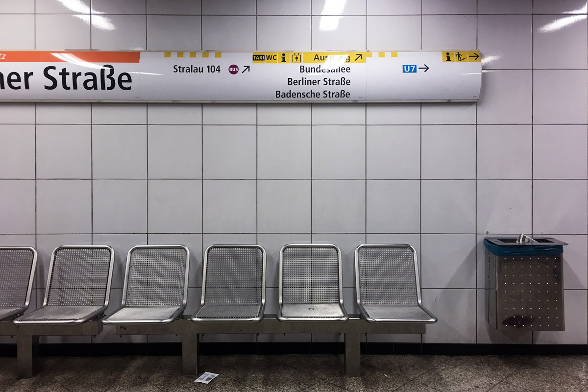
Another exit guide design:
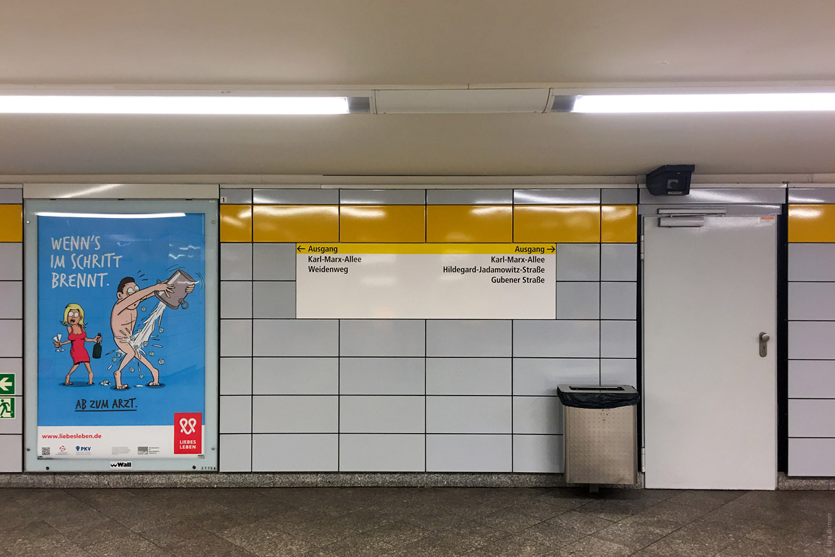
Time to the next train, service information and a clock:
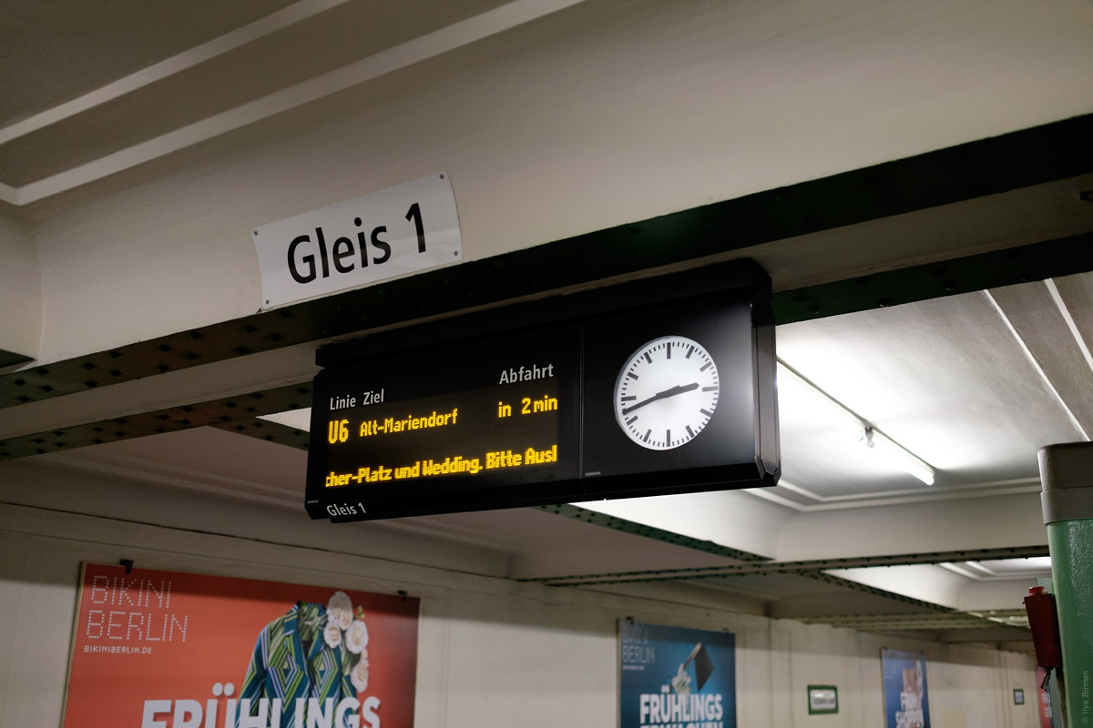
A compact version:
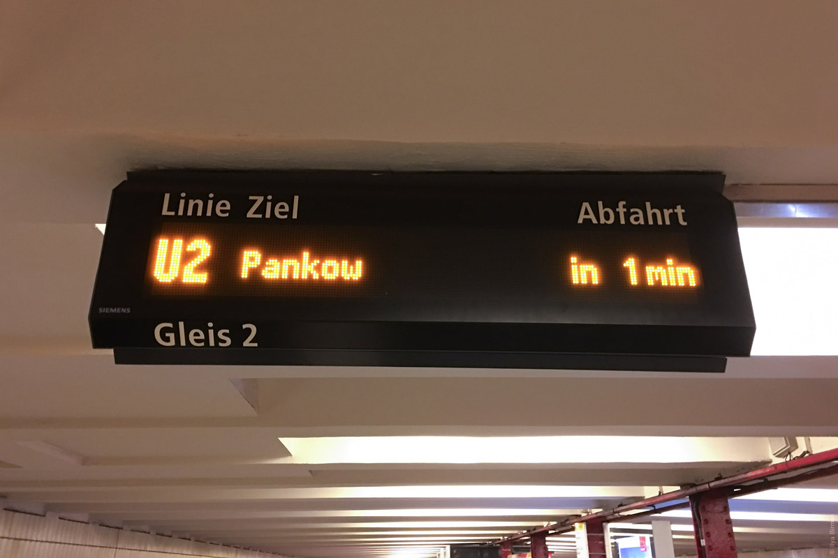
Ads:
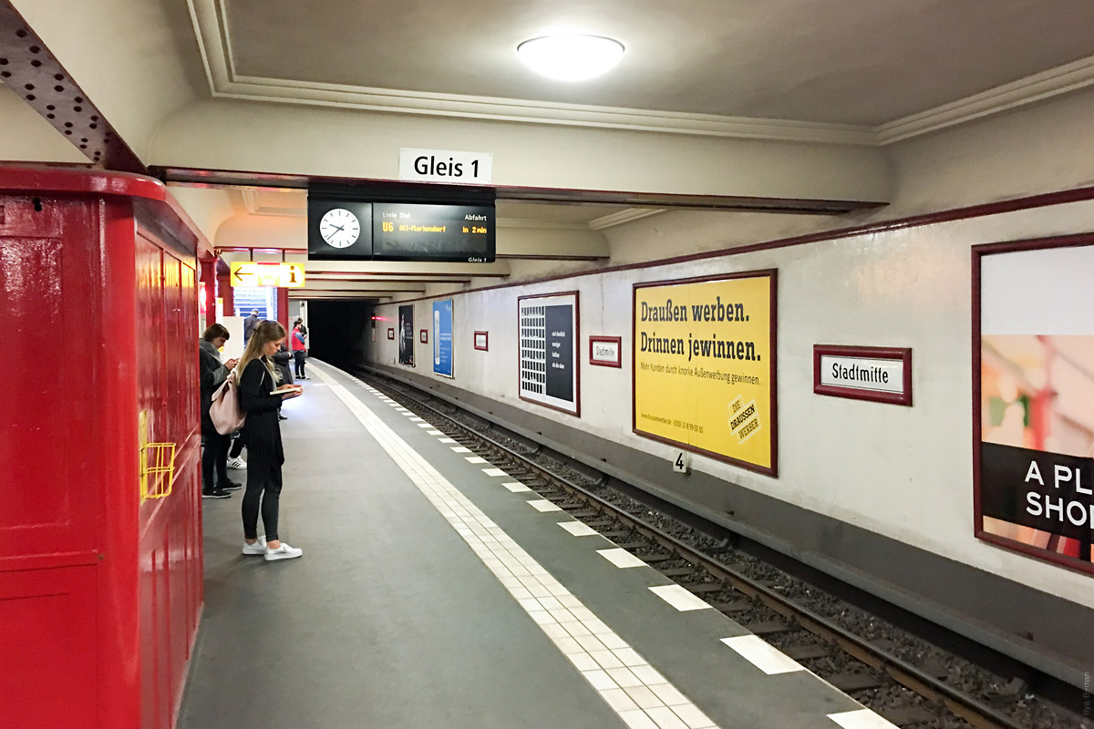
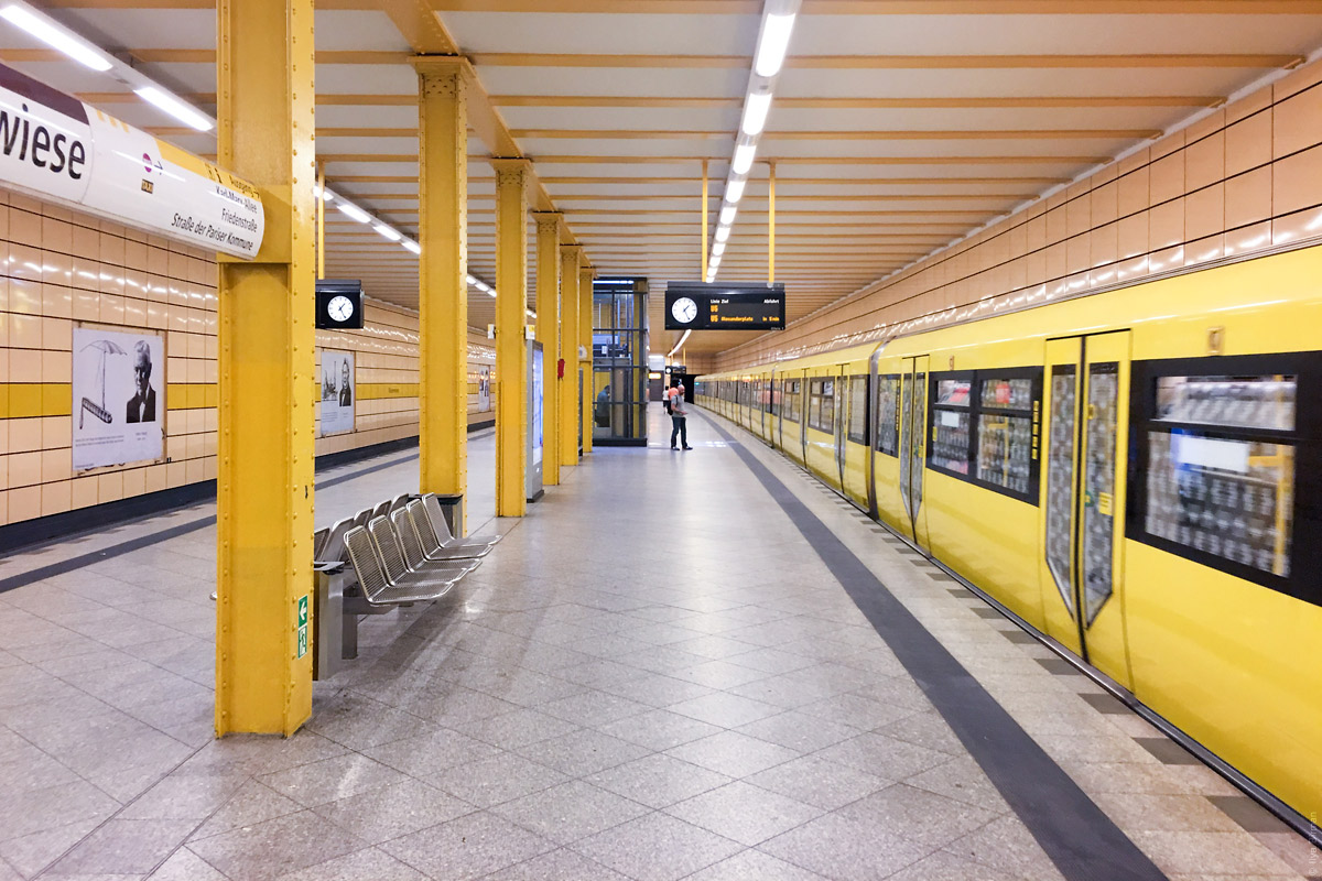
Train are yellow:
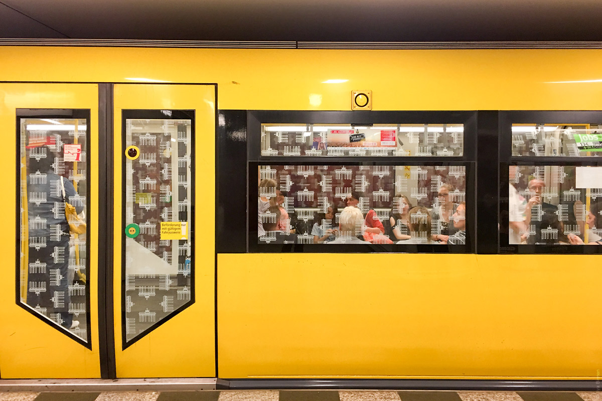
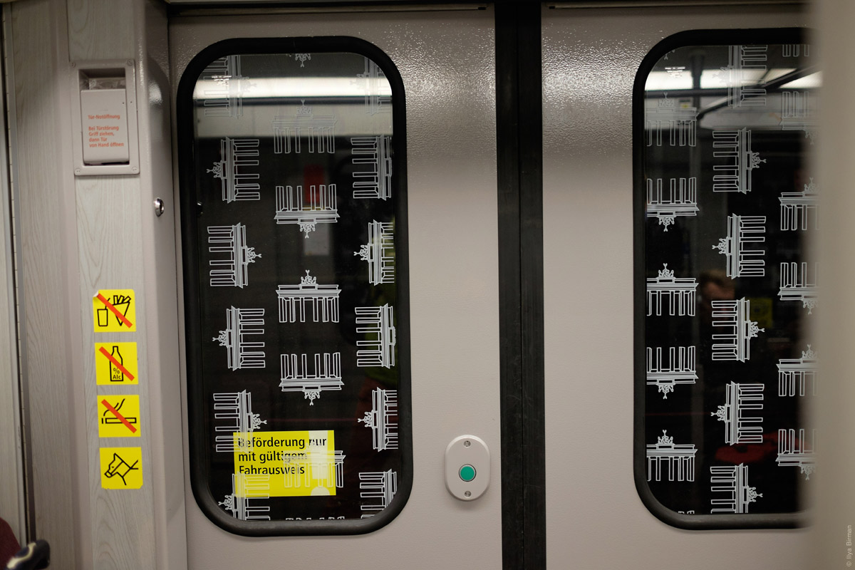
All trains have an external speaker (above a window) so that the announcement are heard from the platform. The windows are filled with the pattern of Brandenburg Gate.
Inside an older train:
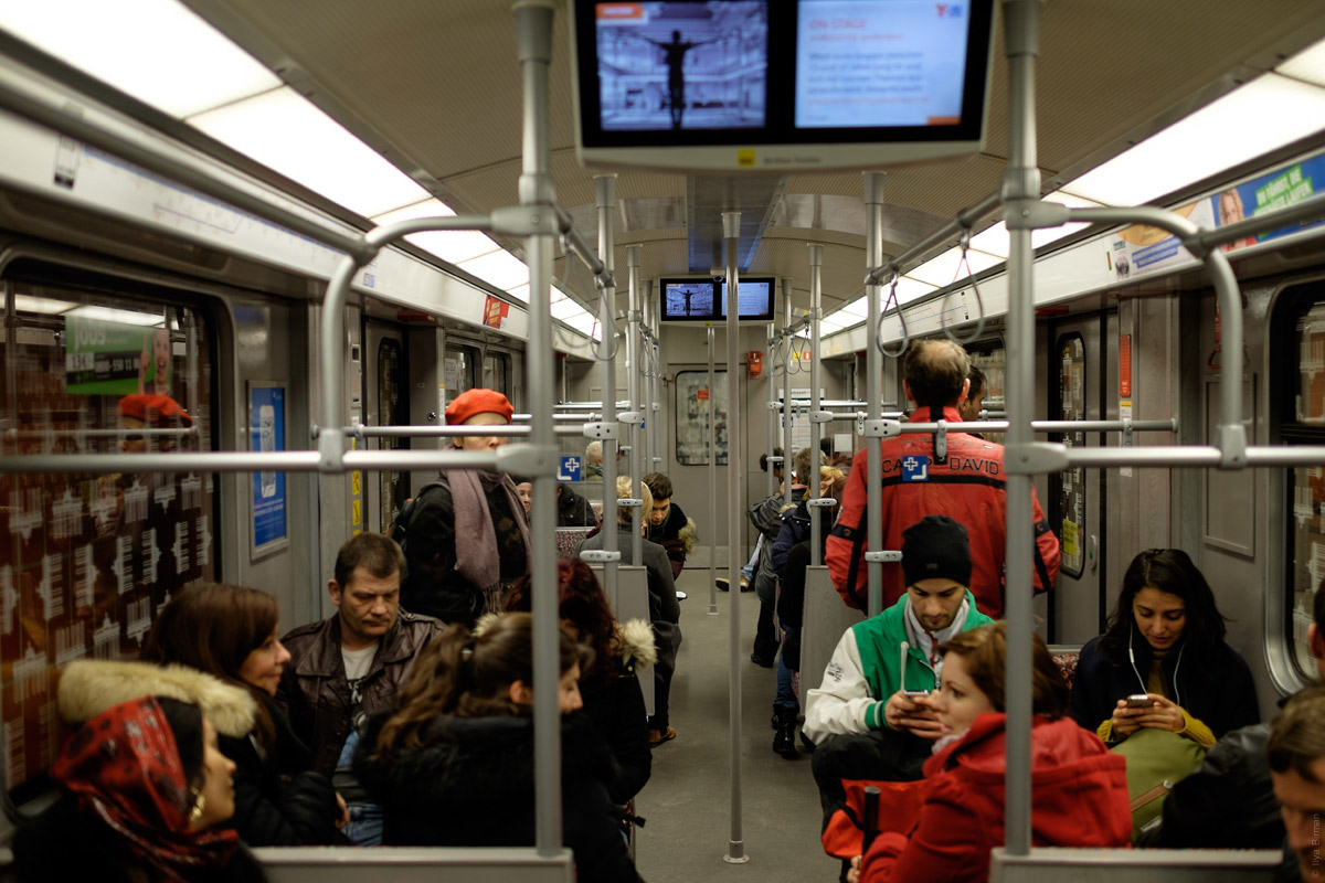
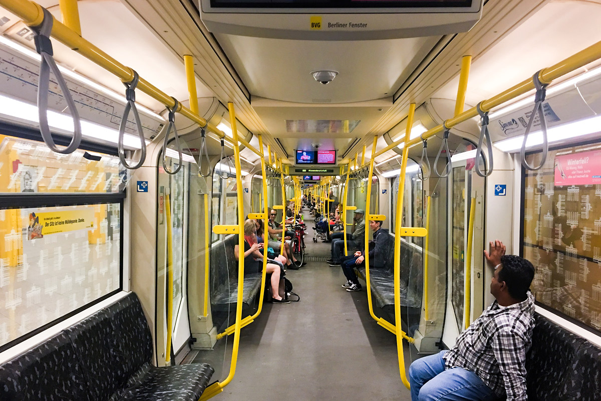
Inside an newer train:
Line diagrams are grouped. 5, 8 & 9:
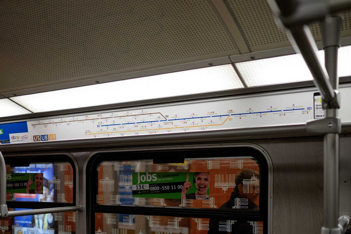
6 & 7:
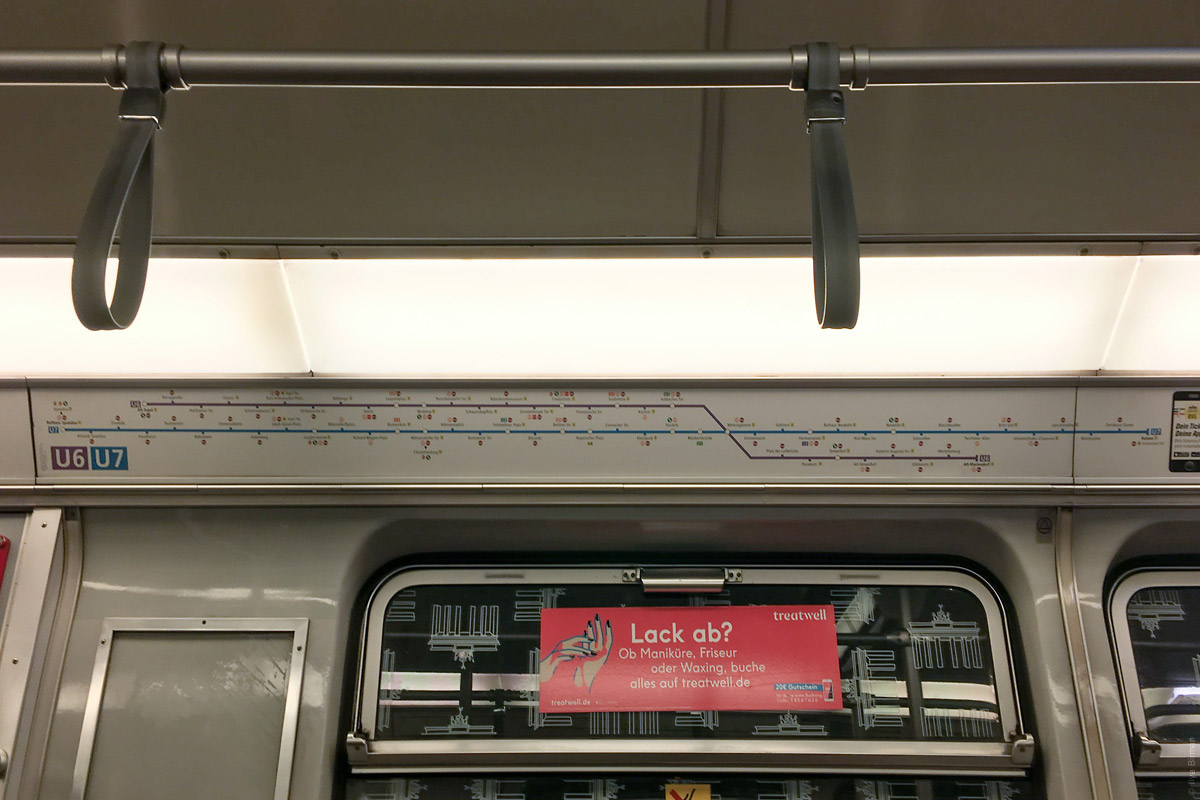
Apparently, this reduces the production cost. But this format also makes the shown lines more “related” in the eyes of a passenger, even though transfers to other lines are no worse.
A button to open the doors:
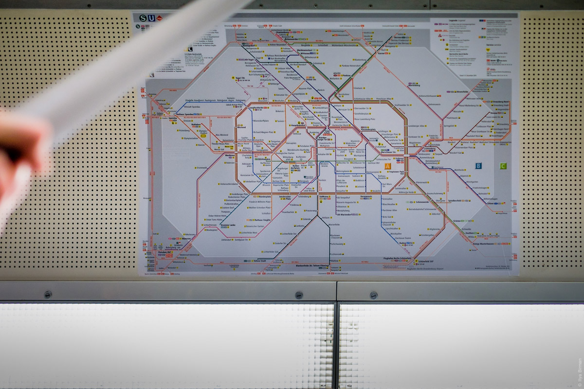
The system map is on the ceiling:
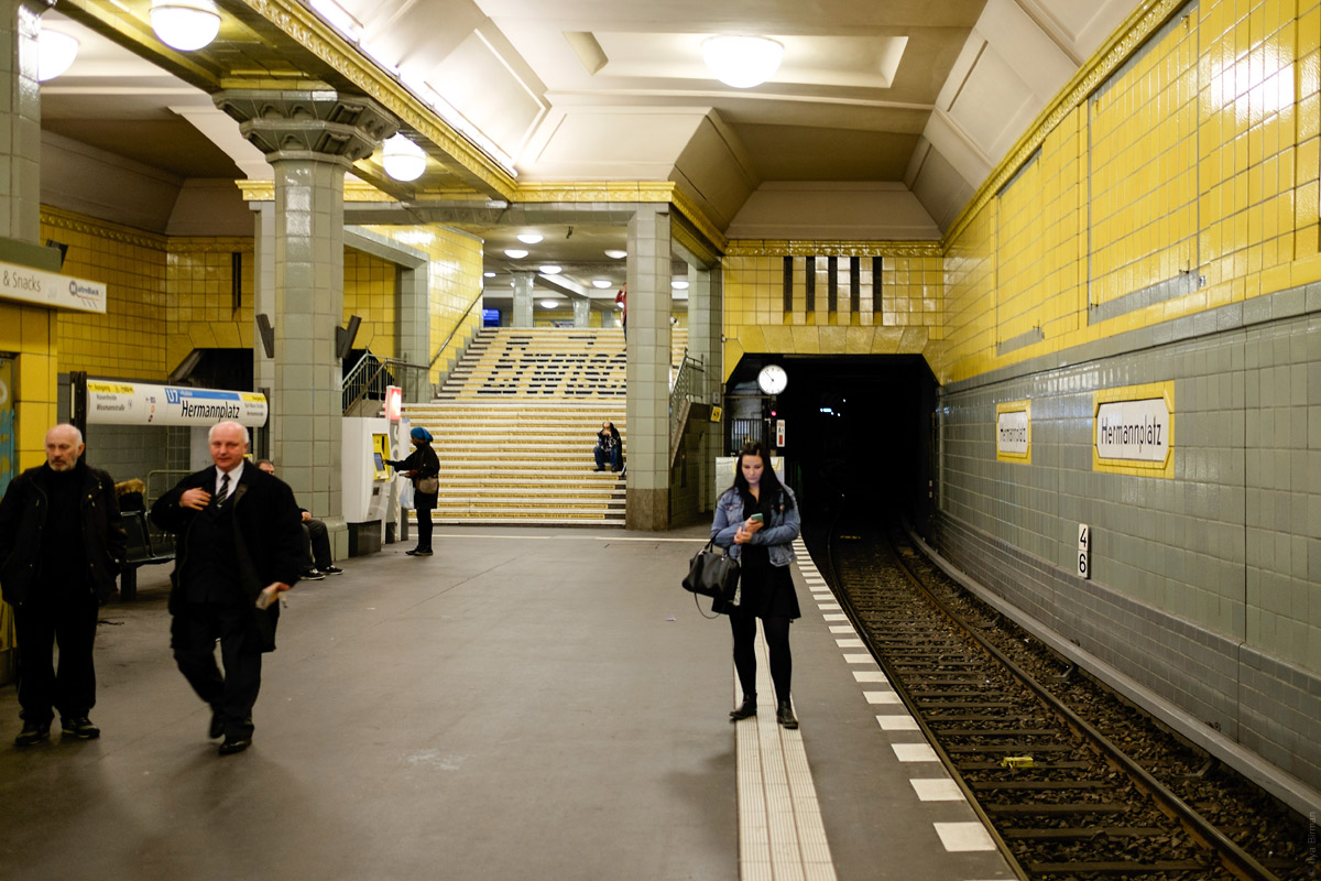
Hermannplatz station:
Weberwiese station:
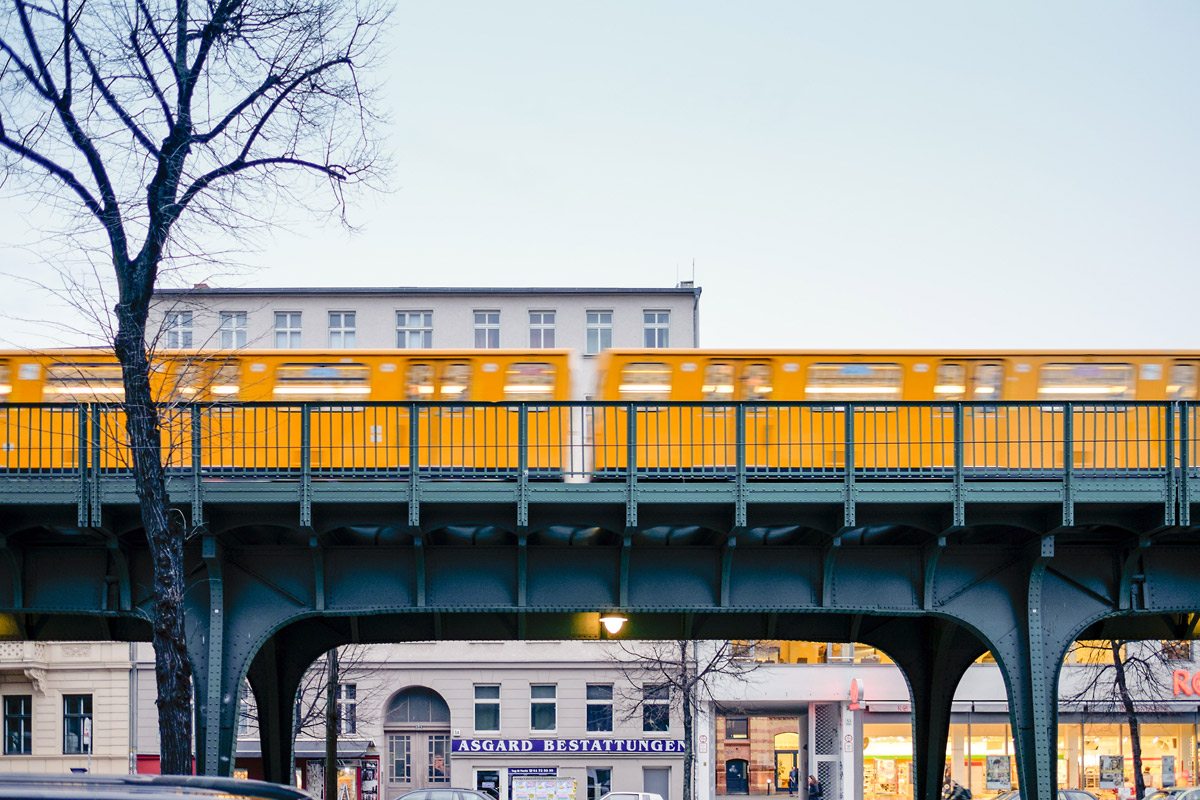
A train on an elevated structure:
The photos are from the trips of March and May 2016.
More Berlin: