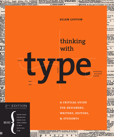
Don’t read this book:

The book is split into three sections: Letter, Text and Grid. This gives the illusion of structure, but don’t be fooled. This is the most disorganized book on design I have ever read.
There is no narrative. Ellen jumps from topic to topic as if each spread was from a separate book. She would write about obscure InDesign hotkeys, font licensing, HTML header tags and even proofreader’s marks without any coherence. Sometimes she would pretend the reader has no idea about computers at all: did you know, she would ask, that if you press Shift+Enter instead of Enter, you would get a new line, but not a new paragraph?
Ellen would explain how typeface is not the same as font. Then put a spread of some student works of questionable value. Then write half a page about “branding”. Because why not write about something, if such a thing exists? It feels like Ellen just crammed together everything she heard about typography giving no crap as to how these random facts, thoughts and examples would help anyone get better at anything. None of the topics is given any care, many are given just a couple of paragraphs.
As to author’s credibility, I have to say she thinks that a double prime (˝) is the same as dumb quotes ("). She sets HTML is small caps, but CSS is all-caps — on the same page, that is. She would also explain that CSS is Cascading Style Sheets (very helpful). At some point in the book she mentions Tufte, then tries to redesign a table and comes up with a result that shows that she either did not actually read Tufte or completely missed the point.
If you are new to design and typography, after reading the book you’ll go, wow, there’s so many stuff — I guess I will now have to find real books to figure it all out. Well, just go straight to Tufte, Bringhurst, Tschichold and Müller-Brockmann.