Somehow it’s become a common knowledge that the design of the iPhone 7 is almost the same as the design of the iPhone 6. This boggles my mind.
How can you not see that the iPhones 6 and 7 are the most different iPhones in the history of iPhones? The iPhone 6 is the ugliest iPhone ever created. The iPhone 7 is the most beautiful iPhone ever created.
This is the original iPhone:
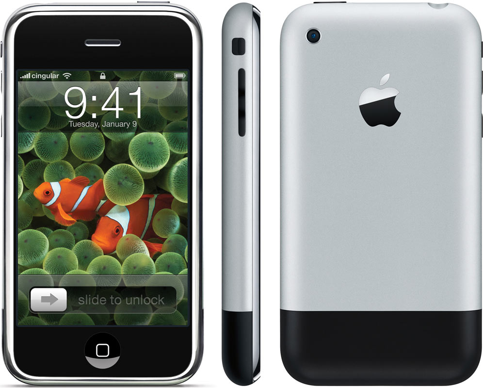
It was beautiful. Everything was perfectly aligned. It would be better without the black stripe on the bottom, but it had to be there for the antennas to work.
iPhones 3G and 3Gs were worse:
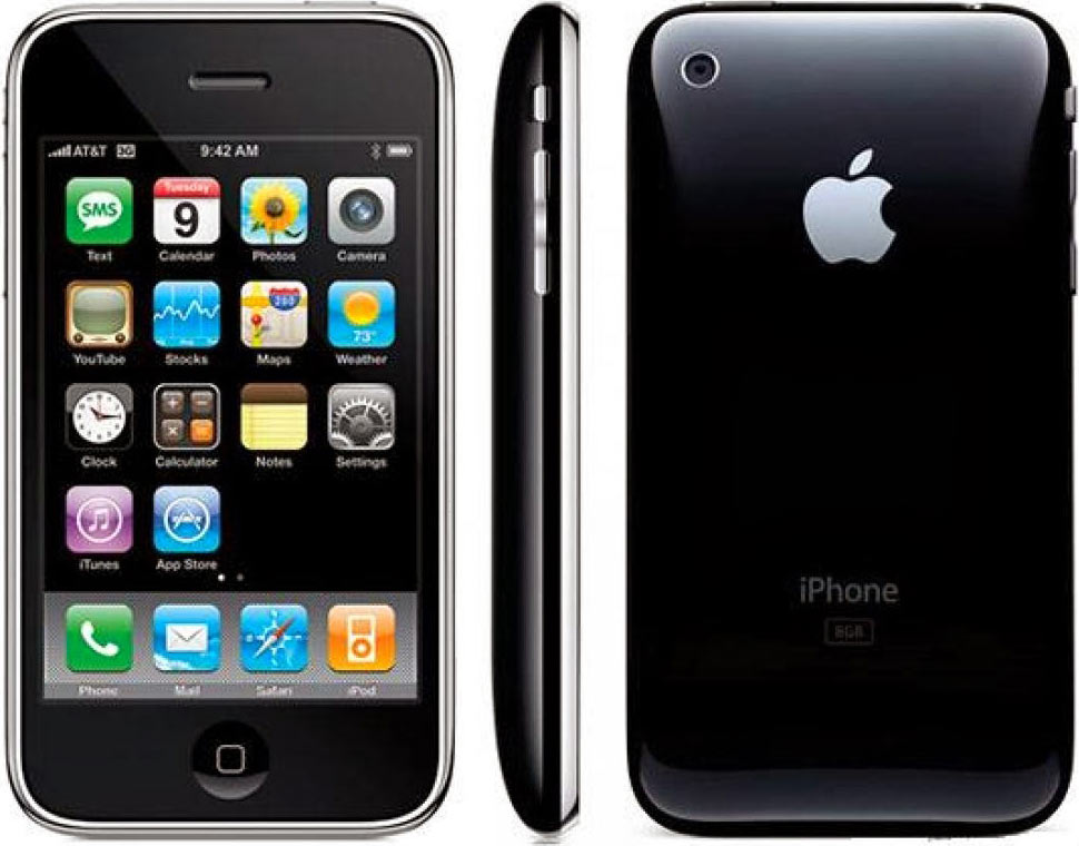
They looked fine in pictures, but were plastic, felt cheap and often cracked.
Then there were the iPhones 4 and 4s:
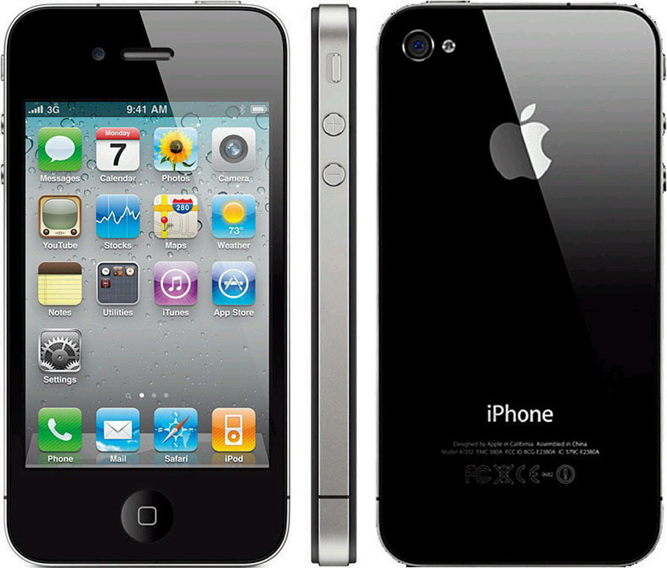
These were special. They didn’t look nice in pictures, but were very attractive in person. The antenna lines bugged me a lot, but overall these were good ones. The glass back was really cool (I don’t break my phones).
Since then, things went downhill. The iPhones 5 and 5s were ugly:
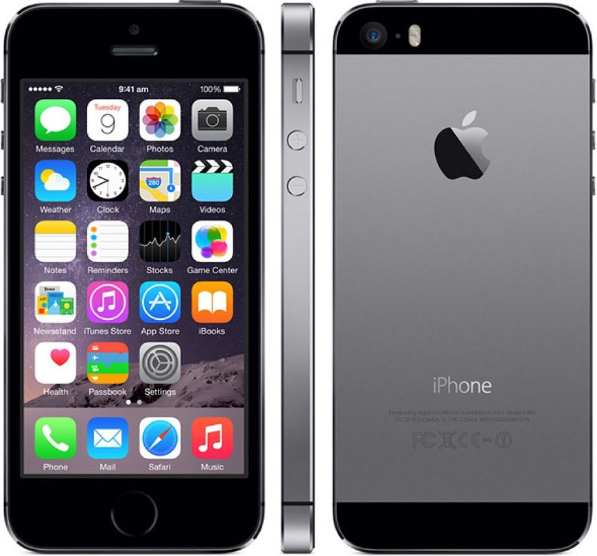
The black stripes, unlike on the original iPhone, were completely out of place. The camera was misaligned.
I wrote about it in The hope for a beautiful iPhone.
Then came the iPhones 6 and 6s, painfully ugly:
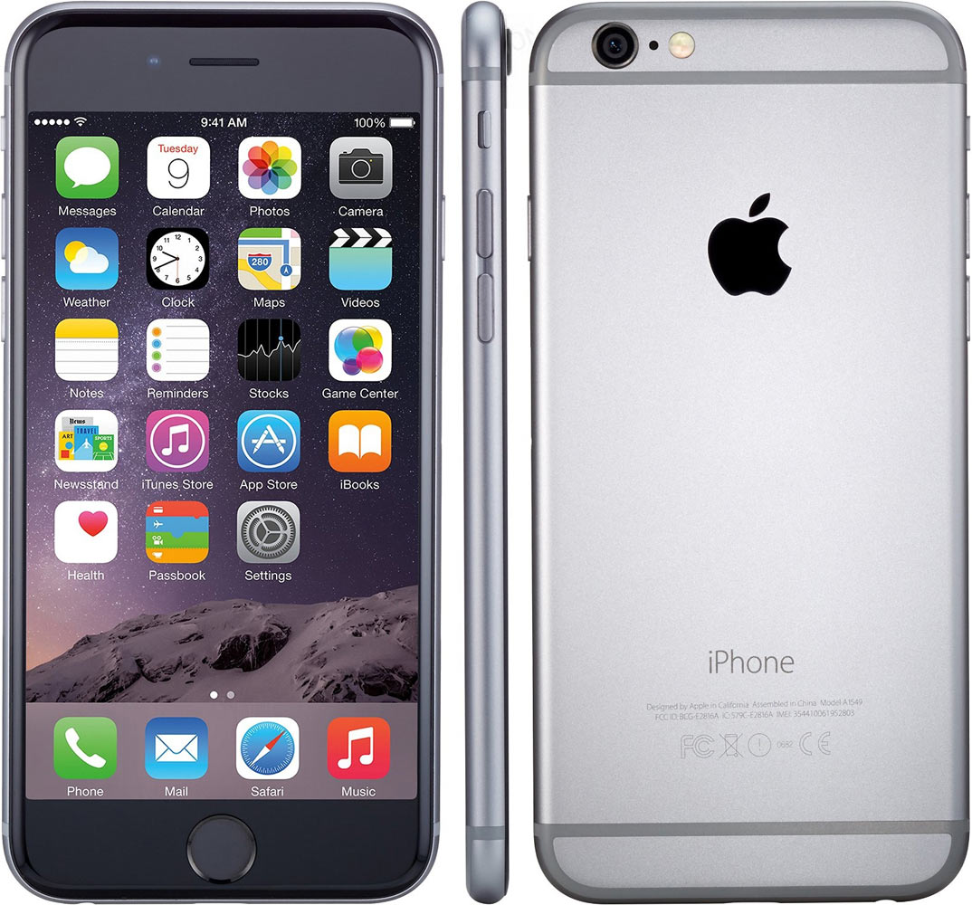
The camera was not aligned with anything and sticked out. The rubber stripes were all over the back. How was this even possible? Imagine somebody showing it to you in 2008, after you’ve seen the first iPhones. You wouldn’t believe Apple would have shipped such a device.
Definitely, these were the ugliest iPhones ever built.
And then Apple showed the iPhone 7:
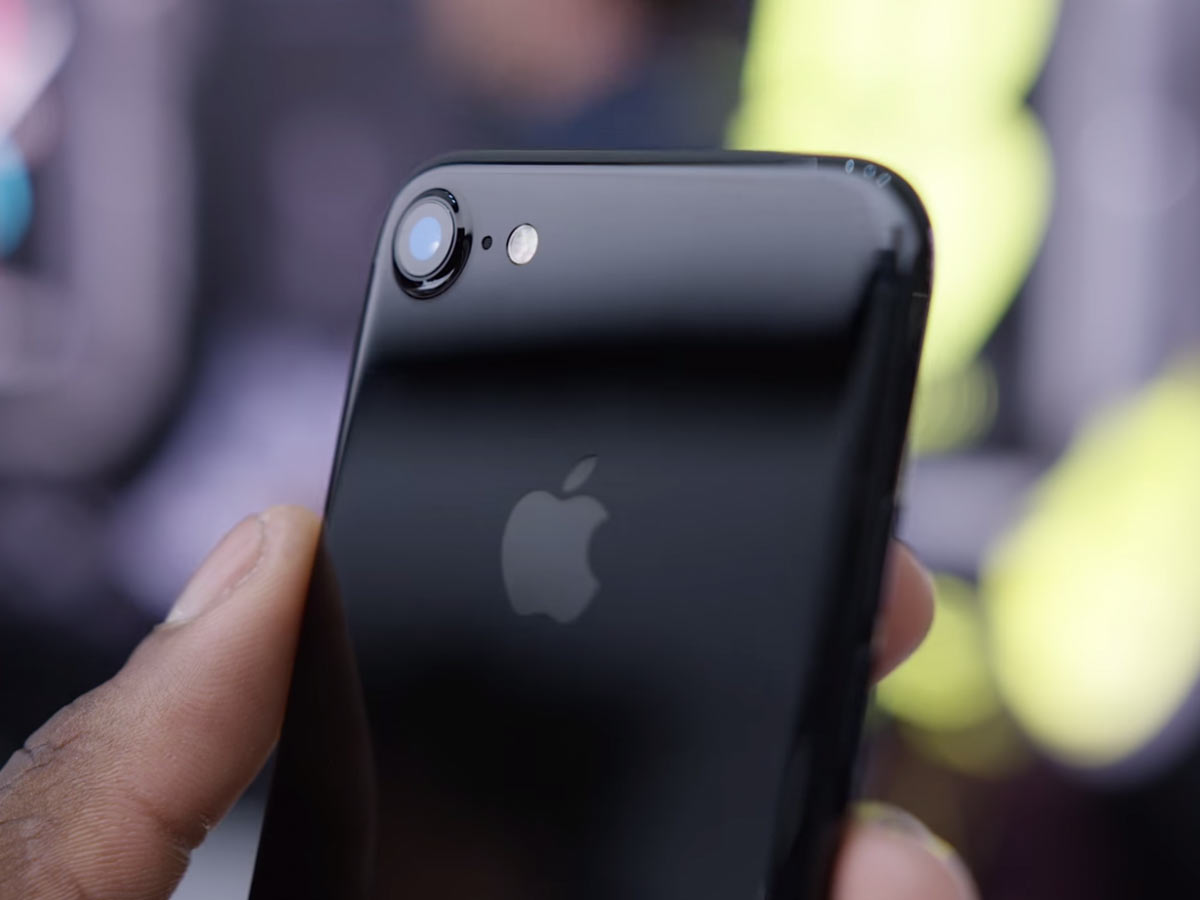
Image from wylsa.com
How can you even compare it to the 6? This one is finally beautiful, after several years of ugliness. The camera is aligned with the phone’s corner, for the first time after the iPhone 4! It still sticks out, but this time the phone is designed with this in mind. It’s not slapped on top of an unexpecting phone; it’s there because it was meant to be there. The same for the antenna lines: they are part of the design, not some crap put on top because it had to be.
This is the first iPhone in years that you can enjoy just looking at. And unlike the iPhone 4, it looks great from every angle. It’s the opposite of the iPhones 6.