Design
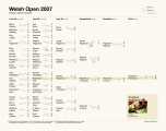
Check out my visualization of a snooker tournament results. The diagram shows Welsh Open 2007 down to a frame
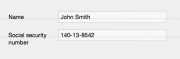



One of the objectives of the design of Ångström was getting the result as fast as possible. But we’ve confronted a problem with currencies

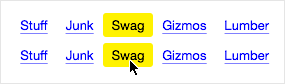





Immediate feedback is one of the core principles of good user interface design. But what if the data is unavailable for the feedback?






Ugly mail defames the sender. It may later occur that the sender was a good person, but life is unjust


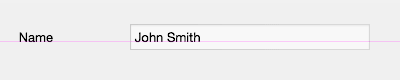
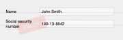
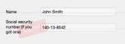
People often draw lines to separate things. They should, instead, move the things apart
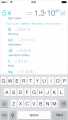
With Ångström, we were thinking about a way to make the units you use most, accessible more easily


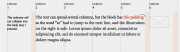
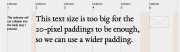

The popular way to make grids for your layouts is to account for gutters, like this

While developing Ångström, the unit converter for the iPhone (check it out!), Alex Babaev and I have come up with the Ångström Style System