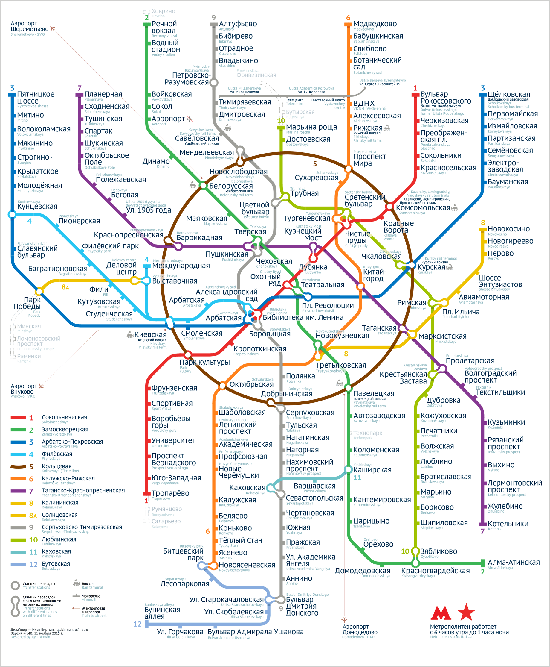
I made my first Moscow metro map in 2007. The official map was disgusting then, but nobody cared. My work inspired many designers to try to design their own map. I know several designers who gave up after they’ve appreciated how hard the task actually was. I had two major revisions of my map including the one for the official 2013 competition for the new map to be used on the system. In that version I’ve solved the problem of the Biblioteka imeni Lenina junction and invented the Compass (more on that on the 2013 map’s page in my portfolio). I took the second place.
In the beginning of 2015 I saw many ways to make my map better. I wanted to use the space more efficiently and to improve the graphical design: remove the dirty gradients and pseudo-realistic shadows, use beautiful peanut-like transfers that I imagined. It took most of the 2015 to design the new map.
Here it is:
I like it on every level, it’s beautiful. I’ve spent much time to perfect the overall shape, the graphical rhythm, the relationships between the widths of the lines, ticks and circles. Inside the Circle line, I’ve found the most even distribution of captions and white space. This not only looks calm and unforced, but also makes possible a significant font size increase as the space is never lost.
I also had to engineer a special version of the PT Sans font for the map. I used PT Sans in the previous version and I like it. But it has a problem: the capital letters are too high. When you have a multi-line caption, you have to make its line height quite large, which is hindrance when you strive for density. So I had to create a version of PT Sans with lower capitals and slightly less prominent accents specially for the map. Thanks to Anna Danilova for help with this.
Go see the new map’s page in my portfolio. There you can also download a PDF to see the map in detail. Don’t forget to share.
