User interface
Hyperlinks should be highlighted on mouse hover. This provides feedback necessary for the user to feel that the element is clickable
In “The Humane Interface”, Raskin explains that confirmations do not help prevent destructive actions, as people quickly form a habit of responding “Yes” to every “Are you sure?
Web services send notification emails. The links in such emails serve a sole purpose of bringing users back to the services’ websites...
Let’s talk about iOS 7 — it clearly has not been covered enough lately

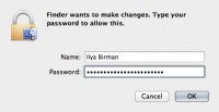
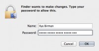
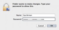
When you enter a password, Terminal does not show anything



All user interface designers should know and apply the Fiitts’s law. It says that the larger and the closer the target area is, the easier it is
You enter your email in a sign-in form and then realize you do not remember your password. You click “remind me my password” and get redirected to “Remind password” form
As you may know, modes are bad. Even worse are timed modes often used in the human interface of consumer electronics

When presenting the first iPhone, Steve Jobs said that the Home button “takes you home from wherever you are”...

What I hate about all calendar and reminder apps is that they think tomorrow starts at midnight. I mean, come on...