Selected

Later Ctrl + ↑

Map and reality: diagrams

In the previous two parts, we’ve figured out that the preferred distortion and layers depend on the map’s supposed use case.

With public transport maps, our goal is to help the customer get from point A to point B using the displayed transport network.

This is a map of Paris Metro of 1915:

Paris Metro, 1915

The city is shown in full detail. There are many layers. The metro lines, however, stand out because of the use of contrasting red thick lines.

Compare with the map of London underground railways of 1908:

London underground railways, 1908

The lines of different railways are denoted by different colours. The rest of the city — the roads, the parks and the river — makes one pale-gray layer.

But even this layer is removed by 1932:

London underground railways, 1932

The river Thames is the only non-railway object that remains on this map. And it is the only device that links the railways to the surface geography.

It is always interesting to explore a detailed map with lots of layers. But in this case, the pleasure of exploration is much less important than the customers’ ability to quickly pick out which train to take. The information richness is sacrificed to the comprehension speed.

But as we see, despite all the simplifications, the central part is still rather hard to read. In several places, arrows had to be used to clarify the correspondence of labels and stations.

The engineer Harry Beck has come up with a radical idea. He suggested redesigning the maps using the principles of electrical circuit drawings.

Electrical circuit

Such drawings prioritise the logical connection between the elements over their physical position. What if a railway map also displayed first and foremost the logical connection between the stations?

The Beck’s diagram replaced the map in 1933:

Beck’s Underground map, 1933

All lines segments were put to the angles of 45° and 90°. The distances between stations were equalised.

The modern diagram has twice as many lines and many more layers, but it inherits the Beck’s principles:

Modern London Underground map

Compare with a geographical map of the same lines:

Geographical London Underground map

The central part here is so dense that it had to be put in a cutaway at a bigger scale. And even so, everything turned out very small. Now we see that showing “true” geography is not universally useful. This geographical map is much harder to read. For the railways’ customers, the diagram excels.

If the distances between the stations are equal, the reader will grasp that it’s just a convention and won’t rely on it. If the lines are strictly at 45° or 90°, the reader will grasp that they do not represent the actual paths of the underground tracks and won’t rely on it either. But this doesn’t mean that you can get rid of any geographical reference.

In 2007 I made a rectilinear Moscow Metro map as an experiment:

While the principles of the above diagram are easy to figure out, there still is a problem: even if you live in Moscow, you will have a hard time finding your station.

Since any map is perceived in reference to the image of reality formed by the geographical maps, you have to respect that. If the reader knows roughly where a station is in the city, they should be able to find it on the diagram, too.

Why are browsers so slow?

I understand why rendering a complicated layout may be slow. Or why executing a complicated script may be slow. Actually, browsers are rather fast doing these things. If you studied programming and have a rough idea about how many computations are made to render a page, it is surprising the browsers can do it all that fast.

But I am not talking about rendering and scripts. I am talking about everything else. Safari may take a second or two just to open a new blank tab on a 2014 iMac. And with ten or fifteen open tabs it eventually becomes sluggish as hell. Chrome is better, but not much so.

What are they doing? The tabs are already open. Everything has been rendered. Why does it take more than, say, a thousandth of a second to switch between tabs or create a new one? Opening a 20-megapixel photo from disk doesn’t take any noticeable amount of time, it renders instantaneously. Browsers store their stuff in memory. Why can’t they just show the pixels immediately when I ask for them?

You may say: if you are so smart, go create your own browser — and you will win this argument, as I’m definitely not that smart (I don’t think any one person is, by the way).

But I remember the times when we had the amazing Opera browser. In Opera, I could have a hundred open tabs, and it didn’t care, it worked incredibly fast on the hardware of its era, useless today.

You may ask: why would a sane person want a hundred open tabs, how would you even manage that? Well, Opera has had a great UI for that, which nobody has ever matched. Working with a hundred tabs in Opera was much easier back then than working with ten in today’s Safari or Chrome. But that’s a whole different story.

What would you do today if you opened a link and saw a long article which you don’t have time to read right now, but want to read later? You would save a link and close the tab. But when your browser is fast, you just don’t tend to close tabs which you haven’t dealt with. In Opera, I would let tabs stay open for months without having any impact on my machine’s performance.

Wait, but didn’t I restart my computer or the browser sometimes? Of course, I did. Unfortunately, modern browsers are so stupid that they reload all the tabs when you restart them. Which takes ages if you have a hundred of tabs. Opera was sane: it did not reload a tab unless you pressed Reload. To show you the tab, it just reopened everything from its disk cache. Which took a couple of seconds.

Modern browsers boast their rendering and script execution performance, but that’s not what matters to me as a user. I just don’t understand why programmers spend any time optimising for that while the chrome is laughably slow even by ten-years-old standards.

I want back the pleasure of fast browsing.

You should follow me on Twitter, here

Map and reality: layers

In Map and reality: distortion I talked about how distortion is inevitable on a map and the question is what to distort given a particular task.

Now let’s talk about layers. What properties of land should a map display?

Physical and geographical world atlas (1964)

Physical and geographical world atlas (1964)

A physical map shows terrain: oceans, trenches, plains and mountains. On a political map, the land is divided into countries and states. A mineral resources map is covered with the symbols of mineral deposits and oilfields.

One can’t say that a physical map is “truer” than, say, a railroad atlas. The following map shows the history of Amsterdam’s development, and it’s also true. Red houses are the oldest, the blue ones are the newest:

Buildings age in the Netherlands

A good cartographer will find ways to display lots of data on a map:

A map of Chelyabinsk region, Russia (1956)

A map of Chelyabinsk region, Russia (1956)

This map displays terrain, the region boundaries, motorways and railroads, settlements, ponds, mountain ridges, height markings, parallels and meridians.

By carefully choosing colour shades, widths and styles of lines, typefaces of text, the cartographer achieves clear separation of visual layers. Background colours that marks the heights are unsaturated to let one see the labels clearly. A particular hatching is used along the region boundaries to make them well distinguishable. The letters У Р А on the left separated by many other designations, are perceived as one label ЮЖНЫЙ УРАЛ (Southern Ural) on the full map thanks to a special typeface.

The more features are shown on a map, the more interesting it is to explore it.

However, there are circumstances that do not suggest an unhurried examination by a curious reader. Sometimes a map should just answer a narrow set of practical questions.

A pedestrian map shows the main landmarks, sidewalks, bike lanes, subway stations, toilets and Wi-Fi zones:

WalkNYC wayfinding system (2013)

A nautical chart displays water depths, navigational hazards, important routes, harbours and the details of the coastline:

A nautical chart

The depths are marked with numbers — while the shades of blue as used on physical maps are more illustrative, a sailor wants the actual values. The dry land gets very little attention.

The choice of the layers and the way to separate them, as well as the choice of appropriate distortion, depends on the map’s goal and supposed use.

Continued in Map and reality: diagrams.

Map and reality: distortion

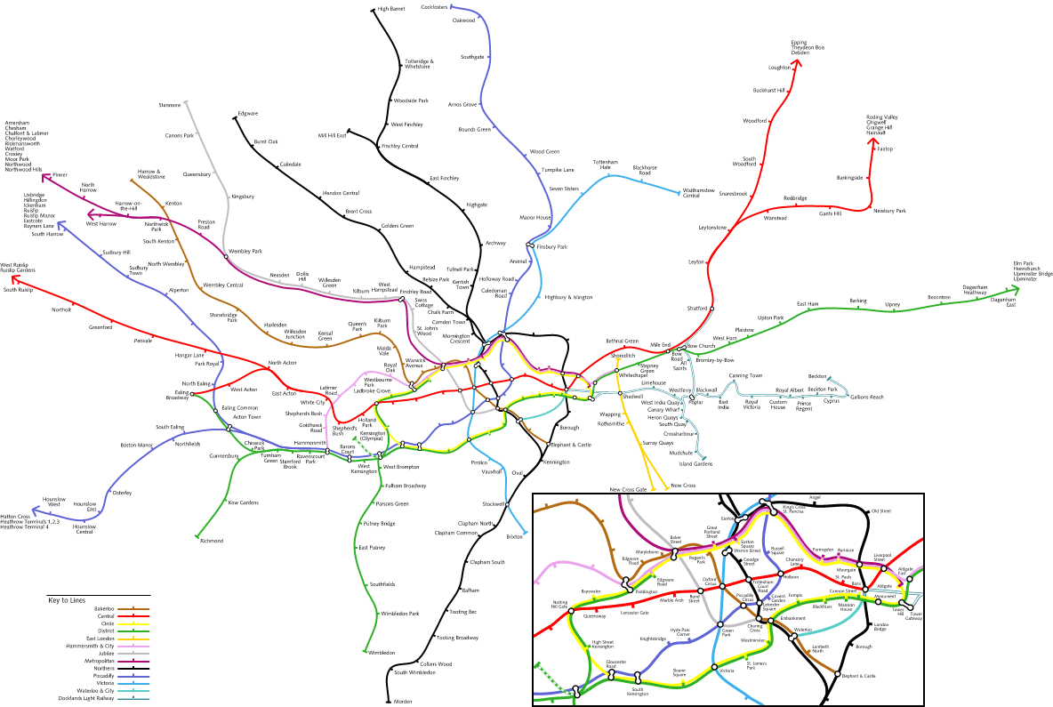
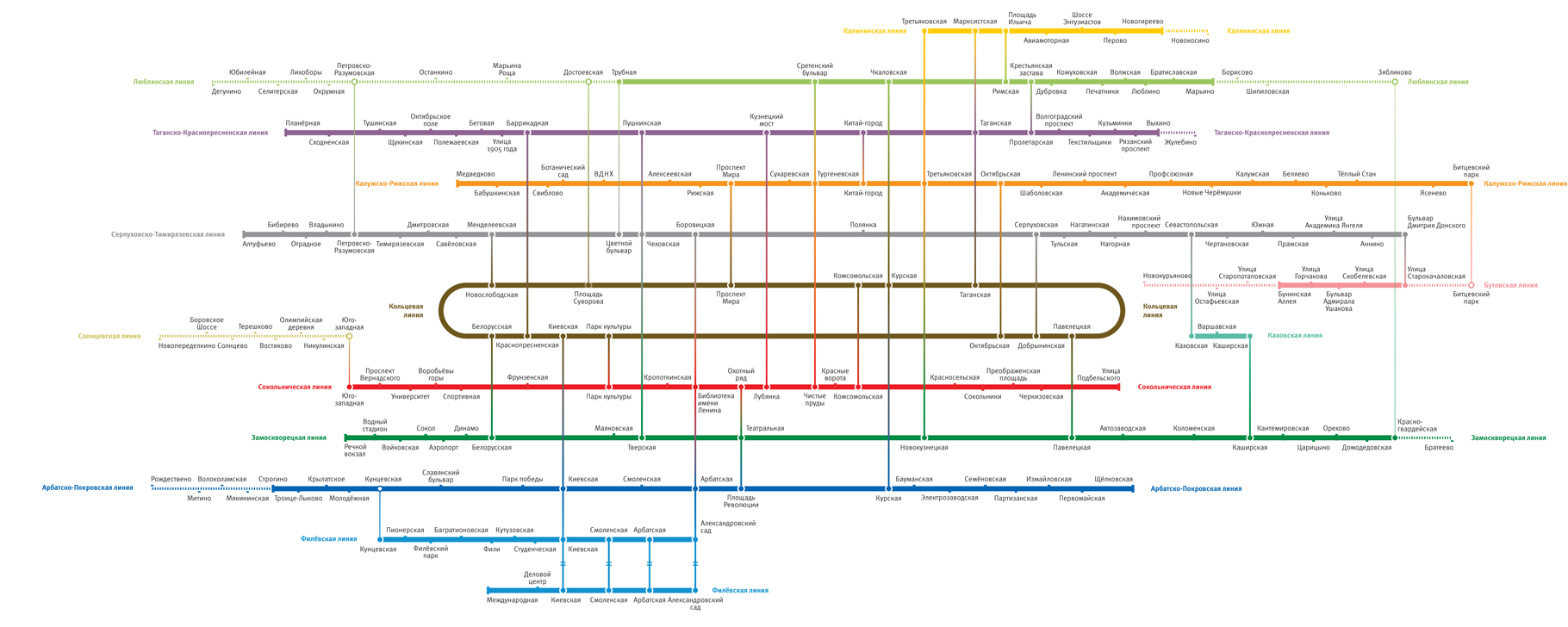
Often, transport diagrams do not accurately represent reality. But is this “lying” even acceptable? And if yes, to what degree?

Schematic depiction of the land has been done since rock drawings. By any contemporary measure these “maps” are ridiculously inaccurate. But they include enough detail for orientation.

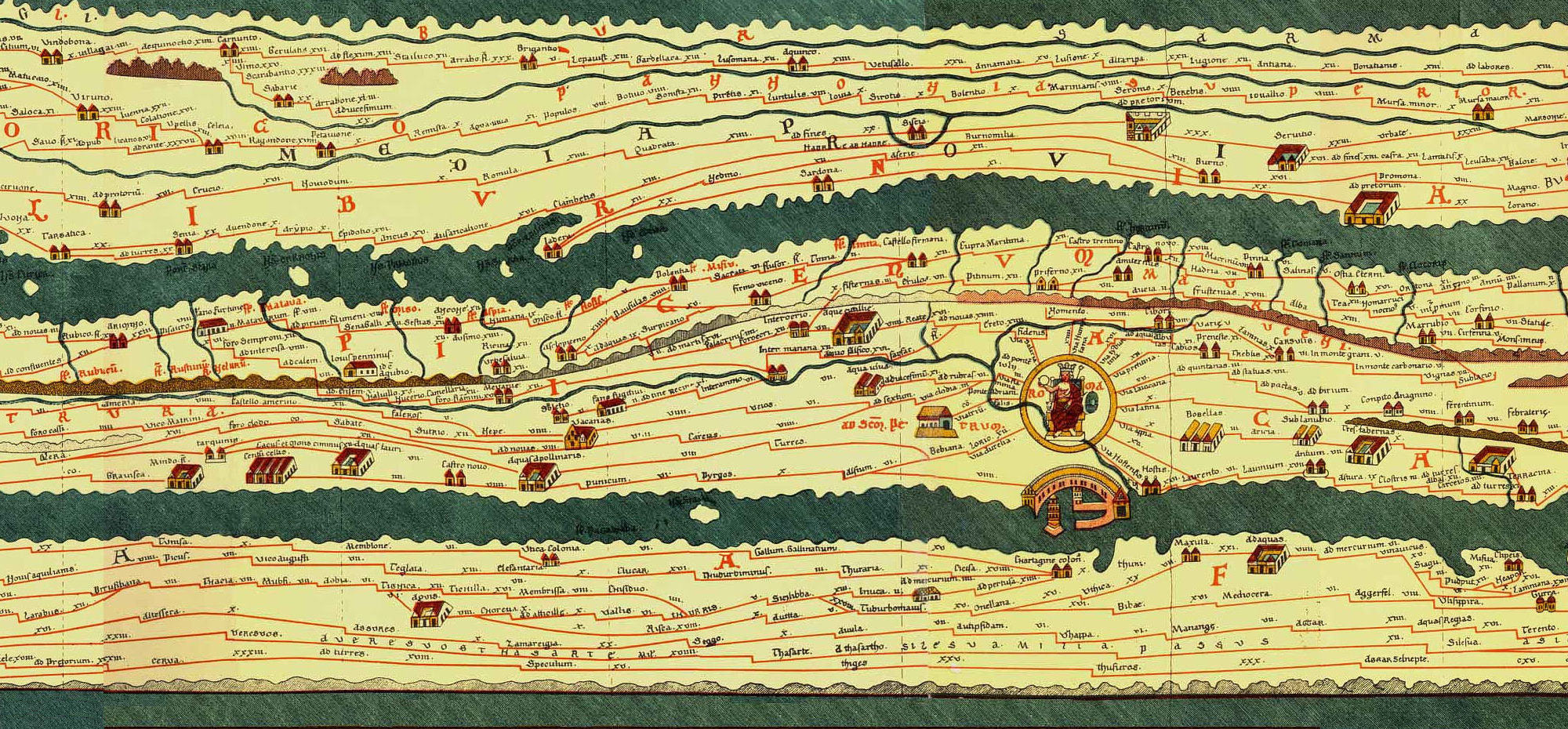
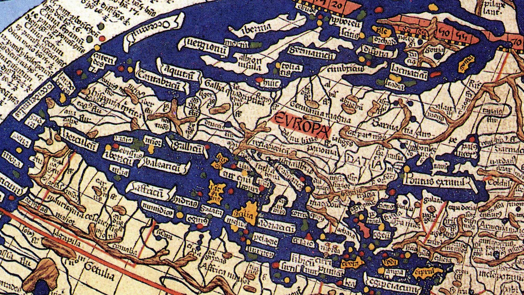
This is an ancient road map of Roman Empire (created between −1 and 5 centuries; implemented in parchment in the 13th):

Ancient road map of Roman Empire

Here is Rome:

Rome on a map of Roman Empire

We are used to a very different appearance of these territories on a map. It’s quite hard to figure out what’s going on here. However, for a man who haven’t seen other maps, there is no reason to think that something is wrong: the roads actually connect the places.

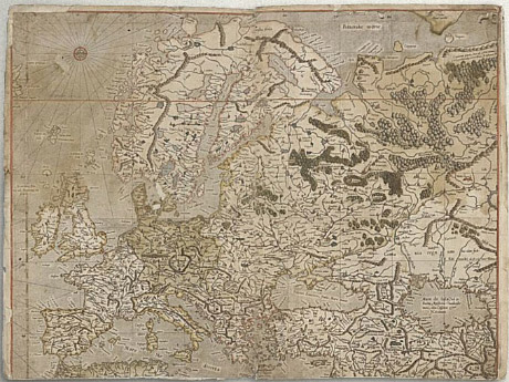
On Ptolemy’s map of the world (2nd century; reproduced by the engraver Johan Schnitzer in the 15th century) the outline of Europe gets somewhat familiar:

Ptolemy’s map of the world

On Mercator’s map (16th century) it looks the way we are used to:

Transit maps and distortion

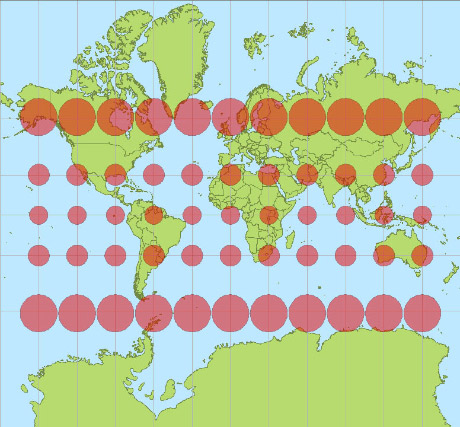
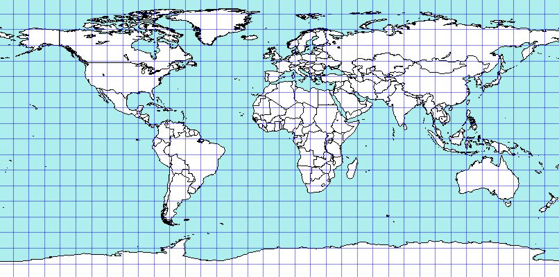
And here’s the whole world in Mercator projection:

Transit maps and distortion

Greenland looks bigger than Africa. The area of Antarctica’s looks comparable to everything else combined. But the red circles actually denote the same physical area, which gives you an idea of how distorted the map is.

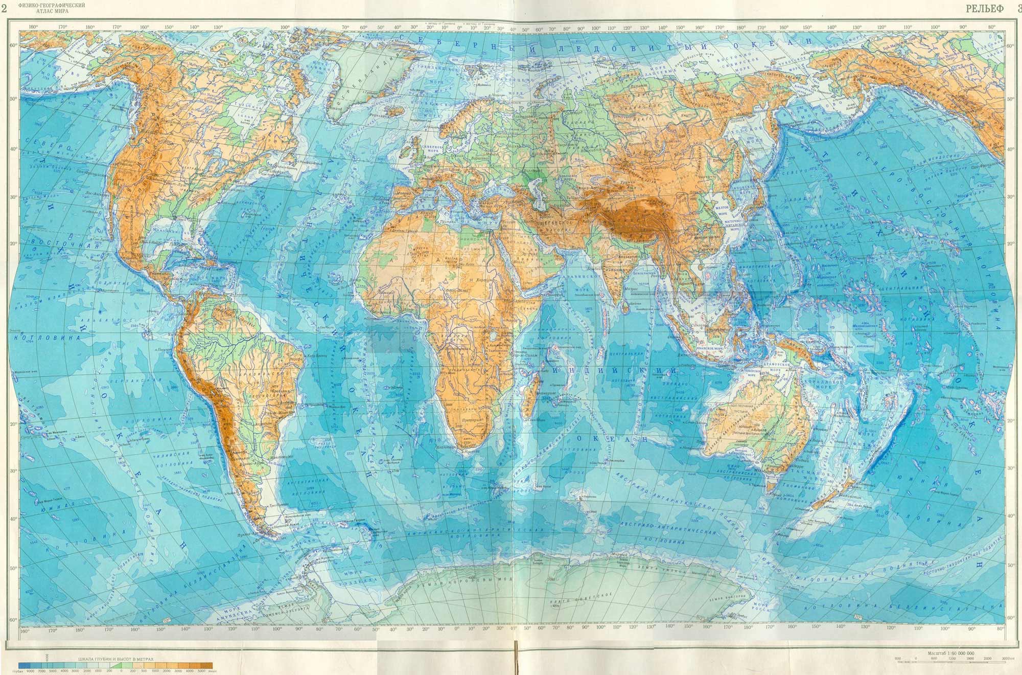
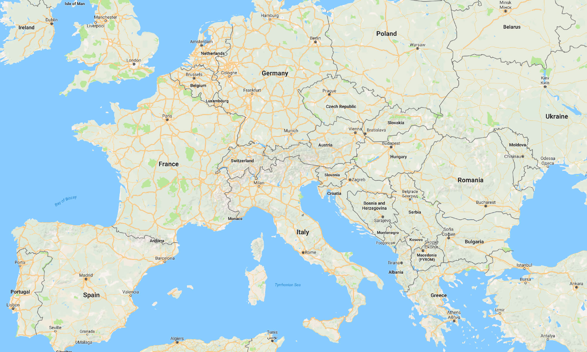
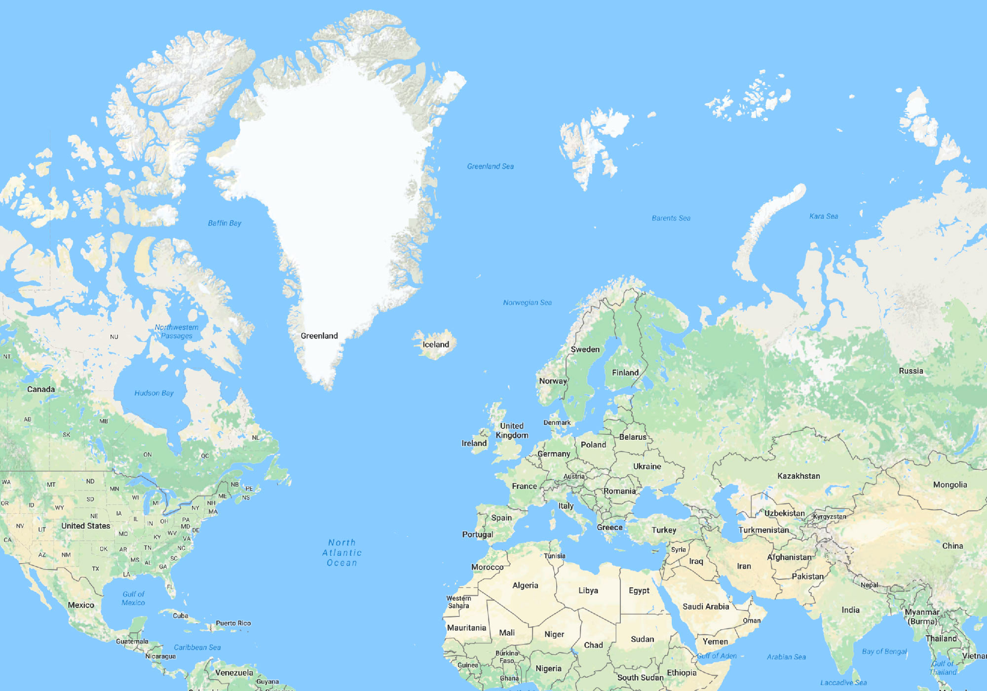
This is a modern Google Map:

A Google Map of Europe

After a man had been to space, it seems, there are no more uncertainties about the shapes of land and sea. But can we say this map is actually precise?

The map is flat and Earth is “round”, so a precise map just can’t exist. Futhermore, let’s look from a distance:

A Google Map

This is Mercator projection!

Mercator projection is one the most important map projections. Its main quality is that it preserves the angles. In each point the horizontal and vertical scales of the map are the same. That’s why when moving from the equator to the poles, the map is artificially stretched vertically the same way it naturally gets stretched horizontally.

Google engineer explains:

The first launch of Maps actually did not use Mercator, and streets in high latitude places like Stockholm did not meet at right angles on the map the way they do in reality. While [Mercator] distorts a “zoomed-out view” of the map, it allows close-ups (street level) to appear more like reality. The majority of our users are looking down at the street level for businesses, directions, etc… so we’re sticking with this projection for now.

Turns out, angles are far more important for navigation than the fair relative representation of land area.

The equidistant projection doesn’t distort area as much, but does distort the shape significantly:

Equidistant projection

The map projections are actually classified by the types of distortions they make. Depending on task at hand, the lengths, angles, areas or shapes can be sacrificed.

When I was designing a map of UZP plant dealerships in Russia, I even split the country in two halves. The Eastern part was displayed at twice smaller scale. This has let me show the much more inhabited Western part in larger detail (I didn’t know then that using such colours was not a good idea):

Map of UZP plant dealerships in Russia

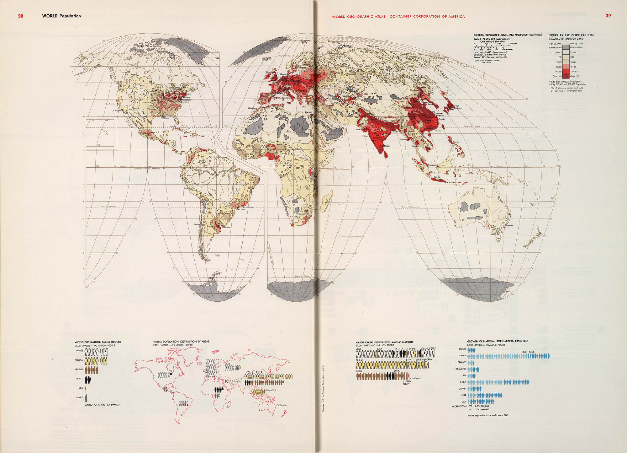
A map from Herbert Bayer’s “The World Geo-Graphical Atlas” the Earth is cut in pieces in order to preserve the shape of the mainlands. For a map that shows the world’s population the fair display of the oceans and Antarctica is not that important:

World population map from Herbert Bayer’s “The World Geo-Graphical Atlas”

To some degree, any map is a lie.

Continued in Map and reality: layers.

Sayve with Karaoke

Sayve 1.1 is out. We’ve added what we call Karaoke:

Sayve with Karaoke

The screenshot is in Russian, but you probably get the idea. When playing audio, we now highlight the corresponding words in the transcription. When playing, tap any word to jump to it in the audio. When selecting among alternatives, tap Play to listen to the selected word only.

We transcribe up to a minute of speech, but the recording can now be as long as you like. Tap audio wave to play. The screen when you have no more recordings looks better. And other small improvements.

The button:

Get for free in the App Store

It won’t be always free.

Sayve, a reliable voice recorder and recogniser

Sometimes an idea comes to mind when I am running or driving and I can’t write it down. I just want to say it to my phone and I want the phone to remember it. Unfortunately, there was no tool for this.

Siri needs Internet and is stupid. When it fails to recognise what I’ve said, there is no way to get back to it later. Keyboard dictation works offline most of the time, but if you aren’t lucky, the original audio recording is also lost. Also, you have to remember to pick the right keyboard language before starting dictation, otherwise you will also lose everything. The Voice Notes app records audio, but does not recognise speech. To find the necessary recording, you need to listen to each as they all look the same.

That’s why together with the developer Michael Rubanov we made Sayve — a reliable voice recorder and recogniser. It works like this: when you open the app, it starts recording and recognising immediately. When you are done speaking, it underlines the words it’s unsure about.

Sayve, a reliable voice recorder and recogniser

You can tap the words and replace with the alternatives. If it’s completely wrong, you can re-listen to the audio. Raise the phone to your ear to listen through the ear speaker.

You can change the recognition language after recording, and it will re-recognise the recording. Then you can export everything to Notes.app or whatever.

We can’t always recognise speech without Internet. But audio is stored permanently, so you won’t lose your thoughts in any case. Also we’ll try to recognise it later, when Internet is back.

Here is the button:

Get for free in the App Store

For free for now, but we’ll see.

How to not destroy Apple cables

Apple cables suck. If you aren’t particularly careful with them, they get destroyed quickly. But I haven’t destroyed a single one in my life.

How to not destroy Apple cables

Most people take the power adapter and tightly wrap the cable around it, thus significantly bending it at its weakest point. Instead, let it go freely straight from the brick for an inch, then wrap around. The same goes for lightning and earphones cables.

Still, Apple cables suck.

Fifth version of the Moscow Metro map

I made my first Moscow metro map in 2007. The official map was disgusting then, but nobody cared. My work inspired many designers to try to design their own map. I know several designers who gave up after they’ve appreciated how hard the task actually was. I had two major revisions of my map including the one for the official 2013 competition for the new map to be used on the system. In that version I’ve solved the problem of the Biblioteka imeni Lenina junction and invented the Compass (more on that on the 2013 map’s page in my portfolio). I took the second place. It took most of the 2015 to design the next version of the map: it used space more efficiently and the overall graphical design was improved.

Here is the new version, with the new Circle Railway (Line 14) added:

Compared to the official map, this map has almost 35% larger font when printed as same-size poster:

Fifth version of the Moscow Metro map

See the project page for detail.

The transformation of Moscow Metro map from version 3 to version 4

I’ve made a video showing how my Moscow Metro map transformed from version 3 to version 4:

After the video has loaded (16 MB), you can scrub it.

0:00 Changes inside the Circle and on the west
0:02 Font size grows
0:05 Font size grows
0:10 The Circle becomes smaller
0:14 Yellow line appears on the west
0:15 The grid becomes narrower
0:16 The northern and southern grids decouple
0:22 Finding the right corner rounding
0:24 Changes on the west
0:27 Preparing the north to adding the monorail
0:33 Butovskaya line on the south, monorail
0:34 Even distribution inside the Circle
0:36 It’s hard to position the Tretykoskaya and Novokuznetskaya stations well
0:42 Transfers become bigger
0:44 Font size grows
0:47 Font size grows
0:48 The northern and southern grids reunite
0:54 The font changes to PT Sans Metro
0:57 Transfers become nicer
0:59 Adjusting the distances
1:05 Layout...

The “Buy” button should always work

Here is one lesson I have learnt working on Envy, a cool Hawaiian car rental.

On a car page, there is a yellow price tag with a “Rent” button:

The “Buy” button should always work

A typical way to get to this page is the following. On the front page a client chooses the desired rent dates, clicks “Find”, then selects from available cars. It is possible though, that by the time the client selects a car, somebody else books it already. Or the client reloads the car page in a couple of days, and the car is gone. One way or the other, a client can end up on the car page with the pre-selected rent dates, for which the car is no longer available, and they won’t be able to rent it.

Also, on the front page we show the best cars we have. A client can click any of them and get to its page, having skipped the dates selection altogether. In this case, the dates won’t be specified, and the client also won’t be able to rent the car. We didn’t want the client to be confused by the disabled “Rent” button, so in addition to the front page, we put the dates selectors to this price tag itself.

I presented the design of the car page to Ilya Sinelnikov (co-creator of Envy) and was talking about the price tag.

I said, we didn’t like that the “Rent” button is disabled sometimes: the website is there for the people to rent cars. But how can you rent a car which is taken by someöne else? At first, we thought that we could automatically change the dates to the nearest available ones. But it can result in a disaster: what if the client doesn’t notice the change, pays for the rent, comes to pick-up the car, and learns that we don’t have it? I said, we were also thinking about some tool to explain the problem and help the client change the dates, but there was no chance to make it on time for the website launch. So, I said, for now I suggest just disabling “Rent” the button in this case.

Also, I said, a car could become unavailable while the clients looks at its page. Therefore we needed to re-check the availability after the “Rent” button is pressed, and inform the client of a problem, if it occurs. For now, I said, we’ve designed this error page. In the future it would be better to suggest a date change or offer another car. But this is also not going to be implemented by launch...

Ilya interrupts: “To hell with the dates, let’s just make the button always enabled.”

What? There can be no car for the client when they come.

“The client is willing to pay us money”, Ilya says, “and you prevent them from it by disabling the button. This is inefficient. Let them pay, and we’ll sort it out”.

And then Ilya enlightens me. Envy as a business must be able to sort this out anyway. It is possible that a booked car is not available for the client, say, if the previous client breaks it, or whatever. In order to make the client happy, Envy offers them a better car for the same price.

For Ilya, it all appeared as if I was trying to stop his client from paying him money with my UI. But from the business perspective my UI consistency hurdles are insignificant. Dates have accidentally overlapped? Oops, sorry, here’s a Mercedes instead of a Ford, no big deal. In the worst case, if there’s a super-picky client who won’t take anything but the very car they’ve chosen on the website, we’ll return the money and apologise.

So we made the “Rent” button always enabled. If by the time the client clicks it, the car becomes unavailable for the selected dates, the manager gets a notification about a problem, and it is their job then to contact the client and agree on a new car or dates. And if the dates are not selected at all, clicking “Rent” moves the focus to the dates fields and opens the calendar, so that the client knows what to do.

Principle: the “Buy” button should always work.

Earlier Ctrl + ↓