Design
During WWDC, the new Monument Valley was released. It’s the most splendid game ever. I’ve finished it, having made some screenshots

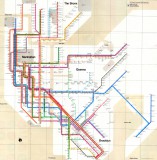
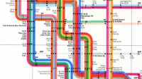
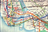
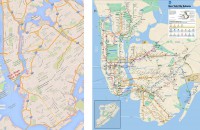
In part 1 I’ve covered the difference between the Beck’s London underground map, our Ekaterinburg metro map, and the Vignelli’s and Hertz’s maps of New York subway
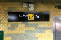
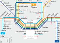
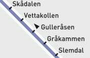
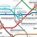
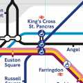
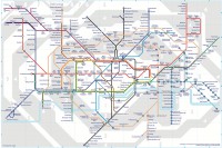
In the first part I’ve covered the difference between the Beck’s London underground map, our Ekaterinburg metro map, and the Vignelli’s and Hertz’s maps of New York subway
For many people, a map of a transport network is a given, an expected part of a system, something that just is — like a fire escape plan in a building
Many of the things I do are considered a job of a “UI/UX” designer. But I haven’t ever called myself one
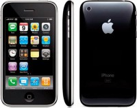
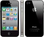
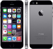
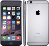

Somehow it’s become a common knowledge that the design of the iPhone 7 is almost the same as the design of the iPhone 6
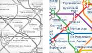
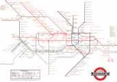
I made my first Moscow metro map in 2007. The official map was disgusting then, but nobody cared. My work inspired many designers to try to design their own map
I’ve made a video showing how my Moscow Metro map transformed from version 3 to version 4
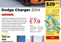
Here is one lesson I have learnt working on Envy, a cool Hawaiian car rental