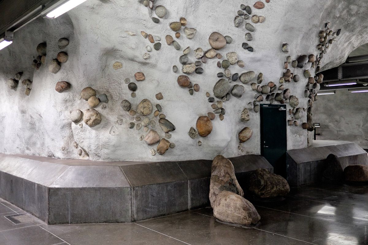
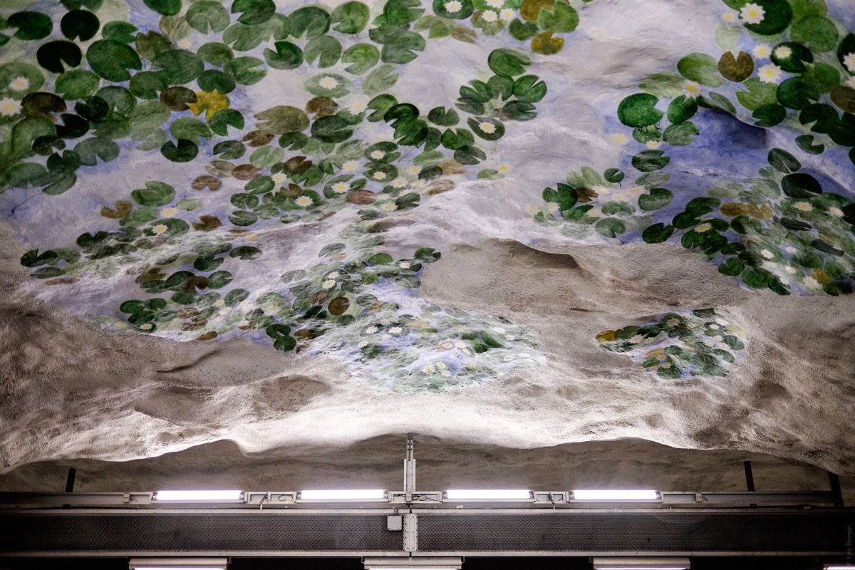
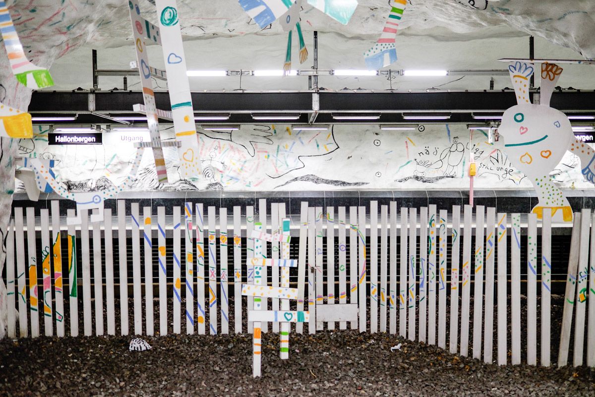
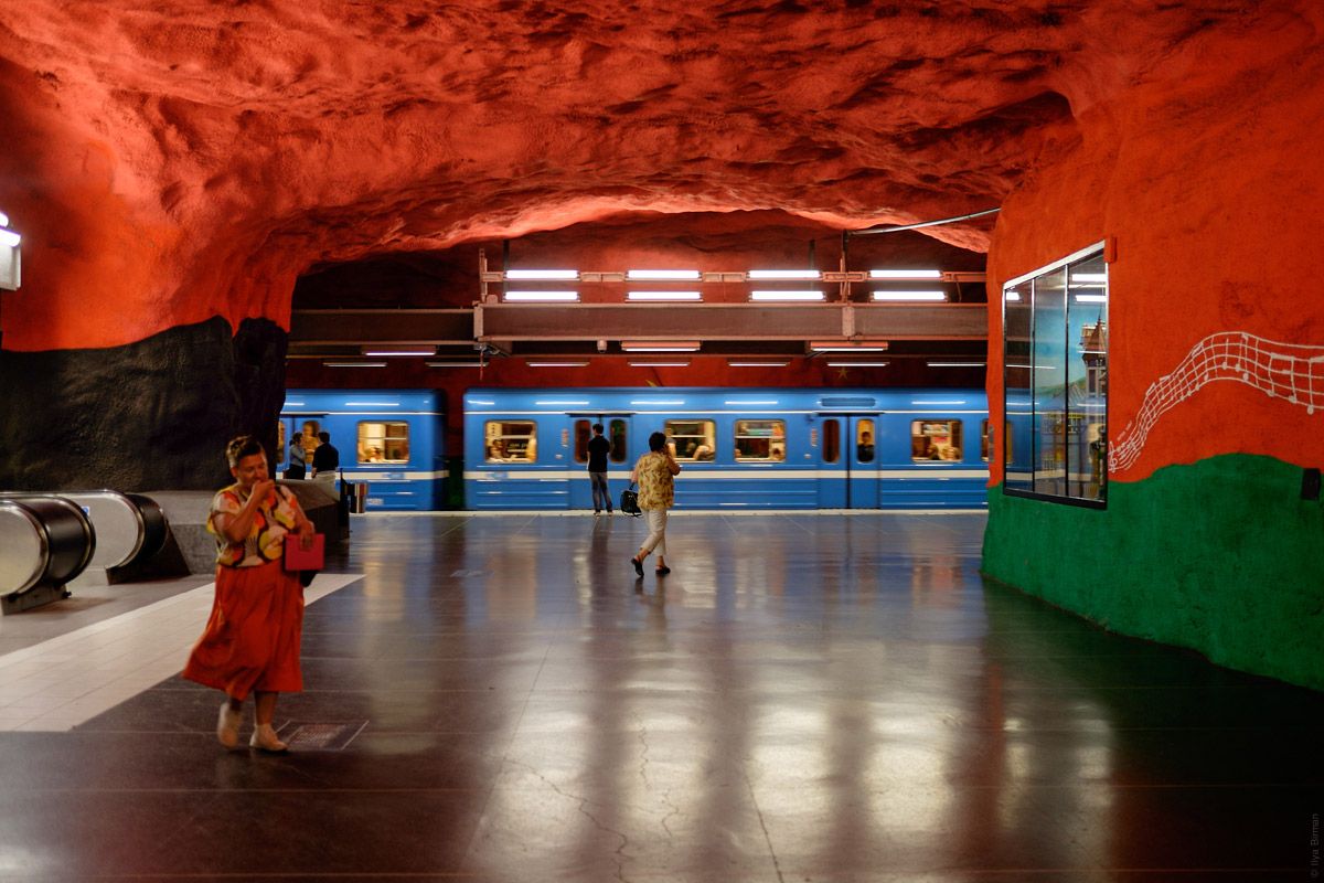
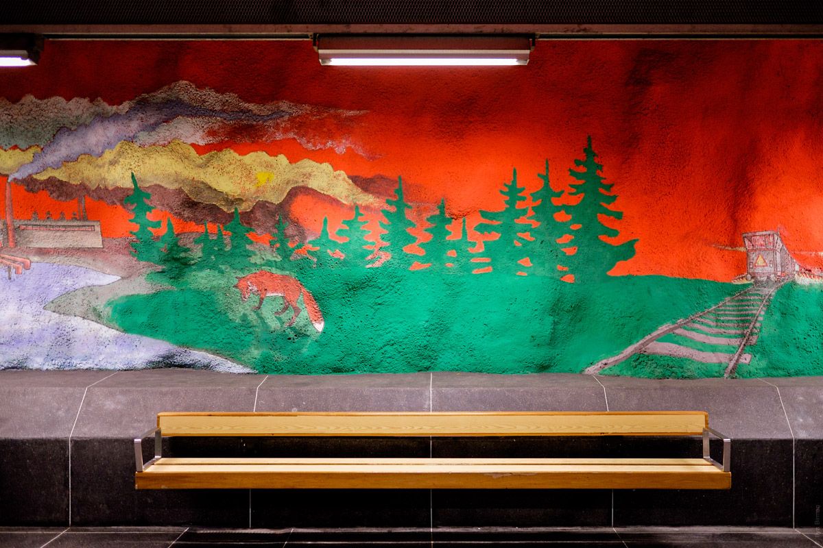
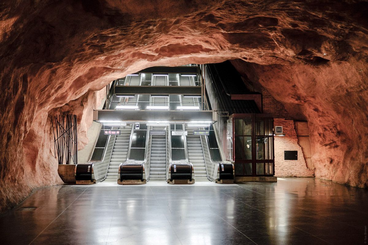
This is a kind of photos you usually see in blog posts titled “Stockholm metro”:
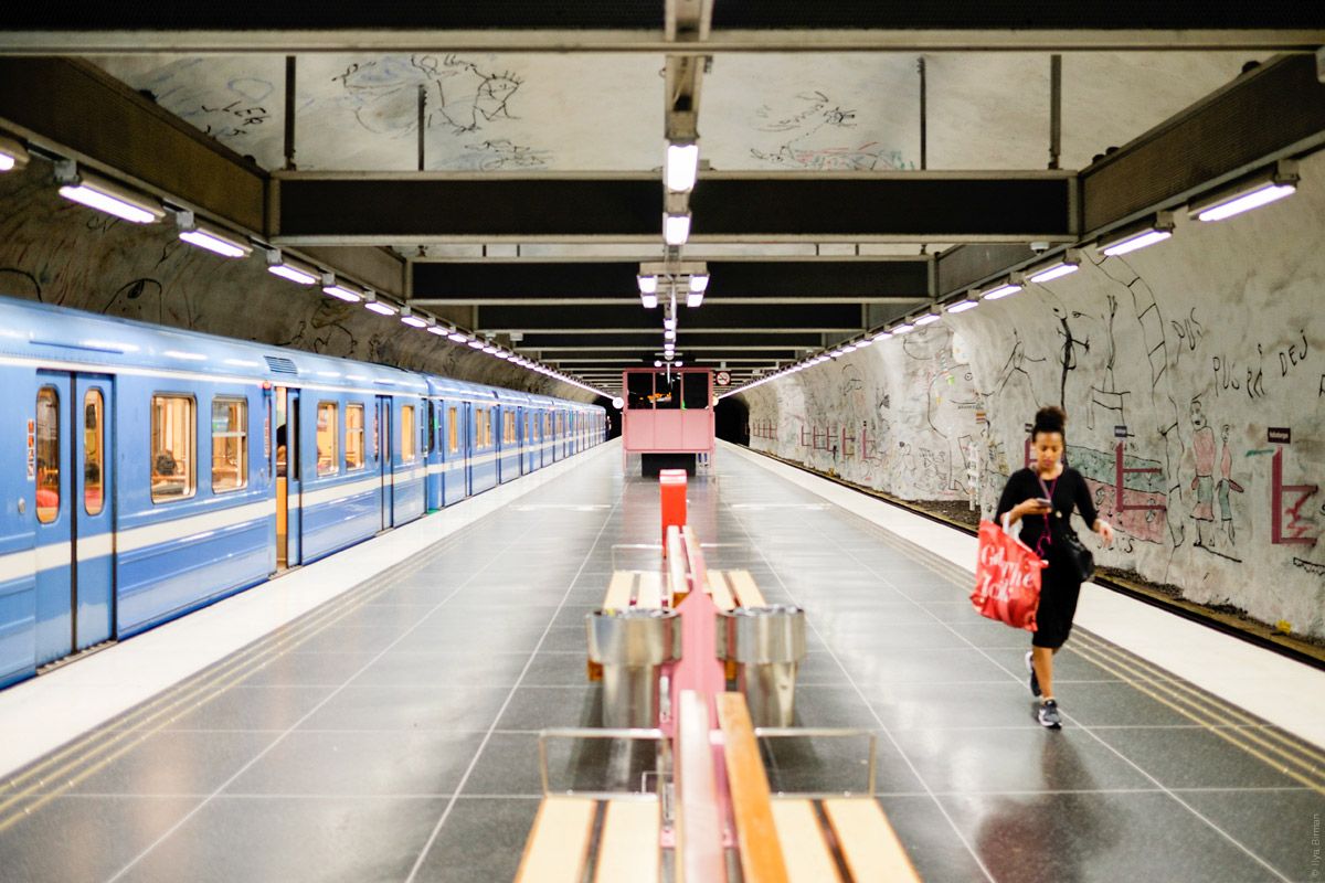
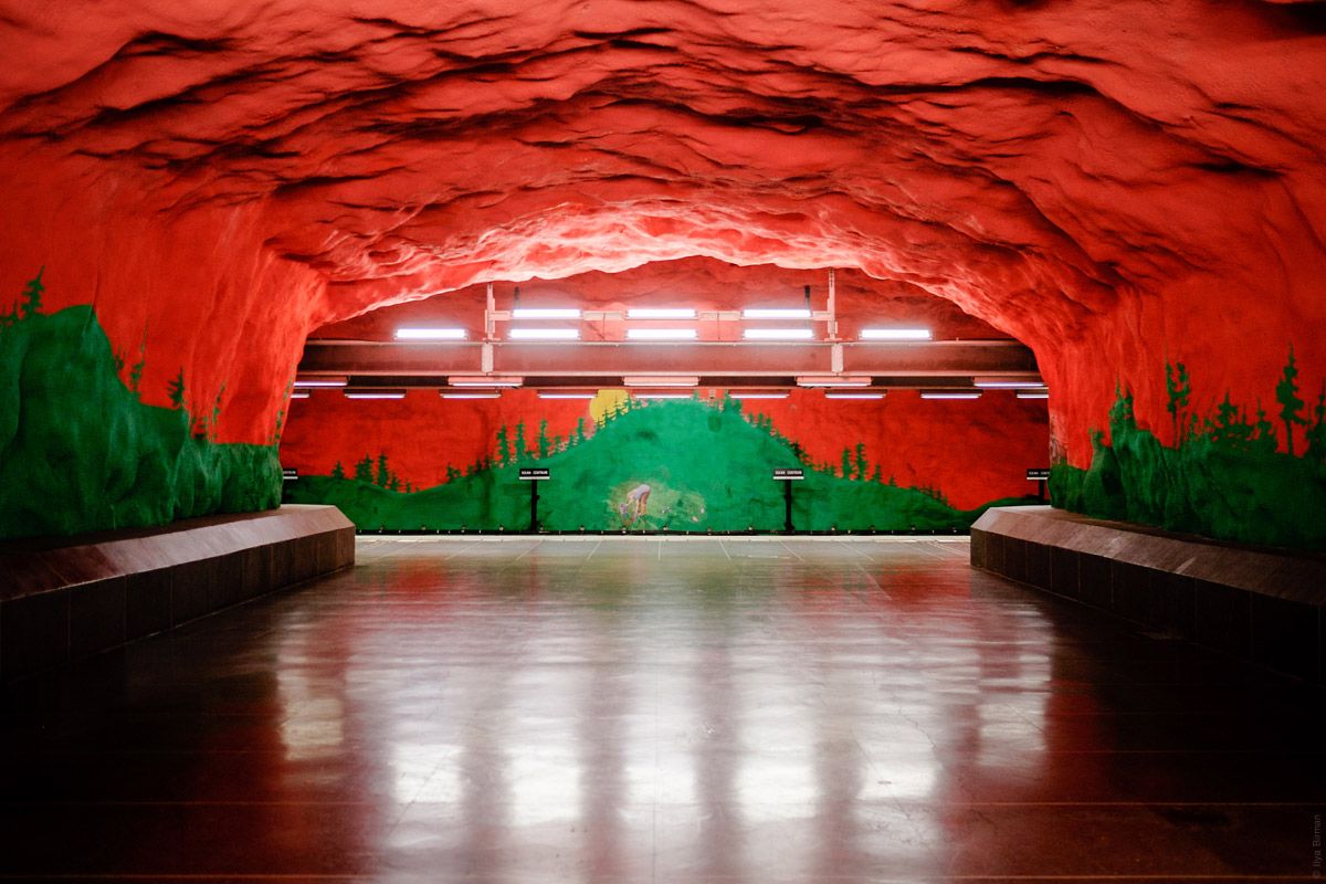
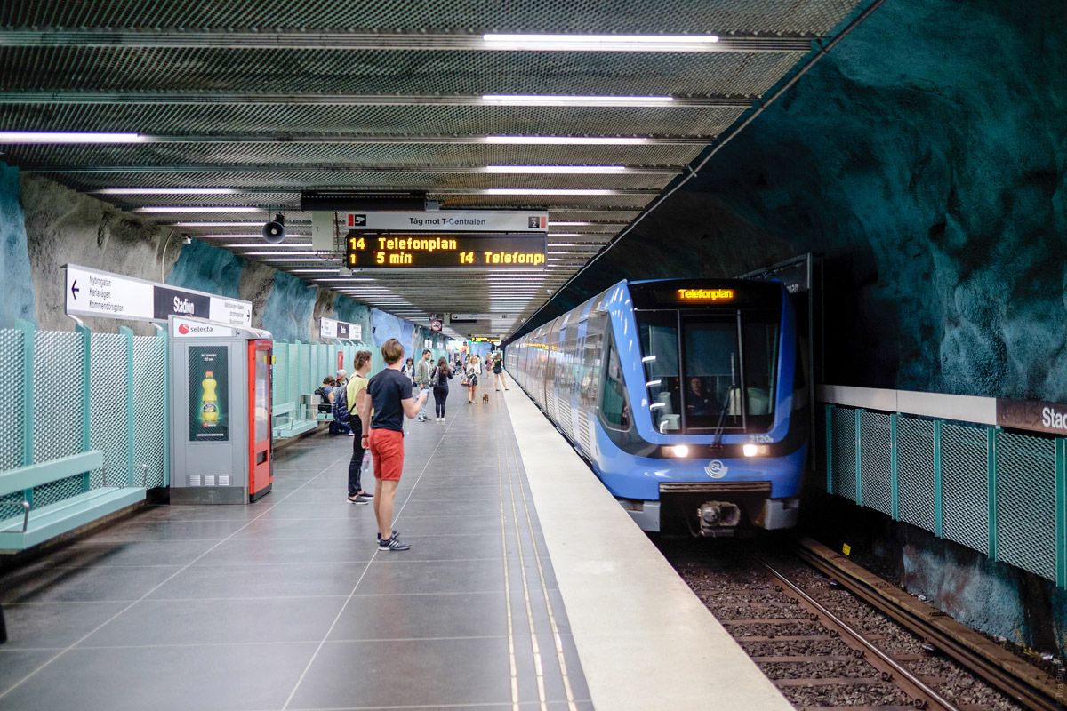
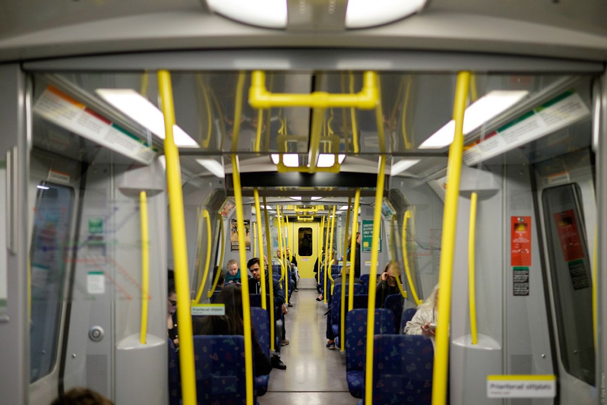
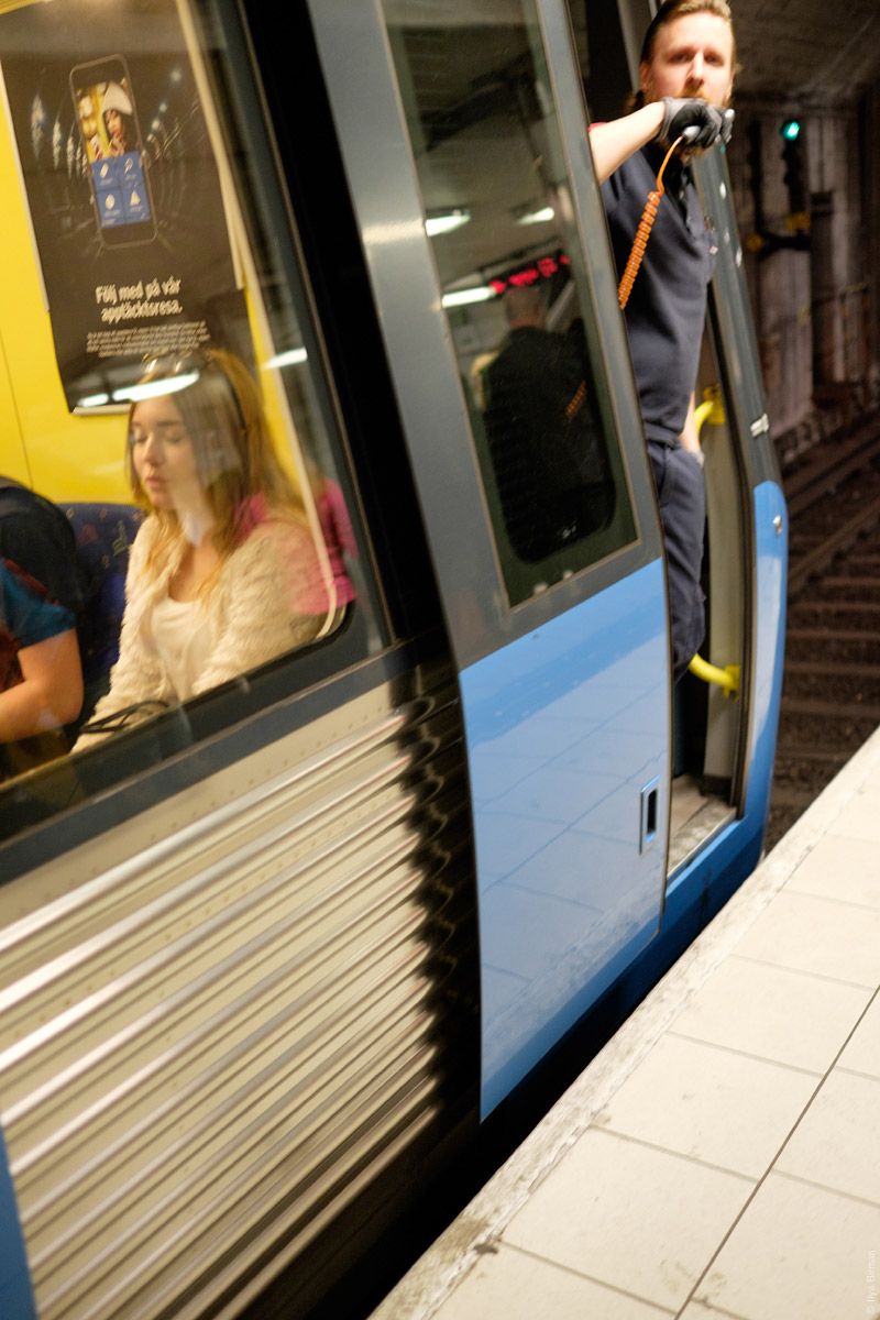
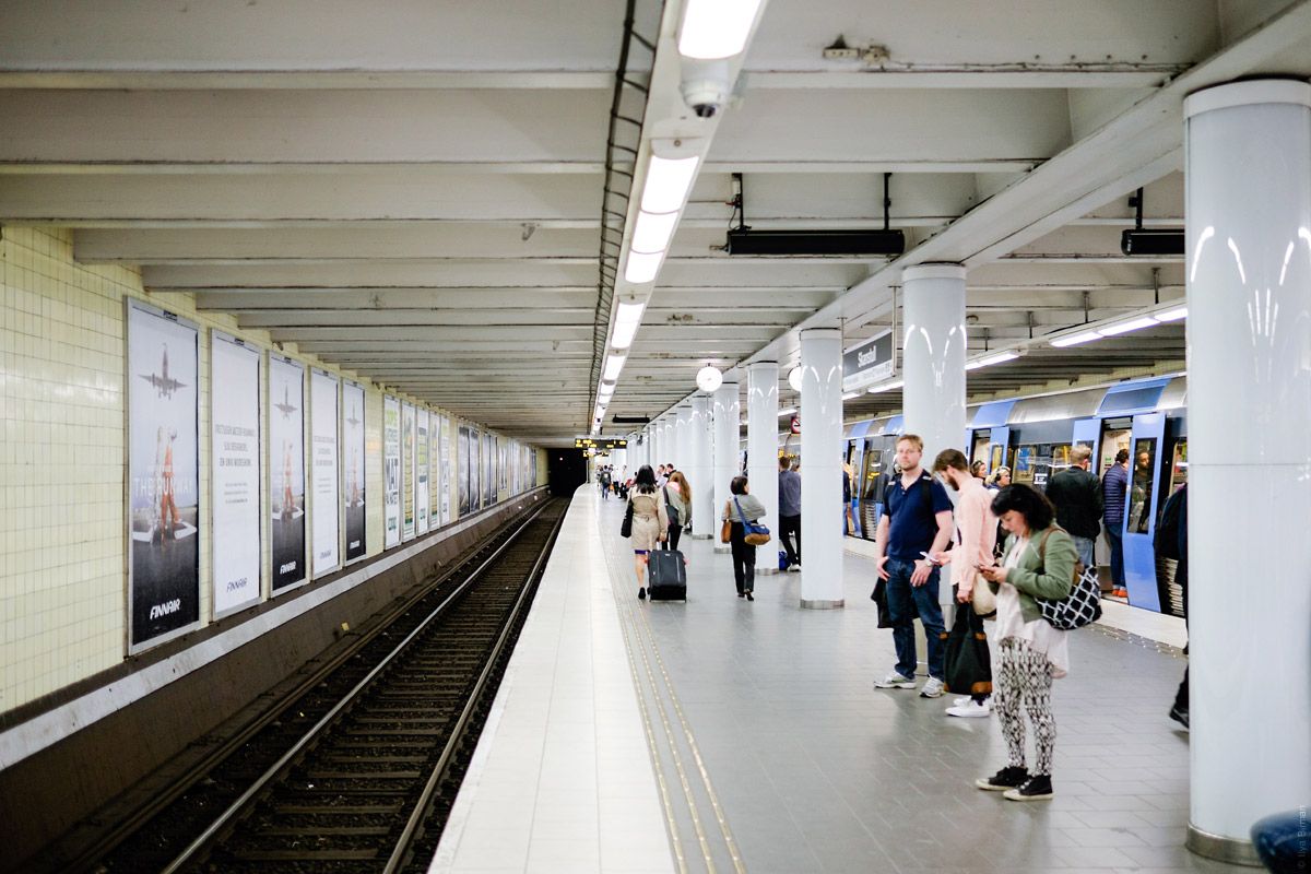
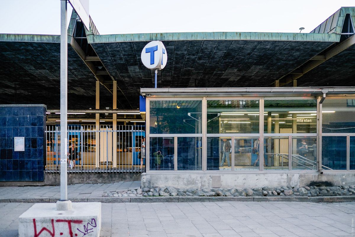
You may think that all Stockholm metro is like this. But when you come to Stockholm and go to the metro, what you see is this:
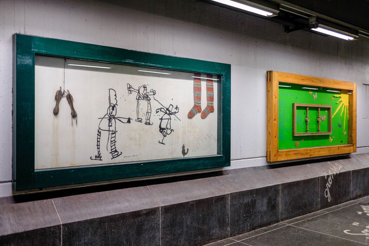
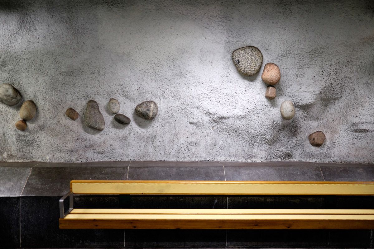
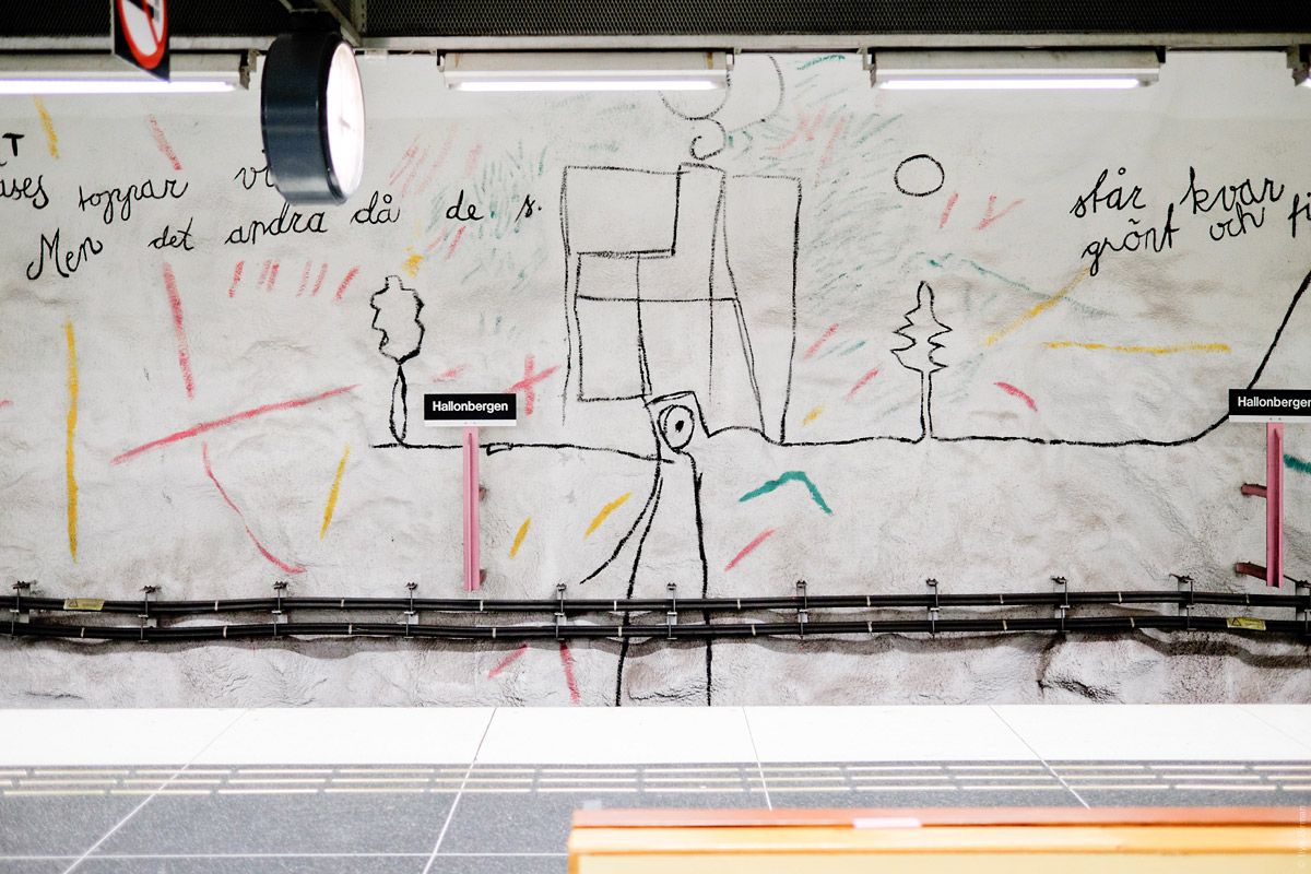
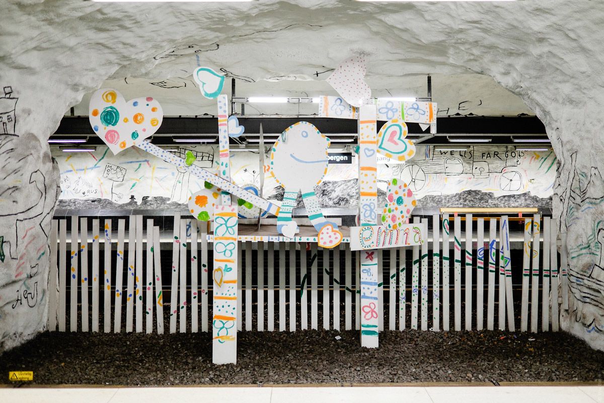
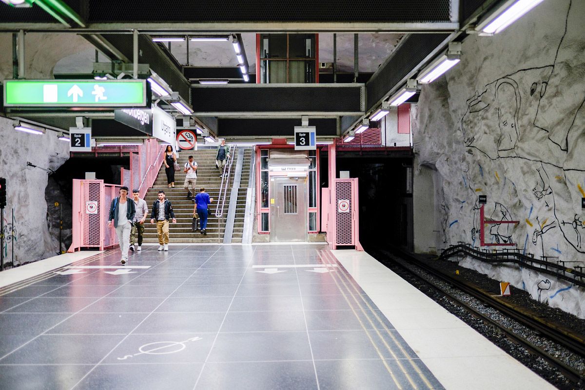
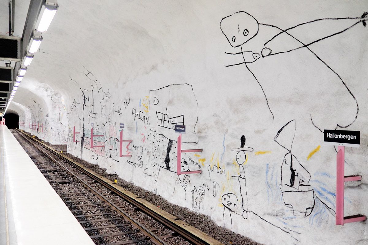
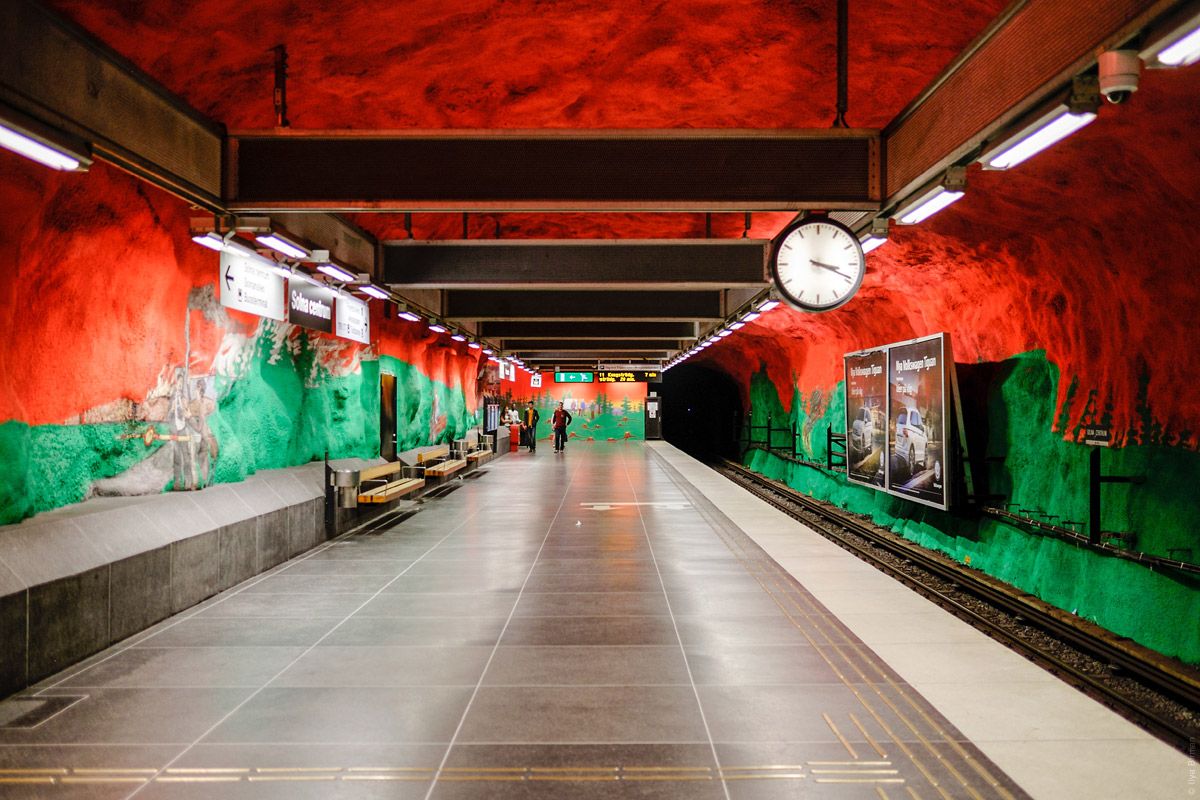
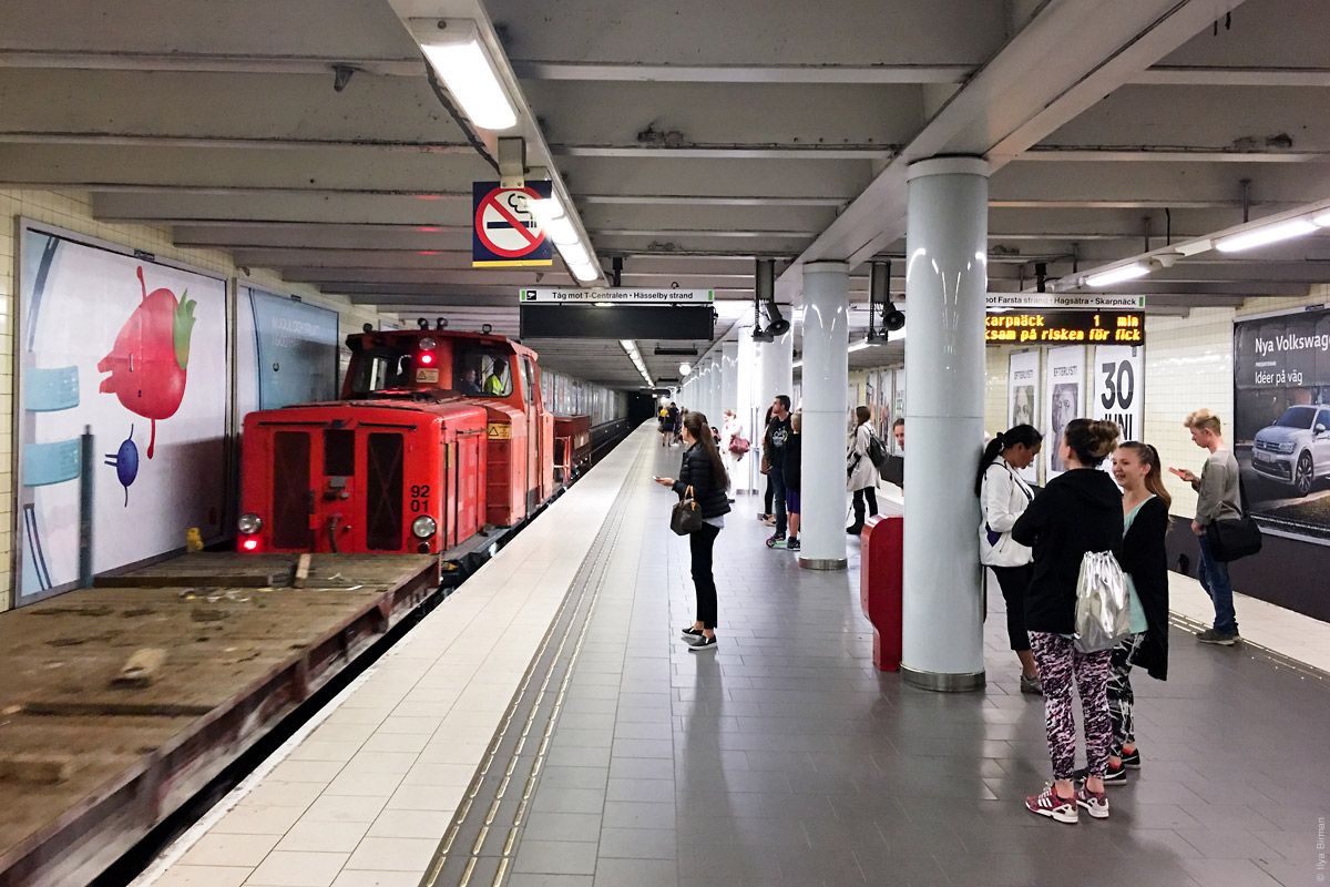
Not all stations are fantastic, you must know where to go. I will get to the good ones, but will start with the other things.
The station entrances are denoted with the letter T, because metro is a “tunnel road” (tunnelbana). The entrance from the central rail station:
In Swedish, the definite article is expressed as a suffix, including -n, so sometimes you see a funny word tunnelbanan (“the tunnel road”):
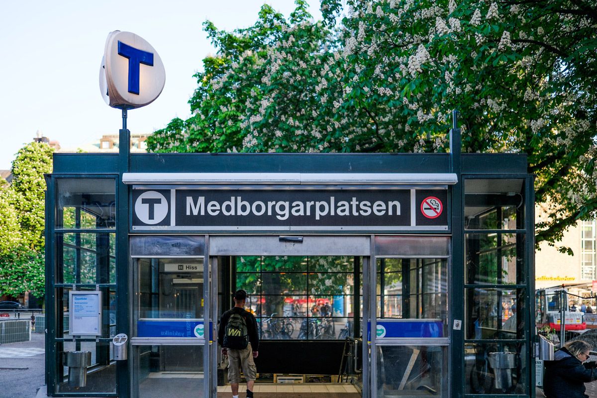
The entrance in the old town:
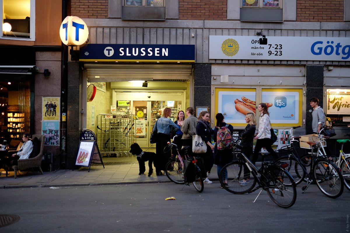
Another one in the central part of the city:
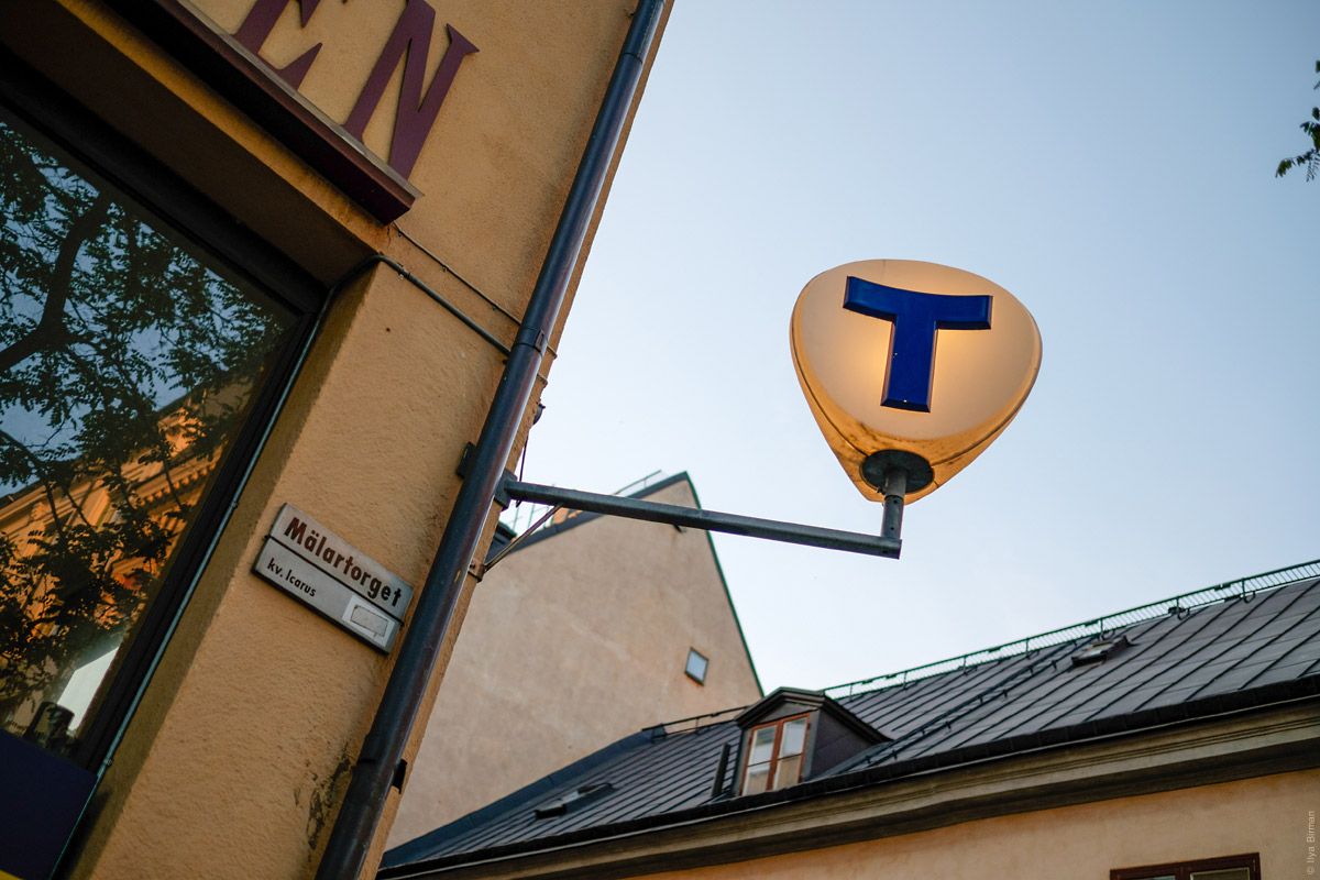
The “T” thing itself is of a very nice form:
And it is glowing at night:
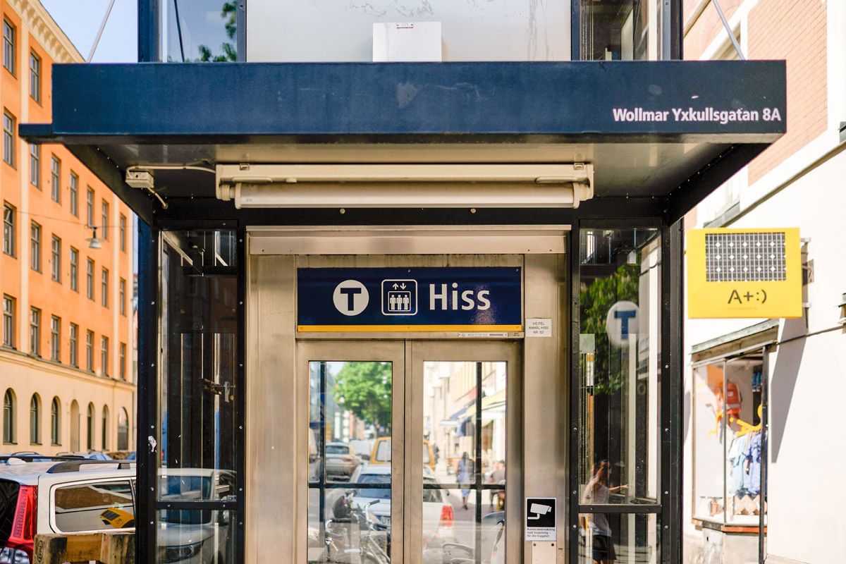
A lift at one of the stations:
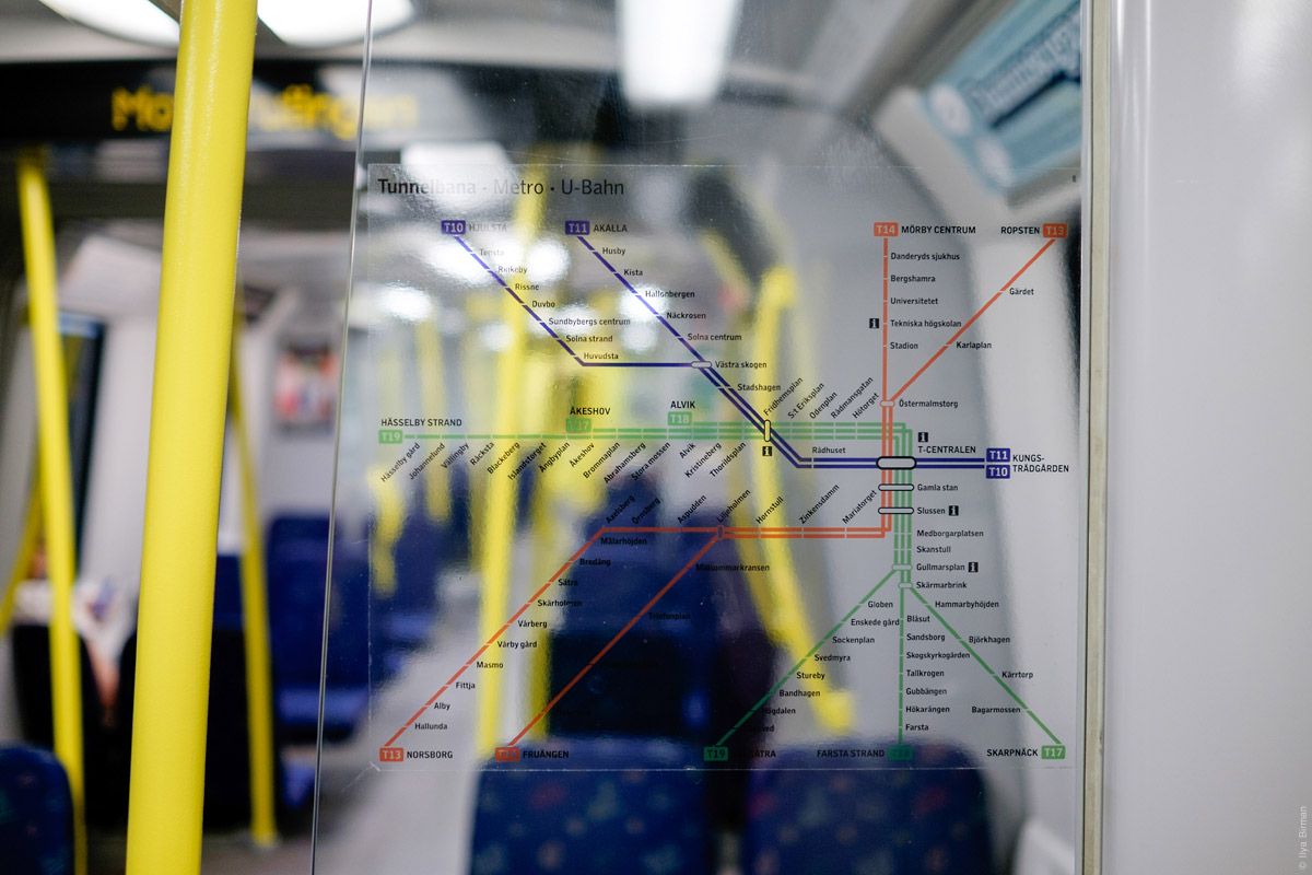
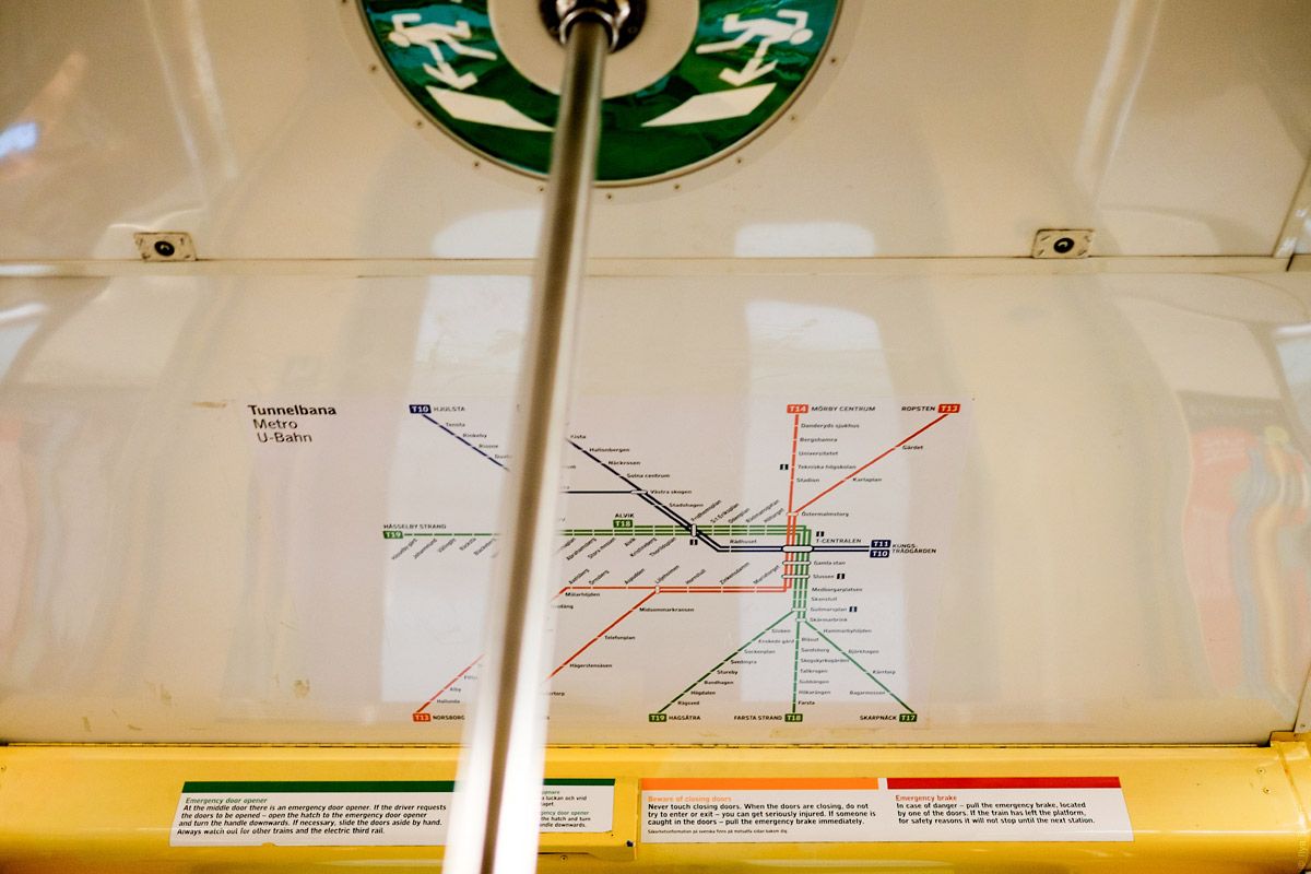
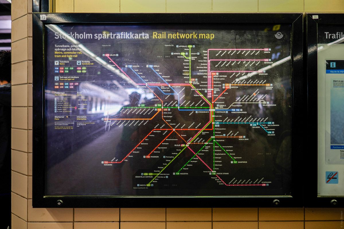
The map of the metro and suburban trains:
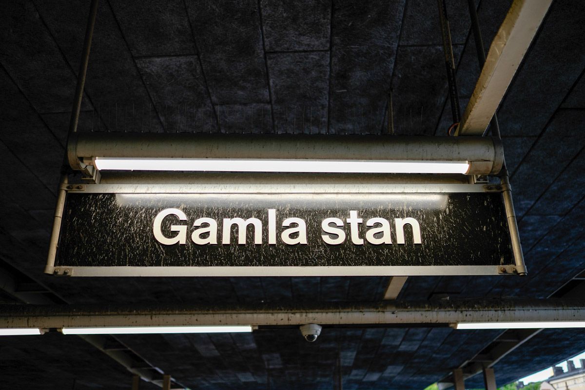
You can find the stations Skanstull, Medborgarplatsen, Slussen, Gamla stan in the centre.
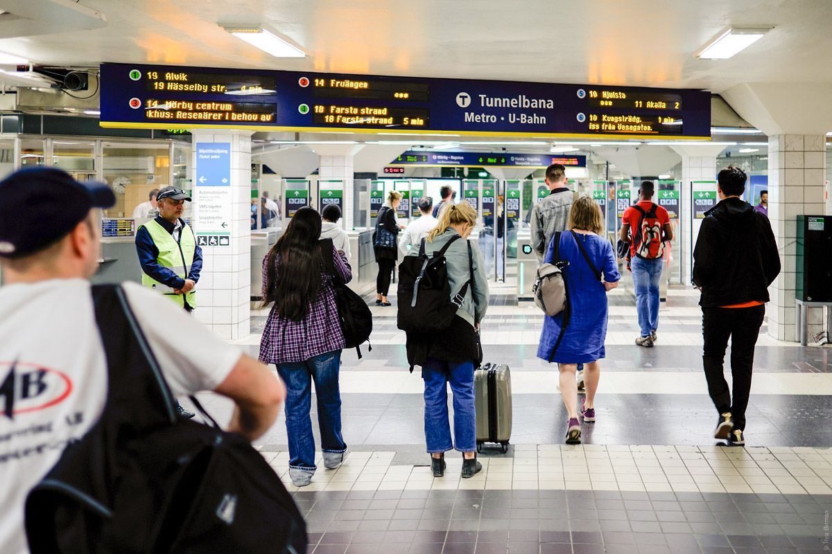
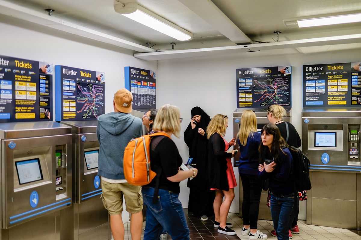
Ticket machines:
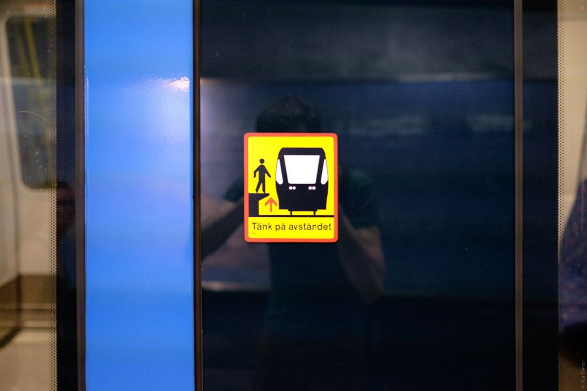
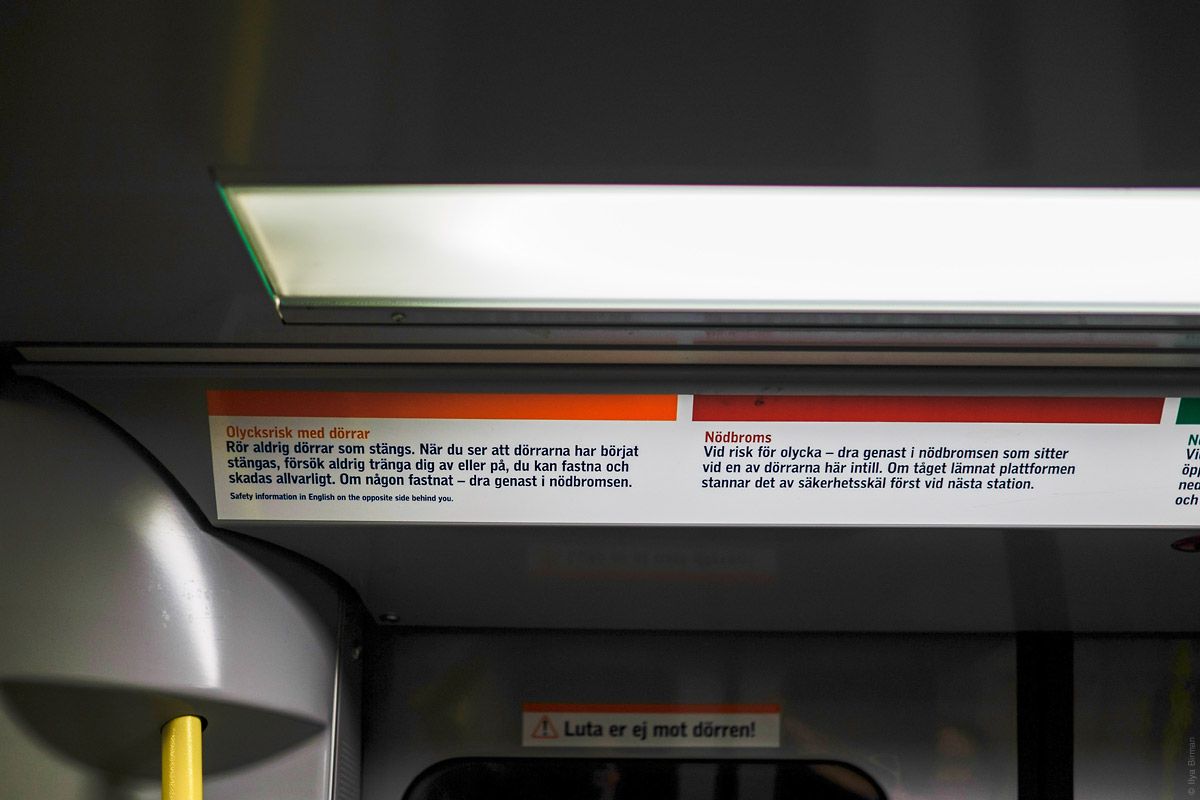
There is a unified graphic style for the transport system. I will show the airport and the central railway station later. They all use the same font, the Swedish text is always white and the English one is yellow. But on the metro, only the posters follow this style. Other elements are inconsistent in their design.
Let’s get it. A beautiful font:
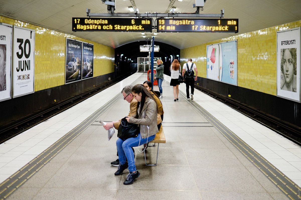
A platform. The letters on the display are gigantic. Looks right:
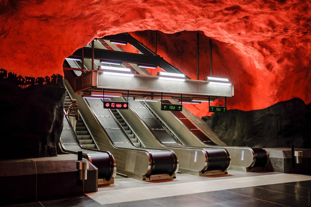
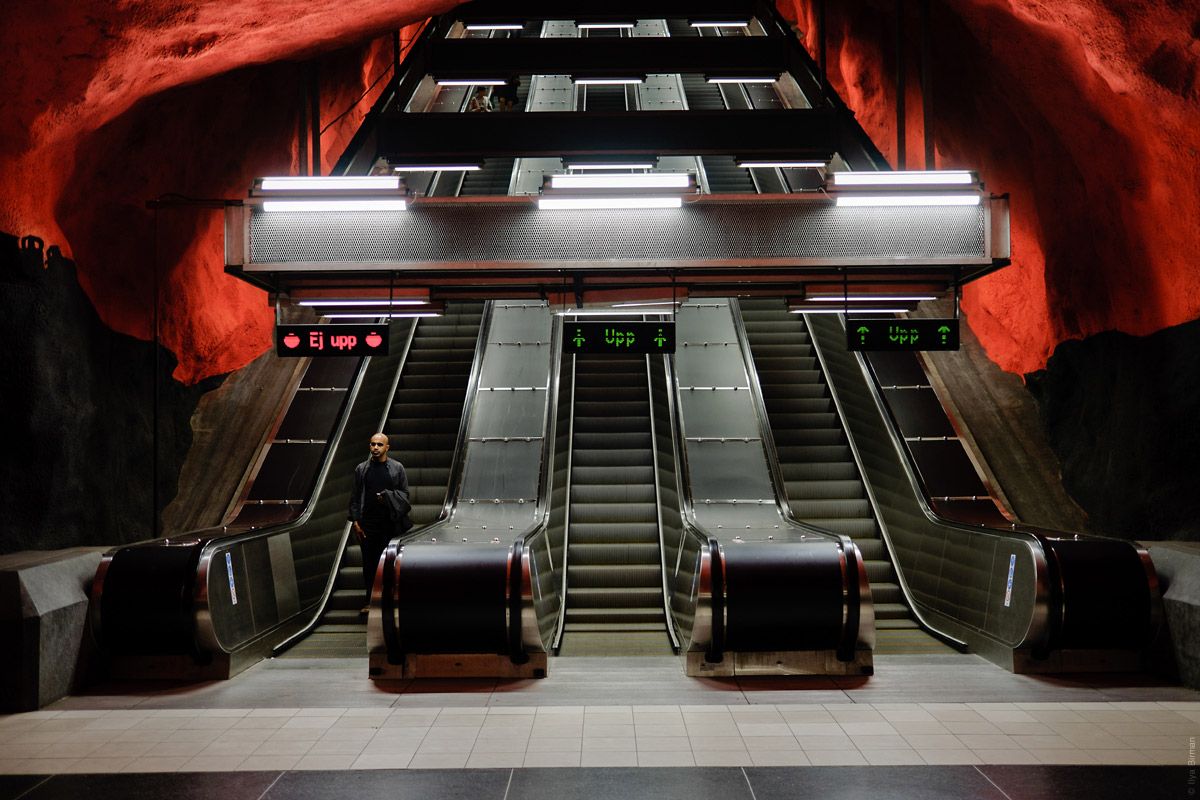
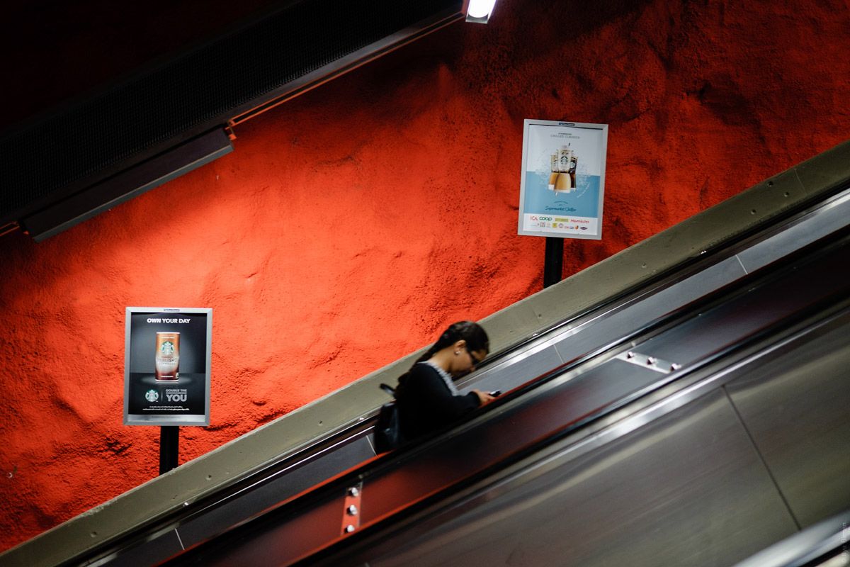
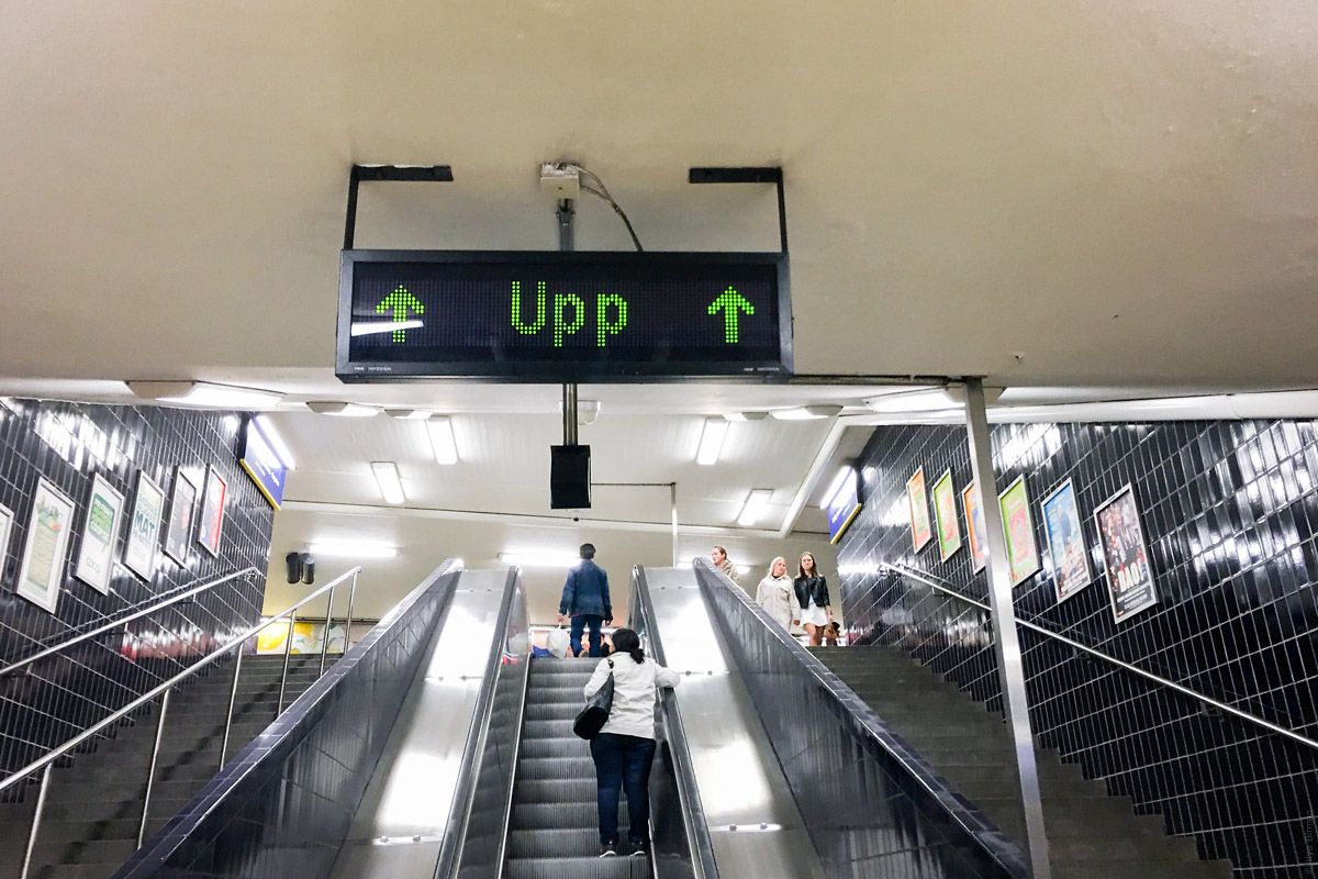
This display informs about escalator direction:
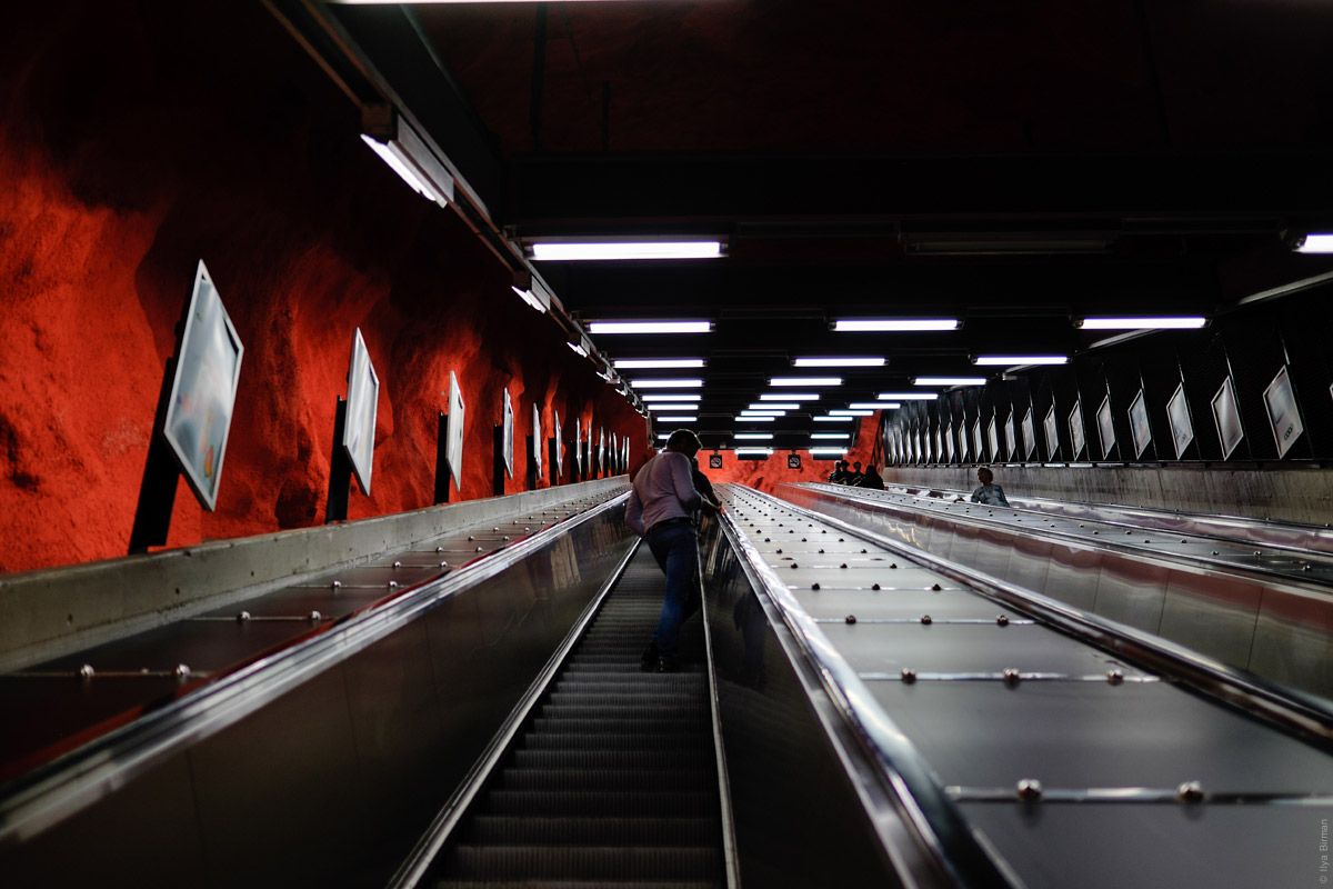
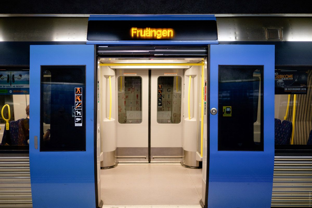
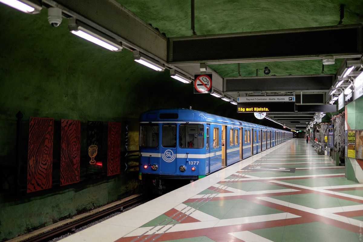
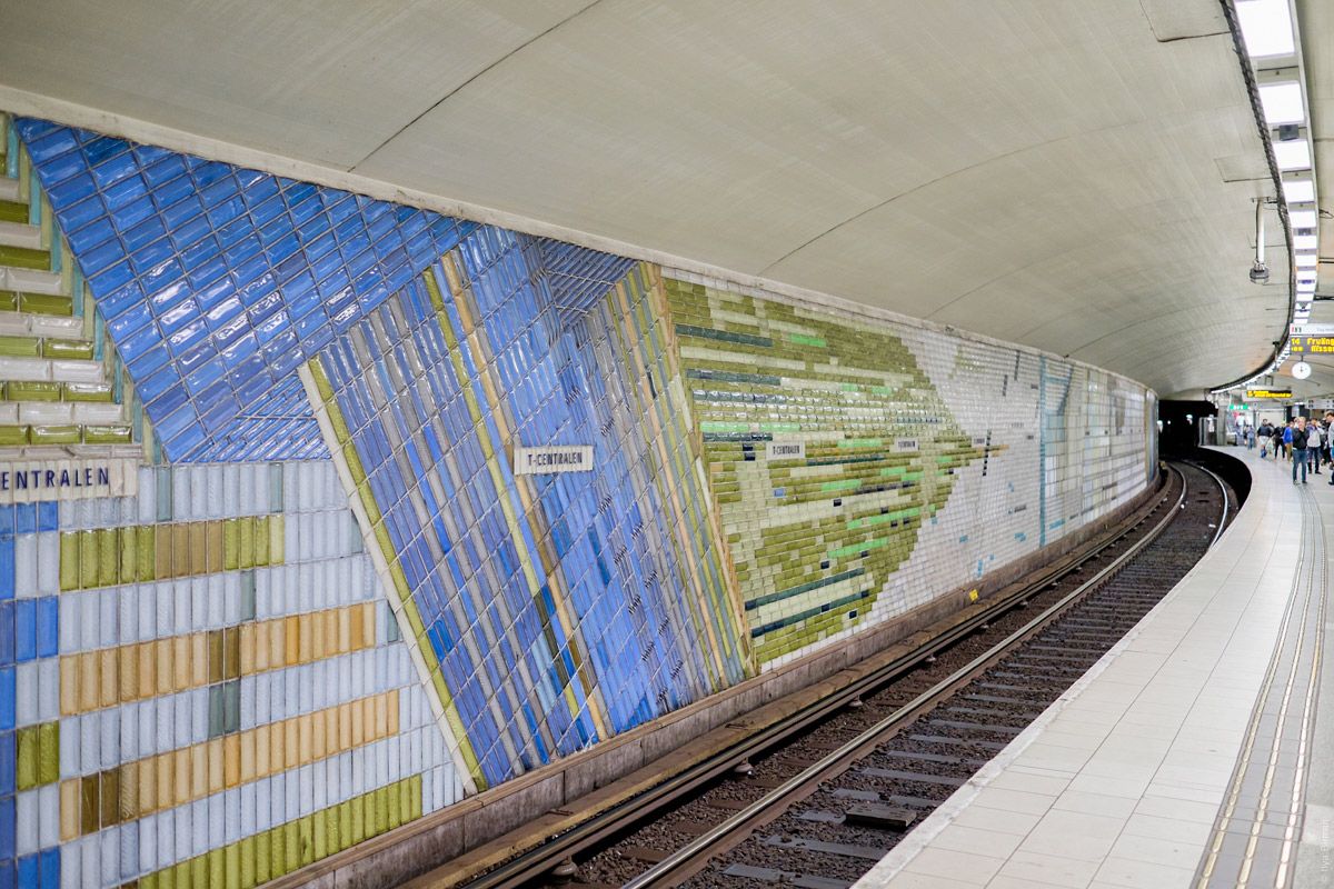
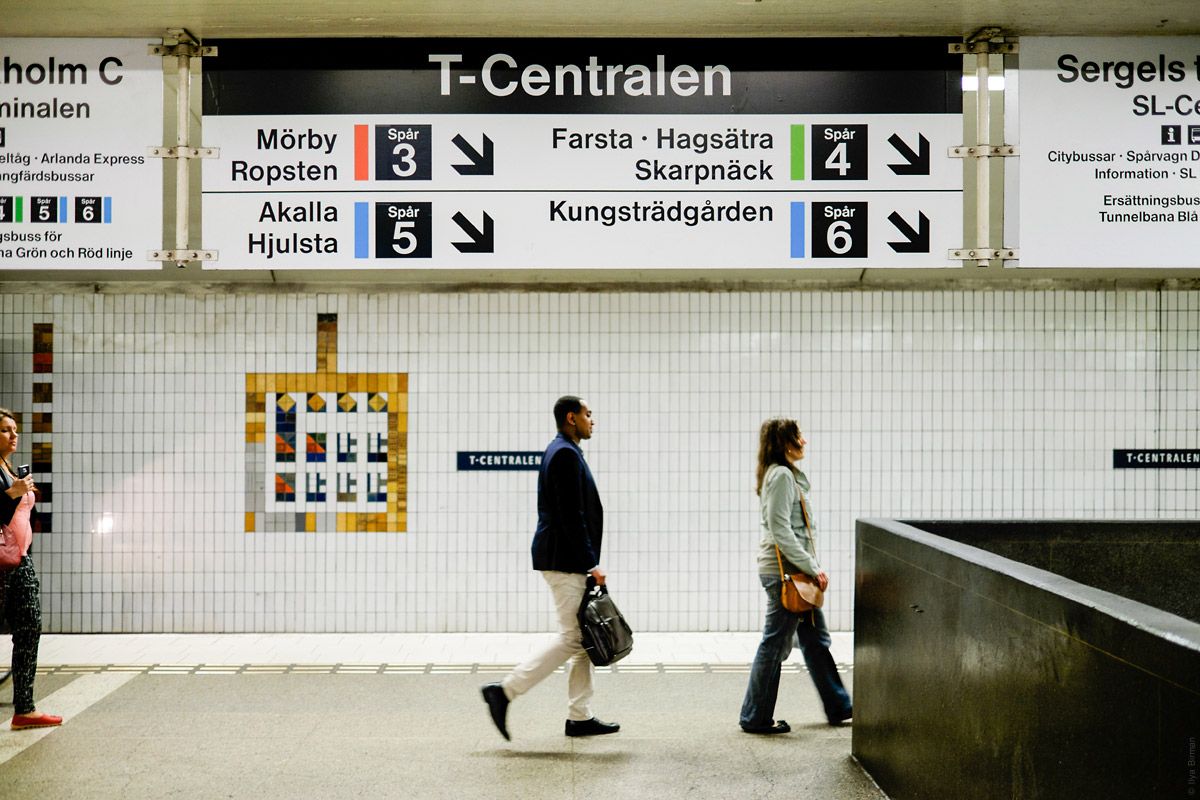
One of the platforms at T-Centralen, where the central railway station is:
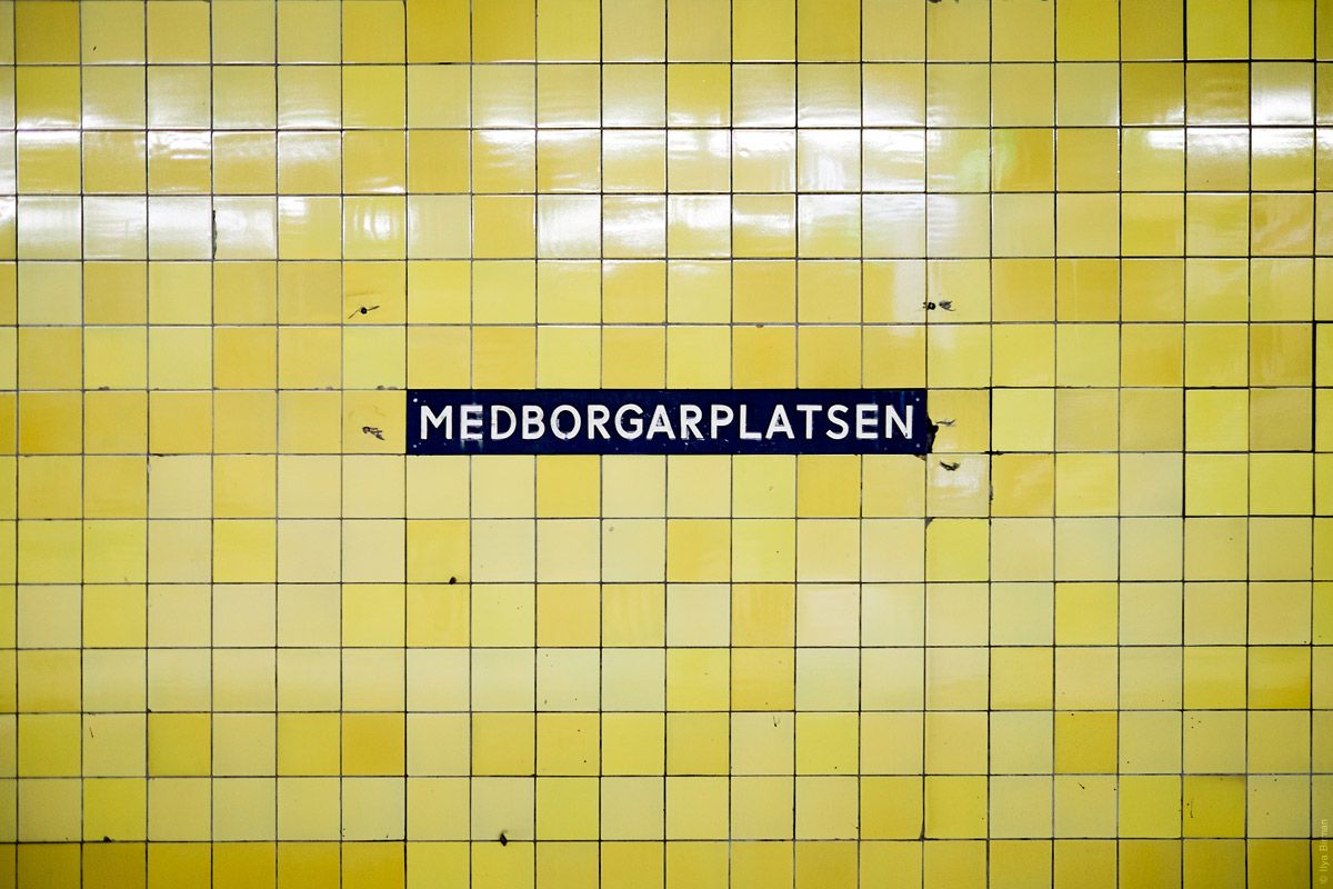
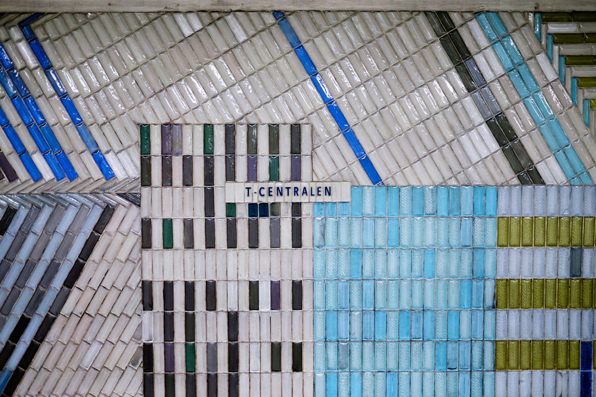
A station name:
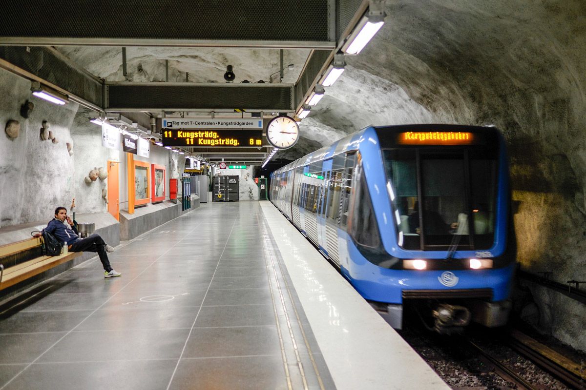
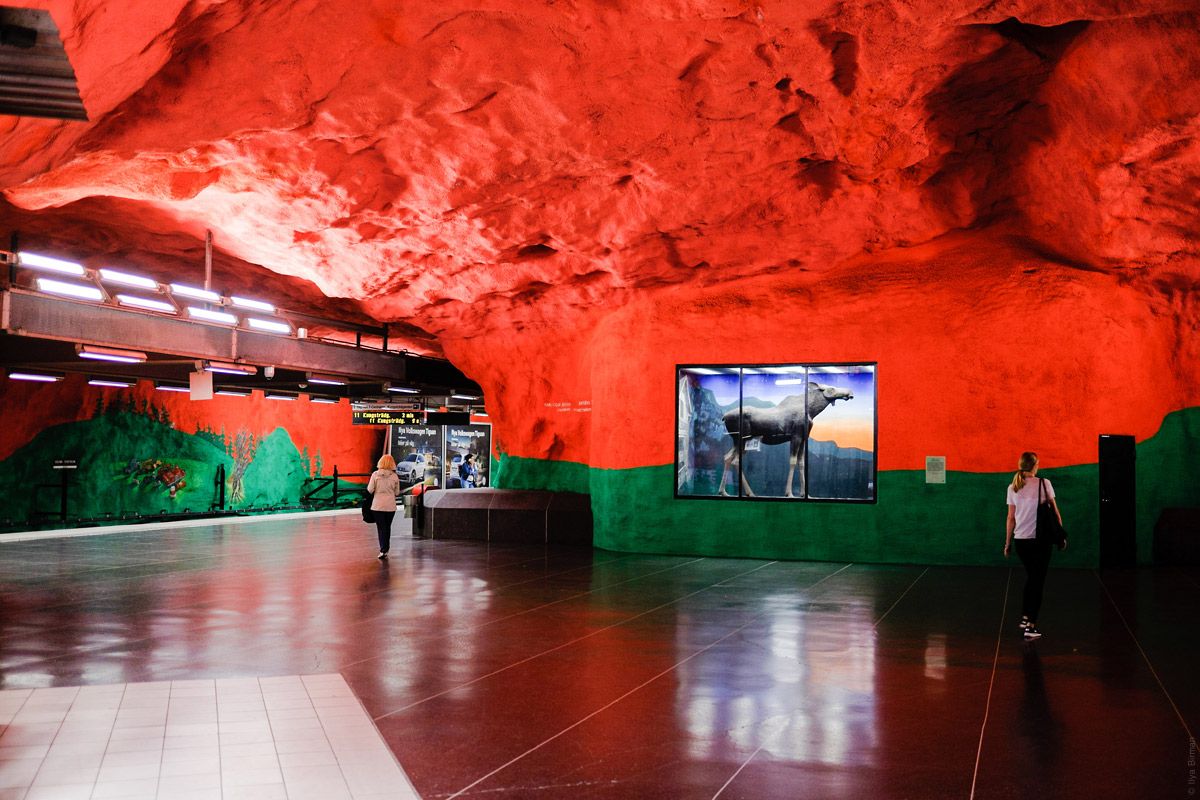
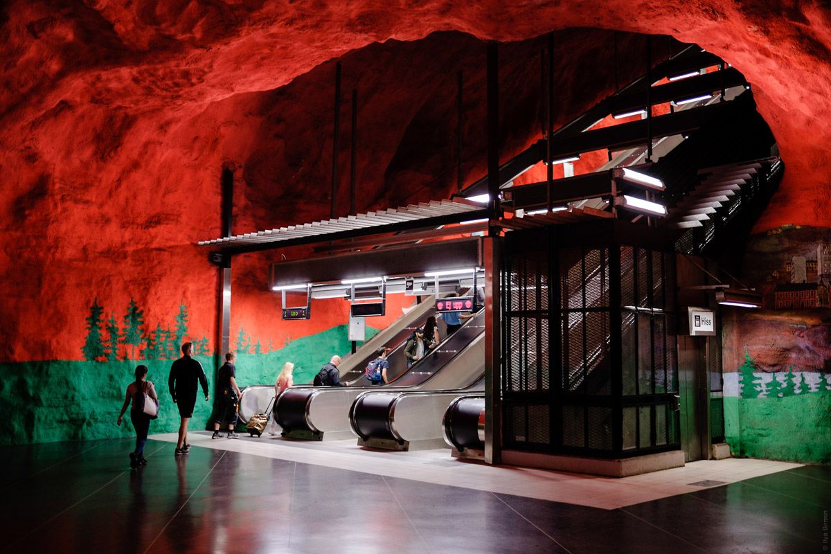
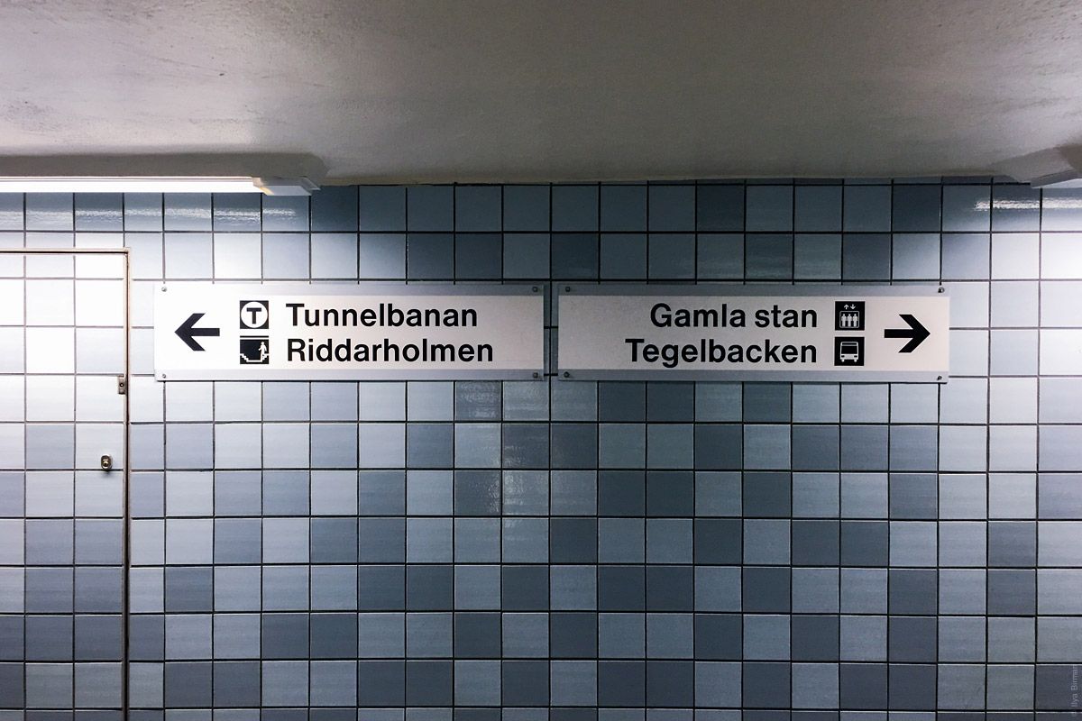
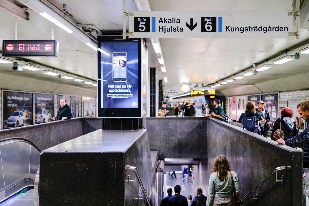
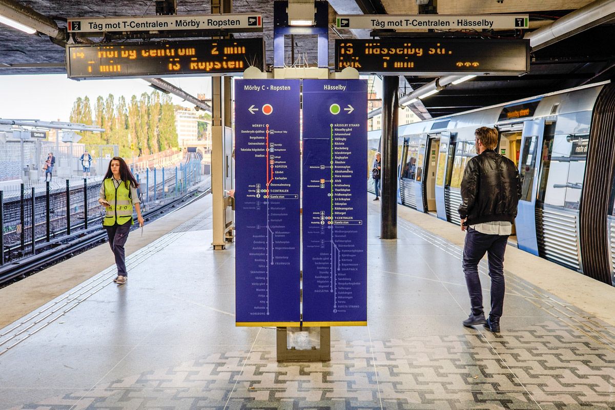
Now let me guide you to a more impressive platform at the same station. Follow the signs:
Helvetica, rectangles, arrows (the display on the left says “not down”):
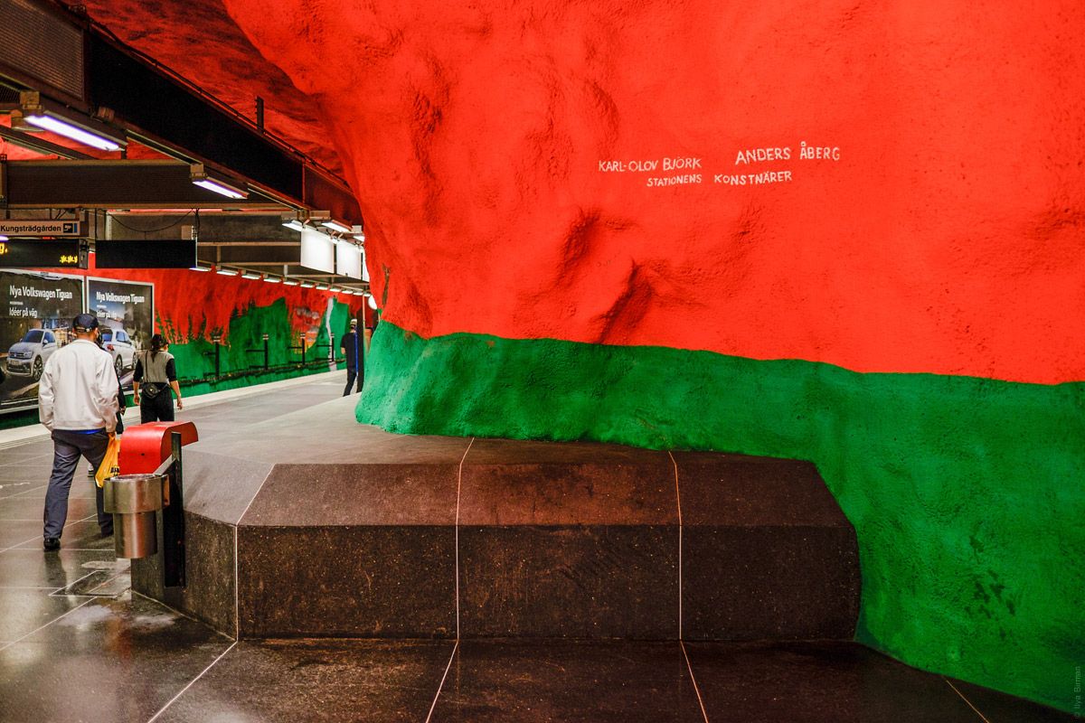
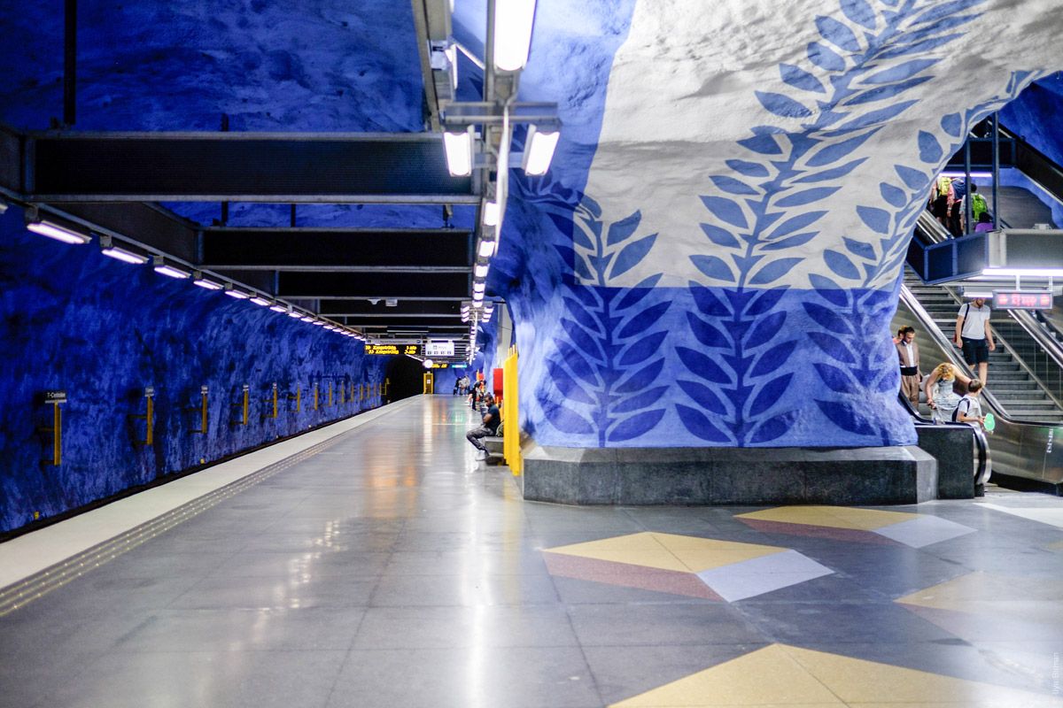
And here we are on the platform of the blue T10 and T11 lines:
We’ll get back to this later.
A standard hanging sign with the station name, Helvetica again:
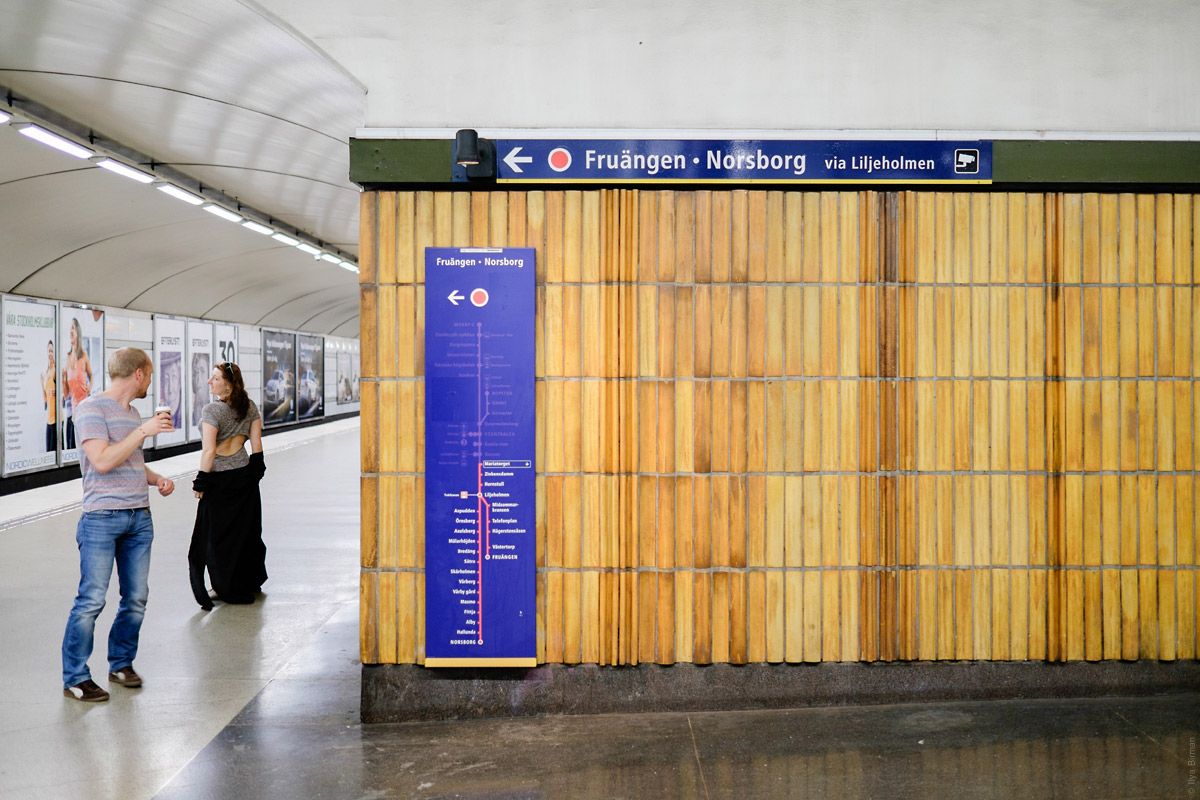
And here’s another style, on a blue background:
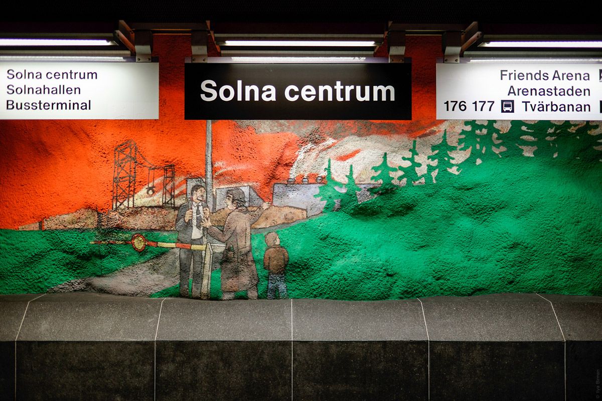
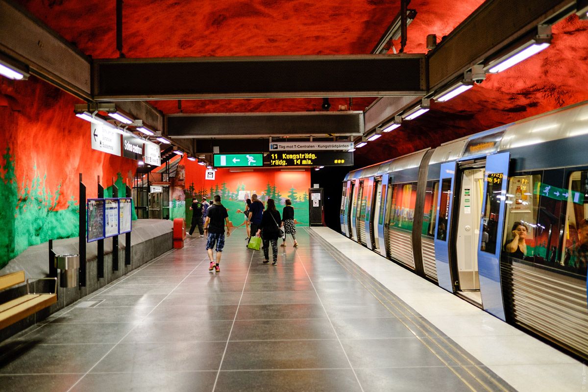
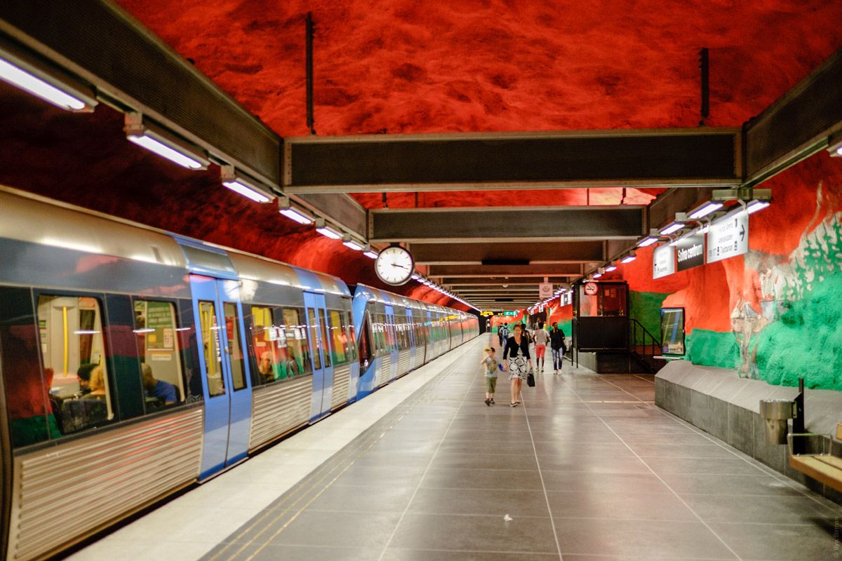
The same style is used for remaining stations list:
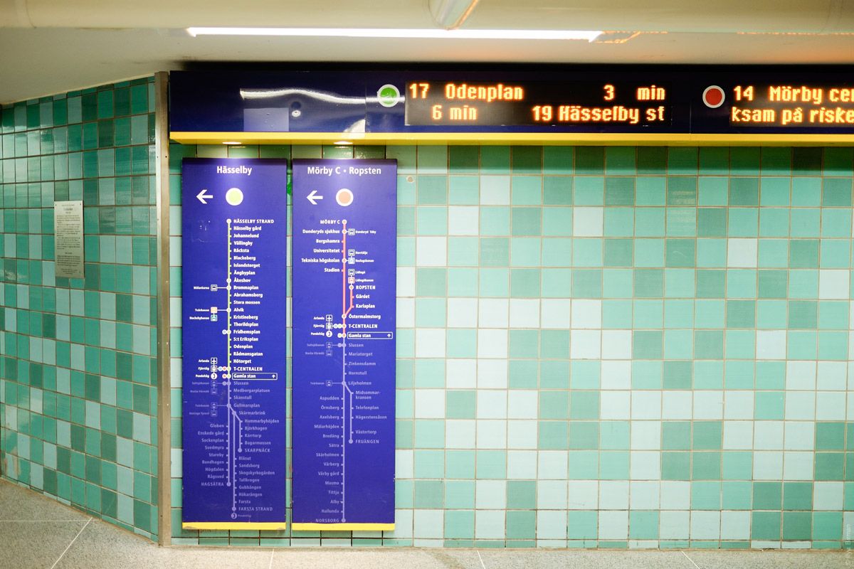
Another one:
The pictures are from the trip in June 2016.
Сontinued