Design

Later Ctrl + ↑

Footnotes make blogs hard to read

Some authors use footnotes too much. This usually takes the following form

Why voice control is not the future

Voice control is getting better and better. Siri understands the words I say quite well, and one day it will be good enough at understanding the meaning of those words

Font check marks

At Artem Gorbunov Design Bureau, we have created a set of check marks for many popular fonts

Why and how to highlight hyperlinks on mouse hover

Hyperlinks should be highlighted on mouse hover. This provides feedback necessary for the user to feel that the element is clickable

A way to syntax-highlight CSS metrics declarations

Here is an idea on how you could syntax-highlight margin, padding, outline and border values in CSS

How I bought into the iOS 7 icons’ large circles

Many designers seem to not like the size of the circles in iOS 7 icons constructed with the help of “Jonny Ive’s grid”

The principle of one link

Web services send notification emails. The links in such emails serve a sole purpose of bringing users back to the services’ websites...
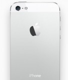
The hope for a beautiful iPhone

When I first saw the leaked pictures of iPhone 4, I thought, no way, this cannot be true, it is ugly as hell

Paris road marking experiments

Oleg Andreev sent me a couple of pictures of Paris experiments with pedestrian crossings marking

Forebruary

It has always bugged me that every year people produce and sell wall calendars for the next year. It is hard not to notice that there are only seven different months

Earlier Ctrl + ↓