Selected

Later Ctrl + ↑

Online video and opening titles

Online video does not require an opening title.

On television, opening title is the only way to introduce a program. It alerts the viewers that the program is about to begin, giving them several seconds to make themselves comfortable in front of the TV.

On the Internet, the video is introduced by the content of the page it is on. There is already a title and in most cases even a description. And it’s up to user when to hit “Play”. When she does, there’s no point in alerting her, it just irritates her by delaying the show.

If video is made to be used on many different sites and thus needs some sort of title within itself, it’s always better to use a signature in the corner or on a plate which fades out shortly.

Wireless DJ with a setup guide

Together with Evgen Bodunov we’ve just released an update to Wireless DJ. The new version 1.5 includes a step-by-step setup guide. While Wireless DJ has always been the easiest iPad DJ controller to setup, it still required the user to do a couple of non-obvious things described on our website. This may have alienated some DJs.

Now the app itself guides the user through the setup process:

And we also have a special offer: for three days we sell Wireless DJ for only eight bucks instead of ten.

You should buy Wireless DJ in the App Store.

Tomorrow does not begin at midnight

What I hate about all calendar and reminder apps is that they think tomorrow starts at midnight. I mean, come on. Not everyone goes to bed before midnight. Even if your office hours end at 6pm, it doesn’t mean you never touch a computer before going to bed. And for many creative professionals midnight is time when they (and by “they” I mean “we”) actually work sitting in front of their computer.

It’s very frustrating to see 15 reminders come up on the screen at 00:00 saying that today you have such and such appointments and things to do. No, stupid, it’s not today, it’s tomorrow. The day starts when I wake up.

It’s quite misleading when you see an email you got at 11pm get labeled “Yesterday” in Mail. No, stupid, it’s not yesterday, it’s just an hour ago. The day ends when I go to bed.

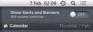
The Notification Centre behaviour drives me nuts the most. Here’s how it works. Some reminder appears on the screen at daytime. I have no time to deal with it right now (obviously), and so I want to postpone it. NC only lets you postpone for 10 minutes, which is useless, so I alt+click the NC icon to shut it up (it’s a shortcut for Do Not Disturb). At 00:00 all the notifications reappear, but I don’t want to think about them at midnight, so I alt+click NC again. NC says that “alerts and banners will resume tomorrow”:

By “tomorrow” the stupid machine means “the next time it’s 00:00”, so in reality I will see no reminders tomorrow. Well, until just before going to bed. And I will just alt+click it, again.

I think there should be a system-wide setting of when “tomorrow” begins like there is a setting for when a week begins (did you know that in Russia Monday is the first day of week?). And this setting should default to something like 4am. For those who go to bed at 10pm or 11pm this will work fine: they will still see all the reminders when they wake up. And for people who are like me, this will make computers much more useful.

I should submit this whole post to Radar, I guess.

Redesigning Moscow Metro map

The current official Metro map looks like this (feel free to reorder the letters in the word “this”):

The official map has always been quite bad, but this design (debuted September, 2012) is just embarrassing. It made the indignation spread from designers to the regular people, which means the design is really, really poor. In November the Moscow Department of Transportation announced a design competition for a new Metro map. The deadline: end of December. The prize: your map in the carriages.

I’ve actually been working on Moscow Metro map since 2006, and have released the first version in 2007. At first I thought I would send them my old map, but it turned out to be a bad idea: every competing design should have included a number of features my map did not have (i. e.: having all station names repeated in English). Adding all the features to the old map wasn’t possible due to its design. So I had to come up with a new map in two months.

Here’s the design I proposed:

The competition has just finished, and unfortunately my design hadn’t won. I took the 2nd place among 37 competitors, losing only to Art. Lebedev Studio, the most well-known Russian design studio. By the way, the 3rd place was taken by the Russian International News Agency (RIA Novosti), one of the largest state-owned news agencies.

I’ve completed a “case study” page for this project, and would like to invite you to read it: Moscow Metro map.

I’ve also been blogging in Russian during the final stages of the competition. If you are any curious, I invite you to look through the posts. As I said, they are in Russian, but there are many pictures. It’s one of my most important design works.

Splash screens

Splash screens are useless: they don’t solve any user’s problem, they shamelessly invade the user’s world, they draw additional attention to the fact that the user is waiting. There is no point in advertising your product to the person trying to actually use it.

In mobile apps splash screens are particularly out of place: they occupy the whole screen and the user has nothing else to look at. The phone is being slow, and a nice picture (which I’m undoubtedly looking at) tells me whom to blame. Isn’t it a huge marketing success?

iPhone’s standard app launch image is its screenshot. While the app is launching, the user has a couple of seconds to look at the interface and prepare for action. It appears that the app has launched instantly. According to iPhone’s Human Interface Guidelines all apps should behave like this, it’s even stated explicitly that you should not use splash screens. Unfortunately, this is the rule which Apple does not enforce, and so sometimes stupid apps with splash screens make it into the App Store.

If you find yourself drawing a splash screen, better do something useful, e. g. meet the programmer and discuss the potential design changes to make startup time shorter.

Fix sudo on a Mac

Sometimes the sudo command stops working for reasons beyond human understanding. When you try to sudo anything, it says: “no valid sudoers sources found”.

It happened to me twice. The first time it happened to a MacBook. I tried to make some changes to the sudoers file, but it didn’t help, and I gave up. After adding an SSD drive to my Mac Pro and moving the system to it, it happened again. Mac Pro is my main working machine, so I had to fix it this time.

Turned out the problem was with the permissions on the root directory. Presumably I’ve somehow broken them while moving my system.

I found a working solution on MacRumors forum. Here’s what you do:

  1. Restart your Mac is a single-user mode (press and hold ⌘+S during boot until you see command prompt).
  2. /sbin/fsck -fy
    check the filesystem integrity (not sure it’s necessary, but I did it anyway).
  3. /sbin/mount -wu /
    mount the root filesystem.
  4. /bin/chmod 1775 /
    fix the permissions.
  5. /bin/sync
    commit the changes to filesystem.
  6. exit

After booting to the normal Mac environment, you may also need to repair permissions with the Disk Utility.

App Store icon

It’s always a pleasure to talk to Kostya Gorsky, lead designer from Yandex and my good friend.

We’ve been discussing the future of browsers, apps and the Internet lately and have formed a vision of how all this stuff should work. I’ve been convinced that the address bar is not necessary and will die some day, and that there won’t be any meaningful difference between apps and websites. This simplification raises some questions and causes some problems at first, but they are all technical. People won’t care. We can make it.

Today one can find a site with Google from the Spotlight page on an iPad and add it to their home screen — all without knowing anything about web addresses. Even if you can explain the difference between an app and a website to your grandpa, this will not be of any value to him. Why bother, it’s all just coloured rectangles.

Kostya have recapped it all well: “You should have a screen with the coloured rectangles and a way to add them to it”.

And so I’ve coined a new design for iPad’s home screen. See the App Store icon. Before:

After:

Of course, manual updates will die, too.

We’ve went into much more detail with this, having talked for about an hour. And I wanted to publish this picture.

Everyone is a designer

Life does not present you with a choice to be or not to be a designer.

Everyone always has to make design decisions. There’s no escape: whatever you do, other people will interact with your product or service. Your design decisions can be good or bad, but they cannot not exist. You have to make them, or you are stuck.

To make these decisions, you have to be competent. That’s why design is a basic discipline, as language is. Saying you don’t want to learn design is like saying you don’t want to learn to write. It’s bullshit. Kids should start learning design in primary school: it’s for everyone.

You can’t just make crap and say “hey, I’m not a designer”. There’s no such thing as “not a designer”. If you make crap, you’re just a crappy designer. Fix it.

Calendar icon manual

As I’m sure many designers do, I have an Assets folder with a collection of small things you always need (mouse cursors, spinners, checkboxes etc.). There’s one thing that’s so easy to create from scratch that I don’t even bother to store it anywhere.

Let’s say you want to add a popup calendar to a date input. Here’s how you make a calendar icon for it.

Start with a 4×4 black rectangle (showing at 1200% zoom):

Make three of them in a row, with overlapping borders, like this:

Clone this whole thing and move 3 pixels down, like this:

Now clone this whole thing and move 3 pixels down and 3 pixels to the left, like this:

Done (don’t try to click, it’s just a picture):

On password-less login

Ben Brown asks if it is time for password-less login. Well, yes it is. It’s actually long been.

I think an even better solution would be to remove the password completely, allowing users to login with only an email address. Each time a user needs to login, they enter their email address and receive a login link via email.

That’s part of our usual process of removing mandatory signup. We try to convince all our clients to do this (see also: Interface is Evil). The thinking goes: password is not really needed to sign in: you can always click the “I forgot” link. So why not just assume that the user has forgotten their password?

This flip makes sense for almost every website. If users visit a site infrequently, signing in via email is not a big deal. If users visit a site regularly, then chances are high that they are already signed in and won’t see the form anyway.

In Bureausphere (it’s a kind of online designers club available only in Russian), we go even further. There’s no sign in or sign out at all. On the me page, if we haven’t recognized the user by cookies, we just ask for an email (I’ve translated this bit for this screenshot):

If we know this user, we just send a link to their page, and the link logs them in behind the scenes. There’s no way to log out. And if we don’t know the person, we still do the same: the page will be created on the fly as the user clicks the link in the e-mail.

There is one problem with this approach. While no user likes messing with passwords, people at least understand how the system works. So if we change it, even for the better, we must take into account that some users will be confused.

Earlier Ctrl + ↓