Selected

Later Ctrl + ↑

Redesigning Moscow Metro map

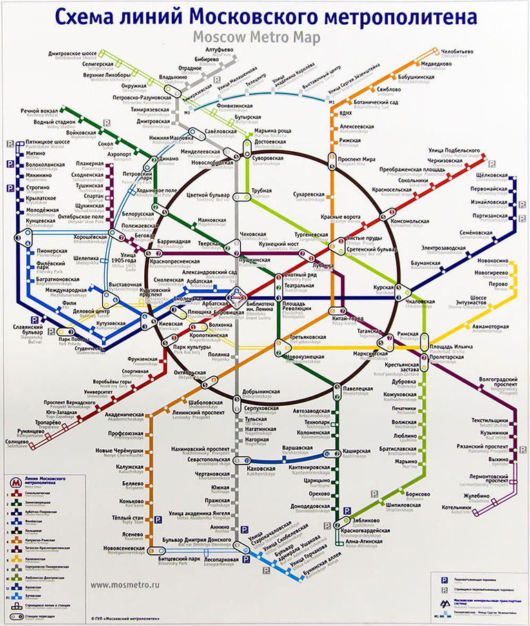
The current official Metro map looks like this (feel free to reorder the letters in the word “this”):

The official map has always been quite bad, but this design (debuted September, 2012) is just embarrassing. It made the indignation spread from designers to the regular people, which means the design is really, really poor. In November the Moscow Department of Transportation announced a design competition for a new Metro map. The deadline: end of December. The prize: your map in the carriages.

I’ve actually been working on Moscow Metro map since 2006, and have released the first version in 2007. At first I thought I would send them my old map, but it turned out to be a bad idea: every competing design should have included a number of features my map did not have (i. e.: having all station names repeated in English). Adding all the features to the old map wasn’t possible due to its design. So I had to come up with a new map in two months.

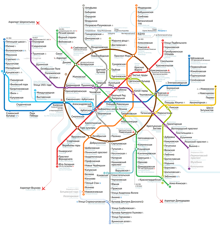
Here’s the design I proposed:

The competition has just finished, and unfortunately my design hadn’t won. I took the 2nd place among 37 competitors, losing only to Art. Lebedev Studio, the most well-known Russian design studio. By the way, the 3rd place was taken by the Russian International News Agency (RIA Novosti), one of the largest state-owned news agencies.

I’ve completed a “case study” page for this project, and would like to invite you to read it: Moscow Metro map.

I’ve also been blogging in Russian during the final stages of the competition. If you are any curious, I invite you to look through the posts. As I said, they are in Russian, but there are many pictures. It’s one of my most important design works.

Splash screens

Splash screens are useless: they don’t solve any user’s problem, they shamelessly invade the user’s world, they draw additional attention to the fact that the user is waiting. There is no point in advertising your product to the person trying to actually use it.

In mobile apps splash screens are particularly out of place: they occupy the whole screen and the user has nothing else to look at. The phone is being slow, and a nice picture (which I’m undoubtedly looking at) tells me whom to blame. Isn’t it a huge marketing success?

iPhone’s standard app launch image is its screenshot. While the app is launching, the user has a couple of seconds to look at the interface and prepare for action. It appears that the app has launched instantly. According to iPhone’s Human Interface Guidelines all apps should behave like this, it’s even stated explicitly that you should not use splash screens. Unfortunately, this is the rule which Apple does not enforce, and so sometimes stupid apps with splash screens make it into the App Store.

If you find yourself drawing a splash screen, better do something useful, e. g. meet the programmer and discuss the potential design changes to make startup time shorter.

Fix sudo on a Mac

Sometimes the sudo command stops working for reasons beyond human understanding. When you try to sudo anything, it says: “no valid sudoers sources found”.

It happened to me twice. The first time it happened to a MacBook. I tried to make some changes to the sudoers file, but it didn’t help, and I gave up. After adding an SSD drive to my Mac Pro and moving the system to it, it happened again. Mac Pro is my main working machine, so I had to fix it this time.

Turned out the problem was with the permissions on the root directory. Presumably I’ve somehow broken them while moving my system.

I found a working solution on MacRumors forum. Here’s what you do:

  1. Restart your Mac is a single-user mode (press and hold ⌘+S during boot until you see command prompt).
  2. /sbin/fsck -fy
    check the filesystem integrity (not sure it’s necessary, but I did it anyway).
  3. /sbin/mount -wu /
    mount the root filesystem.
  4. /bin/chmod 1775 /
    fix the permissions.
  5. /bin/sync
    commit the changes to filesystem.
  6. exit

After booting to the normal Mac environment, you may also need to repair permissions with the Disk Utility.

App Store icon

It’s always a pleasure to talk to Kostya Gorsky, lead designer from Yandex and my good friend.

We’ve been discussing the future of browsers, apps and the Internet lately and have formed a vision of how all this stuff should work. I’ve been convinced that the address bar is not necessary and will die some day, and that there won’t be any meaningful difference between apps and websites. This simplification raises some questions and causes some problems at first, but they are all technical. People won’t care. We can make it.

Today one can find a site with Google from the Spotlight page on an iPad and add it to their home screen — all without knowing anything about web addresses. Even if you can explain the difference between an app and a website to your grandpa, this will not be of any value to him. Why bother, it’s all just coloured rectangles.

Kostya have recapped it all well: “You should have a screen with the coloured rectangles and a way to add them to it”.

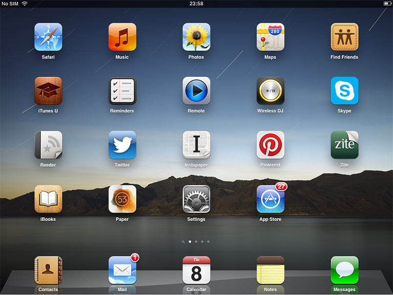
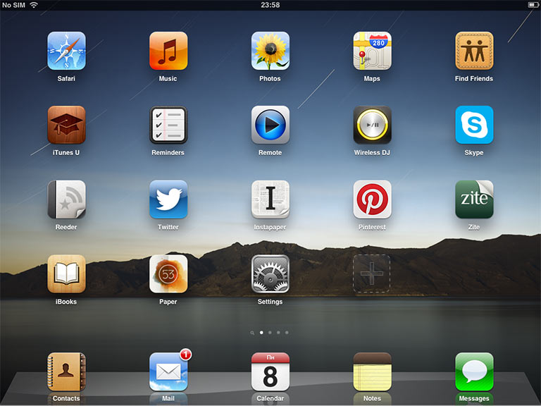
And so I’ve coined a new design for iPad’s home screen. See the App Store icon. Before:

After:

Of course, manual updates will die, too.

We’ve went into much more detail with this, having talked for about an hour. And I wanted to publish this picture.

Everyone is a designer

Life does not present you with a choice to be or not to be a designer.

Everyone always has to make design decisions. There’s no escape: whatever you do, other people will interact with your product or service. Your design decisions can be good or bad, but they cannot not exist. You have to make them, or you are stuck.

To make these decisions, you have to be competent. That’s why design is a basic discipline, as language is. Saying you don’t want to learn design is like saying you don’t want to learn to write. It’s bullshit. Kids should start learning design in primary school: it’s for everyone.

You can’t just make crap and say “hey, I’m not a designer”. There’s no such thing as “not a designer”. If you make crap, you’re just a crappy designer. Fix it.

Calendar icon manual

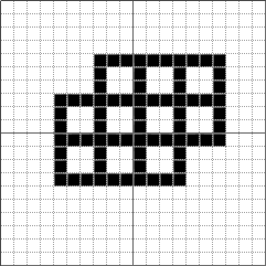
As I’m sure many designers do, I have an Assets folder with a collection of small things you always need (mouse cursors, spinners, checkboxes etc.). There’s one thing that’s so easy to create from scratch that I don’t even bother to store it anywhere.

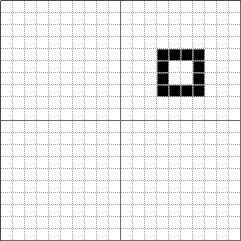
Let’s say you want to add a popup calendar to a date input. Here’s how you make a calendar icon for it.

Start with a 4×4 black rectangle (showing at 1200% zoom):

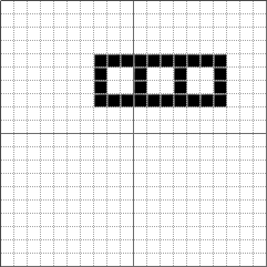
Make three of them in a row, with overlapping borders, like this:

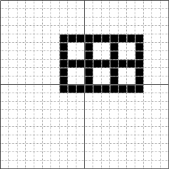
Clone this whole thing and move 3 pixels down, like this:

Now clone this whole thing and move 3 pixels down and 3 pixels to the left, like this:

Done (don’t try to click, it’s just a picture):

On password-less login

Ben Brown asks if it is time for password-less login. Well, yes it is. It’s actually long been.

I think an even better solution would be to remove the password completely, allowing users to login with only an email address. Each time a user needs to login, they enter their email address and receive a login link via email.

That’s part of our usual process of removing mandatory signup. We try to convince all our clients to do this (see also: Interface is Evil). The thinking goes: password is not really needed to sign in: you can always click the “I forgot” link. So why not just assume that the user has forgotten their password?

This flip makes sense for almost every website. If users visit a site infrequently, signing in via email is not a big deal. If users visit a site regularly, then chances are high that they are already signed in and won’t see the form anyway.

In Bureausphere (it’s a kind of online designers club available only in Russian), we go even further. There’s no sign in or sign out at all. On the me page, if we haven’t recognized the user by cookies, we just ask for an email (I’ve translated this bit for this screenshot):

If we know this user, we just send a link to their page, and the link logs them in behind the scenes. There’s no way to log out. And if we don’t know the person, we still do the same: the page will be created on the fly as the user clicks the link in the e-mail.

There is one problem with this approach. While no user likes messing with passwords, people at least understand how the system works. So if we change it, even for the better, we must take into account that some users will be confused.

Two stupid windows on a Mac

There are two stupid windows on a Mac that annoy the hell out of me.

This one appears on my main machine in a couple of minutes after I close the lid of my notebook:

It tells me that the remote volumes are no longer available, which I well know and don’t give a shit about. What am I supposed to do with this information? If I were using the volumes in any way, like copying a file, I would have noticed the problem long ago (as the file would stop copying, obviously).

Additionally, it has two buttons that do exactly the same thing: nothing. No matter what I press, the volumes are no longer available and I can’t do anything about it. What do you mean “Disconnect All”, it’s been disconnected several minutes ago, and we both know it. This window should be killed.

This second one appears one in ten times when I change something in iCal:

Now what is that? Not only are they dumping some cryptic server messages onto me, they are also presenting me with a choice. What am I supposed to do here? I don’t want to go offline, because why would I, and I don’t want to “Revert to Server” because I have no idea what it means.

“Revert to Server” is the default one, so it feels like it’s safe to choose it, but I’ve learned that it actually undoes my latest change. There’s no excuse for that: I’ve made my change for reason. Why would you even offer me the choice to undo it, let alone make it the default one? And “Go Offline” actually saves my edit and syncs it to iCloud (when it’s in a better mood later). Someone in iCal department should read Raskin and learn that user’s input is priceless, and it should always be saved by default.

Just change the button names to “Save and sync when possible” and “Forget what I’ve just done”, and it would be ridiculously obvious that this window, too, is useless and should be removed.

The dark secret of yellow

 4 min

The dark secret of yellow is that there’s no such thing as “dark yellow”. Many designers have technical background, and so they fail to acknowledge this fact.

Let’s say we need to create a series of color buttons for some UI. I’ve started with a green one and then quickly made a blue one. Here are the buttons and the way they are constructed:

As you can see a blue button is just a green button with a blue Hue layer on top. And the Magenta button also has an adjustment Curves layer, because otherwise it looks too dark. The bottom two layers are all identical. The base one is a green fill layer with a gradient overlay for button not to look flat and a gradient stroke for sharp edges:

So you can make a button of any color by just adding a Hue and an optional Curves layer, and it will look OK.

Unless it’s yellow:

If we use this method to create a yellow button, it will look like shit (literally, sometimes). Let’s be honest, It’s not yellow, right? And no Curves will make it look good.

Here’s another take on the yellow one:

Now this is yellow. The button was re-made from scratch. The base layer is changed to yellow, but the main change is the  change in the gradient overlay:

It’s not black and white anymore, it’s red and white. The problem with a black and white gradient is that it will try to make a “dark yellow” color which is not yellow at all. The darker you want yellow to be, the more you should shift its hue towards red:

For the button’s body I’ve used a red gradient overlay, and it worked fine. As of the egdes, I’ve just hand picked colors for the new gradient stroke. I’ve also made the glare twice more intensive, because otherwise we’d barely see it. Oh, and the shadow of the yellow button is slightly lighter, because otherwise we’d percieve it as too dark.

Let’s take an eyedropper and see which hues are there now:

The yellow button has different hues, but looks good. So maths isn’t always your best friend, unfortunately.

I have to point out that every button can be made better by hand-picking colors instead of relying on maths. But while for most colors shifting hues works rather fine, for yellow it’s absolutely unacceptable.

My iOS 6 predictishlist

 5 min

Next iOS must be coming soon. What is going to be in it? I’m not sure where to draw the line between “predictions” and a “wishlist”, so here are my thoughts on things that either were speculated, or I just want to be there, in no particular order.

Maps. Everyone has written about Apple planning to switch to its own mapping backend instead of Google’s. And presumably there will be some cool 3D views. I’m curious whether Apple was able to come up with their own navigation, traffic and local transport services. I also wonder if all these awesome things will work in Russia.

Better Notification Center. Notification Center sucks. Not only is it ugly, it’s unusable. It’s particularly bad on the iPad. It should show more text for each notification. The settings for it is a nightmare, it’s impossible to configure it.

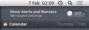
Don’t Disturb. There were screenshots of a “Don’t Disturb” feature in Mountain Lion. I guess it temporarily disables all notifications. This would be great to have in iOS, too.

Widgets. Some people want custom Notification Center widgets and even predict an API for that. Given how bad Notification Center is, adding even more crap to it won’t make it better. I’m for Live icons instead.

Live icons. It’s great that the weather is always +23 ˚C (+73 ˚F if you are from U. S.), except that it’s not. Currently only the calendar icon shows the real date, every other icon is meaningless. The most useful would be making the Weather icon show the real weather, but also Clock could show the real time, Maps, your current location, Notes, the text of the latest note etc.

Better Siri. I don’t know much about Siri since I’m on iPhone 4. But there’s no doubt it can be made better (and Tim Cook has hinted it in his interview). The obvious thing to do is to add some integration with third-party apps. Also, what about Siri for iPad?

Default Apps. If Siri supports third-party apps, it should know which apps I use for what. E. g. if I prefered Opera for web browsing I wouldn’t want to always say “Siri, search web for X with Opera”. I’d just want Siri to know it. The most natural way will be for it to just “figure it out” without some messy settings like the Notification Center has. But even without Siri, default apps will be welcome (some people prefer Sparrow for mail!).

Apps interaction. Something like Windows Phone’s Contracts should be added to iOS. If I have selected a piece of text, I want to be able to translate it without going to the Google Translate app. And the “share sheets” should be extendable. Currently in Twitter app I can send a link to Instapaper or Read it Later, but not to Readability — because Twitter doesn’t know Readability. But Twitter shouldn’t even care, the system should know it. Apps interaction (or lack thereof) is one of the weaknesses of iOS.

Airdrop or wireless sharing. Easier sharing between devices and friends will be great. Currently sending a picture or a piece of text over the air to someone nearby is almost impossible. Or, Imagine that you are looking at a web page on your iPhone and want you friend to open it on her iPad. What would you do? This should be easy.

Work together. All my devices should work together and know when they are close to each other. Don’t display same alert everywhere. If I postpone an alert, postpone it everywhere. Sync open browser tabs, clipboards and everything else.

Airplay target. Open a movie on a Mac and send it to play on an iPad. This should be doable, at least after Mountain Lion (with Airplay) is released.

Better multitasking. I don’t know what exactly has to be done, but I want switching between apps to feel fast and harmless. Currently I think twice before leaving an app.

Facebook integration. I don’t care about it at all, but I’m listing it because it was rumored.

Safari Omnibar. In Safari 5.2 Apple has added what people call an “omnibar”: an addressbar combined with search. Invented by Opera in the 18th century or so and popularized by Google Chrome, this thing was conspicuously missing from Safari for so long. I can’t tell you how many times I’ve entered a search request into address field on my iPhone to get nothing. Modes suck.

Offline Reading List. There were some screenshots of this in desktop Safari, but in mobile one it will make even more sense.

iCloud Tabs. This is included in the latest builds of Mountain Lion, so I guess we’ll see it in iOS 6.

Sync iTunes Match over Wi-Fi. I like iTunes Match (even given how unbelievably buggy it is), but I prefer to use old good iTunes sync, because it works much faster. iTunes Match should detect that my library is available in the local network and download tracks from it (instead of from iCloud).

Sync track positions with iCloud. Want this for podcasts, tired of syncing by hand 5 times a day.

Visual refresh. Aren’t you tired of the standard controls? The transition to the rounded on/off switch (in iOS 5) is not enough. I want something of a Leopard-to-Lion scale at least.

Related links:

Earlier Ctrl + ↓