
In 2016 I’ve re-mixed my old progressive house track Cargo, and now it sounds much better:
Before:
In 2016 I’ve re-mixed my old progressive house track Cargo, and now it sounds much better:
Before:
On the 21st of April I played techno in Art. Lebedev Studio:
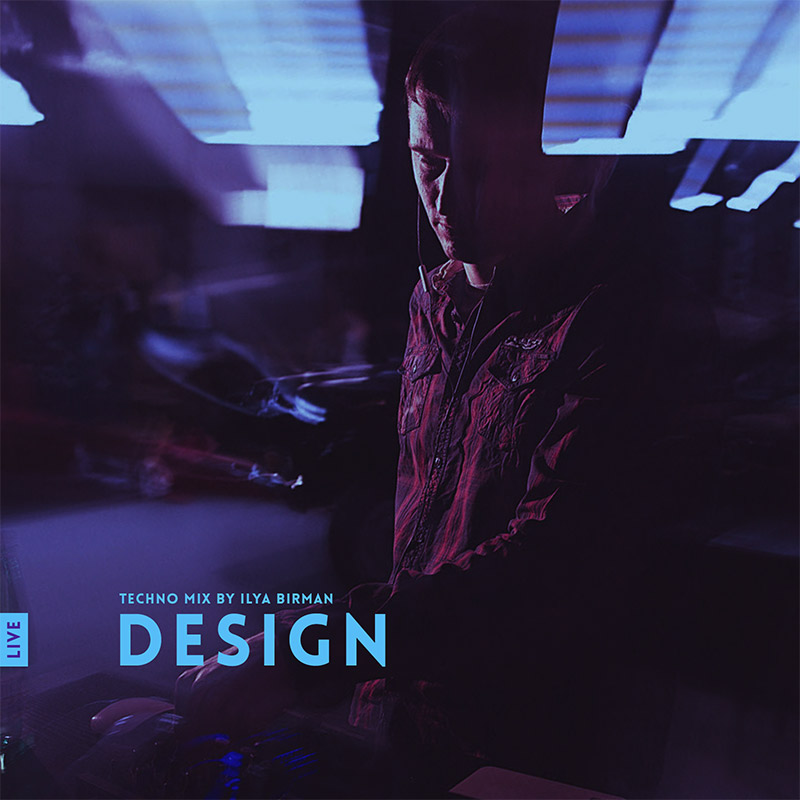
There are two mistakes: at 31:20 and at 1:20:11.
Playlist:
| 0:00:00 | Artefakt | Tidal |
| 0:01:52 | Conrad Van Orton & VSK | Angular Momentum |
| 0:05:35 | Shlømo | Obsession |
| 0:09:01 | Antonio De Angelis | Polar |
| 0:11:58 | Roman Flügel | Pattern 13 |
| 0:17:16 | Planetary Assault Systems | Whistle Viper (Live Edit) |
| 0:20:55 | Sleeparchive | Window 092 (Oscar Mulero Remix) |
| 0:24:14 | Tensal | Achievement 3 |
| 0:26:50 | Axkan | Fear (Israel Toledo Remix) |
| 0:29:01 | Sleeparchive | 1 |
| 0:30:26 | P.E.A.R.L. | Desolation (I/Y Reduction) |
| 0:33:12 | Ilya Birman | Glass |
| 0:35:21 | Israel Toledo | Standing |
| 0:37:49 | Developer | Hooked In |
| 0:40:46 | Planetary Assault Systems | Bell Blocker |
| 0:44:13 | Shifted | Clairvoyance Part II |
| 0:49:00 | Truss | Beacon (Original Mix) |
| 0:50:59 | Rumah & Progression | SC3 |
| 0:54:18 | Dense & Pika | Lack Of Light |
| 0:58:22 | Robert Hood | Shaker |
| 1:02:38 | NoizyKnobs | Really Deep |
| 1:05:36 | Woo York | Siberian Night |
| 1:10:20 | Sector Y | Hit Control |
| 1:14:25 | Exium | Monopoles |
| 1:18:04 | Ilya Birman | I Will Always |
| 1:19:10 | Orion | Forerunner (Original Mix) |
| 1:23:43 | Conrad Van Orton & VSK | DP |
| 1:26:56 | Sleeparchive | 7 |
| 1:27:36 | Birth Of Frequency | Gate (Oscar Mulero Remix) |
| 1:30:15? | Jen Series | Shadow Dancer |
| 1:33:08 | Tørmented | Sins Of Prophets (Original mix) |
| 1:35:36 | Ilya Birman | Octomore |
| 1:41:04 | Alderaan | Disturbed |
| 1:44:13 | Planetary Assault Systems | Bawoo Bawoo |
| 1:49:04 | Birth Of Frequency | Design |
| 1:53:52 | Sleeparchive | Roses |
| 1:54:28 | Oscar Mulero | Inclination |
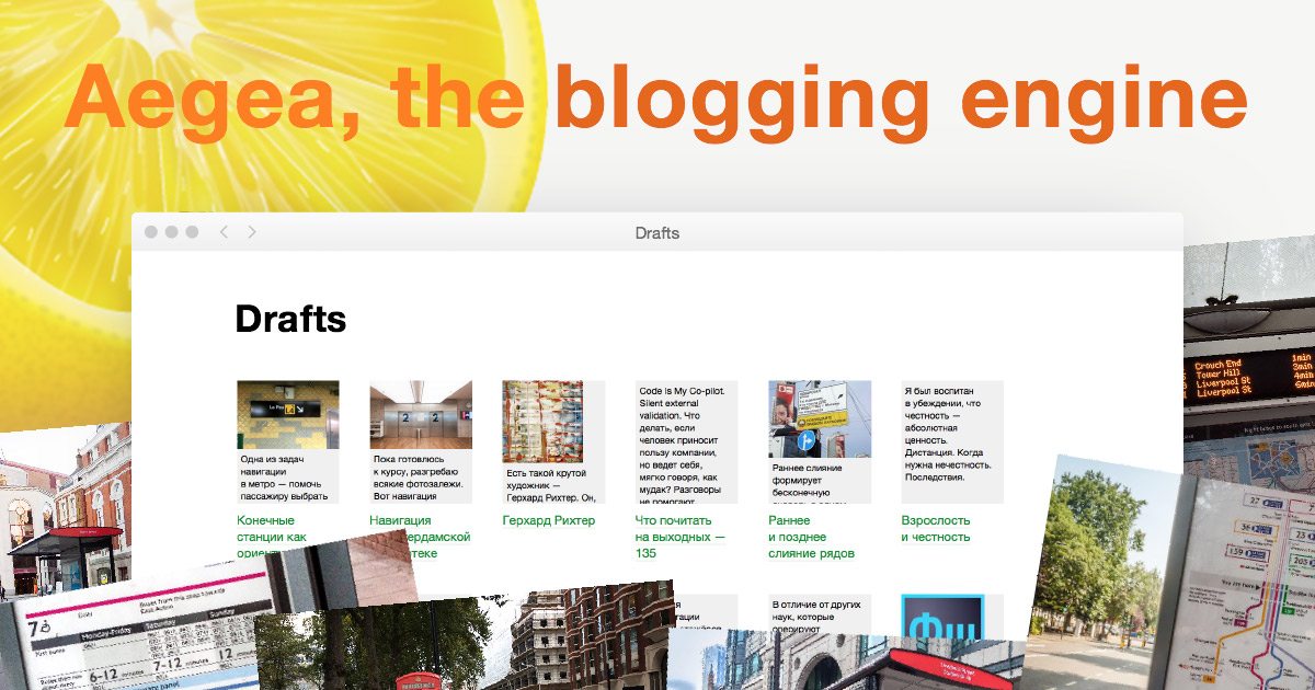
Aegea 2.6 has been released. Aegea is a great blogging engine.
What’s new:
An engine is a program that runs on the blogger’s website. It provides the writing tools to the author, shows the posts to the readers and lets them write comments. Medium.com (or similar) is simpler, but they can shut down and take all your posts offline. With an engine, the blog runs on your own website and you have access to the files and the database (you don’t have to deal with the files or the database, but you own all the data).
I want most people to have access to personal blogging in this way. That’s why it uses the most easily available platform: PHP with MySQL.
Aegea powers this and many other blogs. Among my favourites:
With Aegea, you can use the built-in neutral theme or customise it however you like (this blog is an example). Be flexible with comments: allow and disallow them globally or per post. Refine posts using Drafts. Add images, videos, audio or code to illustrate your point. Organise your writing with tags.
Designers, writers, musicians and software developers use Aegea to show their work, communicate and spread knowledge. They love it because it’s simple and fast yet does everything they need. Aegea is free for personal use and paid for business use.
Learn more and get Aegea at blogengine.me.
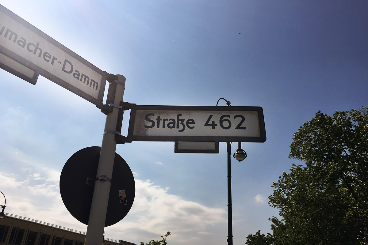
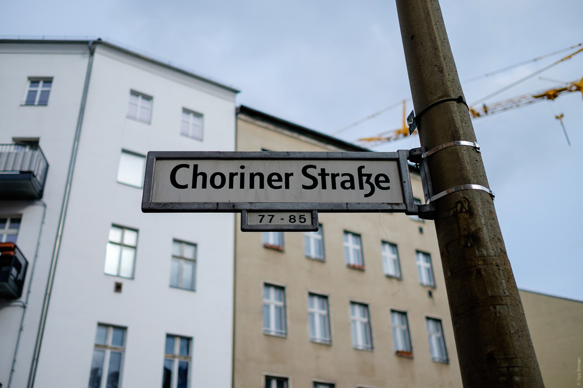
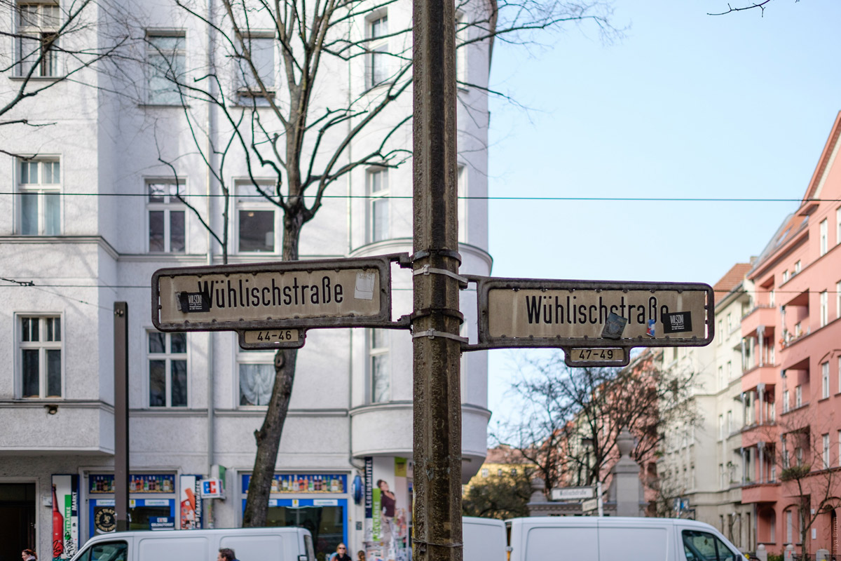
The main design:
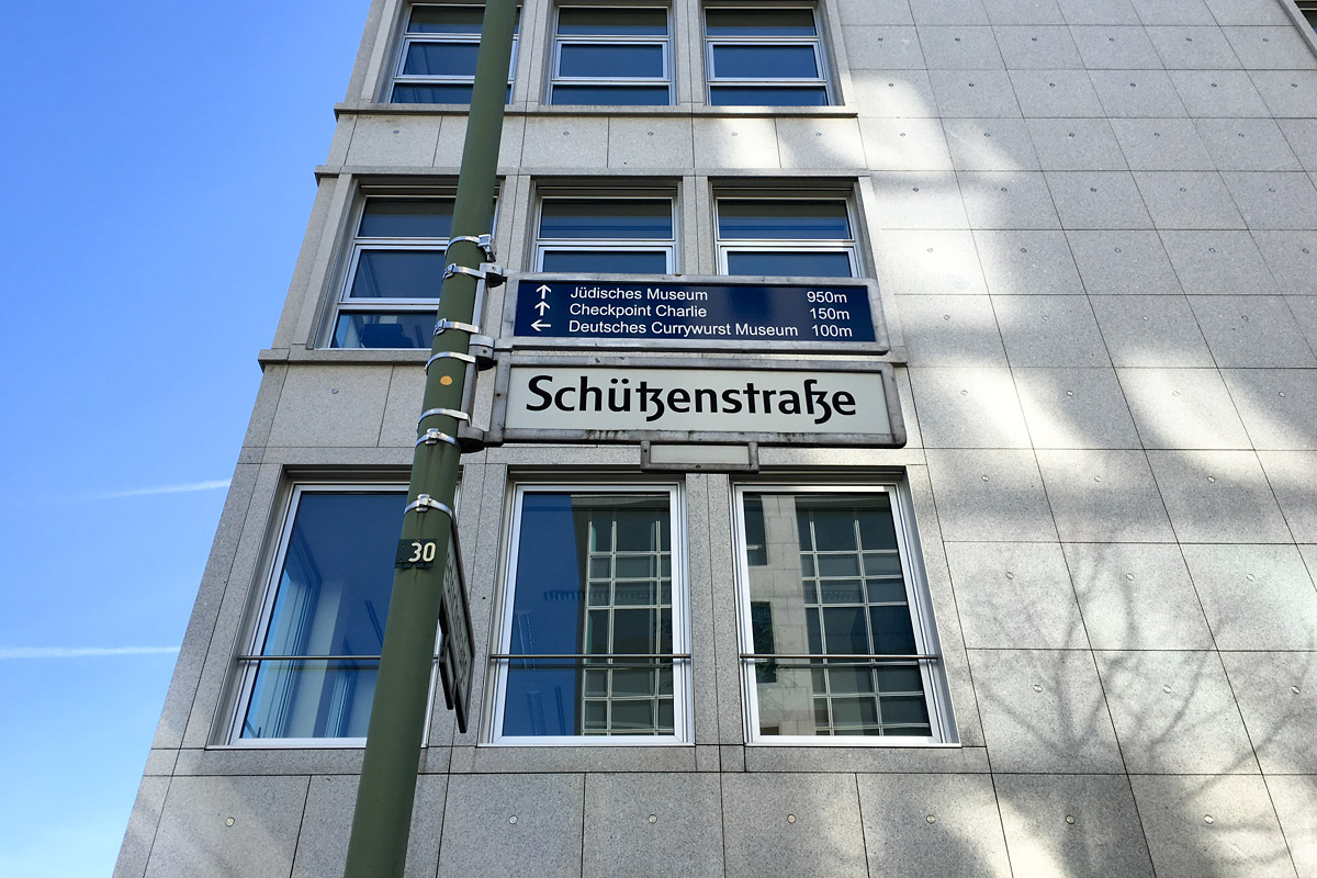
Below the main plate there is a place for a nano-plate with addresses range:
This one with a red spot can be used as a nice logo:
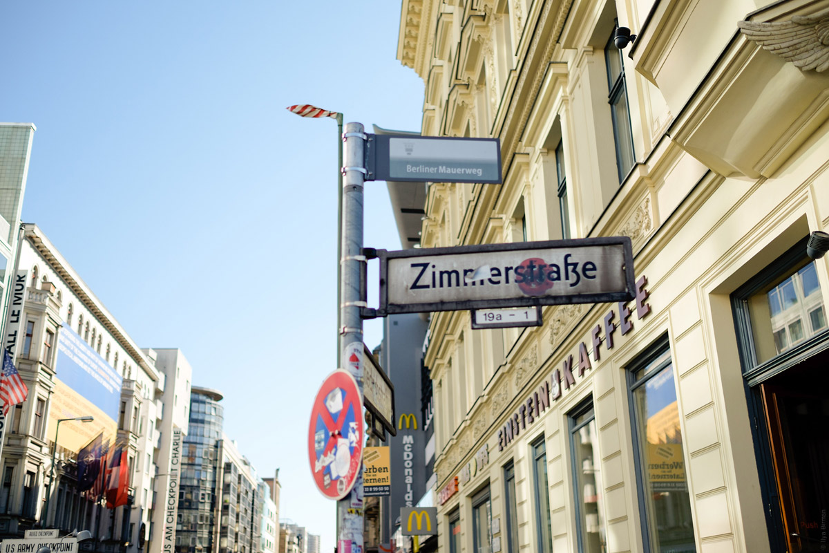
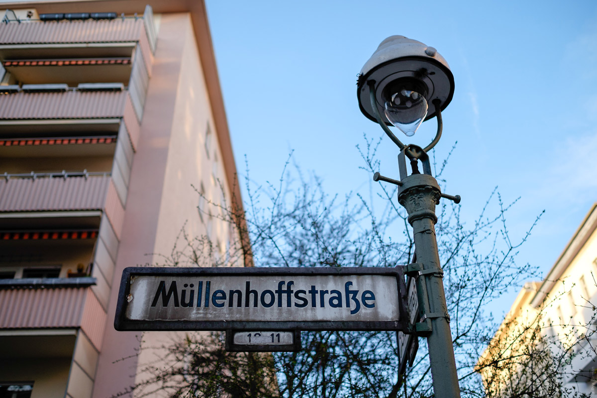
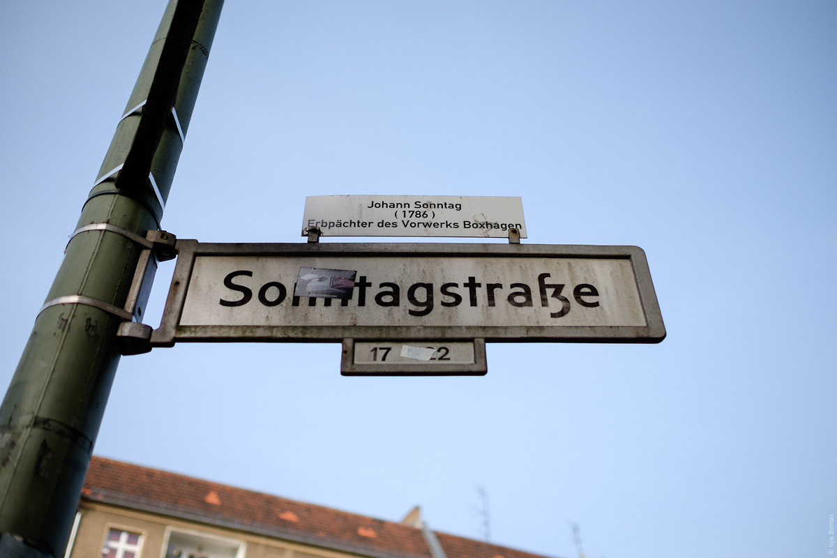
If a street is named after someone, there is an additional plate about them on top:
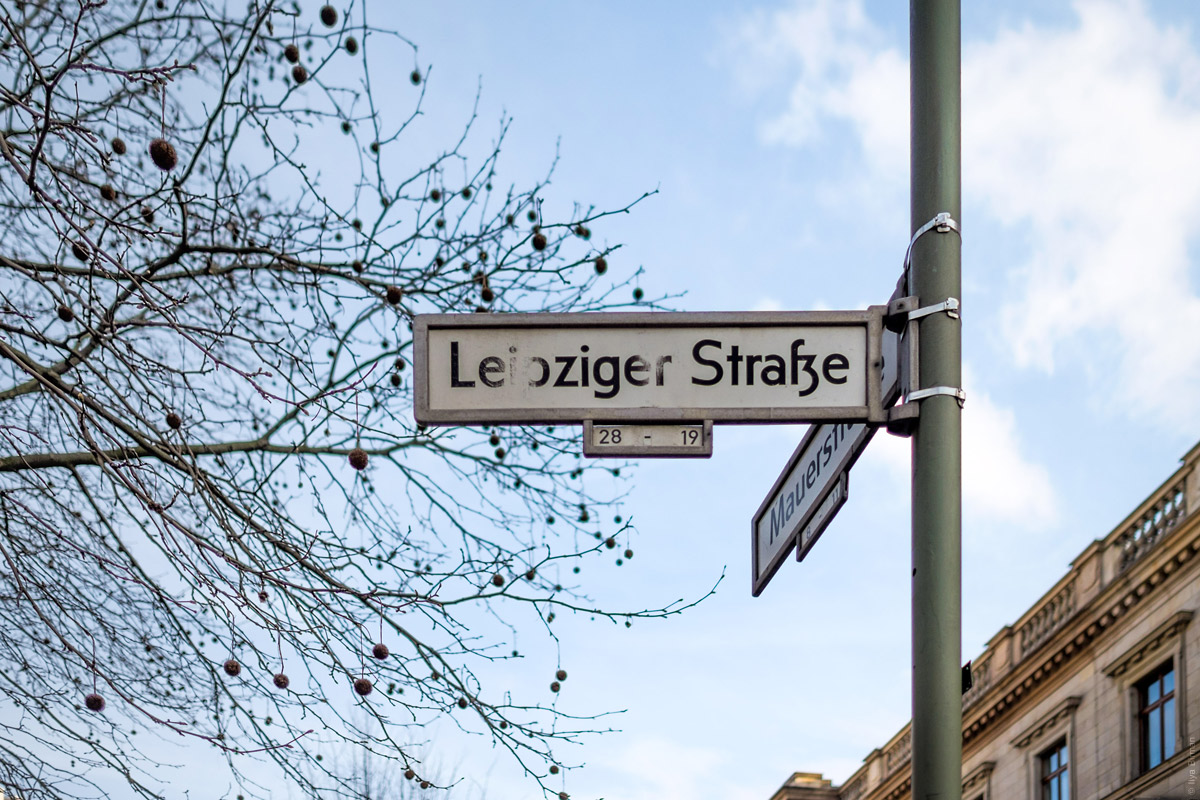
These are two different ligatures:
Nice name:
Alternative design:
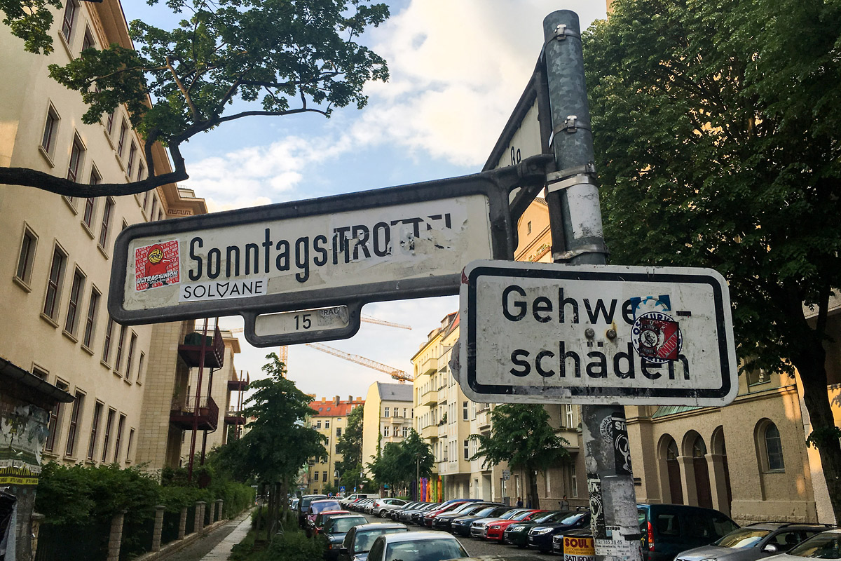
Rare beauty:
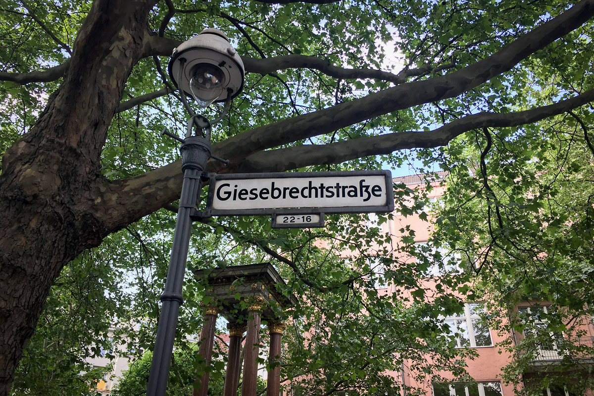
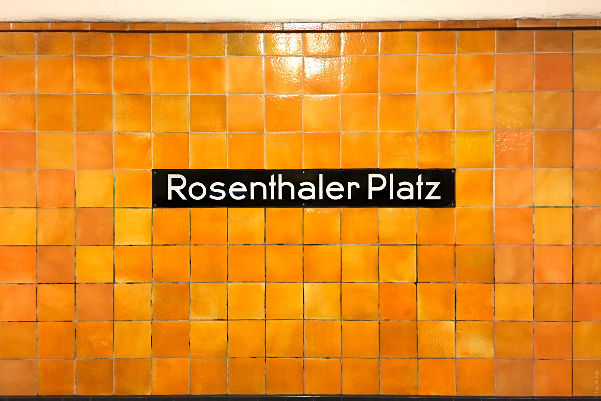
More Berlin:
See also Kiev street name plates.
Jouele is a simple and beautiful audio player for the web. Eugene Lazarev has been developing it lately.
Version 2.3 has been released. Jouele now uses Howler (bundled) instead of jPlayer. This change helps use less bandwidth, display the preloader better and get rid of several bugs. The data-repeat feature is now supported on single tracks. When a file is unavailable, Jouele shows this with an icon, instead of just “hanging”. The markup works better in different browsers.
Song example:
See documentation on Github.
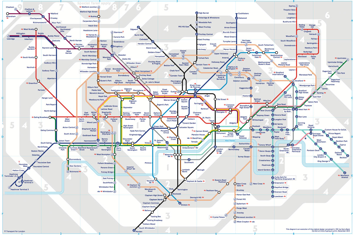
In the first part I’ve covered the difference between the Beck’s London underground map, our Ekaterinburg metro map, and the Vignelli’s and Hertz’s maps of New York subway. But even the maps that appear to be much more alike in principle, have many little details to serve their cities’ needs.
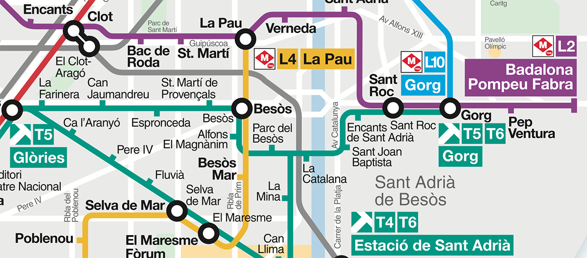
On stations, there are tracks for opposing directions. In some cities, these tracks are marked with the names of a line’s terminals. Barcelona:
The terminals are thus important for wayfinding, so they have to be emphasised on a map. In Barcelona, they put the terminals’ names on a background, whose colour matches the line’s:
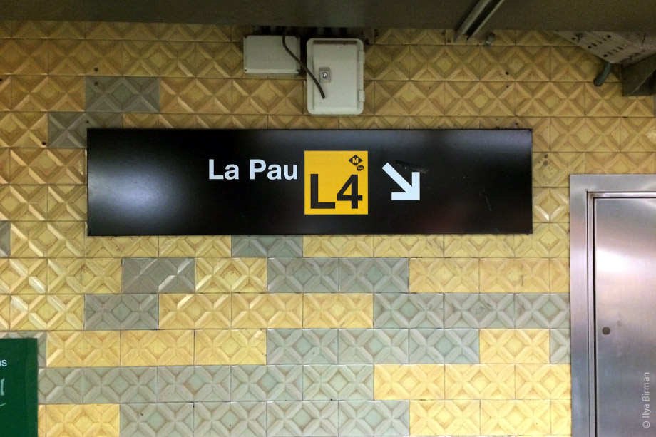
In Paris, they use bold font and put line number symbols:
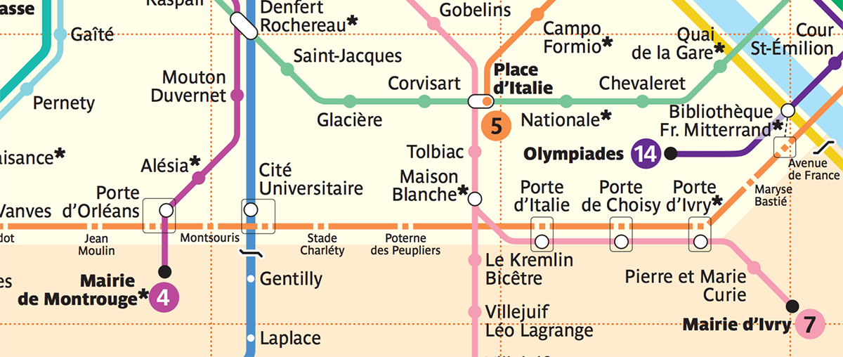
This is unnecessary in London, where instead of toponymics they use geographic directions (i.e. “Northbound”).
In Oslo, a thick wisp of lines passes through the city centre. One of the lines forms a loop and passes several stations twice: first as line 4, and then as line 6. The transformation from 4 to 6 is shown with a gradient — not a typical element indeed:
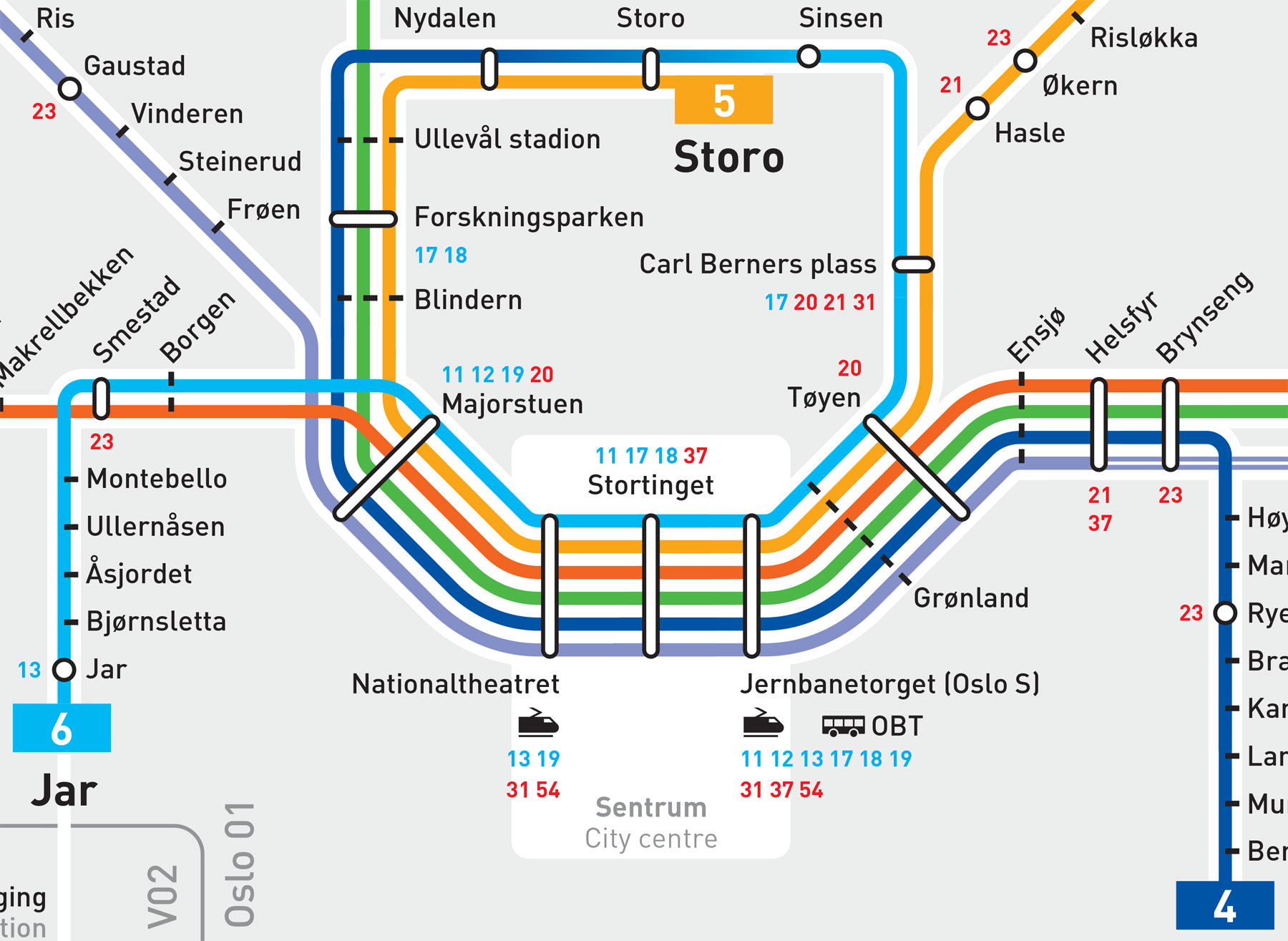
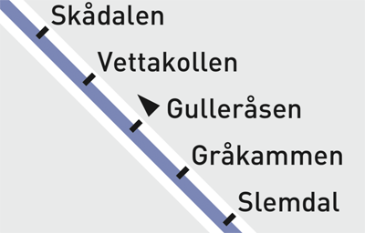
There is another detail in Oslo: the trains pass the Gulleråsen station only in one direction. This requires a designation, an element that was not used in any of the maps we’ve discussed above:
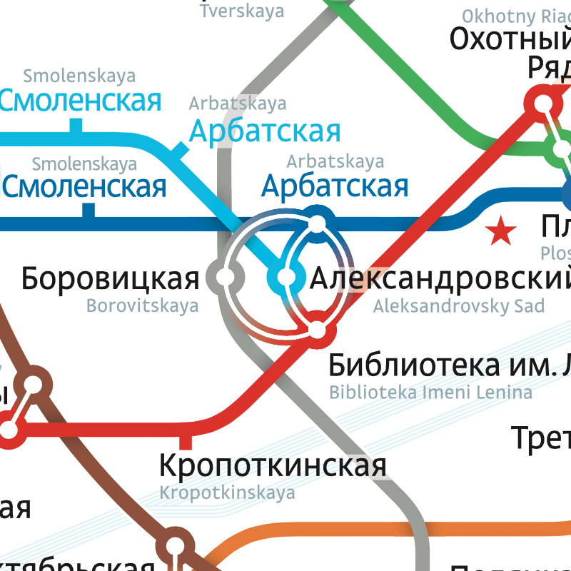
Moscow has its own peculiarity: for historical reasons, the stations have different names on different lines (sick, but what can you do). In addition, the Moscow metro map has to use both Cyrillic and Latin scripts for its station names. Depiction of transfers turns into a problem. Here, eight names should be positioned around the “Biblioteka imeni Lenina — Aleksandrovsky sad — Arbatskaya — Borovitskaya” junction, where four lines intersect:
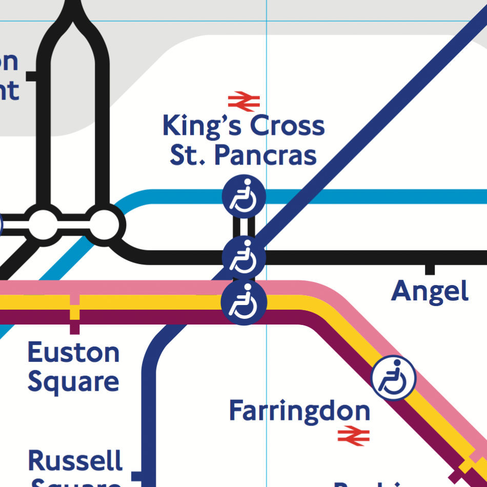
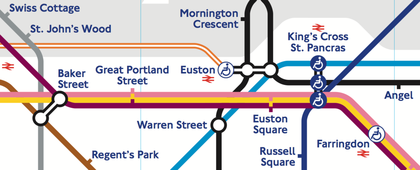
A whopping six lines intersect at London’s “King’s Cross St. Pancras” station; just one name suffices:
There is not a single place on the giant London map where a station name intersects a line — there is always space around the lines. To achieve this in Moscow, one would need to dramatically reduce the font size and complicate the line geometry. That’s why Moscow metro map includes a device the London one does not: a transparent plaque for the station names crossing lines (see above).
But London has its own complication absent in Moscow. The grey “clouds” designate the payment zones — something Moscow does not need since the price of a ride is fixed:
Every city and transport network has lots of details which make it impossible to use the same exact graphical principles everywhere. But there is another reason for maps to be so different, which I will cover next time.
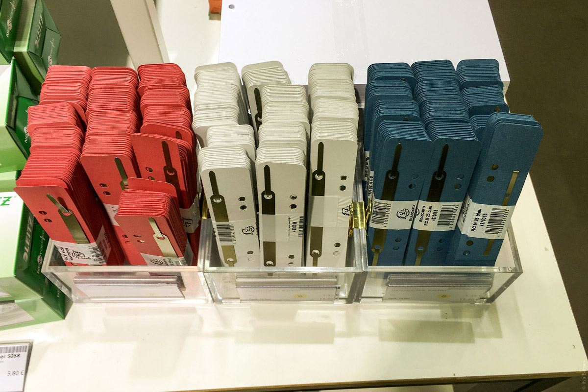
Despite having no need for art supplies whatsoever, these sort of shops always drag me in somehow. There must be some psychological condition that when you see a family of items, each one of them seems much more attractive. Particularly true this is, when the items are neatly organised.
Here, for instance, are colour pencils:
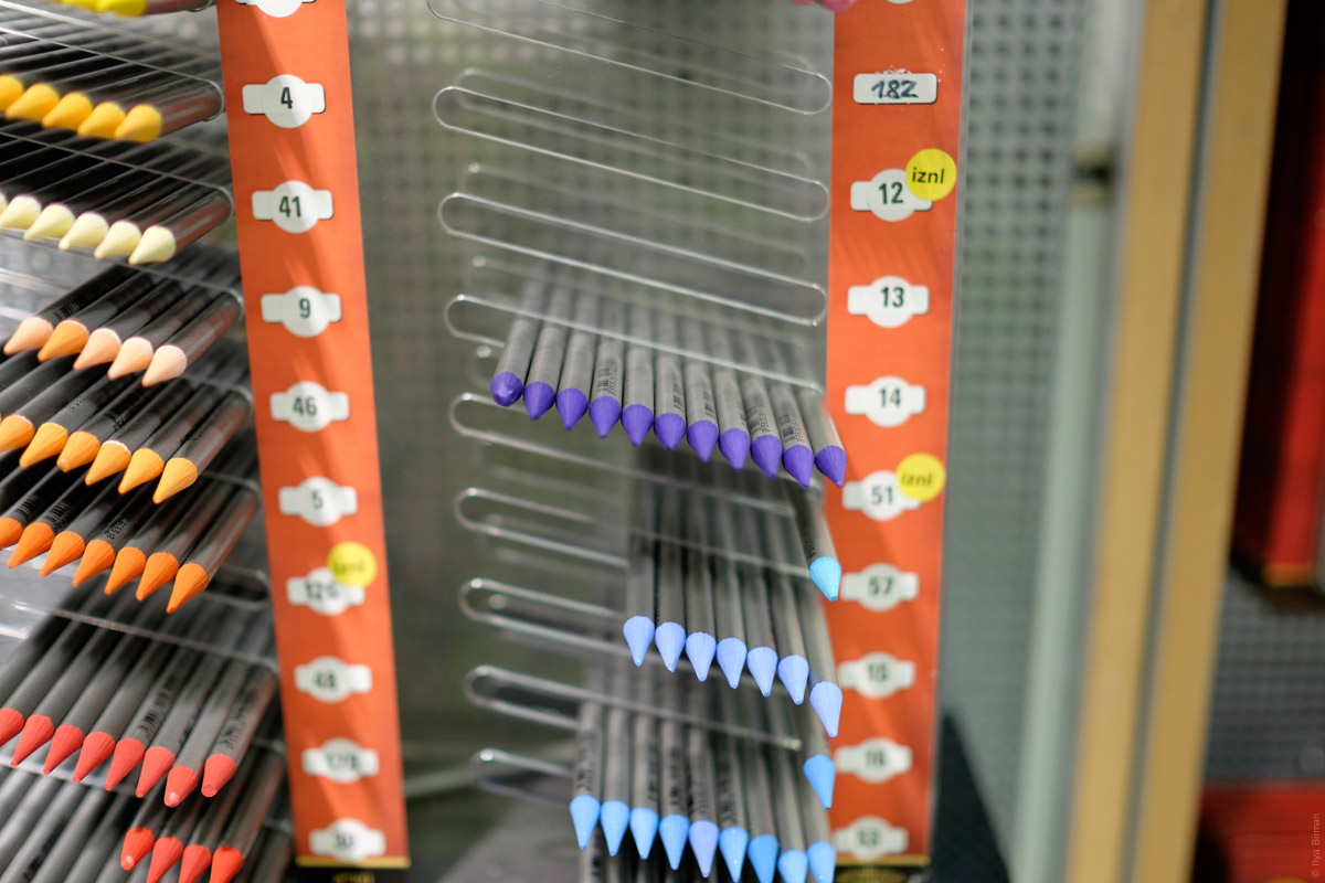
Most are sold already, but the attraction still works.
Or some ropes:
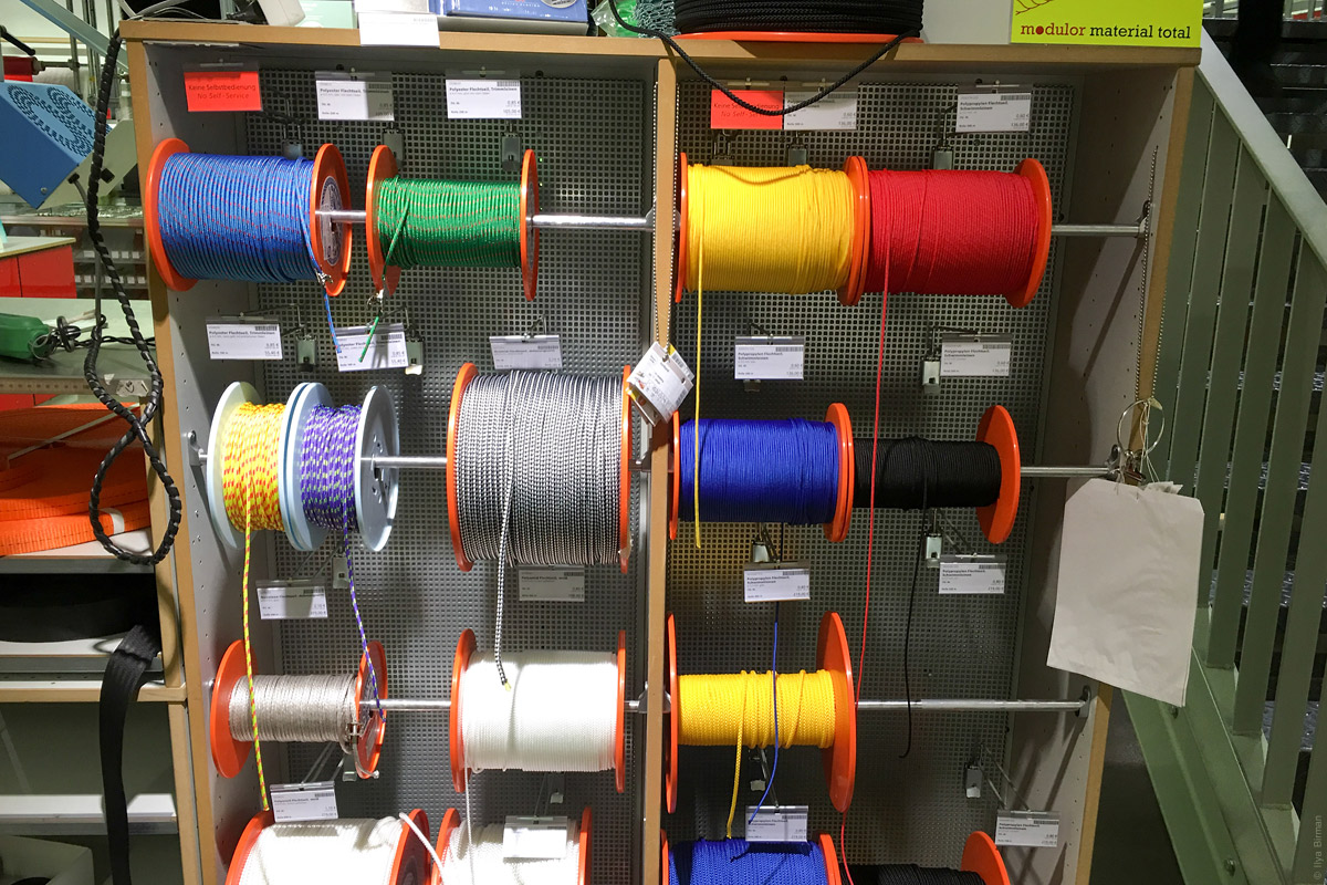
You cannot not want them.
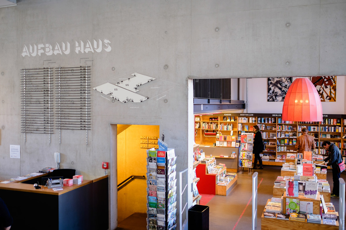
It’s Planet Modulor, a Berlin shop for all things material from stationery to scale models (photos from the April 2006 trip). Entrance:
Note the 3D stairways.
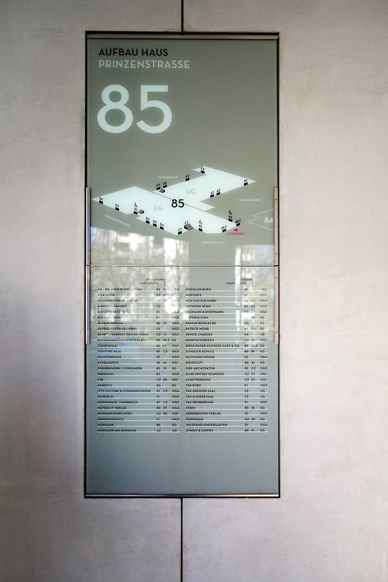
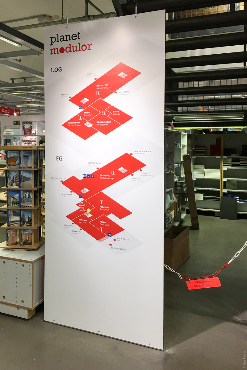
Inside signage:
More:
Nice colours:
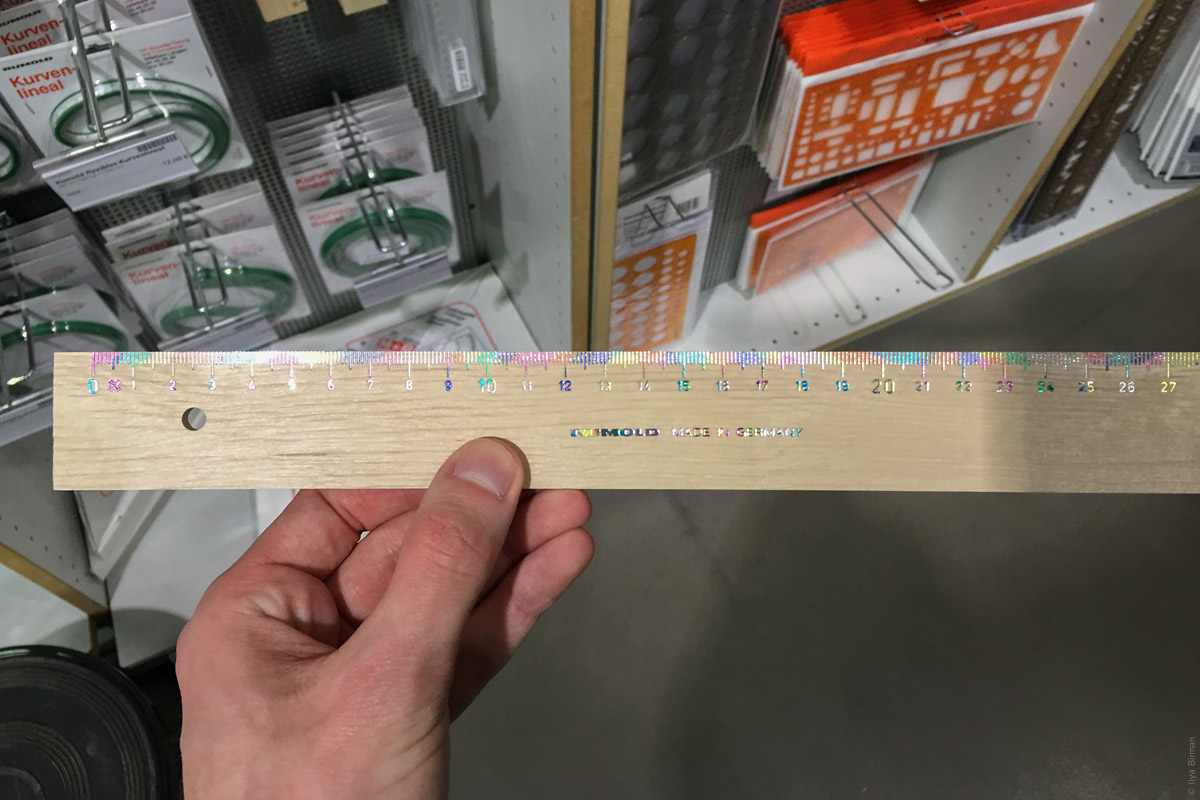
A ruler:
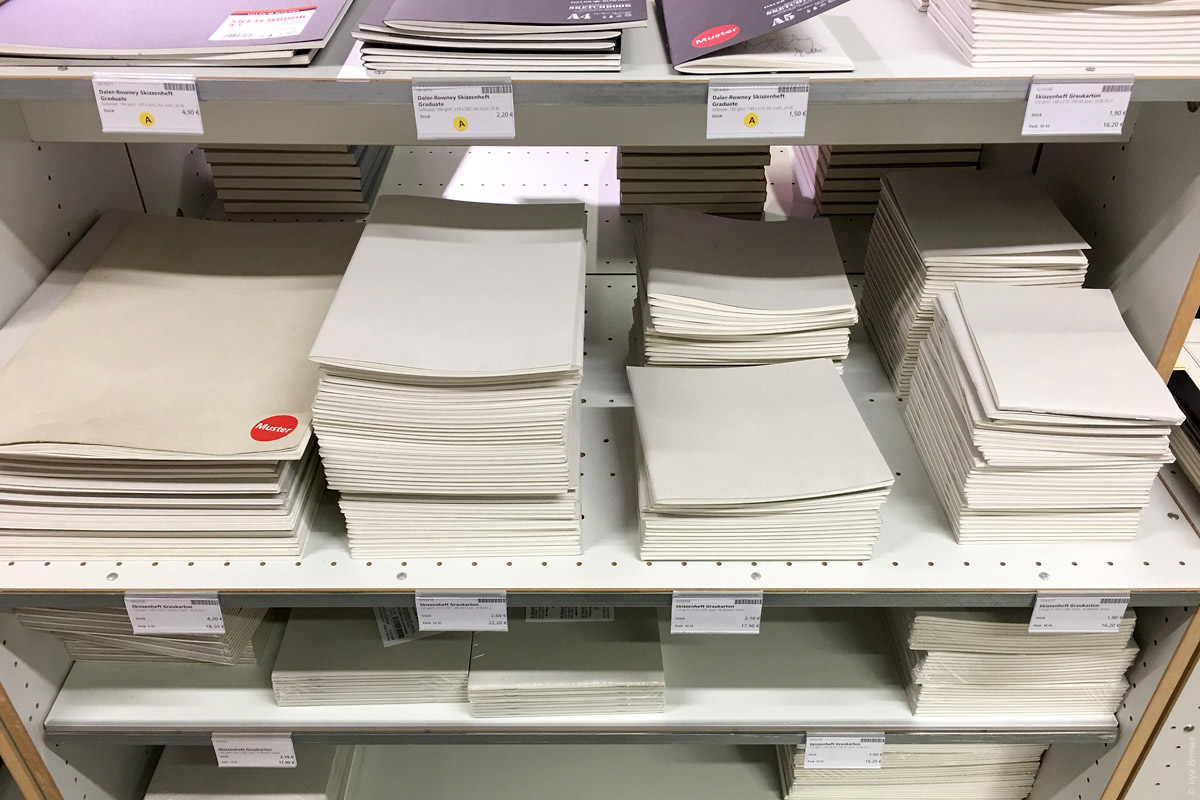
Just copybooks:
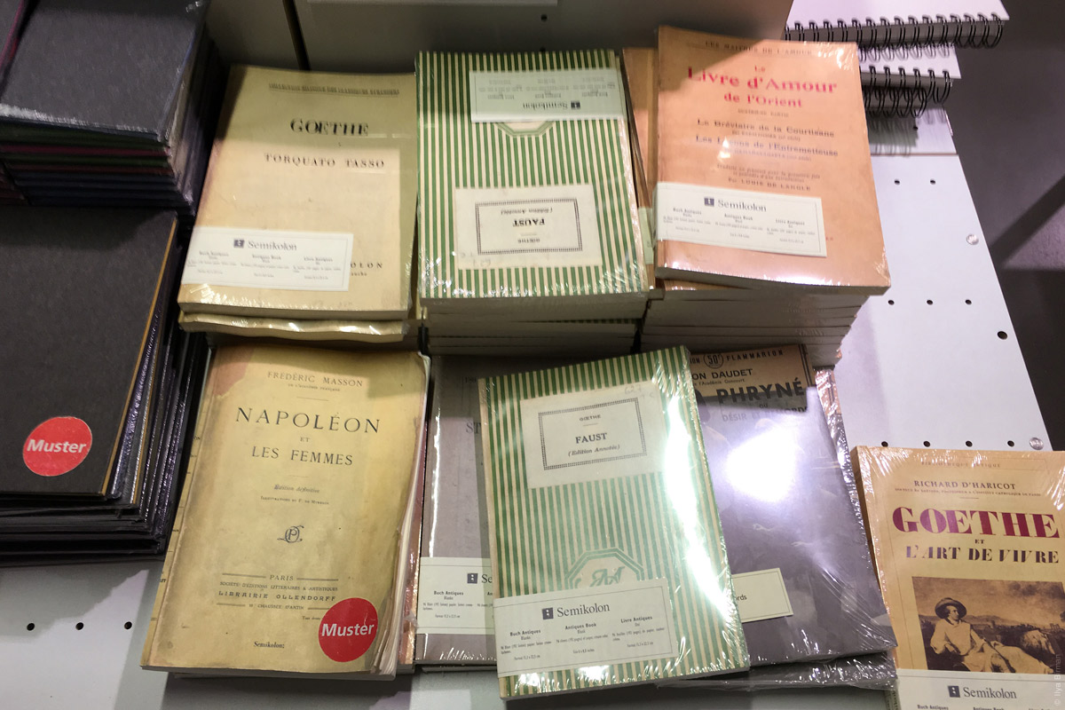
Also copybooks. If I ever wrote, I would use one of these:
Clean:
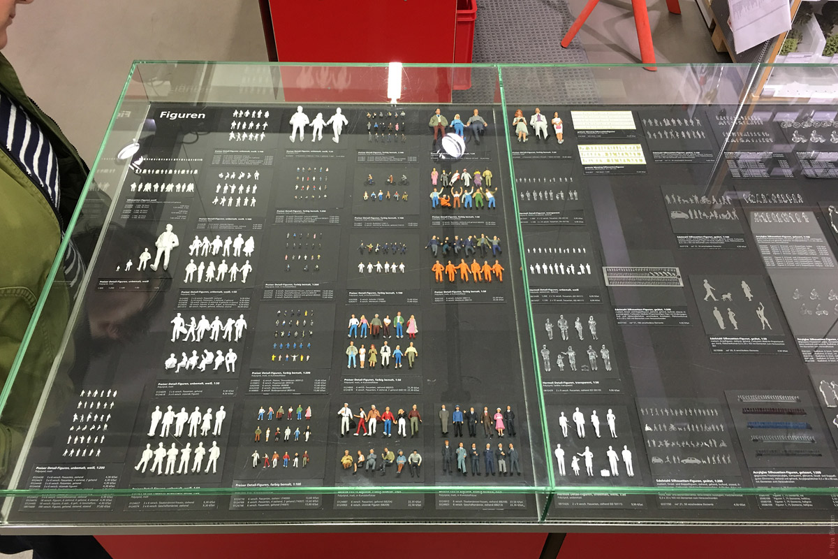
Scale models of humans:
Transportation and furniture:
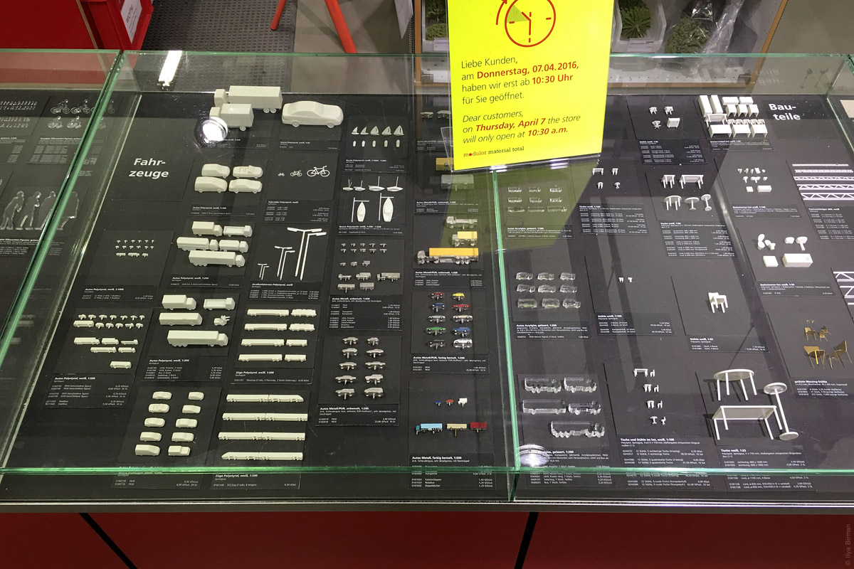
This department drew my attention immediately:
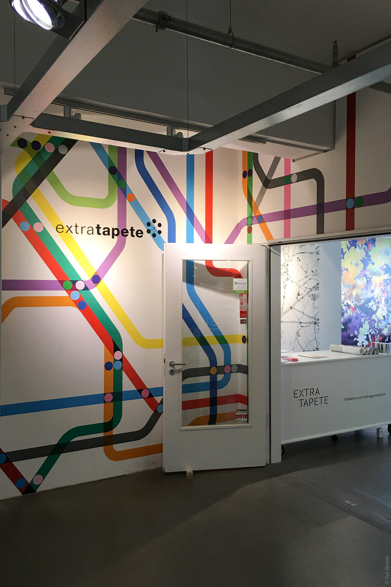
Looks like some transit maps:
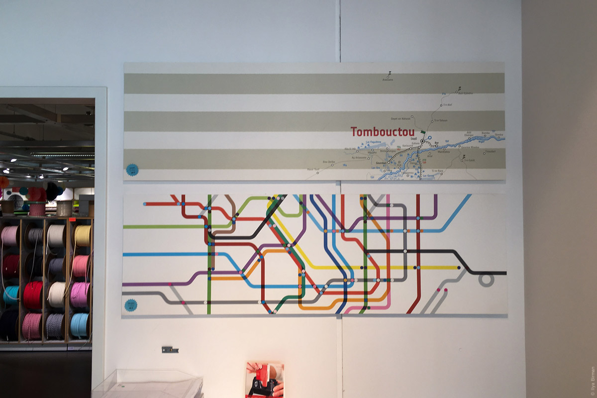
I don’t remember what was inside, so probably it turned out to be not that interesting.
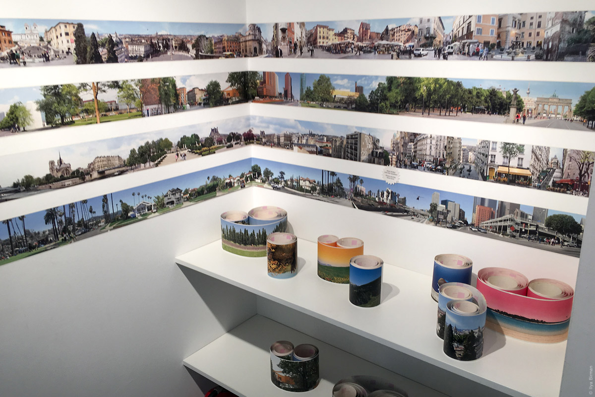
Scrolls with street panoramas:
The coolest department was the one with 3D printers. You can stand in a circle, they would take pictures of you all around and then print you out like this:

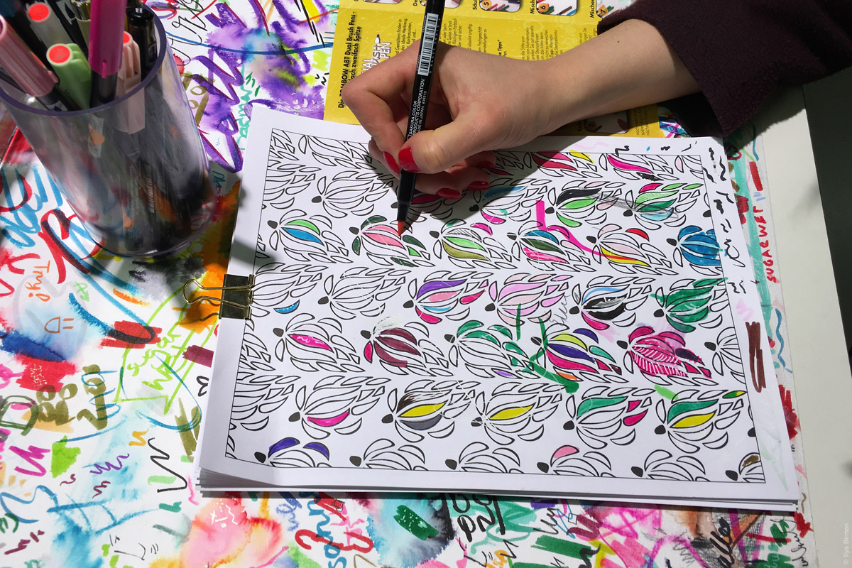
To try out markers, you colour some patterns, not boring white paper:
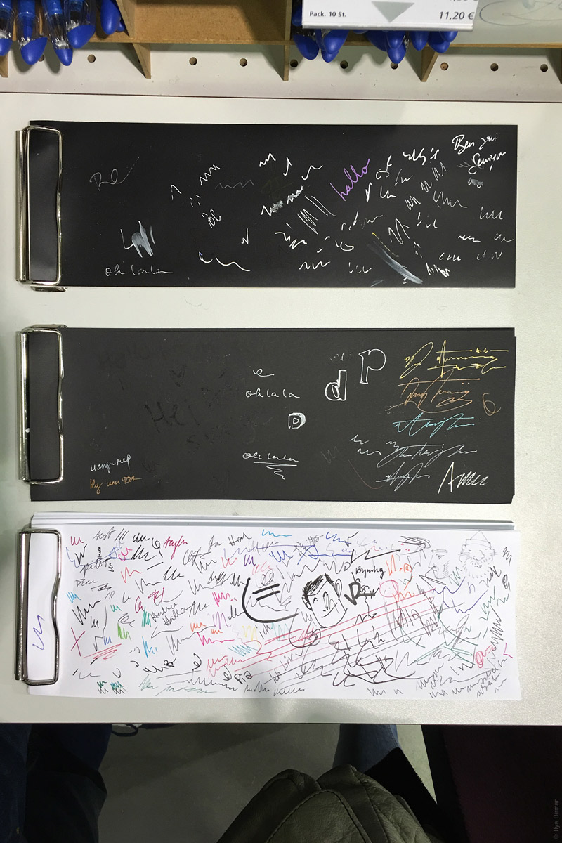
Every time I see black paper and light pens, I think I should start sketching user interfaces on paper like this:
Also recommended: London Graphic Centre at Covent Garden (Mercer st. and Shelton st.). Another place where you can easily spend an hour.
See also:
For many people, a map of a transport network is a given, an expected part of a system, something that just is — like a fire escape plan in a building. So when I say that I design transport maps, they don’t understand. What is there to design, even?
The London underground map by Harry Beck was the world’s first transport map to use the principles of electrical circuit drawings:
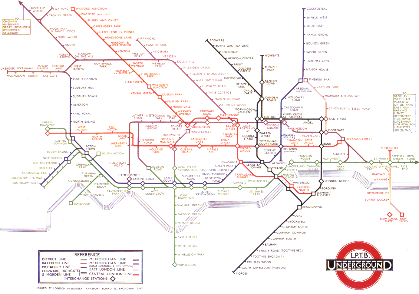
All line segments were put to the angles of 45° and 90°. The distances between stations were equalised. I wrote about it in part three of my “Maps and reality” series, Diagrams.
This schematic approach was later adopted by many transport maps of the world. But not every time was this a good idea. This is one useless map (Samara, Russia):
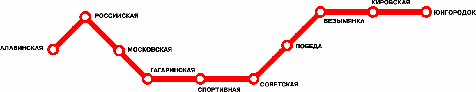
It adds almost nothing to just listing the stations:
Алабинская · Российская · Московская · Гагаринская · Спортивная · Советская…
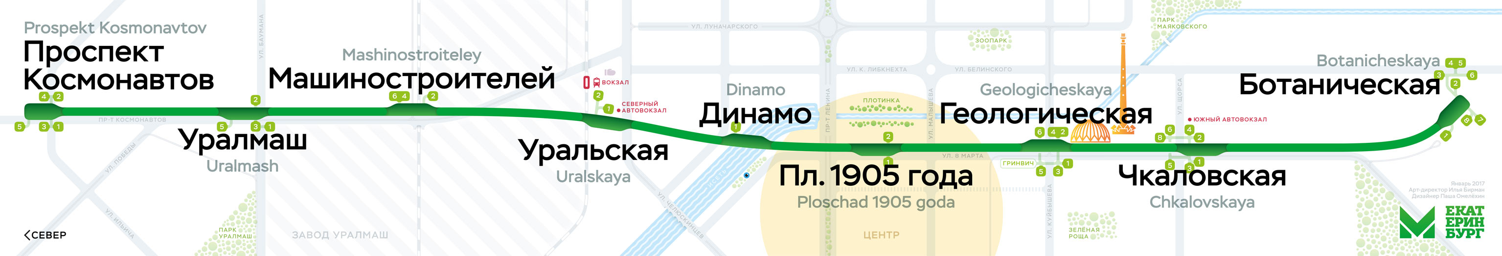
Beck’s design dealt with growing complexity and spread of London underground rail network. When there is just one line, it’s better to put this line in context. See our Ekaterinburg metro map, for example:
Every transport network requires a specialised solution.
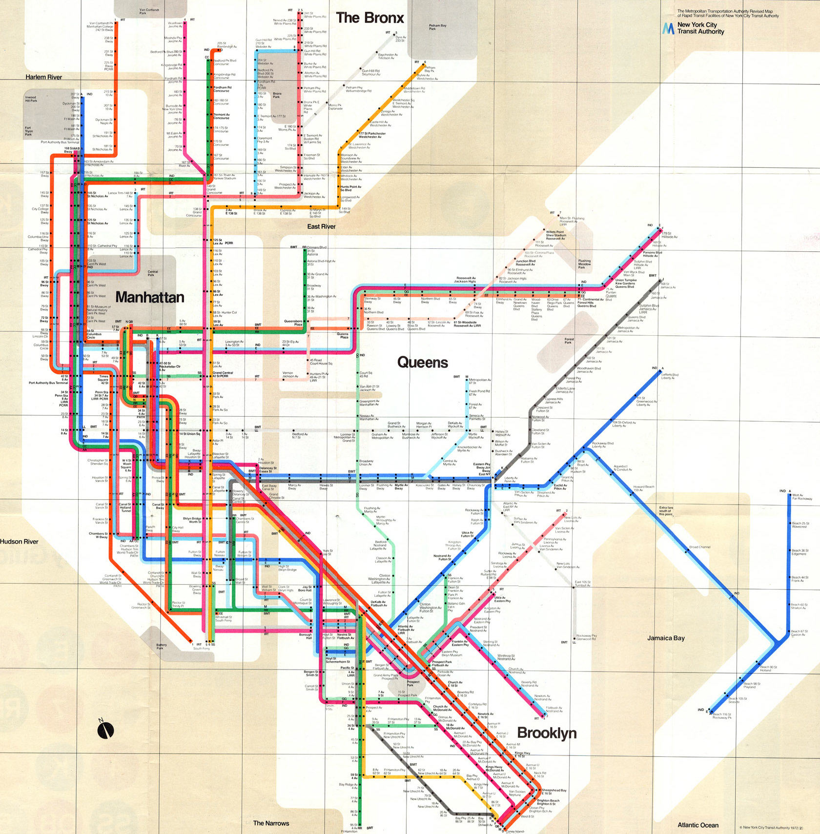
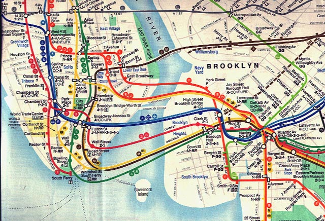
Let’s look at New York. The subway is large and complicated, but quite different from London: trains can have different routes, which are denoted by both numbers and letters. In 1972, Massimo Vignelli designed this map:
In London, ticks are used to depict stations:
Vignelli couldn’t have used them in New York. In London, lines rarely run together through the same stations. And when they do, all trains in a “wisp” stop at all of them — see Great Portland Street and Euston Square above.
In New York, such wisps are everywhere, and some trains don’t stop at some stations. So when there is a stop on a particular route, Vignelli puts a black bullet in the route’s line:
You can see that at some stations, not every line has a bullet.
Vignelli’s map was beautiful, but, unfortunately, unsuccessful. People considered it too abstract. Having no geographical reference, the eye had nothing to catch on. Also, the stations named with street numbers looked identical — the font was just too small for that.
This design was the closest to London’s that New York has ever seen.
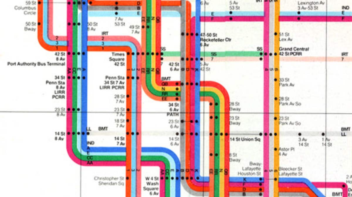
The successful design was the one by Michel Hertz (1979) — still in use. It includes parks, ponds, main streets and areas names:
The related routes are denoted with just one line, not a wisp:
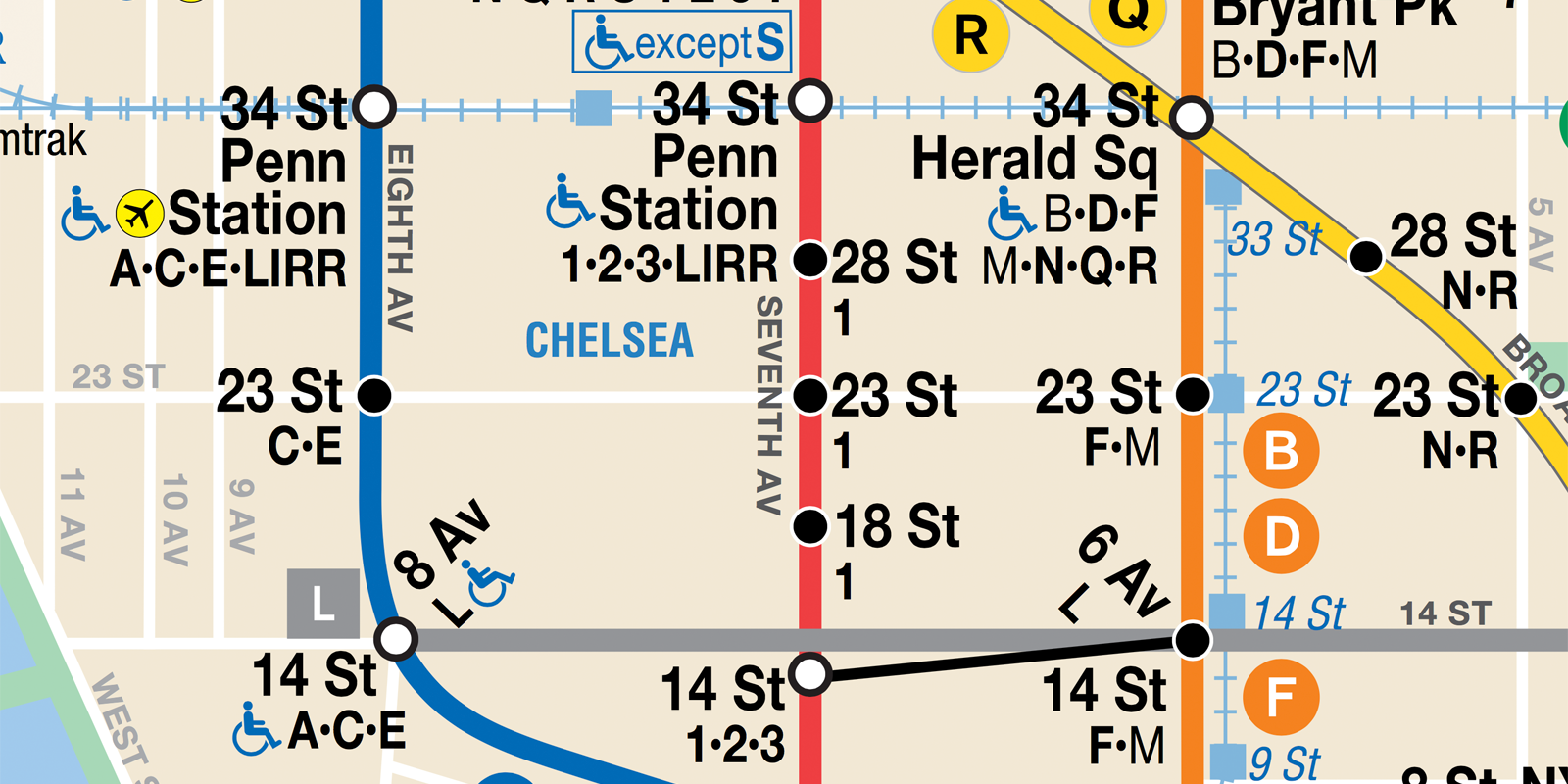
But there’s a list of stopping routes at each station. Look at the red line, for example. Only route 1 stops at 18, 23 and 28 st., but all routes stop at 14 and 34 st.
Hertz wanted his map to look geographical. But he knew that a “true” map would use the format very inefficiently. So his map is actually distorted significantly for everything to fit. Google Maps on the left, Hertz’s map on the right:
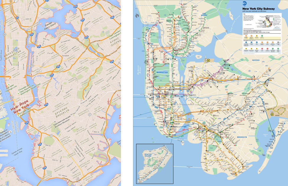
Hertz’s map doesn’t look stylish. But it has proven to work well. This is a very specific, bulletproof design tailored to New York.
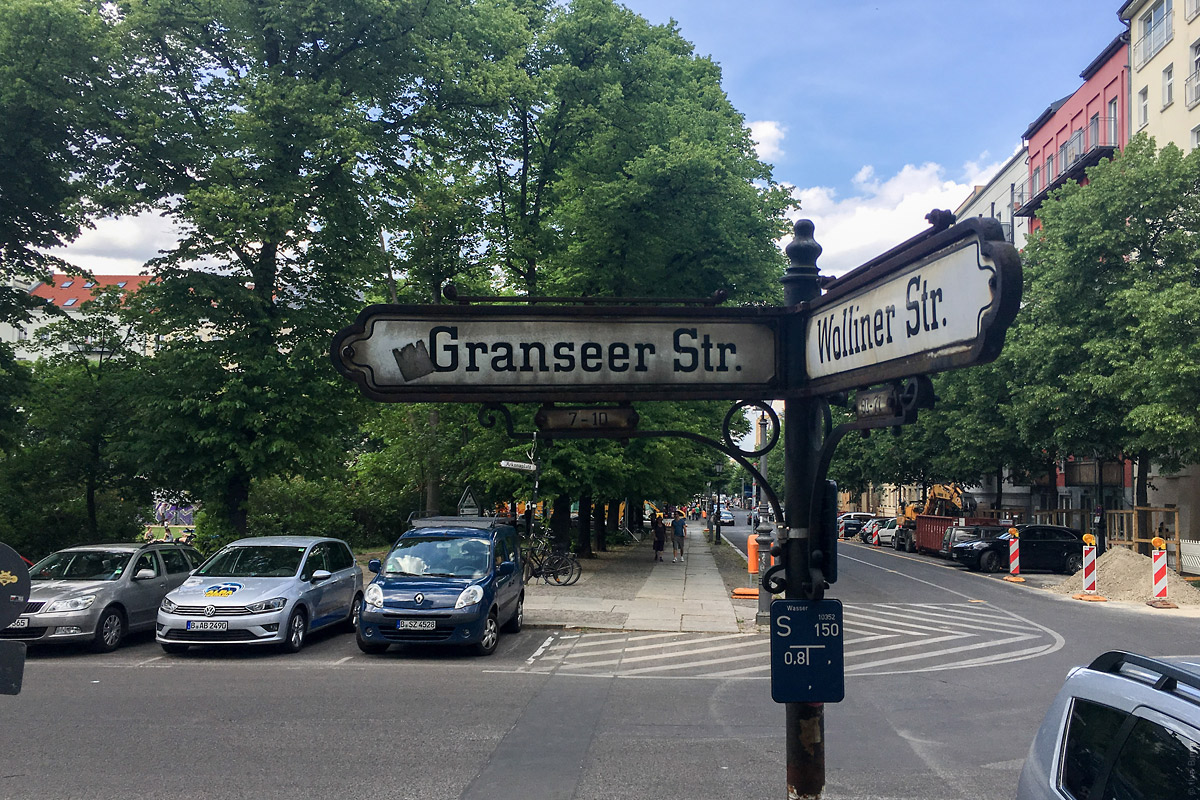
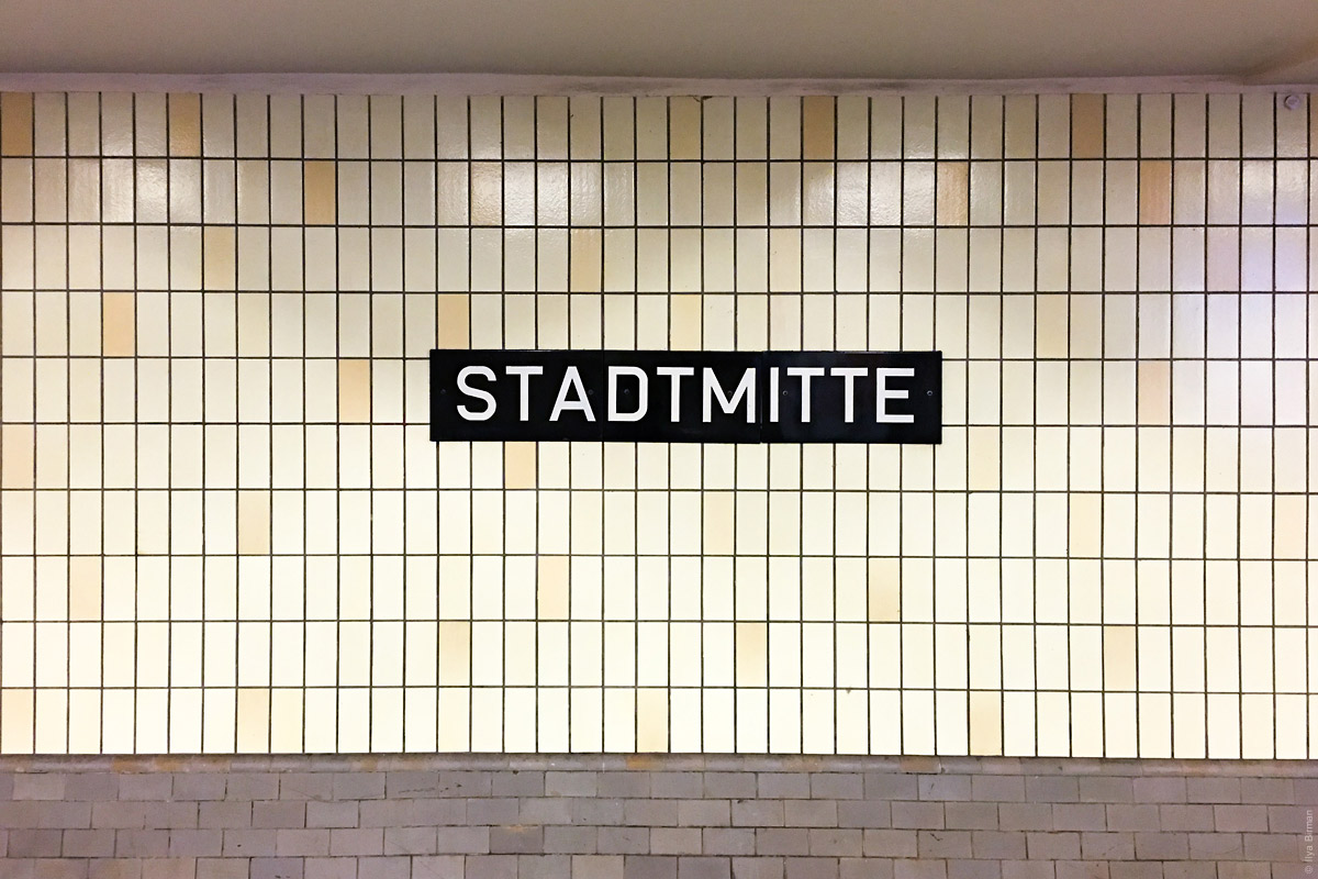
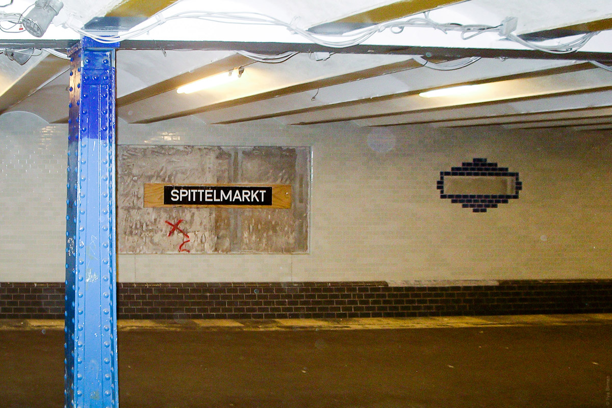
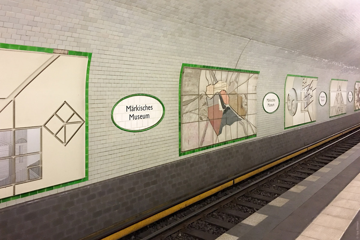
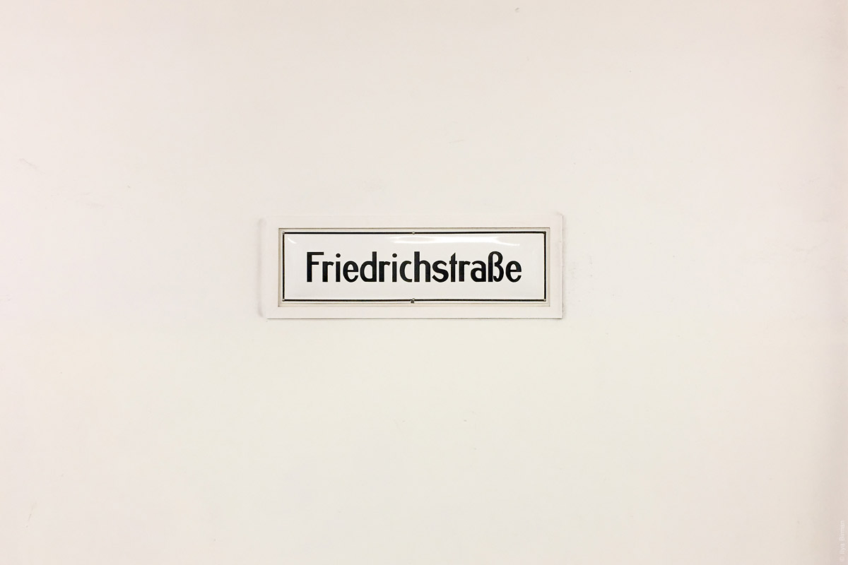
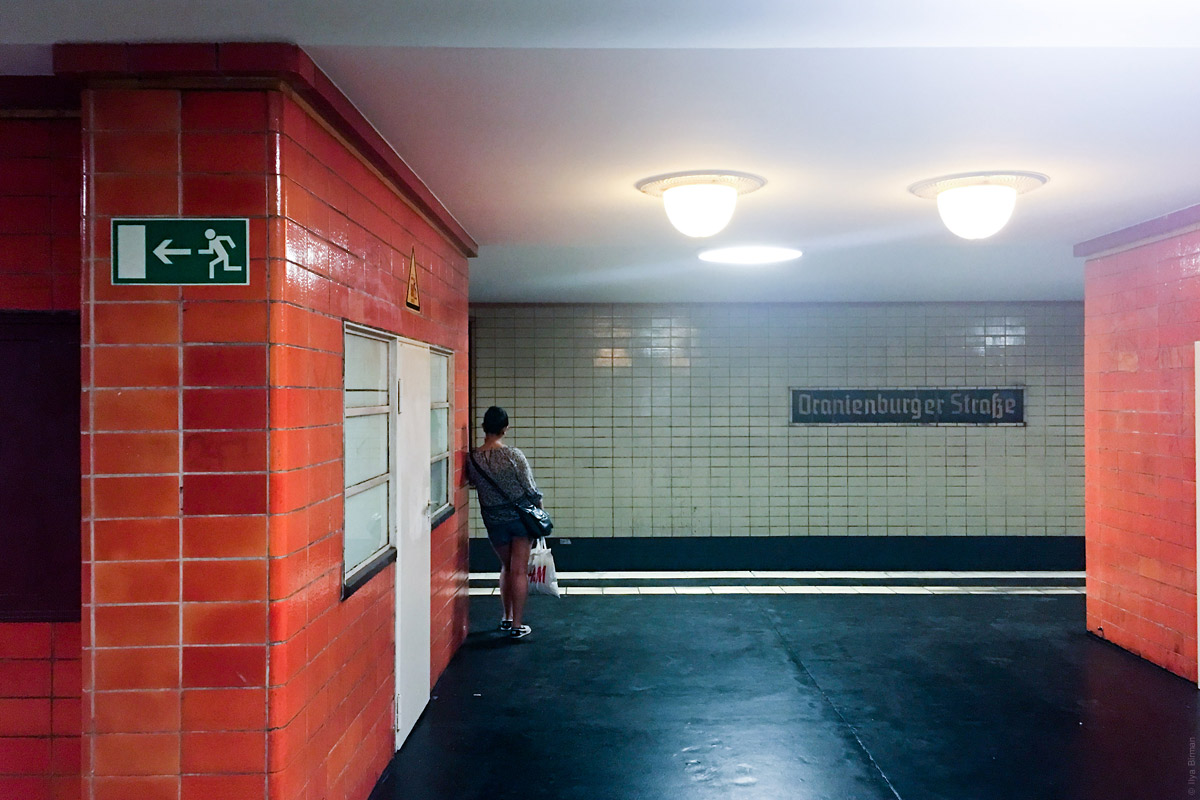
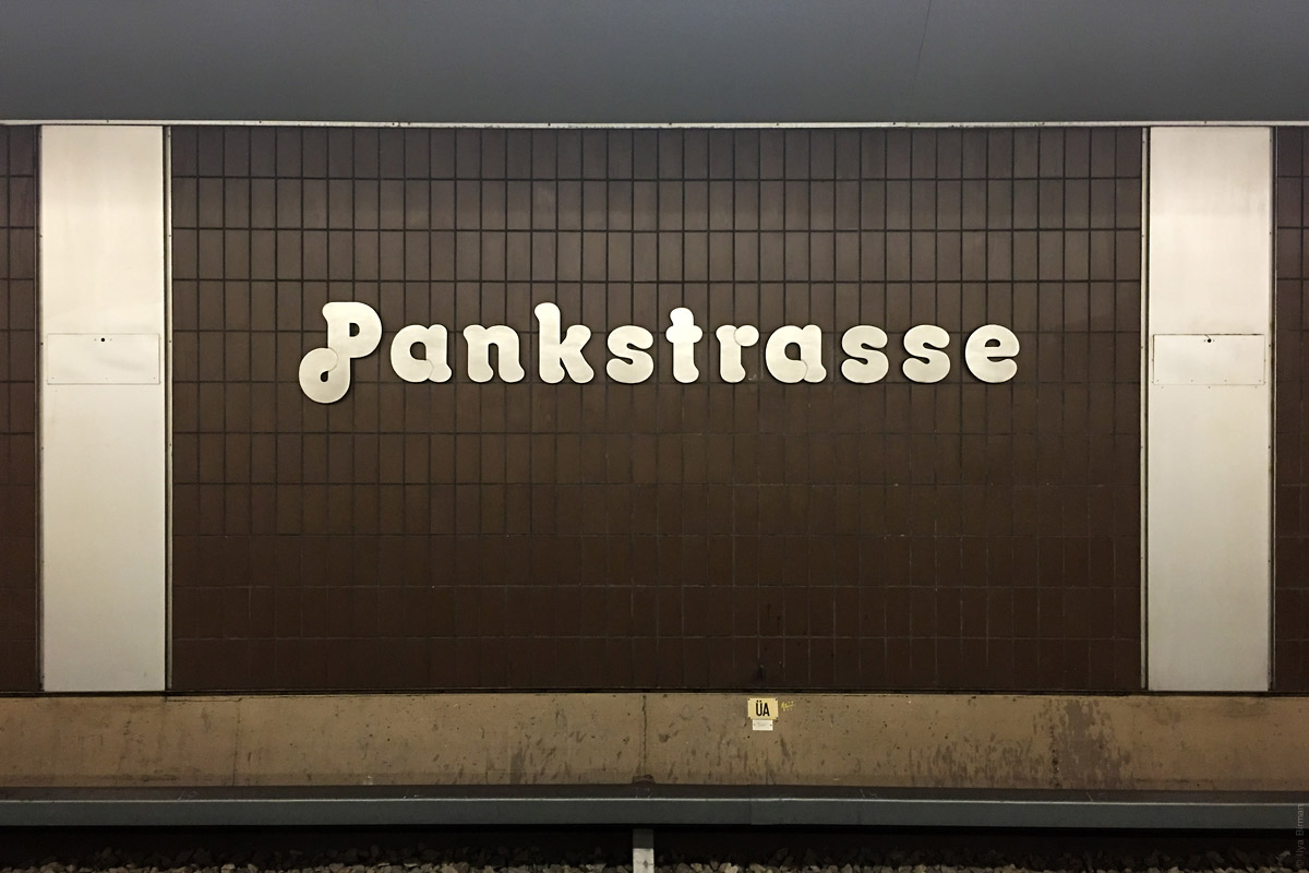
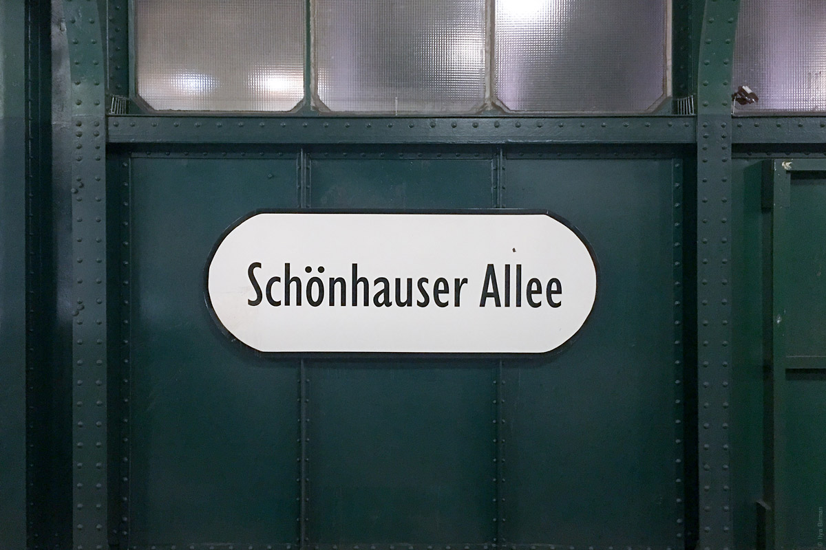
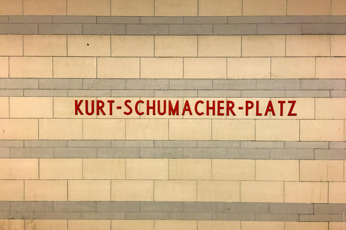
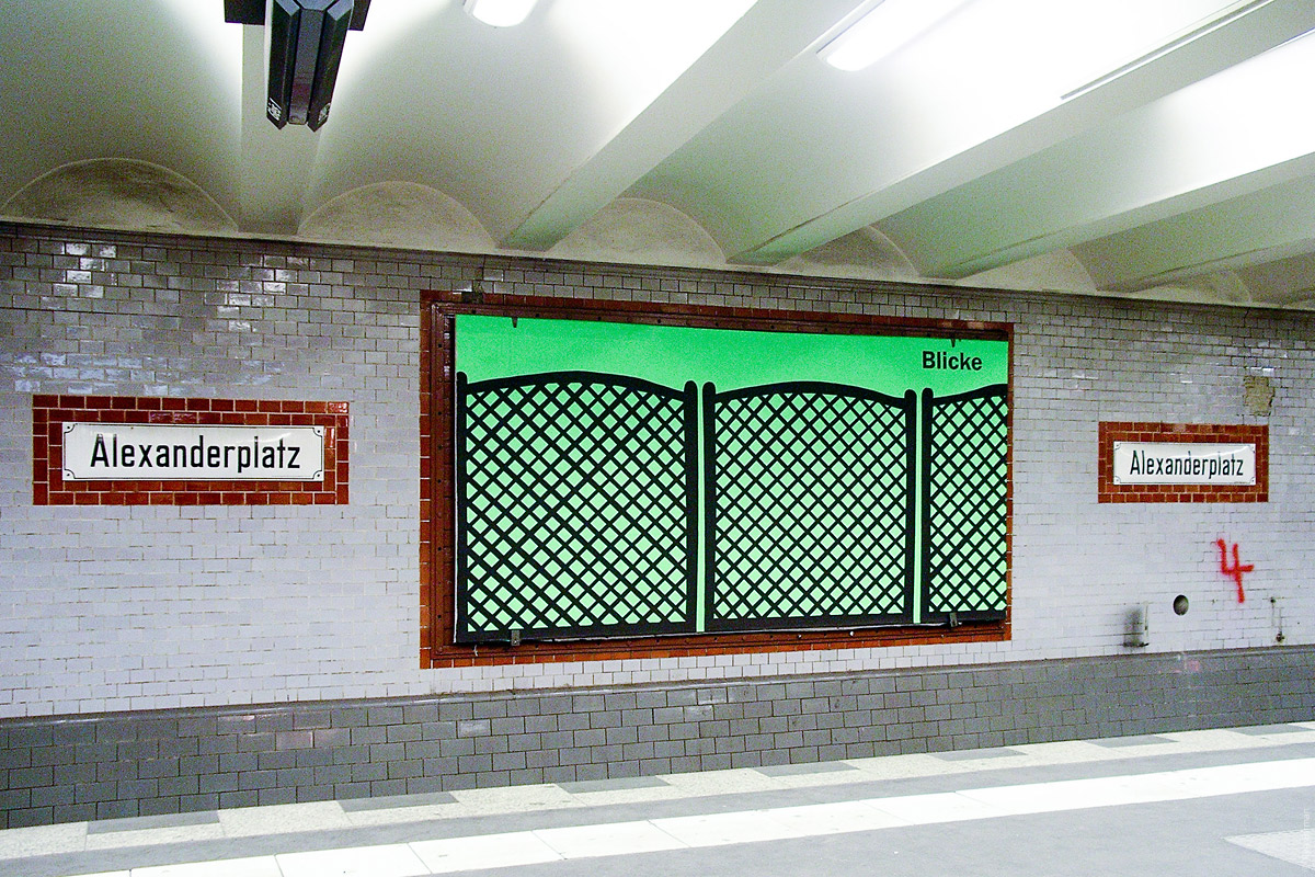
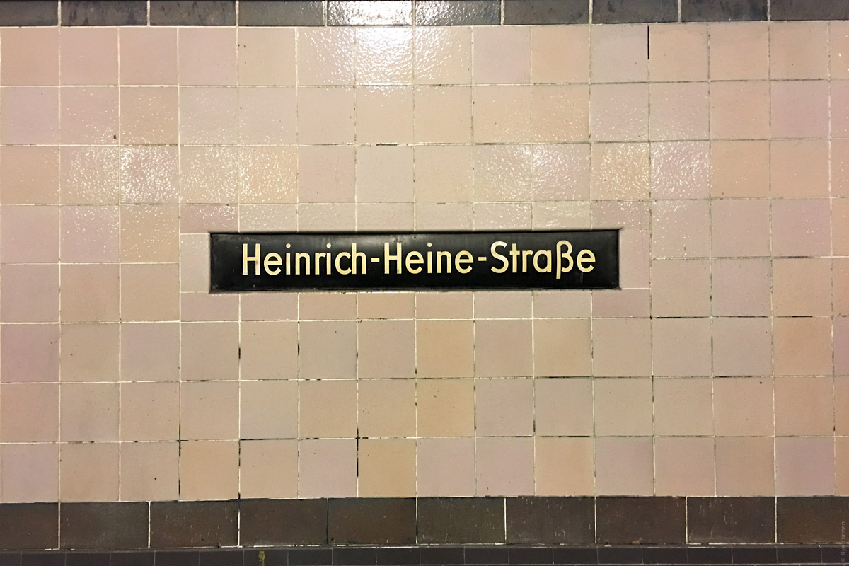
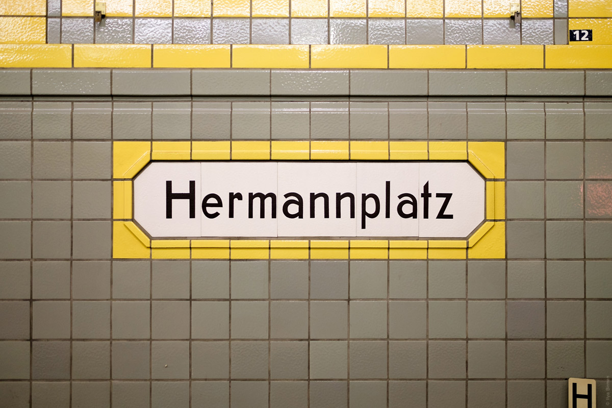
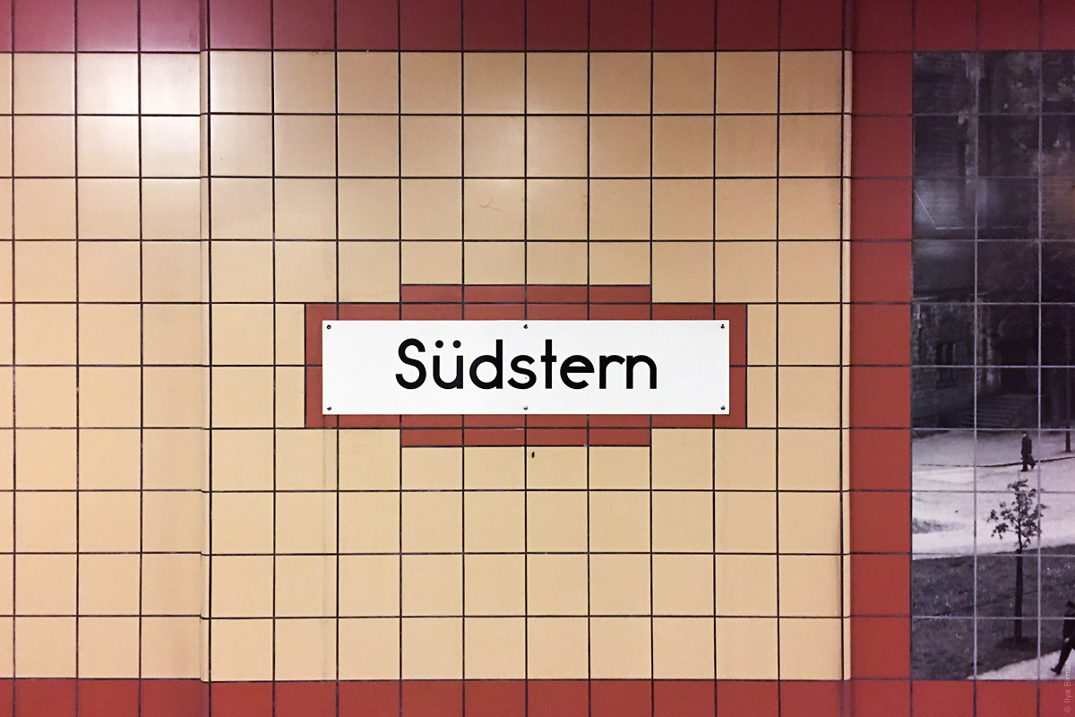
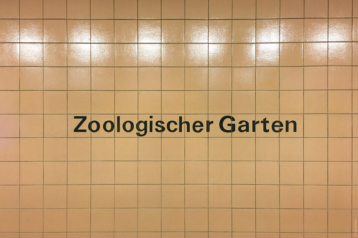
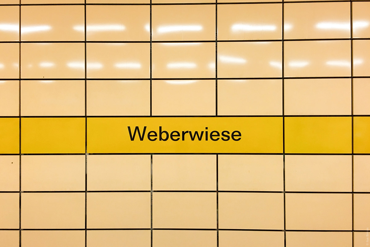
Here are some Berlin metro station names (photos from trips of August 2005, April and May 2016).
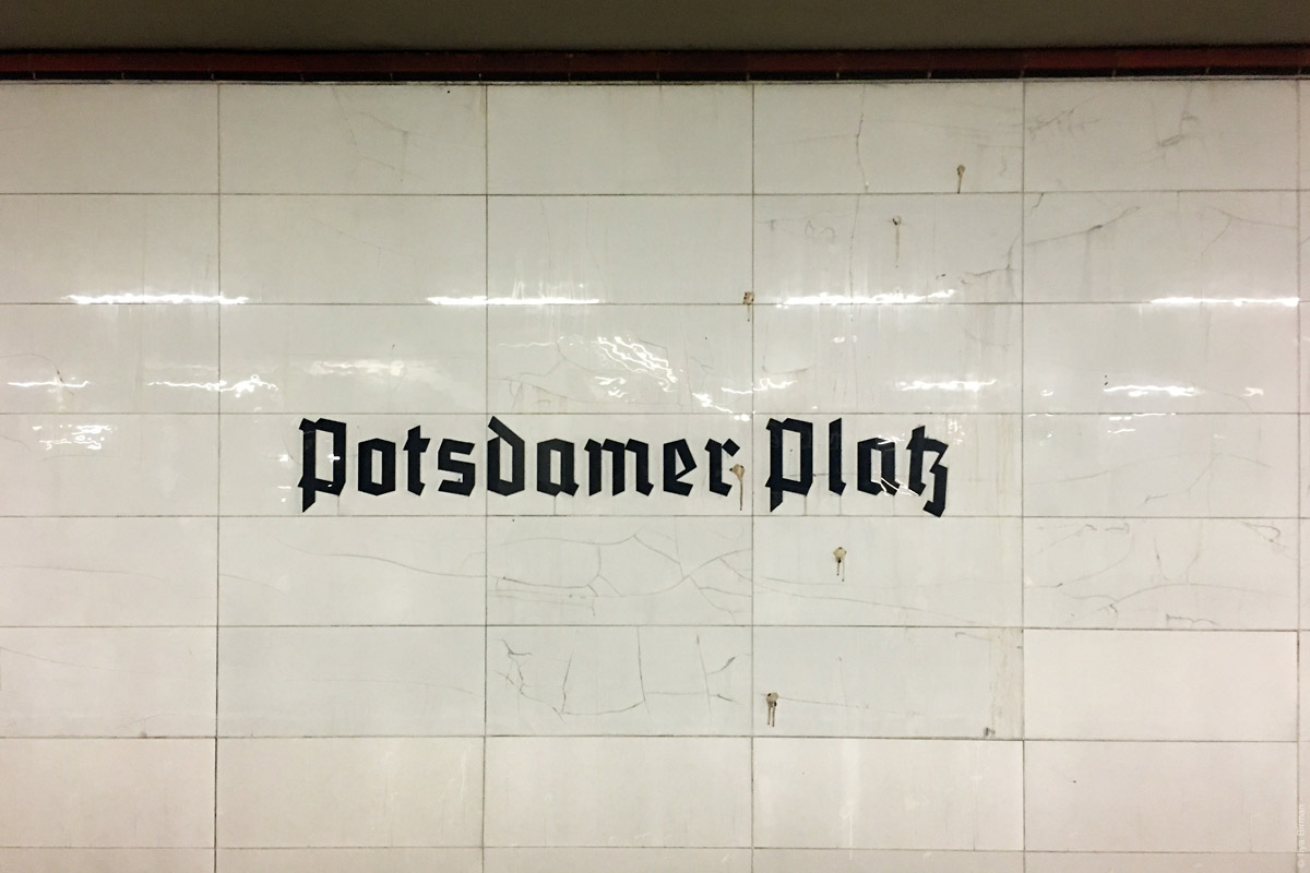
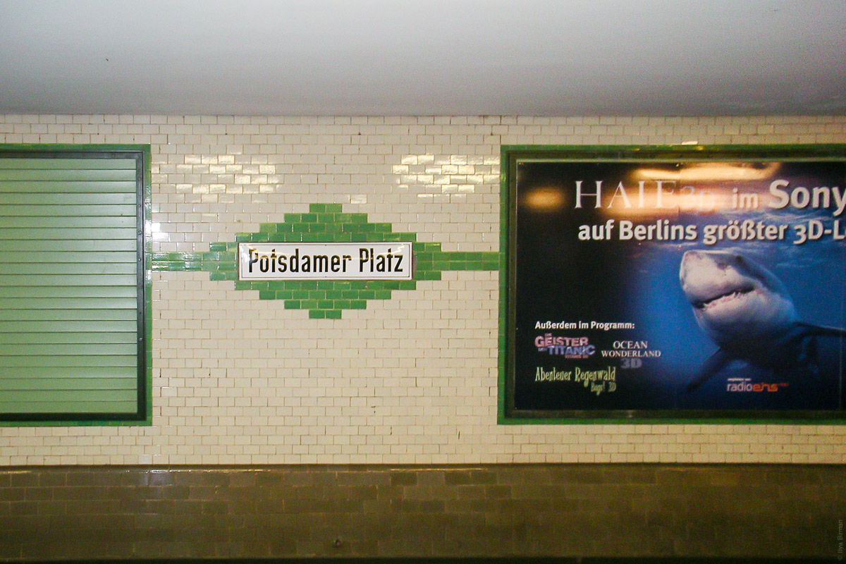
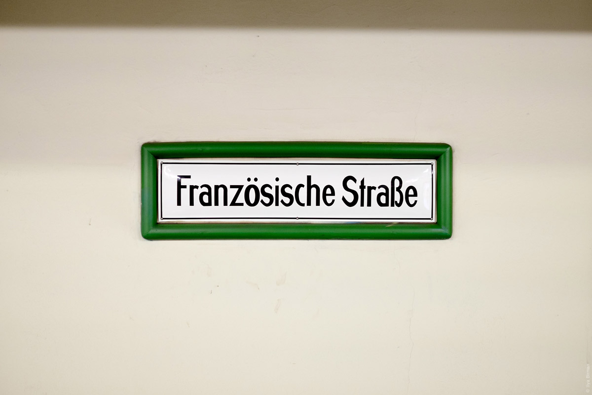
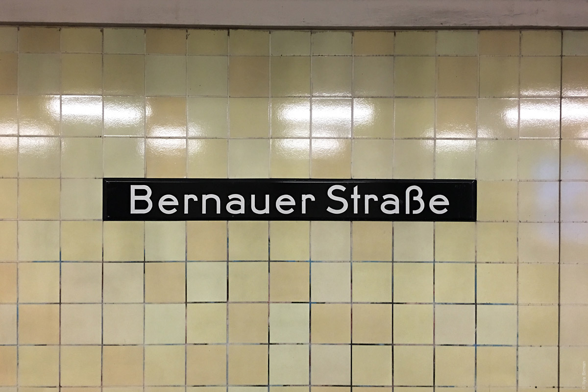
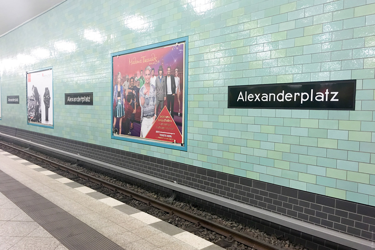
My favourite plate:
Animals:

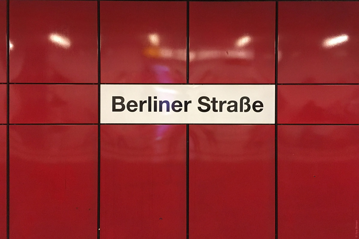
Another boring one:
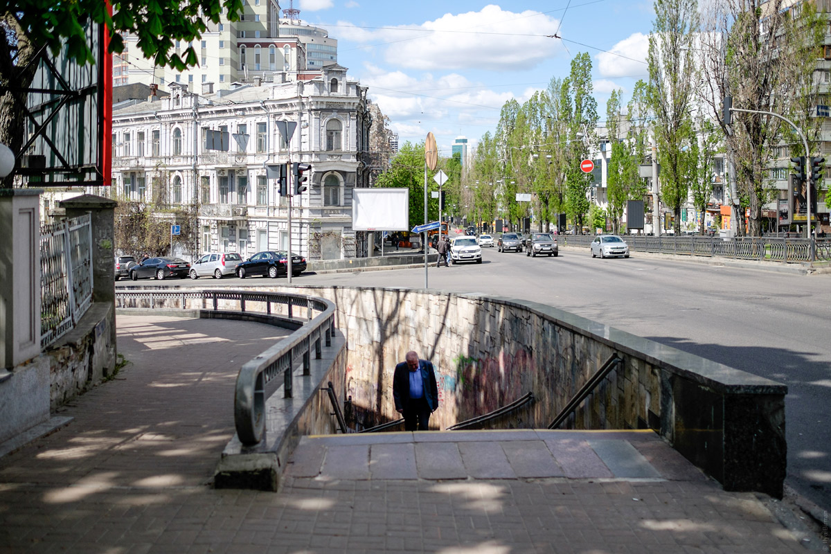
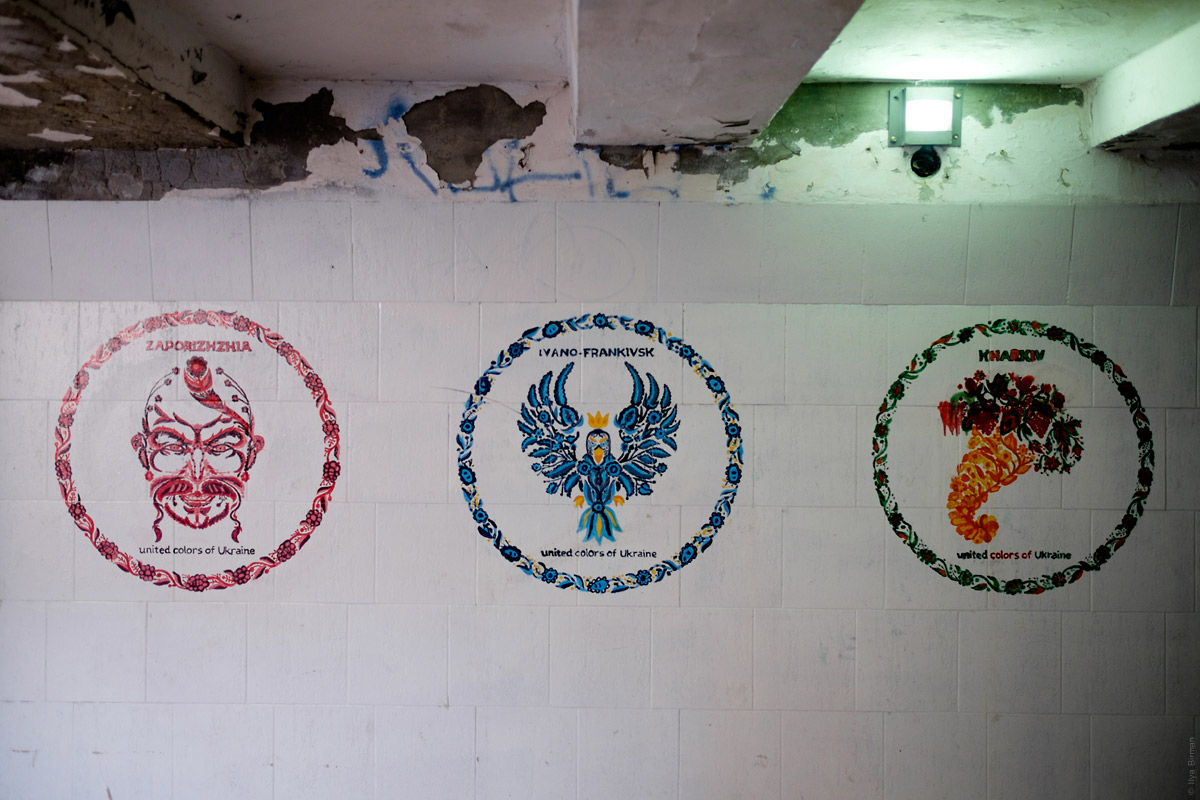
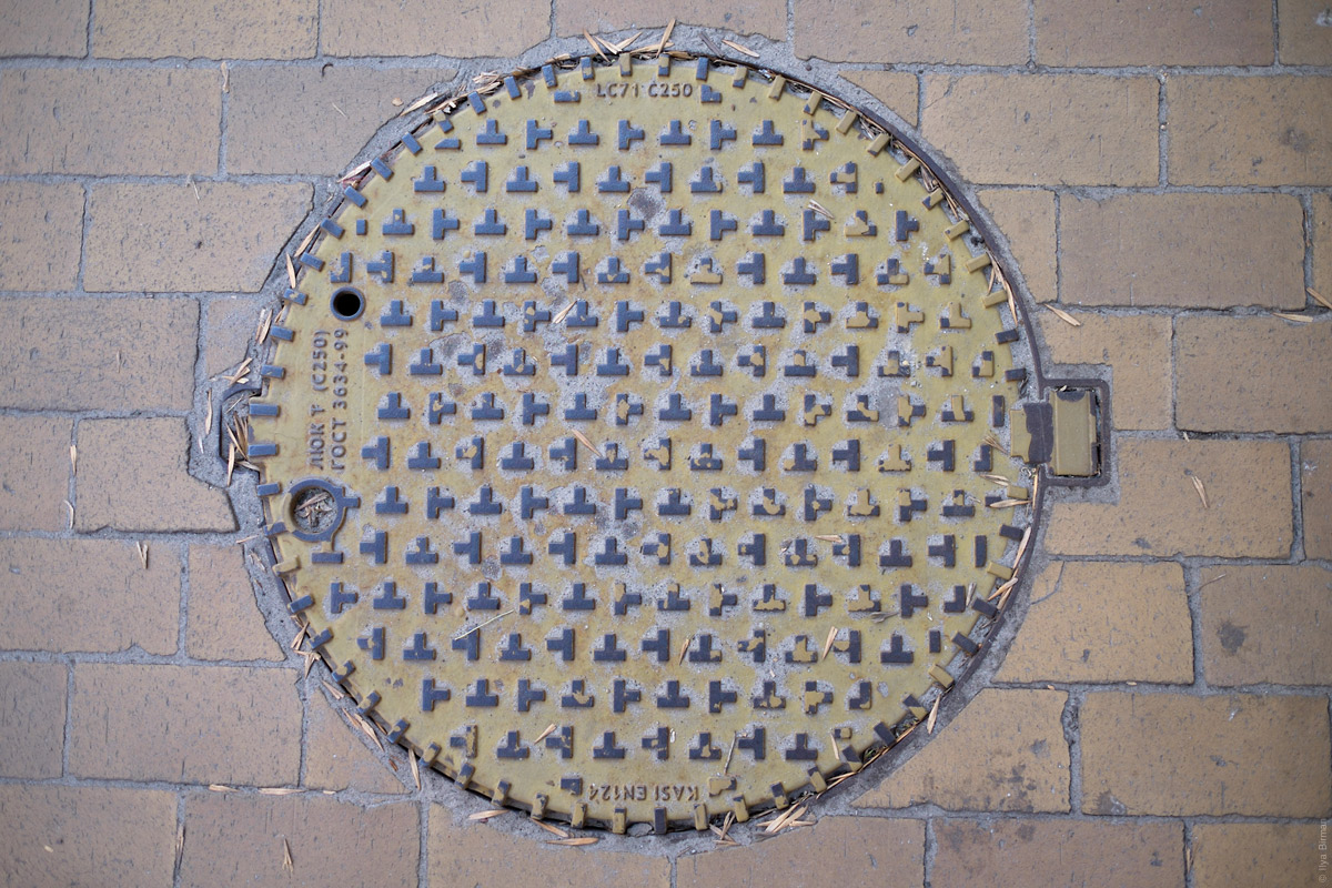
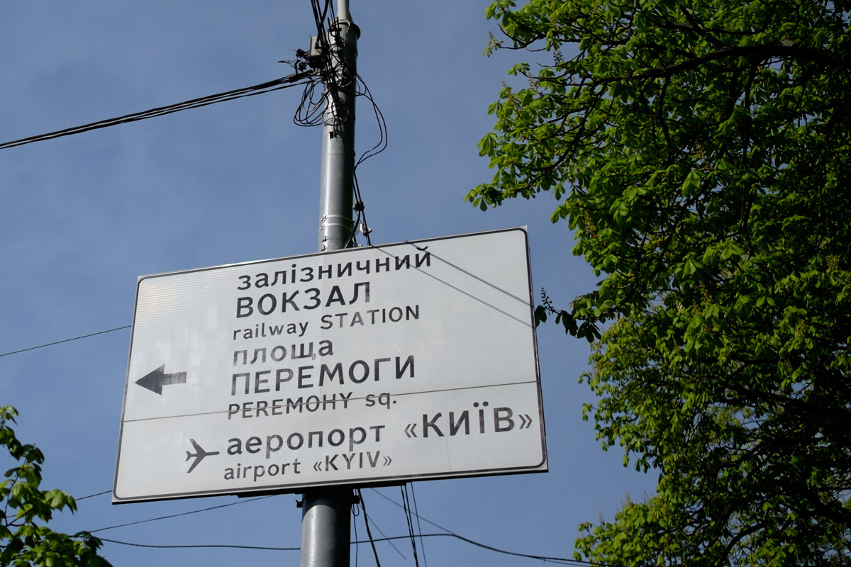
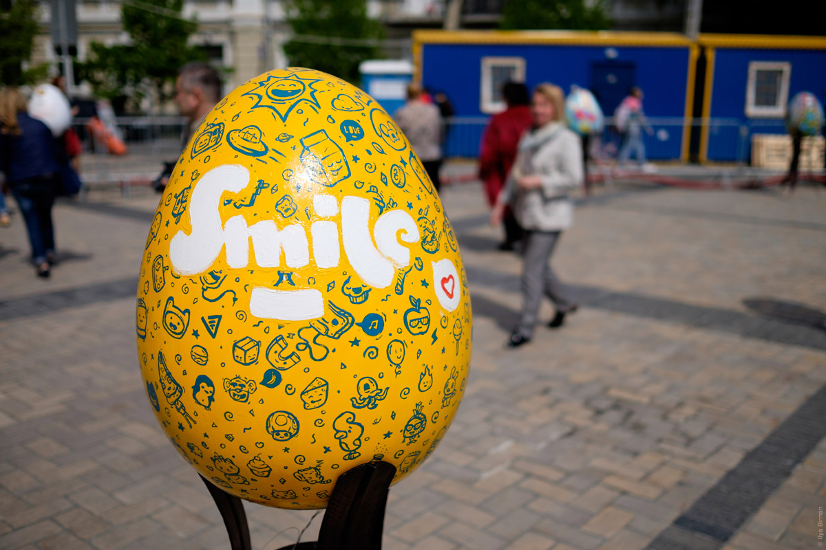
Here are the rest photos from Kiev in April 2016 that I wanted to share.
In Kiev, there are several peculiar subways. The stairways from the crossing streets run down in a form of an arc, uncovered. The entrance to the subway is where the stairways meet:
These graphics in one of the subways represent the Ukrainian cities:
A manhole cover:
An airplane pictogram confusingly points in wrong direction:
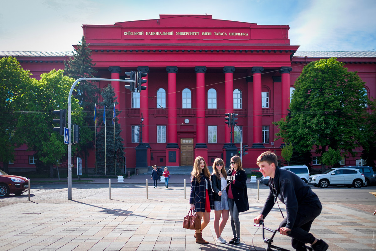
The university is painted with a crazy colour:
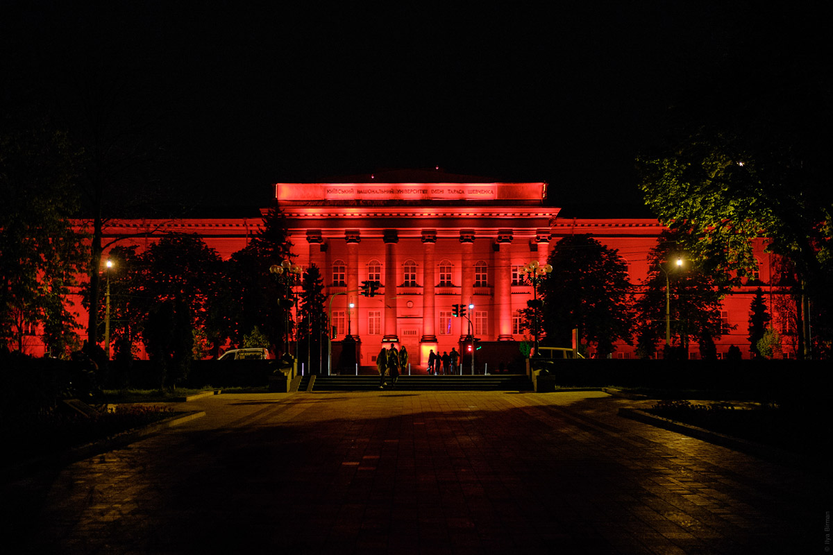
At night it looks infernal:
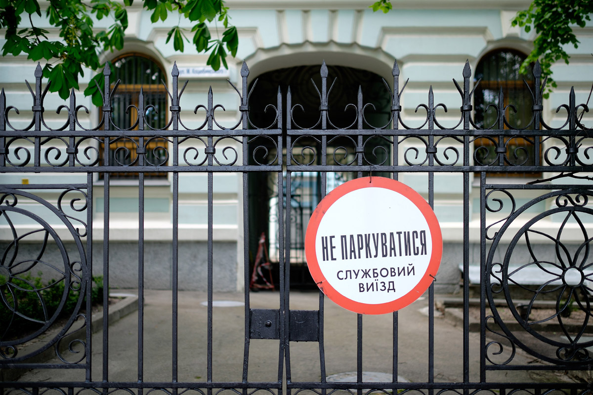
A sign on a fence:
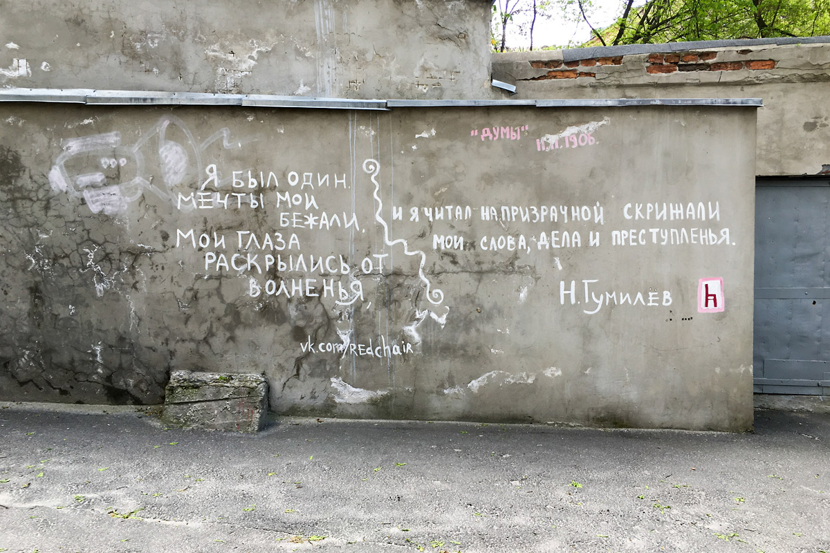
Wall art:
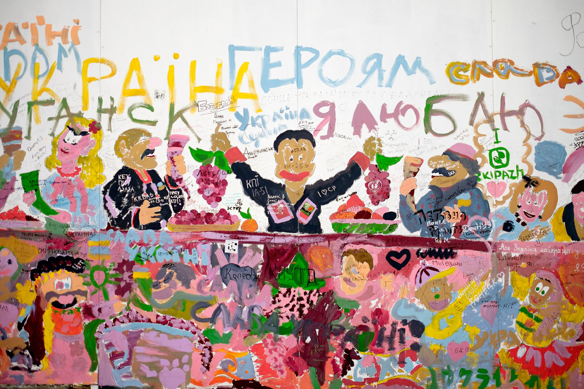
Another example:
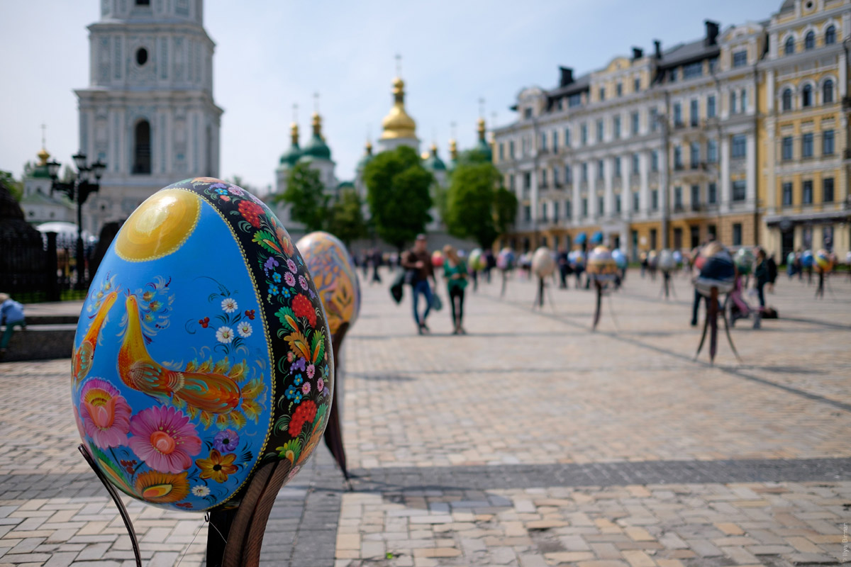
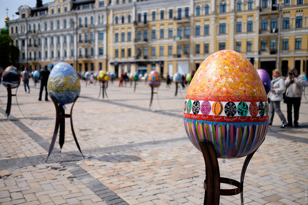
There was an exhibition of painted eggs on a square — many looked beautiful:
Dnipro:
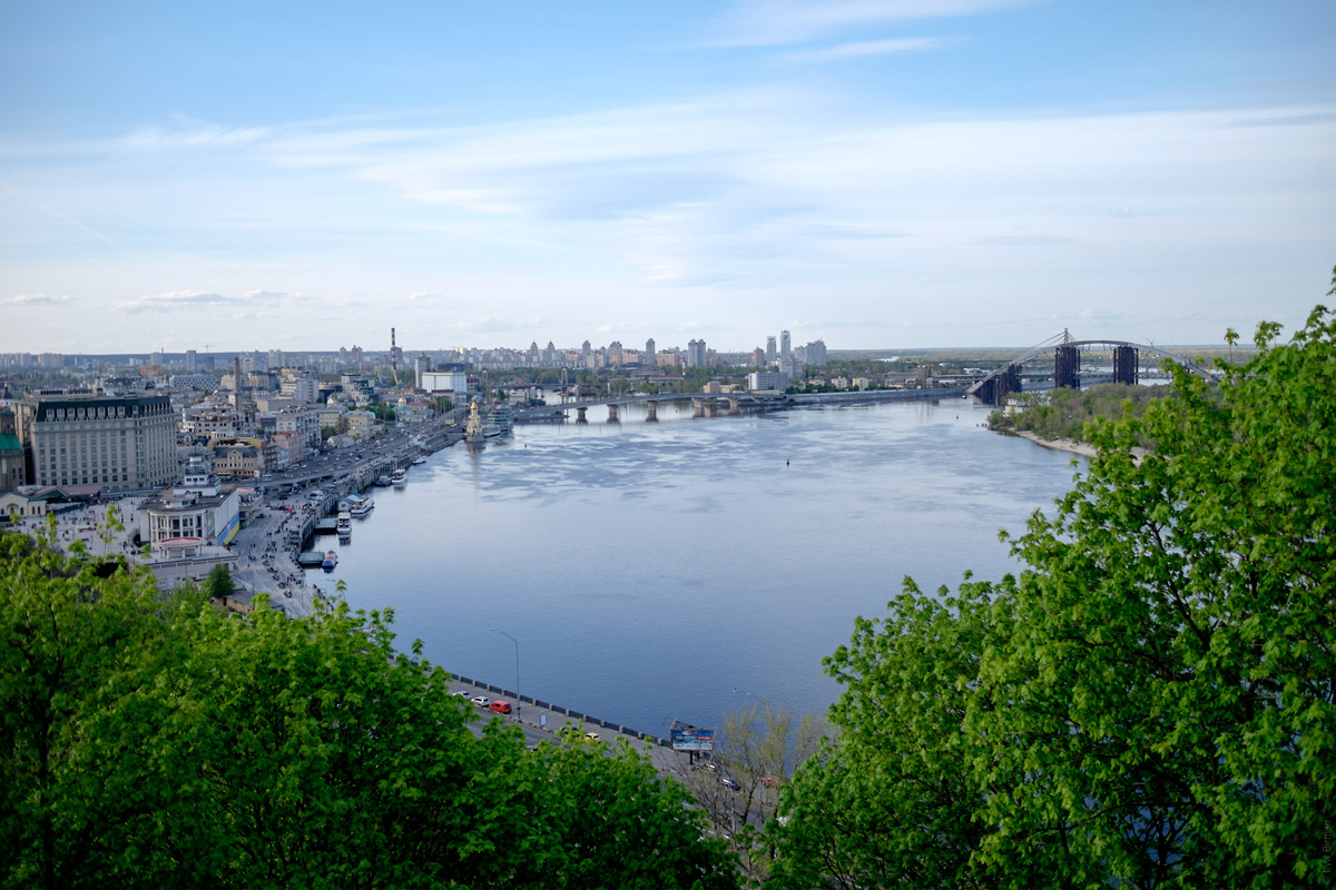
More Kiev: